All posts by media-man

Three interesting code snippets from NPR’s Election Party

The NPR Election Party welcome screen

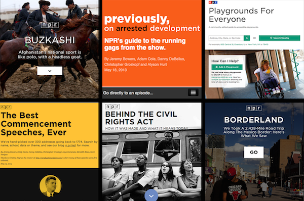
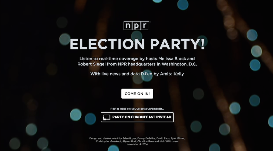
NPR’s Election Party app has a lot of moving parts. It displays live election results from the Associated Press, ingests posts from our Tumblr liveblog, bakes out visualizations of our data, and presents all of this in a slideshow that, on election night, was continuously changing through an admin. It even works as a Chromecast app.

All of the code is open source and freely available to read and use, but it can be hard to make sense of all of it without knowledge of our app template and all the things this app actually does.

There are countless little snippets of this app I could share, but I chose three pieces of the app that would be interesting to share in isolation.

Deploying bug fixes by reloading your users’ browsers

Our app was a static web page, as all of our apps are. We had a server separately parsing AP data, ingesting Tumblr posts and baking out the static website every few minutes, but the client never touched the server. This made it difficult to deploy bug fixes if something broke on election night.

To solve this problem, we devised a simple way to force every client to refresh the web page. We deployed a file with a timestamp to S3, and on page load, the client downloaded that file, read the timestamp and stored it. Then, every three minutes, the client would check that file to see if the timestamp had changed. If the timestamp had changed, the browser refreshed the page. Here’s the client-side code:

var reloadTimestamp = null;

var getTimestamp = function() {
    // get the timestamp on page load
    if (reloadTimestamp == null) {
        checkTimestamp();
    }
    
    // continually check the timestamp every three minutes
    setInterval(checkTimestamp, 180000);
}

var checkTimestamp = function() {
    $.ajax({
        'url': '/live-data/timestamp.json',
        'cache': false,
        'success': function(data) {
            var newTime = data['timestamp'];
            
            // if we haven't set a timestamp yet, set it
            if (reloadTimestamp == null) {
                reloadTimestamp = newTime;
            }
            
            // if the initial timestamp doesn't match the new one, refresh
            if (reloadTimestamp != newTime) {
                // set a cookie in case we need to something to happen
                // when the page reloads
                $.cookie('reload', true);
                window.location.reload(true);
            }
        }
    });
}

$(document).ready(function)() {
    getTimestamp();
    
    // stuff you only want to happen if we forced a refresh
    if ($.cookie('reload')) {
        // for example, skip a welcome screen or hide some UI element
        
        $.removeCookie('reload');
    }
});

Locally, we could deploy the new timestamp file with a simple Fabric command and deploy function:

#!/usr/bin/env python

from datetime import datetime
import json

from fabric.api import local, task

@task
def reset_browsers():
    """
    Create a timestampped JSON file so the client will reset their page.
    """
    payload = {}

    # get current time and convert to epoch time
    now = datetime.now().strftime('%s')
    
    # set everything you want in the json file
    payload['timestamp'] = now

    with open('www/live-data/timestamp.json', 'w') as f:
        json.dump(now, f)

    deploy_json('www/live-data/timestamp.json', 'live-data/timestamp.json')

def deploy_json(src, dst):
    """
    Deploy to S3. Note the cache headers.
    """
    bucket = 'elections.npr.org'
    region = 'us-west-2'
    
    sync = 'aws s3 cp %s %s --acl "public-read" --cache-control "max-age=5 no-cache no-store must-revalidate" --region "%s"'

    local(sync % (src, 's3://%s/%s' % (bucket, dst), region))

We used this once early in the night when we discovered an error with how we were displaying some of our slide types. It worked well, and we could assume all of our users were using the latest versions of our code.

Here is a gist of the described code above.

Widescreen slides on any device

For our app, we decided to optimize for 16x9 or wider devices, which gets you most TVs, laptops, tablets and phones (in landscape mode). Fixing these slides to this aspect ratio and getting everything in the slides to size appropriately was tricky. We used an unusual technique to achieve this.

First, we set the base font size to 1 vw (that is, 1% of the viewport width). Then, we scaled everything else with rem units (like an em unit, but based only on the base font size). By doing this, we were able to accomplish a couple things: We ensured that everything scaled to 16x9 based on the width of the viewport. With some JavaScript, we could also shrink the base font size when the client browser is shorter than 16x9.

A demo of this is simple.

Your HTML file needs only a wrapper div and some content in it:

<div id="stack">
    <div class="big">
    BIG
    <div class="em"></div>
    </div>
    <div class="little">
        little 
        <div class="em"></div>
    </div>
</div>

Then, in a CSS file, we set the base font size on the html element to 1vw and ensure there is no margin on the body:

html { font-size: 1vw; }
body { margin: 0; }

On the wrapper div, we set a few critical styles to making this work, as well as some styles that make the demo visible:

#stack {
    box-sizing:border-box;
    -moz-box-sizing:border-box;
    -webkit-box-sizing:border-box;
    
    // 16x9 aspect ratio 
    width: 100rem;
    height: 56.25rem;

    // centering if the screen is wider than 16x9
    margin: 0 auto;

    // for the sake of testing
    border:4px dashed black;
}

In addition, we used rems for all other measurements, including font sizes, widths and heights, so that they would scale appropriately:

.big {
    font-size: 10rem;
}
 
.little {
    font-size: 2rem;
}
 
.em {
    background-color: blue;
    width: 1rem;
    height: .1rem;
}

Finally, to make this fully responsive, we need a JavaScript resize function to change the base font size when appropriate:

var onWindowResize = function(){
    // get aspect ratio of current window
    var aspect = window.innerWidth / window.innerHeight;

    /*
    * If the window is wider than 16/9, adjust the base font size 
    * so that the wrapper stays 16/9, and letterboxes 
    * to the center of the screen.
    */

    if ( aspect > 16/9) {
        document.documentElement.style.fontSize = ((16/9) / aspect) + 'vw';
    } else {
        document.documentElement.style.fontSize = '1vw';
    }
}

This, of course, required prompting users to shift their phones and tablets into landscape mode.

If you want to see this demo in action, see it on Codepen and resize your browser a bunch. In addition, here is a gist of all the code.

Developing Chromecast applications in JavaScript

The functionality we desired for Chromecast users went beyond simple tab mirroring, which Chromecast allows you do to with any website. Instead, we wanted to make your casting device a remote control, able to mute audio and navigate between slides. To do so, we had to use the Google Cast SDK. The Cast SDK allows you to make the Chromecast load your app on an internal version of Chrome installed on the hardware.

The SDK works pretty well, and other people have done good work in documenting how to get a Chromecast app set up. Peter Janak, in particular wrote a Chromecast Hello World application that was very helpful for us.

To make our lives easier, we wrote a simple library to handle initializing Chromecast sessions and passing messages between the connected device and the Chromecast. Next time we develop a Chromecast app, we will probably develop this further into a standalone library, but it works well as is now.

In addition to embedding the SDK JavaScript on your site, we have two files, chromecast_sender.js and chromecast_receiver.js. Read the full source here. These files provide a friendlier API for interacting with the Chromecast. Specifically, they define the CHROMECAST_SENDER and CHROMECAST_RECEIVER objects, which allow you to interact with casting devices and Chromecasts in code.

First, to setup a Chromecast app, you need to check if a user has the Chromecast extension installed:

// define some global vars
var IS_CAST_RECEIVER = (window.location.search.indexOf('chromecast') >= 0);
// is a currently casting device
var is_casting = false;

window['__onGCastApiAvailable'] = function(loaded, errorInfo) {
    // We need the DOM here, so don't fire until it's ready.
    $(function() {
        // Don't init sender if in receiver mode
        if (IS_CAST_RECEIVER) {
            return;
        }

        // init sender and setup callback functions
        CHROMECAST_SENDER.setup(onCastReady, onCastStarted, onCastStopped);
    });
}

An important thing to keep in mind is that, in our model, the Chromecast app actually runs the same code as the client. You need to maintain state across your app so that your code knows whether the client is a Chromecast or a regular web browser. Thus, you would have a function for the sender when a Chromecast session is initiated, and a code path in your ready function for Chromecasts specifically:

// function for casting devices
var onCastStarted = function() {
    is_casting = true;

    // show what you want to appear on the casting device here
    $chromecastScreen.show();
    $castStart.hide();
    $castStop.show();
}

// example code path when the document is ready
$(document).ready(function() {
    if (IS_CAST_RECEIVER) {
        CHROMECAST_RECEIVER.setup();

        // Set up event listeners here
        CHROMECAST_RECEIVER.onMessage('mute', onCastReceiverMute);
    }
});

Note that you can set event listeners on the Chromecast. This allows you to send messages between the casting device and Chromecast, which powered our remote control functionality. Here’s an example message sending function and receiver callback that allowed us to mute the audio on the TV from the casting device:

/*
 * Cast receiver mute
 */
var onCastReceiverMute = function(message) {
    if (message == 'true') {
        $audioPlayer.jPlayer('pause');
    } else {
        $audioPlayer.jPlayer('play');
    }
}

/*
 * Unmute the audio.
 */
var onAudioPlayClick = function(e) {
    e.preventDefault();

    if (is_casting) {
        CHROMECAST_SENDER.sendMessage('mute', 'false');
    } else {
        $audioPlayer.jPlayer('play');
    }

    $audioPlay.hide();
    $audioPause.show();
}

/*
 * Mute the audio.
 */
var onAudioPauseClick = function(e) {
    e.preventDefault();

    if (is_casting) {
        CHROMECAST_SENDER.sendMessage('mute', 'true');
    } else {
        $audioPlayer.jPlayer('pause');
    }

    $audioPause.hide();
    $audioPlay.show();
}

Importantly, we were able to handle both casting devices and one-screen sessions in the same code path thanks to our state variables.

Again, read the full source of our Chromecast code in this gist.

The many moving parts of our elections app created more interesting pieces of code, and you can dig through everything in our repo. As always, the code is open source and free to use.

Hoban, Abramovitz to Fill PRPD Board Positions

Matt Abramovitz
Jon Hoban
Two PRPD board positions vacated by recent resignations were filled today by Matt Abramovitz, PD at WQXR, New York and Jon Hoban, Chief Content Officer at KJZZ, Phoenix.   They will assume their seats immediately and will serve oout the terms of Dale Spear and Gabe DiMaio.   The latter has taken a job outside of public radio and Spear resigned in light of the retirement of WFAE's GM (and former PRPD chair) Roger Sarow.

A complete PRPD Board listing is located at http://www.prpd.org/aboutus/board.aspx

Note: The next PRPD Board Election is coming up soon.  Nominations will begin in December.

The Story Behind the Geezer Grants

Posted To: Ideas & Innovation > Blogically Thinking

Masters Mediapreneurs and the J-Lab were featured in three MediaShift articles: J-Lab’s Jan Schaffer Reflects Back on 20 Years of Journalism InnovationJ-Lab Launches Journalism Grant Program for Baby Boomers; and Reimagining Journalism School as a ‘Gateway Degree’ to Anything

Last week we announced an awards project to help Baby Boomers launch news startups. This week, we chuckle at our new nickname and shine a spotlight on the history that gave the project momentum.

"Geezer grants" is the term some wags have applied to the $12,000 startup funding open to people age 50-plus who want to launch a news project. Bring it on. Fourteen applications have been submitted for the four awards in the first week. The deadline is Dec. 15.

The funding will come as an award, not a grant. That means individuals are eligible; you don't have to be a nonprofit organization. You can preview the application here and fill one out here.

When J-Lab started raising money for the Encore Media Entrepreneurs project, I already knew this cohort group was keenly interested in responsible news and information, were digitally savvy, and had an appetite for launching news startups.

At least 17 of the start-ups J-Lab has funded since 2005 were the vision of adults aged 53 to 70. And they rank among our most enduring projects. They have been winners of seed funding from J-Lab's New Voices program and from our New Media Women Entrepreneurs program. 

They are people like former magazine publisher Ken Martin, who launched The Austin Bulldog in Texas in 2009 at age 70. He has since pugnaciously covered local government, filing 156 FOIA requests just since January 2011.  
     
His stories have led to more open meetings and open records, including a requirement that Austin City Council members must use city email accounts, not personal emails, to conduct city business.

Meet some others:

  • Professor Chris Harper, at 57, launched PhiladelphiaNeighborhoods.com in 2009 and it has since become part of the capstone for Temple University's journalism program.
  • Non-profit executive Sharon Litwin, 69, launched NolaVie.com with journalist Renee Peck, 56, in 2010 in New Orleans. The arts and culture news site has since forged a content partnership with WWNO, the city's public radio station.
  • Environmental journalist Dave Poulson, at 53, launched Great LakesEcho in 2009 to cover environmental issues and his portfolio continues to grow. It is a spinoff from the 2006 Great Lake Wiki.
  • Former San Jose Mercury News journalist Janice Rombeck, at 59, started NeighborWebSJ in 2010 to cover neighborhood issues San Jose, CA.
  • Former Oregonian art critic Barry Johnson launched Oregon Arts Watch in Portland in 2010 at age 59.
  • One-time Yahoo exec Susan Mernit, at 53, launched Oakland Local to focus on social justice issues in Oakland, CA. in 2009.
  • Professor Lew Friedland was 54 when he launched Madison Commons community news site in Wisconsin in 2005.


J-Lab's list doesn't stop there, nor does the variety.

Take a look at what Laura Fraser, Peggy Northrop and Rachel Greenfield are doing with Shebooks.net.  What Jeanne Pinder is doing with ClearHealthCosts.com. What Michele Kayal, Bonny Wolf, Carol Guensburg and Domenica Marchetti are doing with AmericanFoodRoots.com, which just won two 2014 awards from the Association of Food Journalists: best food blog and best non-newspaper food feature. The possibilities are stimulating.

All of these projects launched with micro funding of between $12,000 and $25,000.

Here's an observation from Maureen Mann, who was a retired school teacher when she won J-Lab funding to start The Forum in Deerfield, N.H. in 2005 at age 59: "One thing to point out is that people over 50 are used to having access to good media, want good media and have the time to make it happen – often for a lot less money (or in some cases no money but a desire for a good source of news)."


'The Forum has since expanded coverage to three other New Hampshire communities and Mann has been a mentor to former PTA volunteer Christine Yeres as she started NewCastleNOW.org to cover Chappaqua, N.Y.

Of note, our media entrepreneurs seem to align with Kauffman Foundation research that finds adults in the 55-64 age group have a high rate of entrepreneurial activity, comprising 23.4 percent of all us entrepreneurs in the U.S. – up from 18.7 percent in 2003.

A MetLife Foundation survey found that two out of three want to have local or regional, not national, impact. Two out of three potential encore entrepreneurs said they'd find their business worthwhile if they made less than $60,000 a year.  About the same percentage said they need $50,000 or less to get started, and many expect to tap personal savings. Those are realistic numbers for local news startups.


More information on the Encore Media Entrepreneur Awards

Four $12,000 awards are available to those Baby Boomers who have a vision for a news venture and a plan to continue it after initial funding is spent. Funding can be used for web sites, mobile apps or other news ideas. The deadline for proposals is Dec. 15, 2014. See guidelines here. Apply online here: https://www.surveymonkey.com/s/EncoreEntrepreneurs.

The awards are supported with funding from the Ethics and Excellence in Journalism Foundation and the Nicholas B. Ottaway Foundation.


Sample clocks for fundraising with the new Morning Edition

Editor note:  This is a companion piece to an earlier post about fundraising with the new clocks.

It may be shocking to realize that the new newsmagazine clocks for NPR start on Monday.   While many stations are busy planning their regular schedules with the new clock, it won't be long before you'll have to figure out your fundraising clock with the new format. 

Since Morning Edition is the most changed of the clocks, Greater Public's Jay Clayton put together a few sample approaches for how you can pitch during Morning Edition after the clock change.   Both of these examples try to get 20 minutes of pitching an hour spread out into four breaks.  You can use these as you create your own fundraising clocks for Morning Edition. 

Here are the two examples:

FOR STATIONS THAT DON'T TIME-SHIFT

NPR news             01-04
Station news           04-7:30
NPR A seg            07:30-12
Pitch 1                   12-19
Newscast               19-20:30
Station news          20:30-22:50
NPR B seg             22:50-27
Pitch 2                    27-33:35
NPR C seg              33:35-41
Pitch 3                    41-45:35
NPR D seg             45:35-49:35
Funders                   49:35-51
NPR E seg              51-55
Pitch 4                     55-01
       
FOR STATIONS THAT DO TIME SHIFT

NPR news            01-04
Station news         04-06
Pitch 1                   06-12
NPR A Seg            12-23:30
Pitch 2                   23:30-30
NPR B Seg            30-37:10
Pitch 3                    37:10-43
NPR C/D segs        43-54:30
Pitch 4                    54:30-01    


AIR to Expand Localore Projects

The Association of Independents in Radio (AIR) has received funding to expand three of its Localore projects - Curious City, iSeeChange and Sonic Trace.  The funding will allow producers of those projects (located at Chicago Public Media, KVNF, Paonia and KCRW, LA.)

With the grant from the Wyncote Foundation, AIR has established a "...New Enterprise Fund, a grant distribution that will spread new models and best practices from three Localore productions to stations and producers across the public media system."

Joyce Mac to CPB

Continuing the changes at NPR, Joyce MacDonald has accepted the position of VP of Journalism at the Corporation for Public Broadcasting.  According to a note to the NPR Areps from Jarl Mohn:
"In this role, Joyce will be able to amplify what she has done so exceptionally for so many years, advocate for the critically important work of local journalism throughout the system and across all platforms."
MacDonald is also quoted:
“I am very grateful for the unique opportunity NPR has given me to be on the front lines of delivering on our mission to provide high quality national and local public service journalism. I look forward to continuing this important work on behalf of the American public at CPB.”
Joyce worked for many years in NPR station relations and recently spent 2 years as Chief of Staff under Gary Knell.  In the past year has been Interim President and CEO for NPM.

According to a CPB release, MacDonald will start at CPB next Monday, Novembber 10.

Jody Evans Named Next PRPD Prez


The Public Radio Program Directors Association (PRPD) has named Jody Evans its next President and Chief Executive Officer.  Evans is currently President and CEO of Western North Carolina Public Radio, Inc., which operates WCQS-FM in Asheville, NC. Evans joined WCQS in 2010 and led a highly successful turnaround effort. In 4 years, Evans eliminated the community licensee’s debt through a successful partnership with the organizations’ Board of Directors and significant community leaders. 

Prior to WCQS, Evans has been a national thought leader and successful programmer at Vermont Public Radio and KUT, Austin. Evans was a PRPD Board member from 2005-2009 and has long been a national thought leader in the areas of programming, development and effective public media organizations. She will step into the President and CEO position on January 1, 2015, succeeding Arthur Cohen who is retiring after eight years at the PRPD helm and a decades- long career in public broadcasting.

“We are excited that Jody will bring her passion for mission driven content, forward thinking ideas about our industry, and her inspirational leadership abilities to PRPD,” said Tamar Charney, chair of the PRPD board and Program Director at Michigan Radio. “She is driven by her love of our industry and her excitement about the strong future that is possible for public media. We were impressed by her track record in content creation, fundraising, fiscal management, and working with stakeholders. We look forward to working with her to ensure that PRPD remains a vital force in support of great content across all our platforms.”

PRPD is known for its annual Public Radio Programming Conference, and has evolved into a leadership organization that elevates the role of the program director in each station and throughout the system. Under Evans leadership, PRPD will lead the discussion about the future of content and develop the research needed to move forward in a strategic manner. Evans has expressed great enthusiasm about “the ability to be part of and possibly ignite a national dialogue about what we do and how we are going to move forward.”

Evans has a Bachelor of Arts degree in Mass Communications from Wright State University in Dayton, Ohio.

Cara Erickson, president of NewCoordinates, LLC partnered with PRPD's Board search committee to conduct this search.  NewCoordinates is a boutique retained executive search consultancy specialized in the media, digital media, and information industries. 


Twenty Years on the Front Lines of Journalism Innovation

Posted To: Ideas & Innovation > Blogically Thinking

J-Lab director Jan Schaffer is wrapping up 20 years of raising money to give it away to fund news startups, innovations and pilot projects. She is pivoting J-Lab to do more writing, custom training and discrete projects.

After two decades of work at the forefront of journalism innovations, interactive journalism and news startups, she weighs in with some observations and lessons learned. This post addresses journalism innovations.


Little did I expect when I left The Philadelphia Inquirer to come to Washington, D.C., 20 years ago, that I would end up on the frontlines of journalism innovation, participatory journalism and news startups ­– just as the journalism industry was on the precipice of profound disruption.

I quickly took on a leadership role in what was to become one of the nation's most controversial attempts to reform journalism: the civic journalism movement. Castigated by the cardinals of the profession for its outreach to readers and viewers (there weren't many "users" then), civic journalism was an effort to experiment with new ways to engage audiences and stimulate citizen involvement in elections, local issues and problem solving. Its critics found abhorrent any idea that citizens might have input into how journalists did their jobs.

I can look back now with some amusement. But I gotta say: Civic journalism really worked. (More on this in another blog post.) It makes most of today's audience engagement initiatives look a mile wide and an inch deep.

I now see the degree to which civic journalism was a precursor to today's participatory and interactive journalism and the rise of citizen journalists. And I am heartened when I see so many entrepreneurial news startups openly embrace civic aspirations. Consider Jim Brady's BillyPenn.com, for one.

When a decade of the Pew Charitable Trusts' generous support for civic journalism ended, I spun our efforts into J-Lab: The Institute for Interactive Journalism. Informed by early clickable maps that served as surrogate public hearings (kudos to the Everett Herald's Waterfront Renaissance project) and by the gaming instincts of the first state tax calculators and budget balancers (hat tips to New Hampshire and Minnesota Public Radio), I wanted to move in a more digital direction. It was 2002, and we soon found ourselves in the vanguard of an onslaught of activities. We rewarded innovations with theKnight-Batten Awards, seeded startups with theNew Voices projects and Women Entrepreneur awards, built digital capacity and created new kinds of knowledge.

J-Lab became a catalyst for news ideas that work. The center and its advisory boards funded 100 news startups and pilot projects. They included community news startups, women media entrepreneur initiatives, networked journalism initiatives and enterprise reporting awards.

In the process of monitoring these projects, J-Lab learned a lot. And we shared it in 11 publications and five websites that have been used as resources in newsrooms and classrooms. J-Lab was the first to chronicle the emergence of citizen-ledcommunity news sites. It was the first to capture the extent of nonprofit funding for news projects with a 2009 database of grant-funded news projects accompanied by video case studies. We tapped Mark Briggs to write "Journalism 2.0," and it was such a popular early guide to digital literacy, it was downloaded some 200,000 times.

As I pivot to embrace some new projects, I offer this roundup of some lessons learned:

  • Innovations awards work - if they recognize more than multimedia bells and whistles. Audience engagement and impact are the most useful barometers of excellence.
  • Micro-grants for startups work - when the founders are genuinely committed to leveraging a proof of concept into an ongoing project.
  • News entrepreneurs see new jobs to be done in today's media space ­– but far too many are leaving traditional newsrooms to do them.
  • You can change behaviors by incentivizing change - if you set out short-term and long-term expectations.

Entrepreneurship

Our funding for news startups ranged from $10,000 to $25,000 per project, and our pilot-projects ventures received $5,000 to $50,000. The demand for micro start-up awards is enormous and the success rate is notable, especially when applicants must lay out plans for sustainability.

We received 2,011 applications for 22 awards in our McCormick New Media Women Entrepreneur initiative, launched in 2008; 73 percent of those projects are still active. Across the board, the applicants were deeply accomplished, with many Pulitzer, Peabody and Fulbright winners in the mix. The vast majority of the proposals expressed a passion for purpose-driven news and information projects addressing such things as sustainability, social justice or equity. These themes have started to become more pronounced in recent years. Look at The Marshall Project as a case in point.

The vast majority of our women entrepreneurs were also refugees from traditional newsrooms. What a shame their ideas could not find the oxygen to be developed in-house.

Our New Voices grants for community news startups attracted 1,433 proposals for 55 projects that turned into 57 websites. However, 44 percent of the projects were launched by journalism schools and half of these could not figure out how to continue after the initial funding was spent. Kudos, though, to some notable exceptions: Chicago Talks, Great Lakes Echo,Philadelphia Neighborhoods, Madison Commons and Intersections South LA.

I am particularly proud that our award winners represented a broad cross-section of applicants who won on the merits of their ideas and not because they had past relationships or grant-writing abilities.

Training

J-Lab's shared its learning in dozens of high-touch training programs for both journalism practitioners and educators at national journalism gatherings and at our own interactive summits and workshops. For more than 10 years J-Lab programmed lunches for journalism educators at AEJMC. For eight years, we produced sold-out pre-convention workshops for the Online News Association. We convened the first summit of university-based news sites and two women media entrepreneur summits. When you give people practical, accessible tools and information, they will use them.

Our Knight Community News Network suite of consultants engaged partners to provide learning modules on how to become a nonprofit 501(c)3, avoid legal risks, use social media and engage audiences. Our J-Learning site offers tutorials in using publishing software and hardware.

Innovations Awards

For nine years, J-Lab and its advisory board rewarded first-mover innovations via the Knight-Batten Awards for Innovations in Journalism. We honored 56 winners and showcased 196 notable entries, good ideas even if they didn't win. Again and again, our awards were an early scout for innovations that later turned into Knight News Challenge winners or Knight grantees. Many of the ideas also were replicated by other news organizations.

While we may not know exactly where we are going in the future, sometimes, it's helpful to look back. I am struck by how, if you track past Knight-Batten winners, you really capture the arc of journalism's reinvention over the last decade. The awards were among the first to validate and honor:

  • News games with Minnesota Public Radio's state Budget Balancer (2003).
  • Participatory journalism with KQED's "You Decide" exercise tool and early crowdsourcing with USAToday giving readers the chance to pick their winners in West Virginia's NewSong Festival for songwriters (2004).
  • Database journalism with the Grand Prize going to ChicagoCrime.com, a searchable database of local crime that later became EveryBlock. Minnesota Public Radio was honored for Public Insight Journalism participatory journalism efforts that have since been adopted around the country (2005).
  • Blogs , with the still-robust Global Voices winning for curating and translating international blogs. Our first social media award went to the Bakersfield Californian. The theme of journalistic transparency emerged with webcast news meetings of the Spokane's Spokesman-Review (2006).
  • Non-traditional journalism winners: the Personal Democracy Forum for its techpresident.com initiative and the Council on Foreign Relations for its Crisis Guides. It was time to acknowledge how new players were entering the news and information space. Our first citizen media award went to The Forum, the nine-year-old citizen-run hyperlocal site for Deerfield, N.H. (2007)
  • Fact-checking was the theme with Wired.com's Wikiscanner winning for developing a way to truth-squad entries on Wikipedia. PolitiFact won for fact-checking public officials and candidates. Ushahidi showed us how mobile phone crowdsourcing could help with crisis information (2008).
  • Innovations in mainstream media had the New York Times sweeping the awards with aportfolio of innovative entries. The rise of nonprofit journalism channeled honors to the Center for Public Integrity (2009).
  • Transparency was the theme of Grand Prize winner The Sunlight Foundation's Sunlight Live coverage of the health care summit with an innovative blending of data, liveblogging, streaming video and social media. An award to ProPublica's distributed reporting corps paid tribute to the theme of collaboration (2010).
  • Social media was the hallmark of the final year of the awards, 2011, which honored Storify's social media story builder and NPR's Andy Carvin for his Twitter coverage of the Arab Spring.

The Knight-Batten Awards were unique in their focus on innovations that "spurred non-traditional interactions," demonstrably engaged audiences, "employed new definitions of news" and "created news ways of imparting useful information." Again and again, they proved to be remarkably prescient about innovations that would have real staying power.

My thanks to our supporters, who had the courage and creativity to fund these activities, including The Pew Charitable Trusts and the Knight, McCormick, Ethics and Excellence, Ford, Wyncote, William Penn, Gannett and Ottaway Foundations and to American University, our home.


Journalism Education: It&#8217;s Time to Craft the Gateway Degree

Posted To: Ideas & Innovation > Blogically Thinking

J-Lab director Jan Schaffer is wrapping up 20 years of raising money to give it away to fund news startups, innovations and pilot projects. She is pivoting J-Lab to do more consulting, custom training and discrete projects.

After two decades of work at the forefront of journalism innovations, interactive journalism and news startups, she weighs in with some observations and lessons learned.  This post addresses journalism education.


If I were to lead a journalism school today, I'd want its mission to be: We make the media we need for the world we want. 

Not: We are an assembly line for journalism wannabes.

The media we need could encompass investigative journalism, restorative narratives , soft-advocacy journalism , knowledge-based journalism,artisanal journalism, solutions journalism, civic journalism, entrepreneurial journalism, explanatory journalism, and maybe a little activist journalism to boot. That's in addition to the what-happened-today and accountability journalism.

Journalism is changing all around us. It's no longer the one-size-fits-all conventions and rules I grew up with.  Not what I was taught at Northwestern's Medill School of Journalism. Not what I practiced for 20 years at The Philadelphia Inquirer.

Yet, as someone who consumes a lot of media, I find I like journalism that has some transparent civic impulses, some sensibilities about possible solutions, and some acknowledged aspirations toward the public good. Even though I realize that might make some traditional journalists squirm.

And I'd assert that – if the journalism industry really wants to engage its audiences and woo new ones, and if the academy wants its journalism schools to flourish – it's time for journalism schools to embrace a larger mission and to construct a different narrative about the merits of a journalism education.

It's time for journalism schools to embrace a larger mission and to construct a different narrative about the merits of a journalism education.

There is some urgency here. Colleges and universities are cascading toward the disruptive chaos that has upended legacy news outlets.  Many, like newspapers, will likely shut their doors in the next decade or two, victims of skyrocketing tuitions, unmanageable debt, unimaginative responses and questionable usefulness.

Adding to the urgency are indications that some J-school enrollments have declined in the last few years, according to the University of Georgia's latest enrollment survey, released in July. Industry retrenchment is partly blamed for making prospective students and their parents nervous about future jobs.

How do you quell that nervousness?  One way is to articulate a new value proposition for journalism education; next, of course, is to implement it. 

It's time to think about trumpeting a journalism degree as the ultimate Gateway Degree, one that can get you a job just about anywhere, except perhaps the International Space Station.

It's time to think about trumpeting a journalism degree as the ultimate Gateway Degree, one that can get you a job just about anywhere, except perhaps the International Space Station.

Sure, you might land at your local news outlet. But, armed with a journalism degree, infused with liberal arts courses and overlaid with digital media skills, you are also attractive to information startups, nonprofits, the diplomatic corps, commercial enterprises, the political arena and tech giants seeking to build out journalism portfolios, among others.

We already know that a journalism education – leavened with liberal arts courses and sharpened with interviewing, research, writing, and digital production/social media competencies– is an excellent gateway to law school or an MBA.  And we already know that journalism education has moved away from primarily teaching students how to be journalists; indeed, seven out of 10 journalism and mass communications students are studying advertising and public relations, according to the UGA study.

In particular, schools that offer students hands-on experience running real newsrooms, a piece of the "teaching hospital" model of journalism education, pave the road to richer, more varied futures.

Refining the Gateway Degree, however, means embracing different types of journalism and showcasing different definitions of success achieved by alums, not just highlighting those who work in news organizations.

Journalism education as a Gateway Degree is a good business proposition – both for the journalism schools and for the industry. We need journalism schools to teach more than inverted-pyramid stories and video and digital production, in part because the industry is awash in entrepreneurial startups that are practicing excellent journalism but are increasingly mission-driven. They are driving strong coverage of public schools, public health, diverse communities and sustainable cities. Moreover, the news startup space is increasingly populated by nonprofit, regional investigative news sites.

For many startup founders, it's not enough to afflict the comfortable or speak truth to power.  They want their journalism to solve problems, improve lives and help make things better. These startups want measureable impact...

For many of these startup founders, it's not enough to afflict the comfortable or speak truth to power.  They want their journalism to solve problems, improve lives and help make things better. These startups want measureable impact beyond winning a journalism prize or changing legislation. This is a mindset, however, not a skill set, and one not often addressed in a standard journalism curriculum.

Instead, journalism schools in recent years have been hyper-focused on skill sets – convergence in the last decade, and coding and data skills in this one.

Media entrepreneurship courses especially can help pave the way for embracing a broader mission and cultivating different mindsets. Courses in entrepreneurial journalism train students to spot what disruption guru Clay Christensen calls "jobs [that need] to be done" and rethink how to engage audiences in those challenges. Students do competitive scans  (a good exercise for solutions reporting); they construct business plans (a useful reality exercise); and they build wireframes, proof-of-concept sites or apps (an introduction to the maker culture).

These activities also help channel those students who come to journalism school thinking they are going to produce works of art – the "I like to write" students – into more grounded activities.

Equally important, though, is the role that journalism education can play in the aspirations and social mindsets of Millennials, who are now wearing two hats: as news consumers and news creators. "One of the characteristics of Millennials, besides the fact that they are masters of digital communication, is that they are primed to do well by doing good. Almost 70 percent say that giving back and being civically engaged are their highest priorities," Leigh Buchanon writes in Meet the Millennials.

There is more work to be done in rendering how responsible journalism meshes with responsible aspirations to advance the public good.  But the ripple effect of engaging audiences in issues people care about can be enormous if news organizations master the onramps.

So I'd say it's time to be creative in leveraging current abilities and new mindsets to design a robust Gateway Degree that can imagine and deliver upon the media we need for the future.


Clock Tips From NPR

In advance of the introduction of new broadcast clocks for NPR, here are some tips from NPR:

1. Download and review the new clocks- Clocks are available for all NPR shows at NPRstations.org.
    You'll also find more resources there, including FAQs and sample audio of how ME and ATC
     will sound with the new clocks.  Information on that page is valuable to local hosts, engineers,
     traffic coordinators, etc.

2. Subscribe to the new newsmagazine evergreens- New evergreens are coming for all NPR shows.
    For the newsmagazines, there are new Content Depot program subscriptions and you'll need to
    subscribe in order for them to download automatically. For the other NPR programs, you will
    find the new evergreens at their respective general program pages.  All evergreens will be in
    place by November 17.

3. Subscribe to the new funding credit feeds- If your station makes use of the NPR-voiced
    funding credits available from Content Depot, you will need to subscribe to the new feeds.
    There are also changes coming to the break names for the newscast credits. 

Encore Media Entrepreneurs Invited to Apply for Four $12,000 Startup Grants

Posted To: Press Releases

Washington, D.C.  -  Encore media entrepreneurs, age 50+, are invited to apply for seed funding to help them launch news projects in 2015 as part of a new initiative launched today by J-Lab: The Institute for Interactive Journalism.

Four $12,000 awards are available to those Baby Boomers who have a vision for a news venture and a plan to continue it after initial funding is spent. The awards are supported with funding from the Ethics and Excellence in Journalism Foundation and the Nicholas B. Ottaway Foundation.

Funding is available for web sites, mobile apps or other news ideas. The deadline for proposals is Dec. 15, 2014. See guidelines here. Apply online here: https://www.surveymonkey.com/s/EncoreEntrepreneurs.

"We are seeking to create replicable models for engaging older adults in digital leadership roles in democratic society – roles that can help watchdog local officials, foster doable solutions to community problems, and build models for civic participation through the media, not just the voting booth," said J-Lab Director Jan Schaffer.

"This cohort group, raised in the journalism of the Watergate-era, seem eager to participate in their communities in new digital ways," she said.

J-Lab has provided seed funding to 100 start-ups and collaborative pilot projects since 2005. "At least 17 of the 100 start-ups we have funded so far were the vision of adults aged 53 to 70. They have been among our most enduring projects," Schaffer said.  See some of those projects here: http://www.j-lab.org/projects/masters-mediapreneurs-initiative/

These site founders were familiar with new digital tools, Schaffer said. Often, they were empty nesters who had been involved in their community. Some were journalists who took left newsrooms in the downsizings that have swept the news industry since 2007. Others are embracing an encore career – or just an encore hobby.

Here's an observation from Maureen Mann, a retired school teacher who founded The Forum in Deerfield, N.H. in 2005 at age 59: "One thing to point out is that people over 50 are used to having access to good media, want good media and have the time to make it happen – often for a lot less money (or in some cases no money but a desire for a good source of news)."

Encore media entrepreneurs align with research from the MetLife Foundation that finds adults in the 55-64 age group have the highest rate of entrepreneurial activity in the U.S. Two out of three:

  • Want to have local or regional, not national, impact.
  • Say they'd find their business worthwhile if they made less than $60,000 a year, which is in line with sustainable models for media start-ups.
  • Say they need less that $50,000 to get started.  Nearly one-half expect to tap personal savings to launch ventures.

J-Lab, founded in 2002, is a journalism catalyst. It funds new approaches to news and information, researches what works and shares practical insights with traditional and entrepreneurial news organizations. Jan Schaffer is Entrepreneur in Residence at American University.


Bannon Named PRPD Secretary

Chris Bannon of WNYC, New York, has been elected Secretary of the PRPD Board of Directors replacing Gabe DiMaio, who has accepted a position outside of public media.  As Secretary, Bannon will now be part of the Executive Committee of the organization. The PRPD Board Development Committee is currently in process toward filling DiMaio’s board position.

 Bannon is Vice President of Content Development and Production at WNYC.  From 2006 through 2012, he served as Program Director for WNYC AM and FM. During that time, he also led the teams that launched WQXR and New Jersey Public Radio. In addition to leading the development of new content for WNYC's platforms, he oversees The Leonard Lopate Show, Soundcheck, Studio 360, Freakonomics Radio, Here's The Thing, and collaborations with other broadcast partners. Prior to joining WNYC he worked on a variety of national radio shows, including Here and Now, Michael Feldman's Whad'Ya Know? and A Prairie Home Companion with Garrison Keillor.

Gomeshi and CBC Split

The CBC has fired Jian Gomeshi, host of Q.  In an announcement today, the CBC said in an online statement
"The CBC is saddened to announce its relationship with Jian Ghomeshi has come to an end, This decision was not made without serious deliberation and careful consideration. Jian has made an immense contribution to the CBC and we wish him well"
According to the Globe and Mail, Gomeshi will file a $50 million suit when courts open on Monday.

UPDATE:  KPCC reports on underlying issues.

1-0/28/14: Jian Gomeshi Facebook post

Apply NOW for a spring internship with NPR Visuals

Hey!

Are you a student?

Do you design? Develop? Love the web?

…or…

Do you make pictures? Want to learn to be a great photo editor?

If so, we’d very much like to hear from you. You’ll spend the spring working on the visuals team here at NPR’s headquarters in Washington, DC. We’re a small group of photographers, videographers, photo editors, developers, designers and reporters in the NPR newsroom who work on visual stuff for npr.org. Our work varies widely, check it out here.

Photo editing

Our photo editing intern will work with our digital news team to edit photos for npr.org. It’ll be awesome. There will also be opportunities to research and pitch original work.

Please…

  • Love to write, edit and research
  • Be awesome at making pictures

Are you awesome? Apply now!

News applications

Our news apps intern will be working as a designer or developer on projects and daily graphics for npr.org. It’ll be awesome.

Please…

  • Show your work. If you don’t have an online portfolio, github account, or other evidence of your work, we won’t call you.
  • Code or design. We’re not the radio people. We don’t do social media. We make stuff.

Are you awesome? Apply now!

What will I be paid? What are the dates?

The deadline for applications is November 21, 2014.

Check out our careers site for much more info.

Thx!

Adobe & Nielsen to Launch Digital Content Ratings

In a new partnership, Adobe and Nielsen have announced plans for a Digital Content Ratings system.  While initially focused on TV and online video, the announcement states that it will include all kinds of digital content, including audio.

In an article today, Inside Radio reports:
The company’s long-awaited Digital Audio Measurement product will be rolled into the new more comprehensive digital service. “To be clear, Digital Content Ratings is not replacing or changing our Digital Audio Measurement plans,” a Nielsen rep tells Inside Radio. “The new audio service will be a component of the larger, comprehensive product that is Digital Content Ratings.” Incorporating streaming audio, from both broadcasters and pureplay streamers, into an all-encompassing digital ratings service may help elevate the medium in the eyes of the large ad agency holding groups that have already expressed support for Digital Content Ratings, including IPG Mediabrands and Starcom MediaVest Group

Working on fundraising breaks and the new clocks? Greater Public’s Jay Clayton has some tips.


Today's blog post deals with on-air fundraising with the new clocks.  Thanks to Greater Public for making this post available to PRPD. 

by Jay Clayton

On November 17th NPR will begin using new clocks for Morning Edition, Weekend Edition and All Things Considered, including Weekend All Things Considered. The new clocks will not affect the fundamental strategy behind your on-air fundraising approach. They will require you to rethink where your station decides to run pitch breaks during your drives.

Before I offer specific recommendations about how to get your fundraising breaks into the new clocks, let’s revisit some fundamentals of on-air fundraising that are important considerations when mapping out your breaks.
Converting listeners to donors (and therefore to revenue) through on-air fundraising requires that your listeners hear your message, have time to absorb it and respond to it in large enough numbers to allow your station to achieve its full fundraising potential. In other words, the number and length of your fundraising breaks in any given hour are critical to your station’s fundraising success.
The optimal amount of pitch time is 20 – 22 minutes per hour, broken into four breaks distributed as evenly as possible throughout the hour.This recommendation is based on findings from the Morning Edition Air Check Project conducted by NPR and Greater Public.

Why this amount? 
Consider the average weekly time spent listening to Morning Edition and All Things Considered.
Morning Edition:
2 hours 11 minutes*
All Things Considered:
1 hour 25 minutes*
Weekend All Things Considered:
37 minutes*

The typical listener simply doesn’t hear many pitch breaks. And time spent listening doesn’t take into account how much, or how little, a listener pays attention to the breaks. Therefore, it takes many breaks, implemented consistently over time, to reach enough listeners and generate enough response to achieve an optimal outcome.
So, how can you get 20 - 22 minutes per hour of pitching into NPR’s new clocks? When your station is fundraising on-air, NPR relaxes its requirements around content you are required to broadcast. During an on-air fundraiser your station may cover anything except funding credits, which must run within the hour in which they are fed. If your station opts to run any newscast, it must run live.
Here are the new clocks:
·         Morning Edition
·         All Things Considered
·         Weekend Edition Saturday
·         Weekend Edition Sunday

Your strategy around pitch breaks will not change substantially. Your breaks should preempt part or all of the A, B, D and E segments depending on each day’s news content and whether or not NPR includes one or multiple stories in each segment.
Preempt as much of each segment as you need to, and as frequently as you need to, in order to get 20 - 22 minutes of pitching into each hour. Keep in mind that you may not be able to pitch as much time as you’d like during each hour, depending on each program’s rundown. Remember to distribute your pitching as evenly as possible throughout the hour. Ideally you’d have about 10 minutes of news content followed by about five minutes of pitching in each quarter hour.
The exception to this approach is Weekend All Things Considered. Here you’d run breaks in the A and B segments and then run two breaks in the D segment, one at the start of the segment and one at the end. Between these two breaks you’d run a story from the D segment or one from earlier in the hour.
While the new clocks may take a bit of getting used to, the fundamentals of on-air fundraising remain the same. Join me for my upcoming webinar on this topic, and if you have specific questions please contact me directly. I’ll be happy to help.

JAY CLAYTON is an Individual Giving Advisor for Greater Public.  

NPR offers details on November 17th clock changes


Throughout October, PRPD's blog will be offering posts about the upcoming clock changes to the NPR newsmagazines.  Today's piece is a summary of a recent clock webinar by NPR.   This was initially published on NPR's ENGAGE blog.

By Brendan Banaszak

The NPR clock changes are now just weeks away. On November 17th, the NPR Newsmagazines and other NPR produced and acquired shows will implement their respective new clocks. However, there are four exemptions to this: Here & Now, Fresh Air, Fresh Air Weekend, and Only a Game will NOT implement new clocks on November 17th. The new clocks for those programs will undergo a collaborative review with stations before the new clocks are implemented. That process will begin after November 17th, with an expectation that the clocks to go into effect in the New Year.

Since the PRPD conference some changes have been made to the Newsmagazine clocks and to the business rules around using the clocks. 

In Weekend Edition Saturday, Weekend Edition Sunday, and Weekend All Things Considered the produced promos have been added back to the show.

Changes have also been made to the rules around how much national content a station may cover over and which Newscasts are must carry. Previously NPR proposed rules stated that a station can cover 11:30 worth of segment time in ME, and 12:25 in ATC. Also proposed, stations must carry Newscast 1,3, and 4 in ME, and 1 and 3 in ATC. Initially NPR required a waiver if a station was going to program outside of these parameters. Now, if you plan to regularly cover more time in either ME or ATC or cover those newscasts on a regular basis NPR asks that you contact your station representative and have a ‘good faith conversation’ about your programming decisions. NPR wants to produce a show that is the best it can be and knowing how stations are programming the shows helps achieve that. Please remember that for breaking news and fund drive stations may cover over whatever content is necessary. The only items that are required to be carried are the national funding credits. 

While the clocks are changing on November 17th, there are NO changes coming to the ContentDepot subscriptions for the programs. For the newsmagazines and other NPR produced and distributed shows the subscription information all stays the same. However, there will be changes to the underwriting feeds and the newsmagazine evergreen subscriptions. 

The naming conventions for some of the NPR funding credits and their respective cut IDs are changing. There will also be changes coming for stations who automate the ingestion of the Newscast funding credit text. More information about the changes can be found here.

There are also new Evergreens on the way for the newsmagazines and the other NPR produced shows. All the Evergreens will be in place before the November 17th implementation. For the newsmagazines, this will require new subscriptions for the programs. For the other shows the evergreens will continue to be available through the general show page.

BRENDAN BANASZAK is a producer at NPR. 

Handling newscasts and breaks with the new clocks. MEGS trainer Tanya Ott offers some ideas.


By Tanya Ott

Now that we know what NPR is doing with its newscasts in the New World Order, we have to figure out how we handle ours.     

Each station is different – different size, different resources, different news philosophy.  So every station will have its own way of handling news in the new clocks.  In our “Clocks… Clocks… Clocks” presentation at the PRPD conference, Michigan Radio PD Tamar Charney,  MEGS  founder Scott Williams and I suggested the following structure for Morning Edition, which has much more dramatic changes than All Things Considered.
  
Morning Edition

1:00 – 4:00 NPR Newscast
4:00 – 7:30 Station Newscast

18:00 – 19:00 Forward promote, followed by other station “business” including program vertical or horizontal promotion and underwriting (see tips on stacking here)

19:00 – 20:30 NPR Headlines
20:30 – 22:00 Station Headlines and weather

41:00 – 42:00 Forward promote, station business
42:00 – 43:30 NPR Headlines
43:30 – 45:00 Station Headlines with weather
45:35 – 49:35 Feature

59:00 - :00 Forward promote, station business, and legal ID

The top of the hour newscast is very straightforward.  Stations with more journalists can easily fill the 3+ minute station newscast.  Stations with fewer journalists, or those stepping back from spot news for strategic reasons, can scale commit to fill 6:00 – 7:30 with local news.  (But remember, MEGSsuggests not calling it “local” on the air.  Many listeners equate that with local commercial TV news.) 

The 20:30 and 43:30 breaks are also fairly straightforward.   Stations can take the full 1:30 for newscast (we suggest following NPR’s lead).   For stations who can’t or don’t want to fill a full 1:30, the most recent clock revision provides for an imbedded promo for the first 30-seconds of that break.  Keep in mind, though, that it could sound odd to go from an NPR newscast, to a promo, and then back to station headlines.   You might consider doing your newscast for the first minute, then playing the program promo yourself for the last 30-seconds for a smoother flow.  

By far, the trickiest break in the new Morning Edition clock is the bottom of the hour.  There’s a 3:30 hole.  

Do you keep the return or dump it?

Do you do a station newscast or headlines?

Do you put a SuperSpot in that space? 

How do you fit “station business” around any news content you might choose to include?

Even stations that started planning their clocks months ago are struggling with that break and continue to make tweaks.   If you haven’t heard them yet, check out the early audio samples prepared by Michigan Radio.  And props to NPR for a visually cool player!

One final thought:  When we presented our PRPD session, I was asked how to do an effective newscast in less than 2 minutes.  My response?  “There’s a lot of fat on the bones of current newscasts.  Use these clocks as a training tool to tighten up your writing of your staff.”   

My comment elicited some gasps, some nods, and several tweets.  But I stand by it.  Next week I’ll share some tips for embracing (and employing!) the mantra I learned from WBHM Program Director Michael Krall:  “Fewest, Most Powerful Words.”

TANYA OTT is the Vice President of Radio for Georgia Public Broadcasting and a consultant and trainer with the Morning Edition Grad School (MEGS).

Newscasts and the NPR clocks: MEGS trainer Tanya Ott gets the scoop


PRPD continues its series of blog posts about the new clocks for Morning Edition and All Things Considered.  In this edition, Tanya Ott talks offers the first of two posts about newscasts.  


by Tanya Ott

NPR’s new newsmagazine clocks will go into effect in just four weeks and programmers across the country are scrambling to wrap their heads around how to best serve listeners in the new world order.   You can bet your news departments – from News Director down to morning host – are equally, um, nervous.   

Where should we put our newscasts? Should they be traditional newscasts or super spots?   How often should we repeat stories? How will we fill the time (for newsrooms who’ve back away from spot news) or find the time (for newsrooms with a robust commitment to day-of reporting)? 

One guide is how NPR plans to approach its part of the equation.  I chatted with NPR’s Newscast Unit Executive Producer Robert Garcia  about how his team is handling the move to three newscasts an hour in Morning Edition and he offered these insights:
  • The top of the hour newscast will be a traditional mix of readers, cut & copy, voicers and wraps; but the :19 and :42 newscasts will not be using traditional reporter “spots.”  Instead, NPR will be using newsmaker soundbites and excerpts from debriefs with staff reporters and, hopefully, member station reporters.   (Note: when station and freelance reporters file an NPR spot they’ll be asked to do a brief Q&A too.  I asked Robert if they’d be paid extra for that Q&A – which could, conceivably, result in multiple stories for NPR – and he said that wasn’t his department.   Disclaimer:  I haven’t followed up with NPR, but would still love to know the answer.  AIR?
  • NPR expects to be able to fit four or five stories into each 90-second newscast, with two to three pieces of sound on average.
  • NPR recognizes that listeners may well be hearing both newscasts since they’re roughly 20 minutes apart.  To cut down on repetition they’re going to vary the stories as much as possible.  But some days the “lead” story is THE “lead” story and will have to appear in several newscasts in a row.  In those instances, NPR will work to vary the writing and angle on each version, then follow it up with different “B” and “C” stories.
The most obvious place to insert your local newscasts is adjacent to the NPR newscasts (4:00, 20:30, and 43:30 in Morning Edition and the usual 4:00 and 34:00 in All Things Considered.)   What should you place in those spots?  We’ll tackle that in the next blog post. Stay tuned.  (How’s that for a forward promote?)  

TANYA OTT is the Vice President of Radio at Georgia Public Broadcasting and a trainer and consultant for the Morning Edition Grad School (MEGS).

MEGS Trainer Scott Williams Offers Tips on the New Clocks

                                     Consider These Tips as you Prepare for November 17th

Programmers at stations across the country are working through new plans for Morning Edition and All Things Considered breaks as the deadline approaches for the clock change in November.
As you consider the new clocks, MEGS trainer and veteran programmer Scott Williams has some tips to consider about promotion and underwriting. 

Promotion During Morning Edition-

When planning your breaks for Morning Edition, give the highest priority to forward, vertical and horizontal promos.   If you have more than one promo in a break, be sure they are in chronological order to make it easier for the listener.  If you have limited vertical promotion opportunities, give highest priority to what is on after Morning Edition and prioritize promotion of today’s All Things Considered.

Local Underwriting during Morning Edition-

When planning where to place local underwriting in Morning Edition,  avoid stacking the credits.  Listeners have clearly said that they can tolerate two underwriting announcements in a row but after that you are in danger of losing them.    Also, try not to begin a break with local underwriting as I have yet to meet a listener who specifically tunes in for this content.  Whenever possible, begin breaks with your positioning and local content that is important to the listener.  Note that the hour no longer ends with national underwriting credits.

PRPD will offer more clock tips through the PRPD blog in the coming weeks. 

Knight Names VP Journalism

Award winning NY Times journalist Jennifer Preston will be joining the Knight Foundation at VP of Journalism.  Preston has 30 years of experience in newsrooms and senior management and in 2009 was named the Times' first social media editor.  The announcement on Knight's site states:
The move completes a reorganization designed to boost Knight Foundation’s ability to help accelerate digital innovation at news organizations and journalism schools, while accelerating the pace of experimentation that drives that innovation.
Preston will begin in her new position on October 20.

Leadership Reorg at NPR

Mayer new NPR COO
Wilson out at NPR
In a message to their areps NPR announced a major reorganization of its top leadership.  Loren Mayer
will now be NPR's Chief Operating Officer.  She was formerly Senior Vice President of Strategy.

Leaving NPR will be Kinsey Wilson, Executive VP and Chief Content Officer.  His last day will be Friday.
With these two major changes come reshuffling of reporting lines that are detailed in the memo: 
"...areas that will report up to Loren are: Corporate Strategy, Digital Media, Digital Services, Diversity, Engineering/IT, Human Resources, Member Partnership, and Policy and Representation. " 
When appointed, the new SVP of News will report to the CEO (Jarl Mohn).  Chris Turpin will remain in that role until the hiring is complete.  Other changes:
"Anya Grundmann, Director and Executive Producer of NPR Music, will report to the SVP of News, and Sarah Lumbard, VP of Content Strategy and Operations, Zach Brand, VP of Digital Media, and Bob Kempf, VP of Digital Services, will report to Loren. Eric Nuzum, VP of Programming, will report to Chief Marketing Officer Emma Carrasco, whose portfolio will expand to include audience development and the alignment of promotion and marketing across all platforms.  All news-focused programming will eventually shift to the SVP of News, while non-news programs will continue to be led by Eric."

Webinars Scheduled Re: NPR Clock Changes

With changes to the NPR news magazine clocks set to begin on November 17, PRPD and other organizations will be holding webinars to aid stations in planning the transition.  Tomorrow (9/30) PRNDI is offering the  webinar outlined below
Next week, Tuesday 10/7, PRPD will offer the first of three webinars, this one with Scott Williams and friends reviewing material form the recent PRPD conference session.  More details on that soon - watch your email for an invitation.

Are you scratching your head over the new NPR clocks, trying to figure out how to fit your local programming into the new segments? Well, we all are. That’s why PRNDI is bringing you a webinar that looks at what other stations are doing, Tuesday Sept. 30 at 3:00 p.m. EST.We’ll hear from programmers and news directors at large, medium and small stations on how they will use the new clocks to meet their local programming needs.
Join WBUR’s Sam Fleming, WJCT’s Karen Feagins, and WRKF’s Amy Jeffries as they go over what they’re adding, subtracting or re-jiggering to fit local into Morning Edition and All Things Considered.

Sign up for the webinar here: https://www3.gotomeeting.com/register/157528062


Observations on NPR One

The slogan for the NPR One app is “Public Radio Made Personal. The purpose of the app is to help the user create a more customized listening experience.  Stories can be skipped. A recommendation engine personalizes the line-up of offerings. The app draws on NPR’s most current news content, archival pieces, and content from local NPR stations.

NPR One is a good start for what it is trying to do and it will get better. Here are a few early observations about its potential impact on NPR and NPR News stations.

Sonic Station Branding Needs to Improve – a Lot

When it comes to cobranding, NPR News stations fare better in NPR One than in any of NPR’s previous digital audio efforts. An NPR One listening session begins with an NPR/Station cobranded audio ID. Local station newscasts and stories appear throughout listening sessions. Occasionally, there is a second NPR/Station cobranded audio ID, but there is nowhere close to the amount of NPR/Station cobranding listeners hear when using the radio.

That sonic cobranding over the past three decades was an integral part of building the NPR brand and strong station brands. That sonic cobranding is still needed today to maintain strong station brands. It is probably the single most important element of helping stations of all sizes solidify their place in the digital media space.

This is extremely important given that NPR is prohibited by policy from raising money directly from listeners. In order to protect the existing listener-support model, every listening session in the NPR One space has to have NPR/Station cobranding that is as good, or better, than what listeners have experienced over the past three decades. Stations have to get equal credit with NPR for creating quality listening experiences in the digital space or fundraising revenues will eventually drop.

No Sense of Place, No Sense of Time, Inconsistent Pacing

Sense of Place, Sense of Time, and Pacing are three vital aspects of the radio listening experience for many people, especially in the morning. The radio programming elements that create Sense of Place, Sense of Time, and Pacing – time, segment time posts, weather, local information, forward promotion, etc. – are absent from NPR One.

This will be perfectly fine for many NPR One listeners. Some will even embrace it and use NPR One exclusively. It could even be a substantial audience. But the absence of these elements will prevent NPR One from being a “radio killing” app.

The more likely scenario is that NPR One will share substantial audiences with NPR News stations. These shared audiences will want varied listening experiences. It’s not difficult to imagine someone listening to an NPR station live via stream or over the air in morning and afternoon drive and then using NPR One to customize their listening experience during other dayparts. This is something worth testing within the NPR One app, including testing “live now” promotion of key interviews on national and local talk shows.

Weaker Branding of NPR Programs and NPR Hosts

NPR One is creating a bit of a branding mess for NPR's hosts and programs. I’ve heard NPR’s Steve Inskeep, David Greene, Melissa Block, and Scott Simon all introducing stories within the same listening session. It is sometimes difficult to sense who the host is supposed to be. Likewise, the names of multiple NPR programs can appear within the same listening session.

In its current state, the NPR One App transcends the NPR’s major sub-brands such as Morning Edition and All Things Considered. That might just be one of the inevitable side effects of personalizing the listening experience. The source programs of content could end up being irrelevant in NPR One and the role of the programs hosts could be more correspondent-like than host-like.

Pre-Atomization of Content

Atomizing content is curating it in a way that extends its shelf life and makes it easier to discover and consume in the digital space. It is my understanding that a lot of NPR News content is currently atomized after it is presented on the newsmagazines. That’s why, when listening to NPR content on demand, you can still hear a program outcue at the end of an interview or a reference to “this morning” when a host introduces a story. Those are elements of good radio programming that are unnecessary, and even problematic, in the NPR One space.

Expect this to change. Expect more of what you hear in Morning Edition and All Things Considered to be pre-atomized; to be produced to be NPR One-ready without as much editing work on the back end.  Will it change the way NPR’s newsmagazines sound on the radio?  Probably. Will pre-atomization of content hurt the audience performance of Morning Edition and All Things Considered? We don’t know. Maybe it could help.

Maybe the pre-atomization of NPR content will create new branding opportunities for stations around NPR’s flagship programs. Presently, stations face challenges establishing their own brand in the NPR News programs without excising elements of the NPR brand. A more atomized Morning Edition or All Things Considered just might be the best approach to helping stations create stronger local brands without running away from their NPR identity. More on that in a future posting. 

The Increasing Importance of Station Branding in the Digital Space

Well, the blog unintentionally ended up on hiatus for almost 10 months as I launched Emodus Research to study the emotional connections public radio listeners have with NPR and with their stations.

That research is yielding some fascinating insights. Even the process of planning and evaluating that research has uncovered, for me at least, the increasing importance of branding in public radio, particularly when it comes to digital listening and listener support.

I covered some of this in an article published at Current.org about NPR stations staying relevant in the digital age.

We know that station audiences will fragment as more listening options become available. In our research, we're trying to figure how much audience stations might gain, keep, or lose along the way and how valuable those listeners are to a station's membership fundraising.

Here are some of the issues that have surfaced as we consider the implications of this fragmentation.

1. It is well-established that listening to public radio leads to giving to public radio. In that past, all of that listening was station-branded to some degree. Today, an increasing amount of public radio listening is going to digital brands, particularly NPR, that cannot monetize that listening through individual giving. 

2. Based on industry benchmarks, every 1,000,000 hours of listening that shifts from stations to NPR has the potential of costing public radio 250 givers and $30,000 in gross membership contributions. 

For perspective, it takes 200,000 people listening 5 hours per week to generate 1,000,000 hours of listening.

So 200,000 people switching from station-branded listening to NPR-only listening for an entire year (a loss of 52,000,000 hours) could cost public radio 13,000 current or future givers and just over $1.5 million.

Downloads of NPR apps are in the millions. There is a huge financial downside to shifting existing and generating new listening to NPR platforms that are not strongly co-branded with stations. 

3. Failure to convert NPR-direct listening into listener contributions -- at the station or national level -- risks making NPR more dependent on corporate support as stations' ability to pay for NPR declines. Corporate support will likely have to be NPR's fastest growing income segment to keep up with expenses.

Neither the public nor NPR stations will benefit from an NPR that must put corporate support first to survive, but we see that already beginning to happen. The pressure to create new corporate sponsorship opportunities is great. It has strongly influenced the discussion around how NPR News programs are structured (program clocks), the development of digital offerings, and the drive to promise sponsors prime adjacencies to content that puts their sponsorship in a favorable context. 

Let's bring this back to branding. By policy, NPR cannot raise money directly from listeners.  It has no meaningful way to generate listener revenue from NPR-only digital listening.  It stands to reason then that NPR would want to cobrand every single NPR digital listening occasion with an NPR station. 

That branding has to be as good or better than it is today so listeners understand that the station is a key provider of their listening experiences. Anything short of that will cost public radio givers and membership revenue. Yet today, even with NPR One, digital cobranding isn't even close to what is heard on the radio.

More on that, and other NPR One thoughts, in the next post.  

-------------------------------------------

Footnote:  Here's one additional thought about audience fragmentation.  It might hurt station underwriting income before it hurts membership income.

Our research is beginning to show that givers who put high value on Sense of Place and the station's local efforts are more financially valuable than listeners who perceive the station as a middle-man between them and NPR.

There's more research to be done, but an audience drop of 25% might not result in an equal drop in station membership revenue. However, a 25% drop in audience, particularly during the NPR News programs, might have an even larger impact on a station's ability to sell underwriting. 

How to Setup the NPR App Template for You and Your News Org

Just a few of the apps we have made with the app template.

Just a few of the apps we have made with the app template. Photo by Emily Bogle.

On the NPR Visuals Team, we make a point to open source and publish as much of the code we write as we can. That includes open sourcing code like the app template, which we use every day to build the individual projects we make as a team.

However, we tend to optimize for ourselves rather than for the public, which means it can be a little more difficult for someone outside of our team to setup the app template. For this reason, I will walk through how to set up the app template for yourself if you are not a developer on our team. If you are unfamiliar with the app template, read more about it here.

In this post, you will learn how to:

  • Ensure your development environment will work with the app template.
  • Set up a fork of the app template with your defaults.
  • Clone and bootstrap the app template for an individual project.
  • Deploy app template projects.
  • Customize the app template for your use and remove NPR branding.

Prerequisites

Our app template relies on a UNIX-based development environment and working knowledge of the command line. We have a Python and Node-based stack. Thus, if you are new to all of this, you should probably read our development environment blog post first and make sure your environment matches ours. Namely, you should have Python 2.7 and the latest version of Node installed.

Also, all of our projects are deployed from the template to Amazon S3. You should have three buckets configured: one for production, one for staging and one for synchronizing large media assets (like images) across computers. For example, we use apps.npr.org, stage-apps.npr.org and assets.apps.npr.org for our three buckets, respectively.

Cloning the template

All of our projects start and end in version control, so the first thing to do for your project is to fork our app template so you have a place for all of your defaults when you use the app template for more projects. This is going to be the place where all of your app template projects begin. When you want to start a new project, you clone your fork of the app template.

Once that is done, clone your fork to your local machine so we can start changing some defaults.

git clone git@github.com:$YOUR_GITHUB_USERNAME/app-template.git

Set up your development environment

Hopefully, you’ve already checked to make sure your development stack matches ours. Next, we’re going to create a virtual environment for the app template and install the Python and Node requirements. Use the following commands:

mkvirtualenv app-template
pip install -r requirements.txt
npm install

Environment variables

You will also need a few environment variables established so that the entire stack works.

In order to use Google Spreadsheets with copytext from within the app template, you will need to store a Google username and password in your ’.bash_profile’ (or comparable file for other shells like zsh).

export APPS_GOOGLE_EMAIL="youremail@gmail.com"
export APPS_GOOGLE_PASS="ih0pey0urpassw0rdisn0tpassword"

When you create spreadsheets for your projects, ensure the Google account stored in your environment can access the spreadsheet.

For deployment to Amazon S3, you will need your AWS Access Key ID and Secret stored as environment variables as well:

export AWS_ACCESS_KEY_ID="$AWSKEY"
export AWS_SECRET_ACCESS_KEY="$AWSSECRET"

After you have set these variables, open a new terminal session so that these variables are a part of your environment.

Setting your defaults

With your development environment and environment variables set, we can start hacking on the template.

All of the configuration you will need to change lives in ‘app_config.py’. Open that file in your text editor of choice. We will edit a few of the NPR-specific defaults in this file.

Change the following variables:

  • GITHUB_USERNAME: Change this to your (or your news org’s) Github username.
  • PRODUCTION_S3_BUCKETS, STAGING_S3_BUCKETS and ASSETS_S3_BUCKET: You should change these dictionaries to the three buckets you have setup for this purpose. We also have a backup production bucket in case apps.npr.org goes down for any reason. Be sure to note the region of each S3 bucket.
  • COPY_GOOGLE_DOC_URL: Technically, the default Google Spreadsheet for our projects is viewable by anyone with the link, but you should make your own and use that as the default spreadsheet for your projects. That way, you can change the default sheet style for your projects. For each individual project, you will want to make a copy of your template post and update the URL in the individual project’s 'app_config.py’.
  • GOOGLE_ANALYTICS: ACCOUNT_ID: We love you, but we don’t want to see the pageviews for your stuff in our analytics. Please change this to you or your news org’s ID.
  • DISQUS_API_KEY: If you want to use Disqus comments, retrieve your public Disqus API key and paste it as the value for this variable.
  • DISQUS_SHORTNAME: We configure different Disqus shortnames for different deployment targets. You can set yours in the configure_targets() function in app_config.py

You will also notice the variables PRODUCTION_SERVERS and STAGING_SERVERS. Our app template is capable of deploying cron jobs and Flask applications to live servers. We do this for apps like our Playgrounds app.

If you are going to use these server-side features, you will want to create a couple EC2 boxes for this purpose. As our defaults show, you can either create a full URL for this box or just use an elastic IP.

Testing your new config

With all of this changed, you should be able to bootstrap a new project, work on it, and deploy it with the entire pipeline working. Let’s try it!

Testing cloning and bootstrapping

First, make sure you have pushed all of the changes you just made back to Github. Then, make a test repository for a new app template project on Github. Take note of what you call this repository.

Clone your fork of the app template once again. This is how you will begin all individual app template projects. This time, we’re going to specify that the clone is created in a folder with the name of the repository you just created. For example, if you made a repository called 'my-new-awesome-project’, your clone command would look like this:

git clone git@github.com:$YOUR_GITHUB_USERNAME/app-template.git my-new-awesome-project

Next, run the following commands:

cd my-new-awesome-project

mkvirtualenv my-new-awesome-project
pip install -r requirements.txt
npm install

fab bootstrap

If you go back to the my-new-awesome-project you created, you should see an initial commit that puts the app template in this repository. If this worked, you have made all the changes necessary for bootstrapping new app template projects.

Testing the local Flask app

In the project’s root directory in the terminal, run ./app.py. Then, open your web browser and visit http://localhost:8000

You should see a web page (albeit one with NPR branding all over it… we’ll get there). If you see an error, something went wrong.

Testing deployment

Finally, let’s test deployment. Run fab staging master deploy. Visit YOUR-S3-STAGING-BUCKET.com/my-new-awesome-project to see if deployment worked properly. You should see the same page you saw when you ran the local Flask server.

If everything we just tested worked, then you are ready to start using the app template for all of your static site needs. Happy hacking!

Below, I will get into some finer details about how to turn off certain features and get rid of more NPR-specific defaults

Customizing and Ripping Out Features

Chances are, if you are using our app template, you don’t want to use all of our template. We’re fully aware that some of ways we do things are esoteric and may not work for everyone. Other things are our standard defaults, but won’t work for your projects. Here are some things you will probably want to change.

Fonts

We automatically include the NPR-licensed Gotham web font. You can’t use this. Sorry. If you go to templates/_fonts.html, you can point to your own hosted webfont CSS files, or alternatively, remove the template include from templates/_base.html to turn off the webfont feature entirely.

Ads

We have a rig to serve NPR ads on some of our apps. We’re pretty sure you won’t want NPR ads on your stuff. To remove the ads, remove two files from the repo: www/js/ads.js and less/adhesion.less. Then, in templates/_base.html, remove the call to js/ads.js and in less/app.less, remove the import statement that imports the adhesion.less file.

Finally, in app_config.py, you should remove the NPR_DFP dict, as it will now be unnecessary.

Front-end defaults

We have a base template setup so that we can see that all of the template is working easily. You will probably want something similar, but you will want to strip out the NPR header/footer and all the branding. You can do that by editing the various templates inside the templates folder, especially _base.html and index.html and editing app.less.

Sharing tools and comments

All of our apps come with a common share panel and comments form. We use Disqus for comments and integrate with Facebook and Twitter. This may or may not work for you. Should you want to remove all of these features, remove the following files:

  • data/featured.json
  • fabfile/data.py
  • less/comments.less
  • less/comments_full.less
  • less/share-modal.less
  • templates/_disqus.html
  • templates/_featured_facebook_post.html
  • templates/_featured_tweet.html
  • templates/_share_modal.html
  • www/js/comments.js

Be sure to check for where these files are included in the HTML and less templates as well.

Google Spreadsheets

To turn off the dependency on Google Spreadsheets, simply set the variable COPY_GOOGLE_DOC_URL in app_config.py to None.

Note that many of the default templates rely on a COPY object that is retrieved from a local .xlsx file stored in the data directory. That file path is set by the COPY_PATH variable in app_config.py.

If you want to factor out all spreadsheet functionality, this will take a lot more work. You will need to completely remove the dependency on copytext throughout the app template.

This seems like a lot. Why should I do this?

Our app template is customized for our needs. It has a great many NPR-specific defaults. If you want to use the app template for projects outside of NPR, it takes a good amount of customization to truly decouple the template from NPR defaults.

But we think the payoff would be worth it for any news organization. Having a baseline template with sensible defaults makes all of your future projects faster, and you can spend more time focusing on the development of your individual project. We spend so much time working on our template up front because we like to spend as much time as we can working on the specifics of an individual project, rather than building the 90% of every website that is the same. The app template allows us to work at a quick pace, working on weekly sprints and turning around projects in a week or two.

If you work for a news organization looking to turn around web projects quickly, you need a place to start every time. Instead of making broad, templated design decisions that compromise the functionality and purpose of a project, use our template to handle the boring stuff and make more amazing things.

A reusable data processing workflow

Correction (September 2, 2014 8:55pm EDT): We originally stated that the script should combine data from multiple American Community Survey population estimates. This methodology is not valid. This post and the accompanying source code have been updated accordingly. Thanks to census expert Ryan Pitts for catching the mistake. This is why we open source our code!

The NPR Visuals team was recently tasked with analysing data from the Pentagon’s program to disperse surplus military gear to law enforcement agencies around the country through the Law Enforcement Support Office (LESO), also known as the “1033” program. The project offers a useful case study in creating data processing pipelines for data analysis and reporting.

The source code for the processing scripts discussed in this post is available on Github. The processed data is available in a folder on Google Drive.

Automate everything

There is one rule for data processing: Automate everything.

Data processing is fraught with peril. Your initial transformations and data analysis will always have errors and never be as sophisticated as your final analysis. Do you want to hand-categorize a dataset, only to get updated data from your source? Do you want to laboriously add calculations to a spreadsheet, only to find out you misunderstood some crucial aspect of the data? Do you want to arrive at a conclusion and forget how you got there?

No you don’t! Don’t do things by hand, don’t do one-off transformations, don’t make it hard to get back to where you started.

Create processing scripts managed under version control that can be refined and repeated. Whatever extra effort it takes to set up and develop processing scripts, you will be rewarded the second or third or fiftieth time you need to run them.

It might be tempting to change the source data in some way, perhaps to add categories or calculations. If you need to add additional data or make calculations, your scripts should do that for you.

The top-level build script from our recent project shows this clearly, even if you don’t write code:

#!/bin/bash

echo 'IMPORT DATA'
echo '-----------'
./import.sh

echo 'CREATE SUMMARY FILES'
echo '--------------------'
./summarize.sh

echo 'EXPORT PROCESSED DATA'
echo '---------------------'
./export.sh

We separate the process into three scripts: one for importing the data, one for creating summarized versions of the data (useful for charting and analysis) and one that exports full versions of the cleaned data.

How we processed the LESO data

The data, provided by the Defense Logistics Agency’s Law Enforcement Support Office, describes every distribution of military equipment to local law enforcement agencies through the “1033” program since 2006. The data does not specify the agency receiving the equipment, only the county the agency operates in. Every row represents a single instance of a single type of equipment going to a law enforcement agency. The fields in the source data are:

  • State
  • County
  • National Supply Number: a standardized categorization system for equipment
  • Quantity
  • Units: A description of the unit to use for the item (e.g. “each” or “square feet”)
  • Acquisition cost: The per-unit cost of the item when purchased by the military
  • Ship date: When the item was shipped to a law enforcement agency

Import

Import script source

The process starts with a single Excel file and builds a relational database around it. The Excel file is cleaned and converted into a CSV file and imported into a PostgreSQL database. Then additional data is loaded that help categorize and contextualize the primary dataset.

Here’s the whole workflow:

We also import a list of all agencies using csvkit:

  • Use csvkit’s in2csv command to extract each sheet
  • Use csvkit’s csvstack command to combine the sheets and add a grouping column
  • Use csvkit’s csvcut command to remove a pointless “row number” column
  • Import final output into Postgres database

Summarizing

Summarize script source

Once the data is loaded, we can start playing around with it by running queries. As the queries become well-defined, we add them to a script that exports CSV files summarizing the data. These files are easy to drop into Google spreadsheets or send directly to reporters using Excel.

We won’t go into the gory details of every summary query. Here’s a simple query that demonstrates the basic idea:

echo "Generate category distribution"
psql leso -c "COPY (
select c.full_name, c.code as federal_supply_class,
  sum((d.quantity * d.acquisition_cost)) as total_cost
  from data as d
  join codes as c on d.federal_supply_class = c.code
  group by c.full_name, c.code
  order by c.full_name
) to '`pwd`/build/category_distribution.csv' WITH CSV HEADER;"

This builds a table that calculates the total acquisition cost for each federal supply class:

full_name federal_supply_code total_cost
Trucks and Truck Tractors, Wheeled 2320 $405,592,549.59
Aircraft, Rotary Wing 1520 $281,736,199.00
Combat, Assault, and Tactical Vehicles, Wheeled 2355 $244,017,665.00
Night Vision Equipment, Emitted and Reflected Radiation 5855 $124,204,563.34
Aircraft, Fixed Wing 1510 $58,689,263.00
Guns, through 30 mm 1005 $34,445,427.45

Notice how we use SQL joins to pull in additional data (specifically, the full name field) and aggregate functions to handle calculations. By using a little SQL, we can avoid manipulating the underlying data.

The usefulness of our approach was evident early on in our analysis. At first, we calculated the total cost as sum(acquisition_cost), not accounting for the quantity of items. Because we have a processing script managed with version control, it was easy to catch the problem, fix it and regenerate the tables.

Exporting

Export script source

Not everybody uses PostgreSQL (or wants to). So our final step is to export cleaned and processed data for public consumption. This big old query merges useful categorical information, county FIPS codes, and pre-calculates the total cost for each equipment order:

psql leso -c "COPY (
  select d.state,
    d.county,
    f.fips,
    d.nsn,
    d.item_name,
    d.quantity,
    d.ui,
    d.acquisition_cost,
    d.quantity * d.acquisition_cost as total_cost,
    d.ship_date,
    d.federal_supply_category,
    sc.name as federal_supply_category_name,
    d.federal_supply_class,
    c.full_name as federal_supply_class_name
  from data as d
  join fips as f on d.state = f.state and d.county = f.county
  join codes as c on d.federal_supply_class = c.code
  join codes as sc on d.federal_supply_category = sc.code
) to '`pwd`/export/states/all_states.csv' WITH CSV HEADER;"

Because we’ve cleanly imported the data, we can re-run this export whenever we need. If we want to revisit the story with a year’s worth of additional data next summer, it won’t be a problem.

A few additional tips and tricks

Make your scripts chatty: Always print to the console at each step of import and processing scripts (e.g. echo "Merging with census data"). This makes it easy to track down problems as they crop up and get a sense of which parts of the script are running slowly.

Use mappings to combine datasets: As demonstrated above, we make extensive use of files that map fields in one table to fields in another. We use SQL joins to combine the datasets. These features can be hard to understand at first. But once you get the hang of it, they are easy to implement and keep your data clean and simple.

Work on a subset of the data: When dealing with huge datasets that could take many hours to process, use a representative sample of the data to test your data processing workflow. For example, use 6 months of data from a multi-year dataset, or pick random samples from the data in a way that ensures the sample data adequately represents the whole.

Work In Public! (Or, why you really should consider being NPR’s Knight-Mozilla fellow!)

Visual journalism experts.

Visual journalism experts. David Sweeney/NPR.

It’s joy to work in public media.

Folks here do amazing journalism, and are awesome to work with.

Why? The non-commercial relationship between us and our audience. We’re not selling them anything. We do sell sponsorship, but have you heard an ad on NPR? They’re the nicest, dullest ads you’ve ever heard, and they aren’t our primary source of income. No, public media exists because, for more than 40 years, our audience has sent us money, just because they want us to keep up the good work.

And this relationship, built with love and trust, permeates the newsroom and the whole organization. It’s fucking cool.

Why Visuals?

The visuals team is trying something weird. We’re a small team (a dozen, not including interns), and we handle all aspects of visual storytelling at NPR. We make and edit: charts and maps, data visualizations, photography and video, and lots of experimental, web-native stories.

We’re mission-driven, and believe that being open-source and transparent in our methods is essential to our role as public media.

And we’re having a pretty fun time doing it.

You.

A fellow on our team will not get a special project, just for you. We don’t work that way. You’ll be our teammate: making stuff with us, learning what we’ve learned, teaching us what you know and what you’re learning elsewhere during your fellowship year.

Your perspective is even more valuable than your skills. We’re still just figuring out the best ways for a mashed-up visual journalism team to work together and make great internet. You will help us make this thing happen.

So come along for the ride! I guarantee it’ll be a tremendous year. Apply now! (It closes August 16th!)

Everything our app template does: July 2014 edition

The NPR News Apps team, before its merger with the Multimedia team to form Visuals, made an early commitment to building client-side news applications, or static sites. The team made this choice for many reasons — performance, reliability and cost among them — but such a decision meant we needed our own template to start from so that we could easily build production-ready static sites. Over the past two years, the team has iterated on our app template, our “opinionated project template for client-side apps.” We also commit ourselves to keeping that template completely open source and free to use.

We last checked in on the app template over a year ago. Since then, our team has grown and merged with the Multimedia team to become Visuals. We have built user-submitted databases, visual stories and curated collections of great things, all with the app template. As we continue to build newer and weirder things, we learn more about what our app template needs. When we develop something for a particular project that can be used later — say, the share panel from Behind the Civil Rights Act — we refactor it back into the app template. Since we haven’t checked in for a while, I thought I would provide a rundown of everything the app template does in July 2014.

The Backbone

The fundamental backbone of the app template is the same as it has always been: a Flask app that renders the project locally and provides routes for baking the project into flat files. All of our tooling for local development revolves around this Flask app. That includes:

  • Fabric: Using the app template requires knowledge of the command line. This is because we use Fabric, a Python library for running functions from the command line, to automate every task from bootstrapping the template to deploying to production.
  • Jinja2: Jinja2 provides templating within HTML, which is essential for baking out our various pages within an app. The Flask app allows us to pass any data we want, but we pass in data from a Google Spreadsheet and data from a configuration file by default (more on this later).
  • awscli: All of our apps are hosted on Amazon S3. It is cheap, reliable and fast. With awscli and Fabric, we can fully automate deployment from the command line. It is true one-touch deployment.

Out of these tools, we essentially built a basic static site generator. With just these features, the app template wouldn’t be all that special or worth using. But the app template comes with plenty more features that make it worth our investment.

Copytext and Google Spreadsheets

A few months ago, we released copytext, a library for accessing a spreadsheet as a native Python object suitable for templating. Some version of copytext has been a part of the app template for much longer, but we felt it was valuable enough to factor out into its own library.

We often describe our Google Docs to Jinja template workflow entirely as “copytext”, but that’s not entirely true. Copytext, the library, works with a locally downloaded .xlsx version of a Google spreadsheet (or any .xlsx file). We have separate code in the app template itself that handles the automated download of the Google Spreadsheet.

Once we have the Google Spreadsheet locally, we use copytext to turn it into a Python object, which is passed through the Flask app to the Jinja templates (and a separate JS file if we want to render templates on the client).

The benefits of using Google Spreadsheets to handle your copy are well-documented. A globally accessible spreadsheet lets us remove all content from the raw HTML, including tags for social media and SEO. Spreadsheets democratize our workflow, letting reporters, product owners and copy editors read through the raw content without having to dig into HTML. Admittedly, a spreadsheet is not an optimal place to read and edit long blocks of text, but this is the best solution we have right now.

Render Pipeline

Another piece of the backbone of the static site generator is the render pipeline. This makes all of our applications performance-ready once they get to the S3 server. Before we deploy, the render pipeline works as follows:

  1. Compile our LESS files into CSS files.
  2. Compile our JavaScript templates (JSTs).
  3. Render our app configuration file and copy spreadsheet as JavaScript objects.
  4. Run through the Flask routes and render Jinja templates into flat HTML as appropriate.

When running through the Jinja templates, some more optimization magic happens. We defined template tags that allow us to “push” individual CSS and JavaScript files into one minified and compressed file. You can see the code that creates those tags here. In production, this reduces the number of HTTP requests the browser has to make and makes the files the browser has to download as small as possible.

Sensible Front-End Defaults

We like to say that the app template creates the 90% of every website that is exactly the same so we can spend our time perfecting the last 10%, the presentation layer. But we also include some defaults that make creating the presentation layer easier. Every app template project comes with Bootstrap and Font Awesome. We include our custom-built share panel so we never have to do that again. Our NPR fonts are automatically included into the project. This makes going from paper sketching to wireframing in code simple and quick.

Synchronized Assets

Once we merged with the Multimedia team, we started working more with large binary files such as images, videos and audio. Committing these large files to our git repository was not optimal, slowing down clone, push and pull times as well as pushing against repository sizes limits. We knew we needed a different solution for syncing large assets and keeping them in a place where our app could see and use them.

First, we tried symlinking to a shared Dropbox folder, but this required everyone to maintain the same paths for both repositories and Dropbox folders. We quickly approached our size limit on Dropbox after a few projects. So we decided to move all of our assets to a separate S3 bucket that is used solely for syncing assets across computers. We use a Fabric command to scan a gitignored assets folder to do three things:

  1. Scan for files that the local assets folder contains but S3 does not. Then, we prompt the user to upload those files to S3.
  2. Scan for files that the S3 bucket has but the local folder does not. Then, we download those files.
  3. Scan for files that are different and prompt the user to pick which file is newer.

This adds a layer of complexity for the user, having to remember to update assets continually so that everyone stays in sync during development. But it does resolve space issues and keeps assets out of the git repo.

Project Management

On the Visuals Team, we use GitHub Issues as our main project management tool. Doing so requires a bit of configuration on each project. We don’t like GitHub’s default labels, and we have a lot of issues (or tickets, as we call them) that we need to open for every project we do, such as browser testing.

To automate that process we have — you guessed it — a Fabric command to make the whole thing happen! Using the GitHub API, we run some code that sets up our default labels, milestones and issues. Those defaults are defined in .csv files that we can update as we learn more and get better.

Command Line Analytics

Every few weeks, Chris Groskopf gets an itch. He gets an itch that he must solve a problem. And he usually solves that problem by writing a Python library.

Most recently, Chris wrote clan (or Command Line Analytics) for generating analytics reports about any of our projects. The app template itself has baseline event tracking baked into our default JavaScript files (Who opened our share panel? Who reached the end of the app?). Clan is easily configured through a YAML file to track those events as well as Google Analytics’ standard events for any of our apps. While clan is an external library and not technically part of the template, we configure our app template with Google Analytics defaults that make using clan easy.

It is important for us to be able to not only easily make and deploy apps, but also easily see how well they are performing. Clan allows us to not only easily generate individual reports, but also generate reports that compare different apps to each other so we get a relative sense of performance.

Servers!

Our static site generator can also deploy to real servers. Seriously. In our Playgrounds For Everyone app, we need a cron server running to listen for when people submit new playgrounds to the database. As much as we wish we could, we can’t do that statically, but that doesn’t mean the entire application has to be dynamic! Instead, the app template provides tooling for deploying cron jobs to a cron server.

In the instance of Playgrounds, the cron server listens for new playground submissions and sends an email daily to the team so we can see what has been added to the database. It also re-renders and re-deploys the static website. Read more about that here.

This is the benefit of having a static site generator that is actually just a Flask application. Running a dynamic version of it on an EC2 server is not much more complicated.

In Summation

Over 1500 words later, we’ve gone through (nearly) everything the app template can do. At the most fundamental level, the app template is a Flask-based static site generator that renders dynamic templates into flat HTML. But it also handles deployment, spreadsheet-based content management, CSS and JavaScript optimization, large asset synchronization, project management, analytics reporting and, if we need it, server configuration.

While creating static websites is a design constraint, the app template’s flexibility allows us to do many different things within that constraint. It provides a structural framework through which we can be creative about how we present our content and tell our stories.

Be our fall intern!

Why aren’t we flying? Because getting there is half the fun. You know that. (Visuals en route to NICAR 2013.)

Hey!

Are you a student?

Do you design? Develop? Love the web?

…or…

Do you make pictures? Want to learn to be a great photo editor?

If so, we’d very much like to hear from you. You’ll spend the fall working on the visuals team here at NPR’s headquarters in Washington, DC. We’re a small group of photographers, videographers, photo editors, developers, designers and reporters in the NPR newsroom who work on visual stuff for npr.org. Our work varies widely, check it out here.

Photo editing

Our photo editing intern will work with our digital news team to edit photos for npr.org. It’ll be awesome. There will also be opportunities to research and pitch original work.

Please…

  • Love to write, edit and research
  • Be awesome at making pictures

Are you awesome? Apply now!

News applications

Our news apps intern will be working as a designer or developer on projects and daily graphics for npr.org. It’ll be awesome.

Please…

  • Show your work. If you don’t have an online portfolio, github account, or other evidence of your work, we won’t call you.
  • Code or design. We’re not the radio people. We don’t do social media. We make stuff.

Are you awesome? Apply now!

What will I be paid? What are the dates?

Check out our careers site for much more info.

Thx!

How we work

James Brown, working.

Geballte Energie: James Brown, Februar 1973, Musikhalle Hamburg by Heinrich Klaffs

We wrote this for the newsroom. It’s changed some since we first distributed it internally, and, like our other processes, will change much more as we learn by doing.

Process must never be a burden, and never be static. If we’re doing it right, the way we work should feel lighter and easier every week. (I’ve edited/annotated it a tiny bit to make sense as a blog post, but didn’t remove any sekrits.)

How we got here

The visuals team was assembled at the end of last year. We’re the product of merging two groups: the news applications team, who served as NPR’s graphics and data desks, and the multimedia team, who made and edited pictures and video.

Our teams were already both making visual news things, often in collaboration. When the leader of the multimedia team left NPR last fall, we all did a lot of soul searching. And we realized that we had a lot to learn from each other.

The multimedia crew wanted to make pictures and video that were truly web-native, which required web makers. And our news apps lacked empathy — something we’re so great at on the radio. It’s hard to make people care with a chart. Pictures were the obvious missing piece. We needed each other.

In addition, it seemed that we would have a lot to gain by establishing a common set of priorities. So we decided to get the teams together. The working titles for the new team — “We make people care” and “Good Internet” — reflected our new shared vision. But in the end, we settled on a simple name, “Visuals”.

(See also: “What is your mission?”, a post published on my personal blog, because swears.)

Our role in the newsroom

Everything we do is driven by the priorities of the newsroom, in collaboration with reporters and editors. We don’t want to go it alone. We’d be dim if we launched a project about the Supreme Court and didn’t work with Nina Totenberg.

Here’s the metaphor I’ve been trying out on reporters and editors:

We want to be your rhythm section. But that’s not to say we’re not stars. We want to be the best rhythm section. We want to be James Brown’s rhythm section. But we’re not James. We’re gonna kick ass and make you look good, but we still need you to write the songs. And we play together.

Our priorities

We love making stuff, but we can’t possibly do every project that crosses our desks. So we do our best to prioritize our work, and our top priority is serving NPR’s audience.

We start every project with a user-centered design exercise. We talk about our users, their needs, and then discuss the features we might build. And often the output of that exercise is not a fancy project.

(This process is a great mind-hack. We all get excited about a cool new thing, but most of the time the cool new thing is not the right thing to build for our audience. User-centered design is an exercise in self-control.)

Sometimes we realize the best thing to publish is a list post, or a simple chart alongside a story, or a call-to-action on Facebook — that is to say, something we don’t make. But sometimes we do need to build something, and put it on the schedule.

We make…

And we…

Team structure

Visual journalism experts.

Visual journalism experts. David Sweeney/NPR.

There are twelve of us (soon to be thirteen!) on the visuals team, and we’re still learning the most effective ways to work together. The following breakdown is an ongoing experiment.

Two people dedicated to daily news photography

We currently have one full-time teammate, Emily Bogle, working on pictures for daily news, and we are in the process of hiring another. They attend news meetings and are available to help the desks and shows with short-term visuals.

If you need a photo, go to Emily.

One person dedicated to daily news graphics

Similarly, our graphics editor, Alyson Hurt, is our primary point of contact when you need graphics for daily and short-term stories. She is also charged with maintaining design standards for news graphics on npr.org, ensuring quality and consistency.

If you need a graphic created, go to Aly.

If you are making your own graphic, go to Aly.

If you are planning to publish somebody else’s graphic, go to Aly.

Two lead editors

Brian Boyer and Kainaz Amaria serve as NPR’s visuals editor and pictures editor, respectively. Sometimes they make things, but their primary job is to act as point on project requests, decide what we will and won’t do, serve as primary stakeholders on projects, and define priorities and strategy for the team.

If you’ve got a project, go to Brian or Kainaz, ASAP.

One photojournalist

We’ve got one full-time photographer/videographer, David Gilkey, who work with desks and shows to make visuals for our online storytelling.

Five makers and two managers on project teams

The rest of the crew rotates between two project teams (usually three or four people) each run by a project manager. Folks rotate between teams, and sometimes rotate onto daily news work, depending on the needs of the project and the newsroom.

This work is generally planned. These are the format-breakers — data-driven applications or visual stories. The projects range from 1-week to 6-weeks in duration (usually around 2-3 weeks).

And since we’re reorganizing, some other things we’re gonna try

We’re taking this opportunity to rethink some of our processes and how we work with the newsroom, including…

Very short, monthly meetings with each desk and show

Until recently, our only scheduled weekly catchup was with Morning Edition. And, no surprise, we’ve ended up doing a lot of work with them. A couple of months ago, we started meeting with each desk and show, once a month. It’s not a big meeting, just a couple of folks from each team. And it’s only for 15 minutes — just enough time to catch up on upcoming stories.

Fewer photo galleries, more photo stories

Photo galleries are nice, but when we’ve sent a photographer to far-off lands, it just doesn’t make sense to place their work at the top of a written story, buried under a click, click, click user interface. When we’ve got the art, we want to use it, boldly.

More self-service tools

We like making graphics, but there’s always more to do then we are staffed to handle. And too often a graphic requires such a short turn-around that we’re just not able to get to them. We’d love to know about your graphics needs as soon as possible, but when that’s not possible, we’ve got tools to make some graphics self-serve.

(I wanted to link to these tools, but they’re internal, and we haven’t blogged about them yet. Shameful! Here’s some source code: Chartbuilder, Quotable, Papertrail)

Slow news

For breaking news events and time-sensitive stories, we’ll do what we’ve been doing — we’ll time our launches to coincide with our news stories.

But the rest of the time, we’re going to try something new. It seems to us that running a buildout and a visual story on the same day is a mistake. It’s usually an editing headache to launch two different pieces at the same time. And then once you’ve launched, the pieces end up competing for attention on the homepage and social media. It’s counter-productive.

So instead, we’re going to launch after the air date and buildout, as a second- or third-day story.

This “slow news” strategy may work at other organizations, but it seems to make extra sense at NPR since so much of our work is explanatory, and evergreen. Also, visuals usually works on stories that are of extra importance to our audience, so a second-day launch will give us an opportunity to raise an important issue a second time.


WOULD YOU LIKE TO KNOW MORE?

Managing Instagram Photo Call-Outs

At NPR, we regularly ask our audience to submit photos on a certain theme related to a series or particular story. We wanted a way to streamline these callouts on Instagram using the hashtag we’ve assigned, so we turned to IFTTT.

IFTTT is a website whose name means “If This, Then That.” You can use the service to set up “recipes” where an event on one site can trigger a different event on another site. For example, if someone tags an Instagram photo with a particular hashtag, IFTTT can log it in a Google Spreadsheet. (Sadly, this will not work with photos posted to Twitter.)

Here, we’ll explain our workflow, from IFTTT recipe to moderation to putting the results on a page.

(Side note: Thanks to Melody Kramer, who introduced the idea of an IFTTT moderation queue for our “Planet Money Makes A T-Shirt” project. Our workflow has evolved quite a bit since that first experiment.)

Build A Spreadsheet Of Photos With IFTTT

Set this up at the very beginning of the process, before you’ve publicized the callout. IFTTT will only pull in images as they are submitted. It will not pull images that were posted before we set up the recipe.

(A note about accounts: Rather than use someone’s own individual account, we created team Gmail and IFTTT accounts for use with these photo callouts. That way anyone on the team can modify the IFTTT recipes. Also, we created a folder in our team Google Drive folder just for photo callouts and shared that with the team IFTTT Gmail account.)

First step: Go to Google Drive. We’ve already set up a spreadsheet template for callouts with all of the column headers filled in, corresponding with the code we’ll use to put photos on a page later on. Make a copy of that spreadsheet and rename it something appropriate to your project (say, photo-cats).

Next, log into IFTTT.

Before you set up your recipe, double-check your IFTTT account preferences. By default, IFTTT runs all links through a URL shortener. To make it use the original Instagram and image URLs in your spreadsheet, go into your IFTTT account preferences and uncheck URL shortening.

Now, create a new recipe (“create” at the top of the page).

Select Instagram as the “trigger channel,” and as the trigger, a new photo by anyone tagged. (Note: If we wanted to pull in Instagram videos, we would need to make a separate recipe for just video.)

Then enter your hashtag (in this case, #cats).

(Note: We’re not using this to scrape Instagram and republish photos without permission. We’d normally use a much more specific hashtag, like #nprshevotes or #nprpublicsquare — the assumption being that users who tag their photos with such a specific hashtag want NPR to see the photos and potentially use them. But for the sake of this example, #cats is fun.)

Next, select Google Drive as the “action channel,” and add row to spreadsheet as the action.

Put the name of the spreadsheet in the Spreadsheet name box so IFTTT can point to it, in this case photo-cats. (If the spreadsheet does not already exist, IFTTT will create one for you, but it’s better to copy the spreadsheet template because the header labels are already set up.)

In the formatted row, IFTTT gives you a few options to include data from Instagram like username, embed code, caption, etc. Copy and paste this to get the same fields that are in the spreadsheet template:

{{CreatedAt}} ||| {{Username}} ||| {{Caption}} ||| {{Url}} ||| =IMAGE("{{SourceUrl}}";1) ||| {{SourceUrl}}  ||| {{EmbedCode}}

Then point the spreadsheet to the Google Drive folder where your spreadsheet lives — in this case, photo-callouts. Once your recipe has been activated, hit the check button (with the circle arrow) to run the recipe for the first time. IFTTT will run on its own every 15 minutes or so, appending information for up to 10 images at a time to the bottom of the spreadsheet.

Moderating Photos Using Google Spreadsheets

Not every photo will meet our standards, so moderation will be important. Our spreadsheet template has an extra column called “approved.” Periodically, a photo editor will look at the new photos added to the spreadsheet and mark approved images with a “y.”

Here’s an example of a mix of approved and not approved images (clearly, we wanted only the best cat photos):

To reorder images, you can either manually reorder rows (copy/pasting or dragging rows around), or add a separate column, number the rows you want and sort by that column. In either case, it’s best to wait until the very end to do this.

When you’ve reached your deadline, or you’ve collected as many photos as you need, remember to go back into IFTTT and turn off the recipe — otherwise, it’ll keep running and adding photos to the spreadsheet.

Adding Photos To A Page And Publish Using dailygraphics

So we have a spreadsheet, and we know which photos we want. Now to put them on a page.

The NPR Visuals system for creating and publishing small-scale daily projects has built-in support for copytext, a Python library that Christopher Groskopf wrote to pull content from Google Spreadsheets. The dailygraphics system, a stripped-down version of our team app-template, runs a Flask webserver locally and renders spreadsheet content to the page using Jinja tags. When it’s time to publish the page, it bakes everything out to flat files and deploys those files to S3. (Read more about dailygraphics.)

(In our private graphics repo, we have a template for photo callouts. So an NPR photo producer would duplicate the photo-callout-template folder and rename it something appropriate to the project — in this case, photo-cats.)

If you’re starting from scratch with dailygraphics (read the docs first), you’d instead use fab add_graphic:photo-cats to create a new photo mini-project.

Every mini-project starts with a few files: an HTML file, a Python config file and supporting JS libraries. For this project, you’ll work with child_template.html and graphic_config.py.

First, connect to the Google Spreadsheet. In graphic_config.py, replace the COPY_GOOGLE_DOC_KEY with the key for your Google Spreadsheet, which you can find (highlighted here) in the spreadsheet’s URL:

Run fab update_copy:photo-cats to pull the latest spreadsheet content down to your computer.

And here are the template tags we’ll use in child_template.html to render the Google Spreadsheet content onto the pages:

<div id="callout">

    <!-- Loop through every row in the spreadsheet -->

    {% for row in COPY.instagram %}

    <!-- Check if the photo has been approved.
         If not, skip to the next line.
         (Notice that “approved” matches the column 
         header from the spreadsheet.) -->

        {% if row.approved == 'y' %}

        <section 
            id="post-{{ loop.index }}" 
            class="post post-{{ row.username }}">

    <!-- Display the photo and link to the original image on Instagram. 
         Again, “row.instagram_url” and “row.image_url” reference 
         the columns in the original spreadsheet. -->

            <div class="photo">
                <a href="{{row.instagram_url}}"  target="_blank"><img src="{{ row.image_url }}" alt="Photo" /></a>
            </div>

    <!-- Display the photographer’s username, the photo caption 
         and a link to the original image on Instagram -->

            <div class="caption">
                <h3><a href="{{row.instagram_url}}" target="_blank">@{{ row.username }}</a></h3>
                <p>{{ row.caption }}</p>
            </div>

        </section>

       {% endif %}
    {% endfor %}
</div>

(If you started from the photo-callout-template, you’re already good to go.)

Preview the page locally at http://localhost:8000/graphics/photo-cats/, then commit your work to GitHub. When you’re ready, publish it out: fab production deploy:photo-cats

Put This On A Page In The CMS

Everything for this photo callout so far has happened entirely outside our content management system. But now we want to put this on an article page or blog post.

Seamus, NPR’s CMS, is very flexible, but we’ve found that it’s still good practice to keep our code-heavy work walled off to some degree from the overall page templates so that styles, JavaScript and other code don’t conflict with each other. Our solution: embed our content using iframes and Pym.js, a JavaScript library that keeps the iframe’s width and height in sync with its content.

Our system for small projects has Pym.js already built-in. At the bottom of the photo callout page, there is a snippet of embed code.

Copy that code, open the story page in your CMS, and add the code to your story as a new HTML asset. And behold:


Related Posts

Creating And Deploying Small-Scale Projects

In addition to big, long-term projects, the NPR Visuals team also produces short-turnaround charts and tables for daily stories. Our dailygraphics rig, newly open-sourced, offers a workflow and some automated machinery for creating, deploying and embedding these mini-projects, including:

  • Version control (with GitHub)
  • Starter code for frequently-reused project types (like bar charts and data tables)
  • One command to deploy to Amazon S3
  • A mini-CMS for each project (with Google Spreadsheets)
  • Management of binary assets (like photos or audio files) outside of GitHub

Credit goes to Jeremy Bowers, Tyler Fisher and Christopher Groskopf for developing this system.

Two Repos

This system relies on two GitHub repositories:

  • dailygraphics, the “machine” that creates and deploys mini-projects
  • A private repo to store all the actual projects (which we’re calling graphics)

(Setting things up this way means we can share the machinery while keeping NPR-copyrighted or embargoed content to ourselves.)

Tell dailygraphics where the graphics live (relative to itself) in dailygraphics/app_config.py:

# Path to the folder containing the graphics
GRAPHICS_PATH = os.path.abspath('../graphics')

When working on these projects, I’ll keep three tabs open in Terminal:

  • Tab 1: dailygraphics, running in a virtualenv, to create graphics, update copy, sync assets and deploy files
  • Tab 2: dailygraphics local webserver, running in a virtual environment, to preview my graphics as I’m building them (start it up using fab app)
  • Tab 3: graphics, to commit the code in my graphics to GitHub

If you use iTerm2 as your terminal client, here’s an AppleScript shortcut to launch all your terminal windows at once.

Create A Graphic

In Tab 1, run a fabric command — fab add_graphic:my-new-graphic — to copy a starter set of files to a folder inside the graphics repo called my-new-graphic.

File tree

The key files to edit are child_template.html and, if relevant, js/graphic.js. Store any additional JavaScript libraries (for example, D3 or Modernizr), in js/lib.

If you’ve specified a Google Spreadsheet ID in graphic_config.py (our templates have this by default), this process will also clone a Google Spreadsheet for you to use as a mini-CMS for this project. (More on this later.)

I can preview the new project locally by pulling up http://localhost:8000/graphics/my-new-graphic/ in a browser.

When I’m ready to save my work to GitHub, I’ll switch over to Tab 3 to commit it to the graphics repo.

Publish A Graphic

First, make sure the latest code has been committed and pushed to the graphics GitHub repo (Tab 3).

Then return to dailygraphics (Tab 1) to deploy, running the fabric command fab production deploy:my-new-graphic. This process will gzip the files, flatten any dynamic tags on child_template.html (more on that later) into a new file called child.html and publish everything out to Amazon S3.

Embed A Graphic

To avoid CSS and JavaScript conflicts, we’ve found that it’s a good practice to keep our code-driven graphics walled off to some degree from CMS-generated pages. Our solution: embed these graphics using iframes, and use Pym.js to keep the iframes’ width and height in sync with their content.)

  • The page where I preview my graphic locally — http://localhost:8000/graphics/my-new-graphic/ — also generates “parent” embed code I can paste into our CMS. For example:
  • The js/graphic.js file generated for every new graphic includes standard “child” code needed for the graphic to communicate with its “parent” iframe. (For more advanced code and examples, read the docs.)

Connecting To A Google Spreadsheet

Sometimes it’s useful to store information related to a particular graphic, such as data or supporting text, in a Google Spreadsheet. dailygraphics uses copytext, a Python library that serves as an intermediary between Google Spreadsheets and an HTML page.

Every graphic generated by dailygraphics includes the file graphic_config.py. If you don’t want to use the default sheet, you can replace the value of COPY_GOOGLE_DOC_KEY with the ID for another sheet.

There are two ways I can pull down the latest copy of the spreadsheet:

  • Append ?refresh=1 to the graphic URL (for example, http://localhost:8000/graphics/my-test-graphic/?refresh=1) to reload the graphic every time I refresh the browser window. (This only works in local development.)

  • In Tab 1 of my terminal, run fab update_copy:my-new-graphic to pull down the latest copy of the spreadsheet.

I can use Jinja tags to reference the spreadsheet content on the actual page. For example:

<header>
    <h1>{{ COPY.content.header_title }}</h1>
    <h2>{{ COPY.content.lorem_ipsum }}</h2>
</header>

<dl>
    {% for row in COPY.example_list %}
    <dt>{{ row.term }}</dt><dd>{{ row.definition }}</dd>
    {% endfor %}
</dl>

You can also use it to, say, output the content of a data spreadsheet into a table or JSON object.

(For more on how to use copytext, read the docs.)

When I publish out the graphic, the deploy script will flatten the Google Spreadsheet content on child_template.html into a new file, child.html.

(Note: A published graphic will not automatically reflect edits to its Google Spreadsheet. The graphic must be republished for any changes to appear in the published version.)

Storing Larger Assets

One of our NPR Visuals mantras is Don’t store binaries in the repo! And when that repo is a quickly multiplying series of mini-projects, that becomes even more relevant.

We store larger files (such as photos or audio) separate from the graphics, with a process to upload them directly to Amazon S3 and sync them between users.

When I create a new project with fab add_graphic:my-new-graphic, the new project folder includes an assets folder. After saving media files to this folder, I can, in Tab 1 of my Terminal (dailygraphics), run fab assets.sync:my-new-graphic to sync my local assets folder with what’s already on S3. None of these files will go to GitHub.

This is explained in greater detail in the README.

In Sum

Our dailygraphics rig offers a fairly lightweight system for developing and deploying small chunks of code-based content, with some useful extras like support for Google Spreadsheets and responsive iframes. We’re sharing it in the hope that it might be useful for those who need something to collect and deploy small projects, but don’t need something as robust as our full app-template.

If you end up using it or taking inspiration from it, let us know!

(This was updated in August 2014, January 2015 and April 2015 to reflect changes to dailygraphics.)


Related Posts

Responsive Charts With D3 And Pym.js

Infographics are a challenge to present in a responsive website (or, really, any context where the container could be any width).


Left: A chart designed for the website at desktop size, saved as a flat image.
Right: The same image scaled down for mobile. Note that as the image has resized, the text inside it (axis labels and key) has scaled down as well, making it much harder to read.

If you render your graphics in code — perhaps using something like D3 or Raphael — you can make design judgements based on the overall context and maintain some measure of consistency in type size and legibility regardless of the graphic’s width.


A dynamically-rendered chart that sizes depending on its container.

Case Study: Make A Simple Line Graph Work Responsively

You can find all the files here. I won’t get into how to draw the graph itself, but I’ll explain how to make it responsive. The general idea:

  • Calculate the graph’s dimensions based on the width of its container (rather than fixed numbers)
  • If the page is resized, destroy the graph, check for new dimensions and redraw the graph.

Structure Of The HTML File:

  • CSS styles
  • A container div (#graphic) for the line graph (including a static fallback image for browsers that don’t support SVG)
  • Footnotes and credits
  • JavaScript libraries and the JavaScript file for this graphic

The JavaScript File

Set Global Variables:

var $graphic = $('#graphic');
var graphic_data_url = 'data.csv';
var graphic_data;
var graphic_aspect_width = 16;
var graphic_aspect_height = 9;
var mobile_threshold = 500;
  • $graphic — caches the reference to #graphic, where the graph will live
  • graphic_data_url — URL for your datafile. I store it up top to make it a little easier to copy/paste code from project to project.
  • graphic_data — An object to store the data loaded from the datafile. Ideally, I’ll only load the data onto the page once.
  • graphic_aspect_width and graphic_aspect_height — I will refer to these to constrain the aspect ratio of my graphic
  • mobile_threshold — The breakpoint at which your graphic needs to be optimized for a smaller screen

Function: Draw The Graphic

Separate out the code that renders the graphic into its own function, drawGraphic.

function drawGraphic() {
    var margin = { top: 10, right: 15, bottom: 25, left: 35 };
    var width = $graphic.width() - margin.left - margin.right;

First, rather than use a fixed width, check the width of the graphic’s container on the page and use that instead.

    var height = Math.ceil((width * graphic_aspect_height) / graphic_aspect_width) - margin.top - margin.bottom;

Based on that width, use the aspect ratio values to calculate what the graphic’s height should be.

    var num_ticks = 13;
    if (width < mobile_threshold) {
        num_ticks = 5;
    }

On a large chart, you might want lots of granularity with your y-axis tick marks. But on a smaller screen, that might be excessive.

    // clear out existing graphics
    $graphic.empty();

You don’t need the fallback image (or whatever else is in your container div). Destroy it.

    var x = d3.time.scale()
        .range([0, width]);

    var y = d3.scale.linear()
        .range([height, 0]);

    var xAxis = d3.svg.axis()
        .scale(x)
        .orient("bottom")
        .tickFormat(function(d,i) {
            if (width <= mobile_threshold) {
                var fmt = d3.time.format('%y');
                return 'u2019' + fmt(d);
            } else {
                var fmt = d3.time.format('%Y');
                return fmt(d);
            }
        });

Another small bit of responsiveness: use tickFormat to conditionally display dates along the x-axis (e.g., “2008” when the graph is rendered large and “‘08” when it is rendered small).

Then set up and draw the rest of the chart.

Load The Data And Actually Draw The Graphic

if (Modernizr.svg) {
    d3.csv(graphic_data_url, function(error, data) {
        graphic_data = data;

        graphic_data.forEach(function(d) {
            d.date = d3.time.format('%Y-%m').parse(d.date);
            d.jobs = d.jobs / 1000;
        });

        drawGraphic();
    });
}

How this works:

  • Since D3 draws graphics using SVG, we use a limited build of Modernizr to check if the user’s browser supports it.
  • If so, it loads in the datafile, formats particular data columns as dates or fractions of numbers, and calls a function to draw the graphic.
  • If not, it does nothing, and the user sees the fallback image instead.

Make It Responsive

Because it’s sensitive to the initial width of its container, the graphic is already somewhat responsive.

To make the graphic self-adjust any time the overall page resizes, add an onresize event to the window. So the code at the bottom would look like:

if (Modernizr.svg) {
    d3.csv(graphic_data_url, function(error, data) {
        graphic_data = data;

        graphic_data.forEach(function(d) {
            d.date = d3.time.format('%Y-%m').parse(d.date);
            d.jobs = d.jobs / 1000;
        });

        drawGraphic();
        window.onresize = drawGraphic;
    });
}

(Note: onresize can be inefficient, constantly firing events as the browser is being resized. If this is a concern, consider wrapping the event in something like debounce or throttle in Underscore.js).

An added bit of fun: Remember this bit of code in drawGraphic() that removes the fallback image for non-SVG users?

// clear out existing graphics
$graphic.empty();

It’ll clear out anything that’s inside $graphic — including previous versions of the graph.

So here’s how the graphic now works:

  • On initial load, if the browser supports SVG, D3 loads in the data, checks the width of the containing div $graphic, destroys the fallback image and renders the graph to the page.
  • Whenever the page is resized, drawGraphic is called again. It checks the new width of #graphic, destroys the existing graph and renders a new graph.

(Note: If your graphic has interactivity or otherwise changes state, this may not be the best approach, as the graphic will be redrawn at its initial state, not the state it’s in when the page is resized. The start-from-scratch approach described here is intended more for simple graphics.)

A Responsive Chart In A Responsive iFrame

At NPR, when we do simple charts like these, they’re usually meant to accompany stories in our CMS. To avoid conflicts, we like to keep the code compartmentalized from the CMS — saved in separate files and then added to the CMS via iframes.

iFrames in a responsive site can be tricky, though. It’s easy enough to set the iframe’s width to 100% of its container, but what if the height of the content varies depending on its width (e.g., text wraps, or an image resizes)?

We recently released Pym.js, a JavaScript library that handles communication between an iframe and its parent page. It will size an iframe based on the width of its parent container and the height of its content.

The JavaScript

We’ll need to make a few modifications to the JavaScript for the graphic:

First, declare a null pymChild variable at the top, with all the other variables:

var pymChild = null;

(Declaring all the global variables together at the top is considered good code hygiene in our team best practices.)

Then, at the bottom of the page, initialize pymChild and specify a callback function — drawGraphic. Remove the other calls to drawGraphic because Pym will take care of calling it both onload and onresize.

if (Modernizr.svg) {
    d3.csv(graphic_data_url, function(error, data) {
        graphic_data = data;

        graphic_data.forEach(function(d) {
            d.date = d3.time.format('%Y-%m').parse(d.date);
            d.jobs = d.jobs / 1000;
        });

        // Set up pymChild, with a callback function that will render the graphic
        pymChild = new pym.Child({ renderCallback: drawGraphic });
    });
} else { // If not, rely on static fallback image. No callback needed.
    pymChild = new pym.Child({ });
}

And then a couple tweaks to drawGraphic:

function drawGraphic(container_width) {
    var margin = { top: 10, right: 15, bottom: 25, left: 35 };
    var width = container_width - margin.left - margin.right;
    ...

Pym.js will pass the width of the iframe to drawGraphic. Use that value to calculate width of the graph. (There’s a bug we’ve run into with iframes and iOS where iOS might not correctly calculate the width of content inside an iframe sized to 100%. Passing in the width of the iframe seems to resolve that issue.)

    ...
    // This is calling an updated height.
    if (pymChild) {
        pymChild.sendHeightToParent();
    }
}

After drawGraphic renders the graph, it tells Pym.js to recalculate the page’s height and adjust the height of the iframe.

The HTML Page

Include Pym.js among the libraries you’re loading:

<script src="js/lib/jquery.js" type="text/javascript"></script>
<script src="js/lib/d3.v3.min.js" type="text/javascript"></script>
<script src="js/lib/modernizr.svg.min.js" type="text/javascript"></script>
<script src="js/lib/pym.js" type="text/javascript"></script>
<script src="js/graphic.js" type="text/javascript"></script>

The Parent Page (The CMS)

This is what we’ll paste into our CMS, so the story page can communicate with the graphic:

<div id="line-graph"></div>
<script type="text/javascript" src="path/to/pym.js"></script>
<script>
    var line_graph_parent = new pym.Parent('line-graph', 'path/to/child.html', {});
</script>
  • #line-graph in this case is the containing div on the parent page.
  • Sub out all the path/to/ references with the actual published paths to those files.

(Edited Sept. 4, 2014: Thanks to Gerald Rich for spotting a bug in the onresize example code.)


Related Posts

Making Data Tables Responsive


Left: A data table on a desktop-sized screen.
Right: The same table on a small screen, too wide for the viewport.

The Problem

Data tables with multiple columns are great on desktop screens, but don’t work as well at mobile sizes, where the table might be too wide to fit onscreen.

We’ve been experimenting with a technique we read about from Aaron Gustafson, where the display shifts from a data table to something more row-based at smaller screen widths. Each cell has a data-title attribute with the label for that particular column. On small screens, we:

  • Set each <tr> and <td> to display: block; to make the table cells display in rows instead of columns
  • Hide the header row
  • Use :before { content: attr(data-title) ":0A0"; to display a label in front of each table cell

It works well for simple data tables. More complex presentations, like those involving filtering or sorting, would require more consideration.


Left: A data table on a desktop-sized screen.
Right: The same table on a small screen, reformatted for the viewport.

The Data

We’ll start with some sample data from the Bureau of Labor Statistics that I’ve dropped into Google Spreadsheets:

The Markup

Use standard HTML table markup. Wrap your header row in a thead tag — it will be simpler to hide later. And in each td, add a data-title attribute that corresponds to its column label (e.g., <td data-title="Category">).

<table>
    <thead>
        <tr>
            <th>Category</th>
            <th>January</th>
            <th>February</th>
            <th>March</th>
        </tr>
    </thead>
    <tr>
        <td data-title="Category">Total (16 years and over)</td>
        <td data-title="January">6.6</td>
        <td data-title="February">6.7</td>
        <td data-title="March">6.7</td>
    </tr>
    <tr>
        <td data-title="Category">Less than a high school diploma</td>
        <td data-title="January">9.6</td>
        <td data-title="February">9.8</td>
        <td data-title="March">9.6</td>
    </tr>
    <tr>
        <td data-title="Category">High school graduates, no college</td>
        <td data-title="January">6.5</td>
        <td data-title="February">6.4</td>
        <td data-title="March">6.3</td>
    </tr>
    <tr>
        <td data-title="Category">Some college or associate degree</td>
        <td data-title="January">6.0</td>
        <td data-title="February">6.2</td>
        <td data-title="March">6.1</td>
    </tr>
    <tr>
        <td data-title="Category">Bachelor&rsquo;s degree and higher</td>
        <td data-title="January">3.2</td>
        <td data-title="February">3.4</td>
        <td data-title="March">3.4</td>
    </tr>
</table>

The CSS

<style type="text/css">
    body {
        font: 12px/1.4 Arial, Helvetica, sans-serif;
        color: #333;
        margin: 0;
        padding: 0;
    }

    table {
        border-collapse: collapse;
        padding: 0;
        margin: 0 0 11px 0;
        width: 100%;
    }

    table th {
        text-align: left;
        border-bottom: 2px solid #eee;
        vertical-align: bottom;
        padding: 0 10px 10px 10px;
        text-align: right;
    }

    table td {
        border-bottom: 1px solid #eee;
        vertical-align: top;
        padding: 10px;
        text-align: right;
    }

    table th:nth-child(1),
    table td:nth-child(1) {
        text-align: left;
        padding-left: 0;
        font-weight: bold;
    }

Above, basic CSS styling for the data table, as desktop users would see it.

Below, what the table will look like when it appears in a viewport that is 480px wide or narrower:

/* responsive table */
@media screen and (max-width: 480px) {
    table,
    tbody {
        display: block;
        width: 100%;
    }

Make the table display: block; instead of display: table; and make sure it spans the full width of the content well.

    thead { display: none; }

Hide the header row.

    table tr,
    table th,
    table td {
        display: block;
        padding: 0;
        text-align: left;
        white-space: normal;
    }

Make all the <tr>, <th> and <td> tags display as rows rather than columns. (<th> is probably not necessary to include, since we’re hiding the <thead>, but I’m doing so for completeness.)

    table tr {
        border-bottom: 1px solid #eee;
        padding-bottom: 11px;
        margin-bottom: 11px;
    }

Add a dividing line between each row of data.

    table th[data-title]:before,
    table td[data-title]:before {
        content: attr(data-title) ":0A0";
        font-weight: bold;
    }

If a table cell has a data-table attribute, prepend it to the contents of the table cell. (e.g., <td data-title="January">6.5</td> would display as January: 6.5)

    table td {
        border: none;
        margin-bottom: 6px;
        color: #444;
    }

Table cell style refinements.

    table td:empty { display: none; }

Hide empty table cells.

    table td:first-child {
        font-size: 14px;
        font-weight: bold;
        margin-bottom: 6px;
        color: #333;
    }
    table td:first-child:before { content: ''; }

Make the first table cell appear larger than the others — more like a header — and override the display of the data-title attribute.

    }
</style>

And there you go!

Extra: Embed This Table Using Pym.js

At NPR, when we do simple tables like these, they’re usually meant to accompany stories in our CMS. To avoid conflicts, we like to keep the code for mini-projects like this graph compartmentalized from the CMS — saved in separate files and then added to the CMS via an iframe.

Iframes in a responsive site can be tricky, though. It’s easy enough to set the iframe’s width to 100% of its container, but what if the height of the content varies depending on its width (e.g., text wraps, or an image resizes)?

We recently released Pym.js, a JavaScript library that handles communication between an iframe and its parent page. It will size an iframe based on the width of its parent container and the height of its content.

The Table (To Be iFramed In)

At the bottom of your page, add this bit of JavaScript:

<script src="path/to/pym.js" type="text/javascript"></script>
<script>
    var pymChild = new pym.Child();
</script>    
  • Sub out path/to/ with the actual published path to the file.

The Parent Page (The CMS)

This is what we’ll paste into our CMS, so the story page can communicate with the graphic:

<div id="jobs-table"></div>
<script type="text/javascript" src="http://blog.apps.npr.org/pym.js/src/pym.js"></script>
<script>
    var jobs_table_parent = new pym.Parent('jobs-table', 'http://blog.apps.npr.org/pym.js/examples/table/child.html', {});
</script>
  • #jobs-table in this case is the containing div on the parent page.
  • Sub out all the path/to/ references with the actual published paths to those files.

Advanced: Responsive Data Tables Made Easier With Copytext.py

It’s rather repetitive to write those same data-title attributes over and over. And even all those <tr> and <td> tags.

The standard templates we use for our big projects and for our smaller daily graphics projects rely on Copytext.py, a Python library that lets us use Google Spreadsheets as a kind of lightweight CMS.

In this case, we have a Google Spreadsheet with two sheets in it: one called data for the actual table data, and another called labels for things like verbose column headers.

Once we point the project to my Google Spreadsheet ID, we can supply some basic markup and have Flask + Jinja output the rest of the table for us:


Related Posts

How We Built Borderland Out Of A Spreadsheet

Since the NPR News Apps team merged with the Multimedia team, now known as the Visuals team, we’ve been working on different types of projects. Planet Money Makes a T-Shirt was the first real “Visuals” project, and since then, we’ve been telling more stories that are driven by photos and video such as Wolves at the Door and Grave Science. Borderland is the most recent visual story we have built, and its size and breadth required us to develop a smart process for handling a huge variety of content.

Borderland is a giant slide deck. 129 slides, to be exact. Within those slides, we tell 12 independent stories about the U.S.-Mexico border. Some of these stories are told in photos, some are told in text, some are told in maps and some are told in video. Managing all of this varying content coming from writers, photographers, editors and cartographers was a challenge, and one that made editing an HTML file directly impossible. Instead, we used a spreadsheet to manage all of our content.

A screenshot of our content spreadsheet

On Monday, the team released copytext.py, a Python library for accessing spreadsheets as native Python objects so that they can be used for templating. Copytext, paired with our Flask-driven app template, allows us to use Google Spreadsheets as a lightweight CMS. You can read the fine details about how we set that up in the Flask app here, but for now, know that we have a global COPY object accessible to our templates that is filled with the data from a Google Spreadsheet.

In the Google Spreadsheet project, we can create multiple sheets. For Borderland, our most important sheet was the content sheet, shown above. Within that sheet lived all of the text, images, background colors and more. The most important column in that sheet, however, is the first one, called template. The template column is filled with the name of a corresponding Jinja2 template we create in our project repo. For example, a row where the template column has a value of “slide” will be rendered with the “slide.html” template.

We do this with some simple looping in our index.html file:

In this loop, we search for a template matching the value of each row’s template column. If we find one, we render the row’s content through that template. If it is not found (for example, in the first row of the spreadsheet, where we set column headers), then we skip the row thanks to ignore missing. We can access all of that row’s content and render the content in any way we like.

Let’s look at a specific example. Here’s row 28 of our spreadsheet.

Row 28

It is given the slide template, and has both text and an image associated with it. Jinja recognizes this template slug and passes the row to the slide.html template.

There’s a lot going on here, but note that the text column is placed within the full-block-content div, and the image is set in the data-bgimage attribute in the container div, which we use for lazy-loading our assets at the correct time.

The result is slide 25:

Slide 25

Looping through each row of our spreadsheet like this is extremely powerful. It allow us to create arbitrary reusable templates for each of our projects. In Borderland, the vast majority of our rows were slide templates. However, the “What’s It Like” section of the project required a different treatment in the template markup to retain both readability of the quotations and visibiilty of the images. So we created a new template, called slide-big-quote to deal with those issues.

Other times, we didn’t need to alter the markup; we just needed to style particular aspects of a slide differently. That’s why we have an extra_class column that allows us to tie classes to particular rows and style them properly in our LESS file. For example, we gave many slides within the “Words” section the class word-pair to handle the treatment of the text in this section. Rather than write a whole new template, we wrote a little bit of LESS to handle the treatment.

Words

More importantly, the spreadsheet separated concerns among our team well. Content producers never had to do more than write some rudimentary HTML for each slide in the cell of the spreadsheet, allowing them to focus on editorial voice and flow. Meanwhile, the developers and designers could focus on the templating and functionality as the content evolved in the spreadsheet. We were able to iterate quickly and play with many different treatments of our content before settling on the final product.

Using a spreadsheet as a lightweight CMS is certainly an imperfect solution to a difficult problem. Writing multiple lines of HTML in a spreadsheet cell is an unfriendly interface, and relying on Google to synchronize our content seems tenuous at best (though we do create a local .xlsx file with a Fabric command instead of relying on Google for development). But for us, this solution makes the most sense. By making our content modular and templatable, we can iterate over design solutions quickly and effectively and allow our content producers to be directly involved in the process of storytelling on the web.

Does this solution sound like something that appeals to you? Check out our app template to see the full rig, or check out copytext.py if you want to template with spreadsheets in Python.