Multivariate and AB testing are generally used to iterate on products over time. But what do you do when your product is always different, like the visual stories we tell?
For the past year, NPR Visuals has been iterating on a story format for picture stories that works like a slideshow, presenting full-width cards with photos, text and any other HTML elements. We have made various tweaks to the presentation, but since each story is substantially different, it’s hard to know definitively what works.
With three stories approaching launch in the middle of February (“A Brother And Sister In Love”, “Life After Death” and “A Photo I Love: Thomas Allen Harris”), we decided to test different ways to get a user to take action at the end of a story. We wanted to encourage users to support NPR or, in the case of “A Brother And Sister In Love” and “A Photo I Love”, to follow our new project Look At This on social media.
To find out, we conducted live experiments using multivariate testing, a research method that allows us to show users slightly different versions of the same page and assess which version people respond to more positively.
In multivariate testing, you determine a control scenario (something you already know) and form a hypothesis that a variation of that scenario would perform better than the control.
(Note: You will see the term multivariate testing, A/B testing or split testing to discuss experiments like this. While there is a technical difference between the implementation of these various methods, they all seek to accomplish the same thing so we are not going to worry too much about accuracy of the label for the purposes of discussing what we learned.)
In the control scenario we presented a user with a link to either 1) support public radio or 2) follow us on social media. We hypothesized that users would be more likely to take action if we presented them with a yes or no question that asked them how the story made them feel.
We call this question, which changed slightly on each project, the “Care Question”, as it always tried to gauge whether a user cared about a story.
The overall test model worked like this:
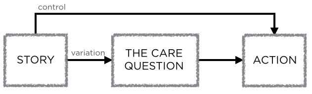
The test exposed two possible paths to users
When we ran the test, we showed half of users (who reached the final slide) the Care Question with two buttons, “Yes” and “No”. Clicking Yes brought them to one of the two actions listed above, clicking No revealed a prompt to email us feedback. The control group was shown the action we wanted them to take, without a preceeding question.
We were able to run these tests at about equal intervals with a small amount of code.
In this blog post, we will show the results, how we determined them and what we learned.
Process
When a user reached the conclusion slide, we sent an event to Google Analytics to log which set of tests ran.
We also tracked clicks on the “Yes” and “No” buttons of the Care Question, and clicks on the subsequent actions (support link, each of the follow links, and the feedback email link).
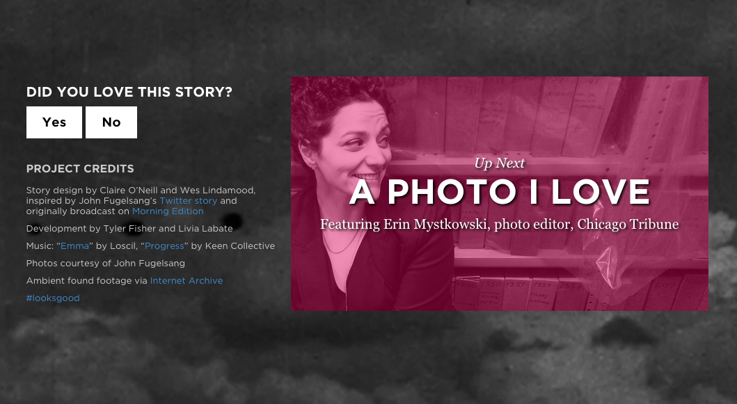
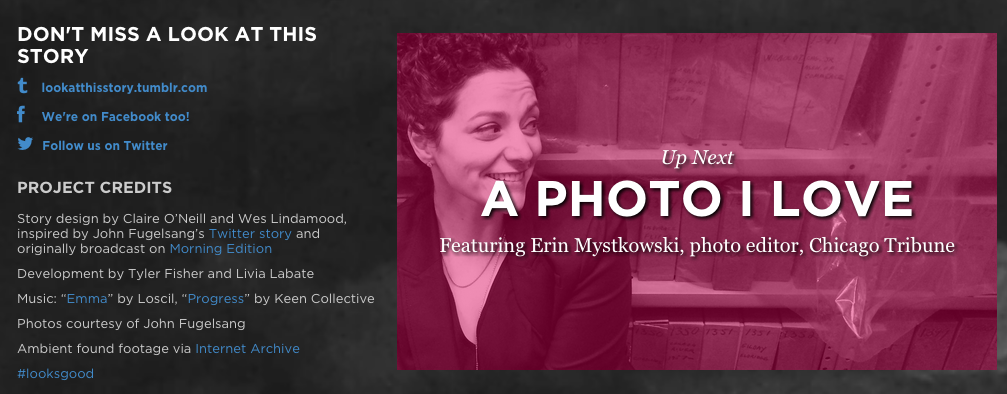
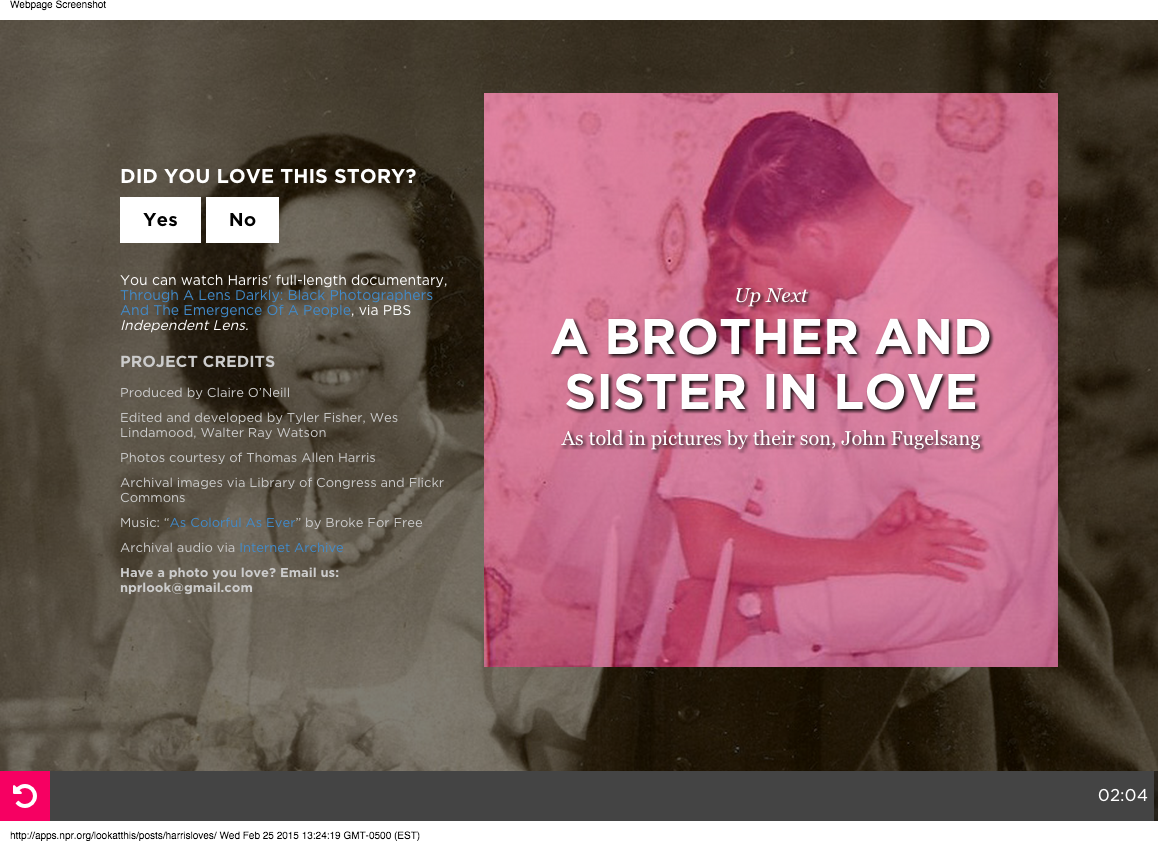
The Care Question used in A Brother And Sister In Love
Determining whether the results were statistically significant required some pretty complex calculations, which you can read about here. Luckily, Hubspot provides a simple-to-use calculator to determine the statistical significance of your results.
Significance is determined by the confidence interval, or how confident you can be that your numbers are not determined simply by randomness. Usually, a 95% confidence interval or greater is high enough to draw a conclusion. Using the calculator, we determined whether the difference in conversion rates (where conversion rate is defined as clicks over the number of times a particular test was run) was statistically significant.
“A Brother And Sister In Love”
The test for “A Brother And Sister In Love” was actually two separate A/B tests at the same time: whether a user was prompted to follow Look At This on social media or support NPR by donating. For each scenario, users were prompted with the Care Question or not. The Care Question was “Did you love this story?”
This breaks down into two tests, a “follow test” and a “support test”, with a control and variation scenario for each:
Follow test, control
Follow test, variation

Support test, control
Support test, variation
Finally, if a user clicked no, we provided a prompt to email us feedback.
If a user answered “No” to the Care Question, we asked them to email us feedback.
We were able to determine with 99.90% confidence that prompting a user with a question before asking them to “Support Public Radio” was more successful. We converted 0.184% of users who did not receive the Care Question and 1.913% of users who did, which makes a user who received the Care Question 10 times more likely to click the support link.
“Life After Death”
One week later, after we had seen the preliminary results of our test from “A Brother And Sister In Love”, we ran another test on “Life After Death”. This was not a story associated with Look At This, and there was not an equivalent NPR property to follow, so we decided to hone our test on converting users to the donate page.
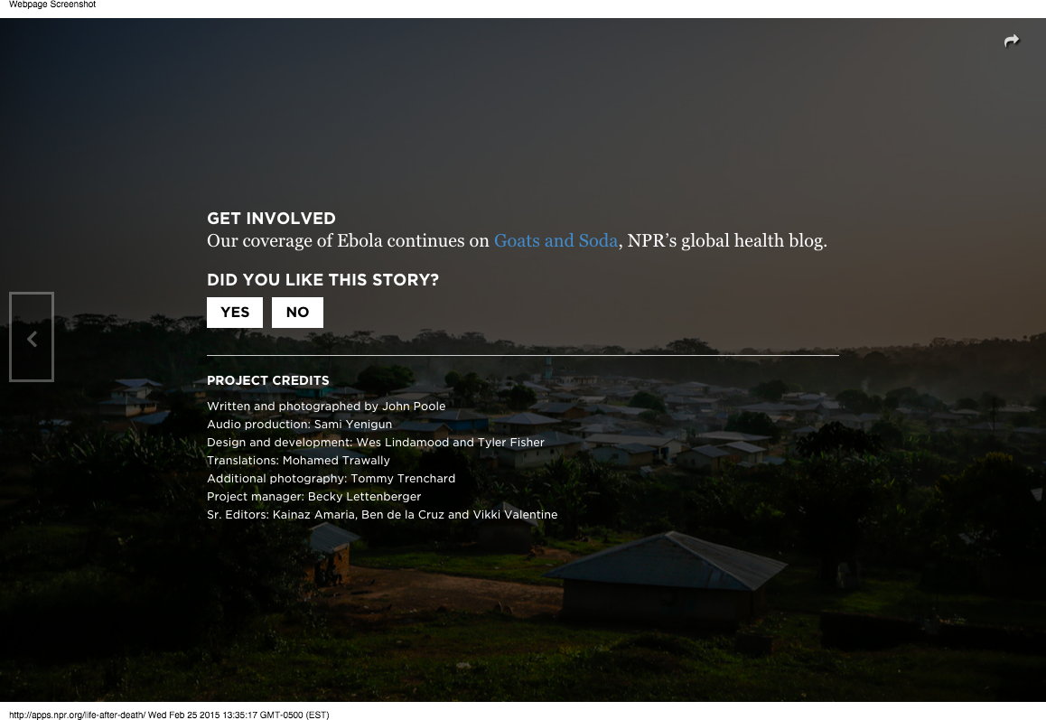
We wanted to confirm that users would convert at a higher percentage when presented with a Care Question first, so we kept the same control scenario. Instead of only using one question, we decided to run a multivariate test with four possible different phrasings. The control scenario and the four question variations each received ~20% of the test traffic. The four possible questions were:
- Did you like this story?
- Did you like this story? (It helps us to know)
- Does this kind of reporting matter to you?
- Does this kind of reporting matter to you? (It helps us to know)
For this test, we tested each question against the control scenario – presenting the user with a support button without showing them a question first.
Once again, we determined that presenting users with a Care Question before asking them to support public radio was a more successful path. Each of our four questions outperformed the control scenario at > 95% confidence intervals. Of the four questions, the two asking “Does this type of reporting matter to you?” were the best performers, which perhaps suggests that tailoring the Care Question to the content is the best course of action. Life After Death is a harrowing, intense story about a devastated village in Liberia, so perhaps asking a user if they “liked” a story was offputting in this case.
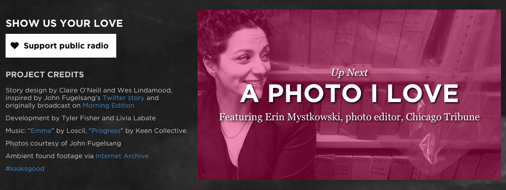
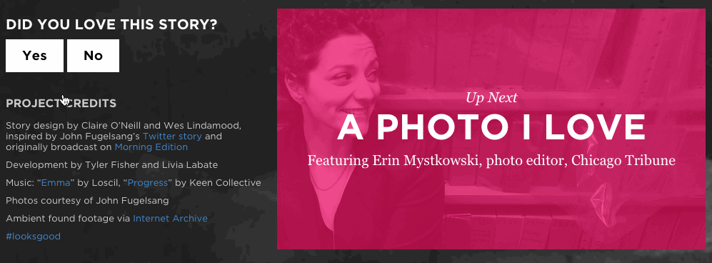
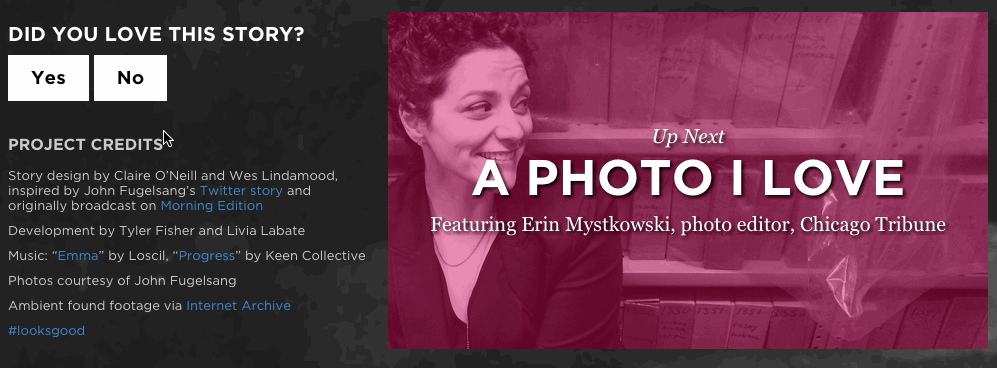
“A Photo I Love: Thomas Allen Harris”
A week later, we were able to run another test on a very similar story. It was a slide-based story that was also driven by the audio. We decided to rerun our original test, but fix our errors when logging to Google Analytics to create a better testing environment.
We left the same Care Question, “Did you love this story?”, and maintained our Look At This follow links.
Once again, we determined that giving users a question before a prompt to take action is a more successful path to conversion (1.7 times better for the Follow action and 13.5 times for the Support action).
Lessons Learned
We learned a lot in a short amount of time: some things about the stories themselves, a lot about the running of live tests and the math behind it. A few insights:
With our third test confirming that the Care Question has a positive impact on performance of actions presented at the end of stories, we feel confident implement this behavior by default going forward.
We also demonstrated that the language used to frame the Care Question matters. So far, aligning the tone of the question with the tone of the story has proven most successful.
Running the same test twice helped us simply validate that everything was working as planned. We are new to this, so it’s not a bad idea to double check!
Given the nature of the traffic for our stories (2-4 days of high volume followed by a long tail of decreased traffic), we need to make sure statistical significance is achieved within the first few days, as running a test for a longer period of time doesn’t add much at all.
Calculating the right sample size for a test is always a concern and particularly difficult when you don’t have a reliable cadance for what traffic to expect (since it varies from story to story), so we found we don’t need to do that at all. Instead, we can simply expose the entire audience for a story to the test we run and make the most of it as soon as possible.
We made several mistakes while analyzing the data simply because this is not something we do every day. Having multiple people look at the analysis as it was happening, helped us both correct errors and get a better understanding of how to make sense of the numbers.
Google Analytics automatically samples your default reports if your organization’s overall sessions exceed 500,000. To analyze tests like these you will want to make sure you have a full picture of your audience, so request an unsampled report (available from GA Premium only) so you can ensure your test is valid and reliable.
Also, with Google Analytics dropping support for custom variables, use distinct events to identify the variations of your test instead.