All posts by media-man
The Mailbag: A Downton Downer and Other Things
Over the Air or Off the Air?
Animation With Filmstrips
This post is cross-posted with our friends at Source.
Animated gifs have immediate visual impact — from space cats to artistic cinemagraphs. For NPR’s “Planet Money Makes A T-Shirt” project, we wanted to experiment with using looping images to convey a quick concept or establish a mood.
However, GIF as a format requires so many compromises in image quality and the resulting files can be enormous. A few months ago, Zeega’s Jesse Shapins wrote about a different technique that his company is using: filmstrips. The frames of the animation are stacked vertically and saved out as a JPG. The JPG is set as the background image of a div, and a CSS animation is used to shift the y-position of the image.
Benefits of this approach:
Potentially better image quality and lower filesize than an equivalent GIF
Since the animation is done in code, rather than baked into the image itself, you can do fun things like toy with the animation speed or trigger the animation to pause/play onclick or based on scroll position, as we did in this prototype.
Drawback:
- Implementation is very code-based, which makes it much more complicated to share the animation on Tumblr or embed it in a CMS. Depending on your project needs, this may not matter.
We decided to use this technique to show a snippet of a 1937 Department of Agriculture documentary in which teams of men roll large bales of cotton onto a steamboat. It’s a striking contrast to the highly efficient modern shipping methods that are the focus of this chapter, and having it play immediately, over and over, underscores the drudgery of it.
(This is just a screenshot. You can see the animated version in the “Boxes” chapter of the t-shirt site.)
Making A Filmstrip
The hardest part of the process is generating the filmstrip itself. What follows is how I did it, but I’d love to find a way to simplify the process.
First, I downloaded the highest-quality version of the video that I could find from archive.org. Then I opened it in Adobe Media Encoder (I’m using CS5, an older version).
I flipped to the “output” tab to double-check my source video’s aspect ratio. It wasn’t precisely 4:3, so the encoder had added black bars to the sides. I tweaked the output height (right side, “video” tab) until the black bars disappeared. I also checked “Export As Sequence” and set the frame rate to 10. Then, on the left side of the screen, I used the bar underneath the video preview to select the section of video I wanted to export.
The encoder saved several dozen stills, which I judged was probably too many. I went through the stills individually and eliminated unnecessary ones, starting with frames that were blurry or had cross-fades, then getting pickier. When I was done, I had 25 usable frames. (You may be able to get similar results in less time by experimenting with different export frame rates from Media Encoder.)
Then I used a Photoshop script called Strip Maker to make a filmstrip from my frames.
And here’s the result, zoomed way out and flipped sideways so it’ll fit onscreen here:
I exported two versions: one at 800px wide for desktop and another at 480px for mobile. (Since the filmstrip went into the page as a background image, I could use media queries to use one or the other depending on the width of the viewport.) Because the image quality in the source video was so poor, I could save the final JPG at a fairly low image quality setting without too much visible effect. The file sizes: 737KB for desktop, 393KB for mobile.
And Now The Code
Here’s how it appeared in the HTML markup:
And the LESS/CSS:
Key things to note:
.filmstrip
is set to stretch to the height/width of its containing div, .filmstrip-wrapper. The dimensions of.filmstrip-wrapper
are explicitly set to define how much of the filmstrip is exposed. I initially set its height/width to the original dimensions of the video (though I will soon override this via JS). The key thing here is having the right aspect ratio, so a single full frame is visible.The background-size of
.filmstrip
is 100% (width) and 100 times the number of frames (height) — in this case, that’s 25 frames, so 2500%. This ensures that the image stretches at the proper proportion.The background-image for
.filmstrip
is set via media query: the smaller mobile version by default, and then the larger version for wider screens.I’m using a separate class called
.animated
so I have the flexibility to trigger the animation on or off just by applying or removing that class..animated
is looking for a CSS animation calledfilmstrip
, which I will define next in my JavaScript file.
On page load, as part of the initial JavaScript setup, I call a series of functions. One of those sets up CSS animations. I’m doing this in JS partly out of laziness — I don’t want to write four different versions of each animation (one for each browser prefix). But I’m also doing it because there’s a separate keyframe for each filmstrip still, and it’s so much simpler to render that dynamically. Here’s the code (filmstrip-relevant lines included):
I set a variable at the very beginning of the function with the number of frames in my filmstrip. The code loops through to generate CSS for all the keyframes I need (with the relevant browser prefixes), then appends the styles just before the </head>
tag. The result looks like this (excerpted):
Key things to note:
The first percentage number is the keyframe’s place in the animation.
The timing difference between keyframes depends on the number of video stills in my filmstrip.
background-position
: The left value is always 0 (so the image is anchored to the left of the div). The second value is the y-position of the background image. It moves up in one-frame increments (100%) every keyframe.animation-timing-function
: Setting the animation to move in steps means that the image will jump straight to its destination, with no transition tweening in between. (If there was a transition animation between frames, the image would appear to be moving vertically, which is the completely wrong effect.)
Lastly, I have a function that resizes .filmstrip-wrapper
and makes the filmstrip animation work in a responsive layout. This function is called when the page first initializes, and again any time the screen resizes. Here it is below, along with some variables that are defined at the very top of the JS file:
This function:
Checks the width of the outer wrapper (
.filmstrip-outer-wrapper
), which is set to fill the width of whatever div it’s in;Sets the inner wrapper (
.filmstrip-wrapper
) to that width; andProportionally sets the height of that inner wrapper according to its original aspect ratio.
Footnote: For the chapter title cards, we used looping HTML5 videos instead of filmstrips. My colleague Wes Lindamood found, through some experimentation, that he could get smaller files and better image quality with video. Given iOS’s restrictions on auto-playing media — users have to tap to initiate any audio or video — we were okay with the title cards being a desktop-only feature.
We’re hiring a web developer
Love to code?
Want to use your skills to make the world a better place?
The visuals team (formerly known as news applications) is a crew of developers, designers, photojournalists and videographers in the newsroom at NPR headquarters in sunny Washington, DC — and we’re hiring.
We work closely with editors and reporters to create data-driven news applications (Playgrounds For Everyone), fun and informative websites (NPR’s Book Concierge), web-native documentaries (Planet Money Makes A T-shirt), and charts and maps and videos and pictures and lots of things in-between.
It’s great fun.
We believe strongly in…
- User-centered design
- Agile software development
- Open-source software, and being transparent in our methods
You must have…
- Experience making things for the web (We’ve got a way we like to do things, but we love to meet folks with new talents!)
- Attention to detail and love for making things
- A genuine and friendly disposition
Bonus points for…
- An uncontrollable urge to write code to test your code
- Love for making audio and video experiences that are of the web, not just on the web
- Deep knowledge of Javascript and functional programming for the web
Allow me to persuade you
The newsroom is a crucible. We work on tight schedules with hard deadlines. That may sound stressful, but check this out: With every project we learn from our mistakes and refine our methods. It’s a fast-moving, volatile environment that drives you to be better at what you do, every day. It’s awesome. Job perks include…
- Live music at the Tiny Desk
- All the tote bags you can eat
- A sense of purpose
Like what you’ve heard? Check out what we’ve built and our code on GitHub.
Interested? Email your info to bboyer@npr.org! Thanks!
This position has been filled. Thanks!
How And Why Cross-Disciplinary Collaboration Rocks (Published At Source (source.opennews.org))
Different Strokes From Different Folks
Does Public Radio Have a Leadership Inferiority Complex?
The Mailbag: The Holiday Spirit Is on Hold
The Book Concierge: Bringing Together Two Teams, Nine Reporters, And Over 200 Books
This post is cross-posted with our friends at Source.
We started the Book Concierge with the NPR Books team about four weeks back in early November. I worked alongside Danny Debelius, Jeremy Bowers and Chris Groskopf. The project centered on Books’ annual best books review, which is traditionally published in multiple lists in categories like “10 Books To Help You Recover From A Tense 2012.” But this presentation was limiting; Books wanted to take a break from lists.
The Collaborative Process
We needed a process for working with Books. Previously, we collaborated with an external team, St. Louis Public Radio, on our Lobbying Missouri project. That project required a solid communication process. It worked out well and gave us a solid foundation to collaborate internally.
We created a separate, isolated HipChat room for the project. Web producer Beth Novey volunteered to be the rep for the Books team, and so we invited her to this chat room, which made for easy, direct communication, and we added her as a user on GitHub. We could assign her work tickets when needed. We used GitHub, HipChat, email, and weekly iteration reviews to communicate as a team.
Once we determined who our users were and what they needed, we started sketching out how the page would visually be organized. At this point, we were thinking the interface would focus on the book covers. The images would be tiled, a simple filter system would be in place, and clicking on a book cover would bring up a pop-up modal with deeper coverage. And because sharing is caring, everything has permalinks.
Implementing The Grid Layout
Isotope (a jQuery plugin) animated all of our sorting and fit the variably sized covers into a tight masonry grid. But loading 200 book covers killed mobile. So we used jQuery Unveil to lazy load the covers as the user scrolled. A cover-sized loading gif was used to hold the space for each book on the page.
Unfortunately, there were some significant difficulties with combining Isotope and Unveil. Isotope kept trying to rearrange the covers into a grid before the images had actually loaded. It didn’t yet know the exact size of the images so we ended up with books covers that were cut off and stacked up in an extremely strange ways. We ended up writing code so that as Unveil revealed the images, we would manually invoke the “reLayout” function of Isotope. As you can see, we also had to throttle this event to prevent constantly relaying out the grid as images loaded in:
There was an even thornier problem in that whenever Isotope would rearrange the grid, all the images would briefly be visible in the viewport (not to the naked eye, but mathematically visible) and thus Unveil would try to load them all. This required hacking Unveil in order to delay those events. Finding the careful balance that allowed these two libraries to work together was a tricky endeavor. You can see our full implementation here.
How The Tags UI Evolved
The tags list initially lived above the book covers on both desktop and mobile versions. A very rough cut (along with placeholder header art) can be seen below:
Our initial UI was oriented around a single level of tagging–books themselves could have multiple tags, but users couldn’t select multiple tags at once. Our feeling was that the data set of books wasn’t large enough to warrant a UI with multiple tags; it would result in tiny lists of just one or two books. But Books felt that the app’s purpose was to help readers find their “sweet spots” or each person’s perfect book. They also tagged each book in great detail, which ensured that there were extremely few two-tag combinations with only a few books in them.
Our interface focused heavily on the book covers. But Books felt that the custom tags were more of a draw–you can browse book images anywhere, but you can only get these specific, curated lists from NPR. Brains over beauty, if you will.
In the end, we agreed that multiple levels of tagging and drawing more attention to the tags were necessary to the user experience. In our final design, the tags list lives to the left of the book covers. A “What would you like to read?” prompt points readers toward the tags.
On mobile, we thought we would just use drop-down menus to display the tags list. However, the iOS 7’s new picker is super difficult to navigate and results in a bit of helpless thumb mashing. The low contrast makes the text hard to read and notice; the hit areas are smaller and difficult to navigate; etc. So we eschewed drop-down menus in favor of a tags list that slides in when a button is hit.
All of these UI changes were made to better present the tags and to allow for the multiple-tag functionality. It took about three weeks to develop/finish the project, and everything launched by the fourth week. Two teams, nine reporters, over 200 books, and one Book Concierge.
Check us out
Wanna see our code? You can find it here on our GitHub page. Don’t hesitate to get in touch with any questions or feedback.
Collaborating On The T-Shirt Project (Published At Source (source.opennews.org))
The Mailbag: Bye-Bye Bobbleheads and Lots of Other Stuff
‘It’s (Not) Okay to be (Not) Smart’
How We Made Lobbying Missouri (Published At Source (source.opennews.org))
More Words About ‘War of the Worlds’
Network Diagrams Are Hard (Published At Source (source.opennews.org))
War of the Words
Muhammad on PBS: Was It Good for the Jews?
The Mailbag: Some Viewers Want to Give PBS a ‘Pop’
Transition for NPR Highlights Major Industry Issues – Part 2: The NPR-Member Station Relationship
Current reported on NPR's recent customer satisfaction survey among member stations. NPR scored well when it came to representing stations on regulatory, legislative and legal matters. NPR received very low satisfaction scores on engagement with member stations.
It's no secret that stations have felt for many years that NPR hasn't been looking out for their best interests. The surprise here is the depth of dissatisfaction. NPR was hoping to score 7.5 out of 10 on the engagement portion of the survey -- that is, NPR aspired to a "C+" average -- and it scored a 5.9. On attentiveness to small stations, NPR scored 5.1 out of 10.
The low customer satisfaction scores are an especially big deal because NPR's Board is controlled by member stations. Also worth noting is that the past three NPR Board Chairs have come from medium-sized stations, not large stations.
There's a long history of tension between NPR and stations over financial, audience service, and governance issues. That tension has grown in recent years as NPR's digital efforts allow more listeners to get content directly from NPR. This "bypass" is a scary proposition for NPR member stations and most stations view their control of NPR's board as the last line of protection against NPR grabbing their listeners and donors.
The thing is -- it's not working at that well. Stations can wield their governance power to prevent NPR from doing some things but they can't seem to use it to get NPR to act in their best interests. The recent satisfaction survey is evidence of that. Member stations control the Board. Through their votes they control which station managers sit on the Board,. Yet with all of this control at the top, NPR still gets an "F" on customer satisfaction among member stations. Station control of the Board isn't translating into a better NPR-Member Station relationship.
So where's the disconnect? It's easy to blame the executives in charge at NPR but perhaps the issue still rests at the Board level. Here are two factors to consider.
First, NPR's Mission and Vision statement doesn't embrace helping member stations succeed. Even though NPR is a membership organization, the Board has not charged the executive leadership with serving member stations. The mission statement says NPR partners with member stations. It says NPR represents the member stations in matters of mutual interest. But it is silent about NPR acting in ways to help stations succeed.
The second factor, and this is probably linked to the Mission/Vision statement, is the role of the CEO/President. Recently, the NPR Board has taken to hiring leaders of NPR but not leaders of the NPR membership, and certainly not leaders of the public radio system. That has to change if the NPR Board wants to repair relationships between NPR and its member stations.
More in our next posting.
Transition for NPR Highlights Major Industry Issues – Part 1: Financial
On the financial side, Current reports that NPR had its best fundraising year ever in 2013, yet ended the year with a $3 million budget deficit. It was a remarkable comeback given that the project budget deficit was $6.1 million.
The lesson here is that public radio doesn't have a fundraising problem, it has a spending problem. This is not only true for NPR, it is also true for many public radio stations. Many stations are raising more money than ever, but struggling to make ends meet. Additional investments in digital and local news aren't coming close to paying for themselves.
According to Mark Fuerst, who is leading the Public Media Futures Forums, this financial pressure is greatest on medium and smaller stations. Revenues are growing for the largest 50 stations, but the smaller stations are struggling. That has to change soon or these stations will find themselves facing the same situation as NPR -- having to shed staff to make ends meet.
How does it change? Here are two necessary steps.
1. Restructure how money changes hands in public radio. After salaries, national program acquisitions are typically the largest line item in a station's budget. The basis for those programming fees is an economic model rooted in 1990s media market dynamics not today's digital media marketplace. Restructuring the public radio's internal economic model could free up much needed resources for the smaller stations while ensuring that NPR and other national program producers have the resources needed to create high value programming, programming that generates loyal listeners and surplus revenues nationally and locally.
2. Start applying financial success metrics to digital and local content efforts. Station managers need to know how much public service these activities really provide. They need to know if there are real returns in terms of public service provided and net revenues against direct expenses. They need to know how close these activities come to breaking even. And if they aren't at least breaking even, they need to know how much subsidization each activity requires. Having a handle on those metrics will help managers make smarter financial decisions whether there is a financial crunch or not.
In the next posting, thoughts on the troubled NPR-Member Station relationship.
Keep Hitting Listeners Right Between the Ears
It’s an honor to receive an award in the name of Don Otto, whose all-too brief career helped launch PRPD and professionalize the job of public radio program director.
The first time I met Don was in 1987 at one the PD Bee workshops he helped to organize. Those workshops were a critical beginning to the success and relevance public radio has today.
One of the key themes of those workshops was helping PDs understand what business they were in. Many thought they were in the “be all things to all people” business. Others thought they were in the museum business, that their stations existed as a place to preserve the failed programming of commercial radio. Polka anyone?
What program directors learned during the PD Bees was that they were in the public service business… more specifically… public service delivered via the ears. They learned that public service was NOT what they created… but what was consumed… what was heard.
Here we are, a quarter century later, and as an industry public radio is again questioning what business it is in. And by “business”I mean the activities that generate the money that pays the bills. The value proposition.
Is it the radio business? The journalism business? The content business. The public media business? Honestly, do listeners even know that that even means?
How about none of the above?
The significant service public radio provides, the market niche public radio owns, the one that keeps public radio in business is not radio. Radio is a technology. And it’s not journalism. There are hundreds of places to find good journalism.
No, the service that you deliver, the service listeners voluntarily support with money is helping people find meaningfulness and joy in life while they are doing other, mundane things.
It's not just the content. It's how and where the content gets to them, how it fits into their lives. That's what listeners support with their money.
Again, the business you’re in today is helping people find meaningfulness and joy in life while they are doing other, mundane things. And you are the best in the world at doing that.
I just started a new reserch company that measures the emotional connection public radio listeners have with NPR, and with their stations. Let me tell you two things we’ve learned and reaffirmed.
First, your listeners believe that the act of listening to public radio is part of doing something good for society. Think about that. For your audience listening is doing good for society.
Second, your listeners believe that listening to public radio makes them better people. You make them feel smarter. You contribute to their sense of happiness. You help them connect to people and ideas that enrich their lives.
You help people lead more meaningful personal and civic lives while they are doing the mundane -- shaving, dressing, making coffee, sitting in traffic.
You don’t occupy their time. You make the time they spend doing other things more valuable.
Sometimes you do that with journalism. Sometimes you do it with music. Sometimes you do it with entertainment.
That was the essential lesson Don Otto, and many others, were trying to help program directors learn in the 1980s. That lesson still applies today.
You’re not a hospice for dying radio formats or, for that matter, local journalism. And digital technology? It’s just that –technology -- another means to the end.
The end game is the same today as it was in the 1980s.
Keep hitting listeners right between the ears.
Keep getting better at turning the most mundane, routine activities into meaningful moments. And when you think you are good as you can be, find ways to be even better.
That was what Don Otto brought to public radio. It is an honor to receive this award in his name. Thank you.
Complex But Not Dynamic: Using A Static Site To Crowdsource Playgrounds
This post is cross-posted with our friends at Source.
We usually build relatively simple sites with our app template. Our accessible playgrounds project needed to be more complex. We needed to deal with moderated, user-generated data. But we didn’t have to run a server in order to make this site work; we just modified our app template.
Asynchronous Updates
App template-based sites are HTML files rendered from templates and deployed to Amazon’s Simple Storage Service (S3). This technique works tremendously for sites that never change, but our playgrounds site needs to be dynamic.
When someone adds, edits or deletes a playground, we POST to a tiny server running a Flask application. This application appends the update to a file on our server, one line for each change. These updates accumulate throughout the day.
At 5 a.m., a cron job runs that copies and then deletes this file, and then processes updates from the copied file. (This copy-delete-read the copy flow helps us solve race conditions where new updates from the web might attempt to write to a locked-for-reading file. After the initial copy-and-delete step, any new writes will be written to a new updates file that will get processed the next day.)
Each update is processed twice. First, we write the old and new states of the playground to a revision log with a timestamp, like so:
{
'slug': 'ambucs-hub-city-playground-at-maxey-park-lubbock-tx',
'revisions':[
{
'field': 'address',
'from': '26th Street and Nashville Avenue'
'to': '4007 26th Street'
},
],
'type': 'update'
}
Second, we update the playground in a SQLite database. When this is complete, a script on the server regenerates the site from the data in the database. Since each page includes a list of other nearby playgrounds, we need to regenerate every playground page. This process takes 10 or 15 minutes, but it’s asynchronous from the rest of the application, so we don’t mind. We’re guaranteed to have the correct version of each playground page generated every 24 hours.
At each step of the process, we take snapshots of the state of our data. Before running our update process, we time-stamp and copy the JSON file of updates from the previous day. We also time-stamp and copy the SQLite database file and push it up to S3 for safekeeping.
Email As Admin
Maintaining a crowdsourced web site requires a little work. We fix spelling and location errors, remove duplicates, and delete playgrounds that were added but aren’t accessible.
Typically, you’d run an admin site for your maintenance tasks, but we decided that our editors use the public-facing site just like our readers. That said, our editors still need a way to check the updates our users are making.
Since we only process updates once every 24 hours, we decided to just send an email. For additions, we link the playground URL in the email so that editors could click through. For updates, we list the changes. And for delete requests, we include a link that, when clicked, confirms a deletion and instructs the site to process the delete during the next day’s cron.
Search
Flat files are awesome, but without a web server, how do you search?
To solve this, we use Amazon’s CloudSearch. Eventually, we’ll probably implement a way to find playgrounds with certain features or to search by name. But right now, we’re using it just for geographic search, e.g., finding playgrounds near a point.
To implement geographic search in CloudSearch you need to use rank expressions, bits of JavaScript that apply an order to the results. CloudSearch allows you to specify a rank expression as a parameter to the search URL. That’s right: Our search URLs include a string that contains instructions for CloudSearch to order the results. Amazon has documentation on how to use this to implement simple “great circle” math. We took it a step further and implemented spherical law of cosines because it is a more accurate algorithm for determining distance between points on a sphere.
You can see the source code where we build our search querystrings in the playgrounds repository, but you should take note of a few further caveats.
CloudSearch only supports unsigned integers, so we have to add the 180 degrees (because latitudes and longitudes can be negative numbers) and also multiply the coordinates by 10,000 (because an unsigned integer can’t have a decimal point) to get five decimal points of precision. Finally, we have to reverse this process within our rank expression before converting the coordinates to radians to calculate distance.
Also, a single CloudSearch instance is not very stable when running high-CPU queries like geographic searches. During load testing we saw a large number of HTTP 507 errors, indicating that the search service was overloaded. Unfortunately, 5xx errors and JSONP don’t mix. To solve this, we catch 507 errors in Nginx and instead return a HTTP 202 with a custom JSON error document. The 202 response allowed us to read the JSON in the response and then retry the search if it failed. We retry up to three times, though in practice we observed that almost every failed request would return a proper result after only a single fail/retry.
Finally, while Amazon would auto-scale our CloudSearch instances to match demand, we couldn’t find any published material explaining how often Amazon would spin up new servers or how many would initialize at once. So, we reached out to Amazon. They were able to set our CloudSearch domain to always have at least two servers at all times. With the extra firepower and our retry solution, on launch day we had no problems at all.
Retrofitting CloudSearch For JSONP
You might notice we’re doing all of our CloudSearch interaction on the client. But the CloudSearch API doesn’t support JSONP natively. So we need to proxy the responses with Nginx.
Option 1: CORS
We could have modified the headers coming back from our CloudSearch to support Cross-Origin Resource Sharing, aka CORS. CORS works when your response contains a header like Access-Control-Allow-Origin: *
, which would instruct a Web browser to trust responses from any origin.
However, while CORS has support in many modern browsers, it fails in older versions of Android and iOS Safari, as well as having inconsistent support in IE8 and IE9. JSONP just matched our needs more closely than CORS did.
Option 2: Rewrite the response.
Once we settled on JSONP, we knew we would need to rewrite the response to wrap it in a function. Initially, we specified a static callback name in jQuery and hard-coded it into our Nginx configuration.
This pattern worked great until we needed to get search results twice on the same page load. In that case, we returned a function with new data but with the same function name as the previous AJAX call. The result? We didn’t see any updated data. We needed a dynamic callback where the function that wraps your JSON was unique for each request. jQuery will do this automatically.
Now we needed our Nginx configuration to sniff the callback out of the URL and then wrap it around the response. And while this might be easy using some nonstandard Nginx libraries like OpenResty, we didn’t have the option to recompile our Nginx on the fly without possibly disturbing existing running projects.
One other hassle: Amazon’s CloudSearch would return a 403 if we included a callback
param in the URL. Adding insult to injury, we’d need to strip this parameter from the URL before proxying it to Amazon’s servers.
Thankfully, Nginx’s location pattern-matcher allowed us to use regular expressions with multiple capture groups. Here’s the final Nginx configuration we used to both capture and strip the callback from the proxy URL.
Nginx Proxy And DNS
Another thing you might notice: We had to specify a DNS server in the Nginx configuration so that we could resolve the domain name for the Amazon CloudSearch servers. Nginx’s proxy_pass
is meant to work with routable IP addresses, not fully-qualified domain names. Adding a resolver
directive meant that Nginx could look up the DNS name for our CloudSearch server instead of forcing us to hard-code an IP address that might change in the future.
Embrace Constraints
Static sites with asynchronous architectures stay up under great load, cost very little to deploy, and have low maintenance burden.
We really like doing things this way. If you’re feeling inspired, complete instructions for getting this code up and running on your machine are available on our GitHub page. Don’t hesitate to send us a note with any questions.
Happy hacking!
Introducing Emodus Research and Sutton & Lee
1. Introducing Emodus Research, a new company created by John Sutton to help public radio professionals identify and leverage the emotional connections that drive listening, brand loyalty, brand advocacy, and giving. The initial service offerings from Emodus Research will be for public radio stations and program producers. Subsequent services will be available to public television.
2. John Sutton & Associates is now Sutton & Lee. Sonja Lee is now running the on-air fundraising side of things. John is still heavily involved in pledge drive planning and preparation. He also continues to help stations with strategic planning and Arbitron analysis.
Emodus Research
Question: In a world with smart phone apps and digitally-equipped cars, why would someone choose to listen to an NPR report from a public radio station when they could hear the exact same report at the exact same time directly from NPR?
Answer: Because he or she has a strong emotional connection to the station.
Question: What does a strong emotional connection look like?
Answer: We're finding that out now.
Emodus Research has already conducted several thousand on-line surveys with public radio, public television, online, and print news consumers across the country, with an emphasis on the public radio news listeners. We've researched the emotional connection NPR News listeners have with NPR and we're researching the emotional connection NPR News listeners have with their stations.
The results will identify the key emotional drivers that lead to increased listening, brand loyalty, brand advocacy, and giving.
Public radio stations will be able to identify specific actions they can take in programming, branding, marketing, social media, and fundraising to build emotional connections strong enough to keep listeners, advocates, and donors from leaving when NPR and other public radio alternatives are just as easy to hear.
You can learn more by visiting the Emodus Research website.
There's also an Emodus Research blog where you can follow our progress as we gain new insights about the relationship public radio has with its listeners and donors.
How to Setup Your Mac to Develop News Applications Like We Do
Updated February 9, 2015
Hi, Livia Labate here, Knight-Mozilla Fellow working with the Visuals team. These great instructions have been verified for OS X Yosemite and a few tips and clarifications added throughout.
Updated June 12, 2014.
Hey everyone, I’m Tyler Fisher, the Winter/Spring 2014 news apps intern. Today, I setup my work machine with OS X Mavericks and found some new wrinkles in the process, so I thought I would update this blog post to reflect the latest changes. Shelly Tan and Helga Salinas also contributed to this post.
I joined the News Apps team a week ago in their shiny new DC offices, and in-between eating awesome food and Tiny Desk concerts, we’ve been documenting the best way to get other journalists setup to build news apps like the pros.
The following steps will help you convert your laptop to hacktop, assuming you’re working on a new Mac with OS X 10.9, or Mavericks, installed. Each Mac operating system is a little different, so we’re starting from scratch with the latest OS.
Chapter 0: Prerequisites
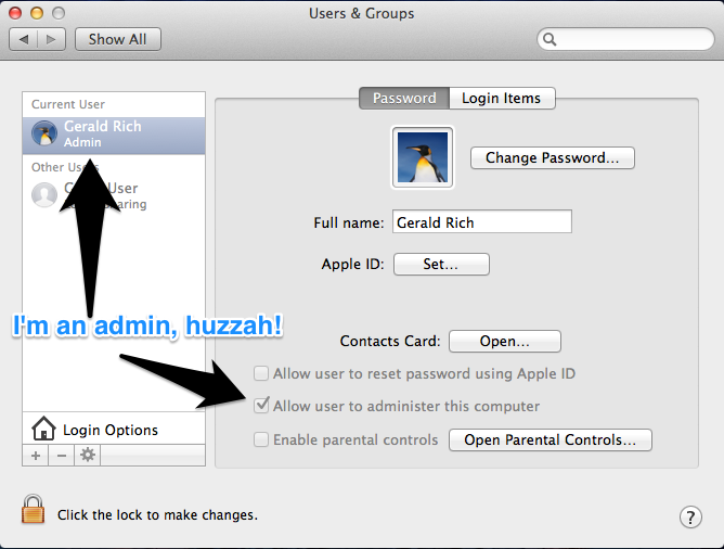
Are you an administrator?
We’ll be installing a number of programs from the command line in this tutorial, so that means you must have administrative privileges. If you’re not an admin, talk with your friendly IT Department.
Click on the Apple menu > System Preferences > Users & Groups and check your status against this handy screenshot.
Update your software
Go to the App Store and go to the updates tab. If there are system updates, install and reboot until there is nothing left to update.
Install command line tools
With the release of OS X 10.9, Apple decoupled its command line tools necessary for compiling some of the tools we use from Xcode, Apple’s proprietary development suite.
All Macs come with an app called “Terminal.” You can find it under Applications > Utilities. Double click to open that bad boy up, and run this command:
xcode-select --install
Your laptop should prompt you to install the command line tools. Install the tools and move on once that process has completed (about 5 minutes).
If it doesn’t install, or there isn’t an update for Xcode to install the tools, you’ll have to download the command line tools from developer.apple.com/downloads/index.action. You have to register, or you can log in with your Apple ID.
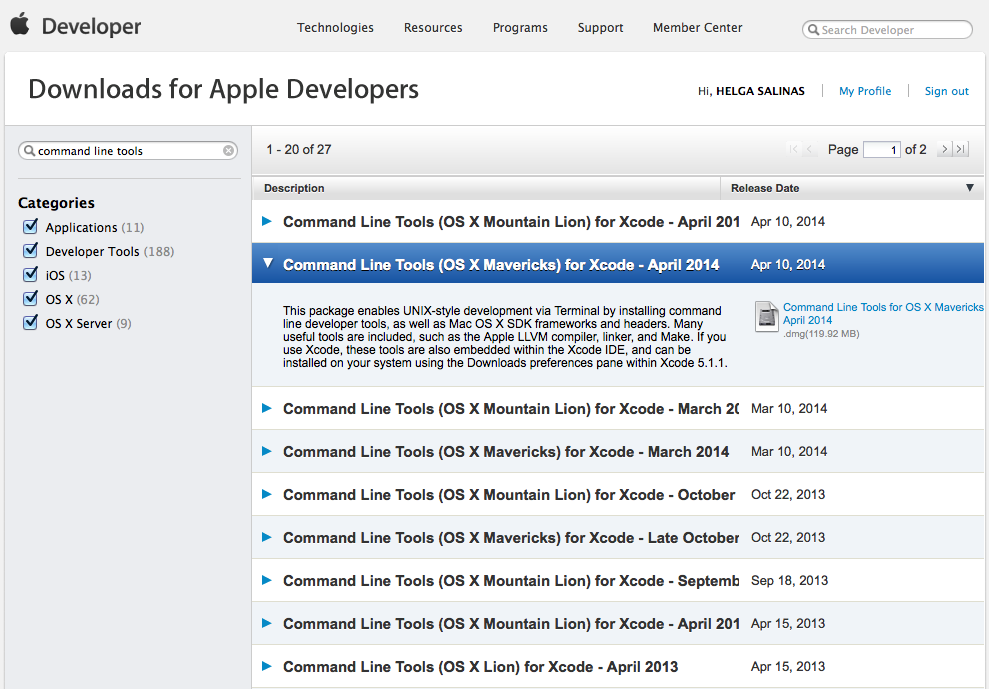
Search for “command line tools,” and download the package appropriate to your version of OS X. Double click on the .dmg file in your downloads file, and proceed to install. In my case, I downloaded Command Line Tools (OS X Mavericks), which is highlighted in the screenshot above.
Chapter 1: Install Homebrew
Homebrew is like the Mac app store for programming tools. You can access Homebrew via the terminal, (like all good things). Inspiration for this section comes from Kenneth Reitz’s excellent Python guide.
Install Homebrew by pasting this command into your terminal and then hitting “enter.”
ruby -e "$(curl -fsSL https://raw.githubusercontent.com/Homebrew/install/master/install)"
It will ask for your password, so type that in and hit “enter” again. Now, paste this line to test Homebrew.
brew doctor
This will test your Homebrew setup, and any tools you’ve installed to make sure they’re working properly. If they are, Homebrew tell you
Your system is ready to brew.
If anything isn’t working properly, follow their instructions to get things working correctly.
Note: If there are two lines inside any of the code blocks in this article, paste them separately and hit enter after each of them.
Next you’ll need to go in and edit ~/.bash_profile
to ensures you can use what you’ve just downloaded. bash_profile
acts like a configuration file for your terminal.
Note: There are many editors available on your computer. You can use a pretty graphical editor like SublimeText2 or you can use one built-in to your terminal, like vim
or nano
. We’ll be using nano
for this tutorial just to keep things simple.
Open your bash_profile
with the following command.
nano ~/.bash_profile
Then copy and paste this line of code at the very top. This lets Homebrew handle updating and maintaining the code we’ll be installing.
export PATH=/usr/local/bin:$PATH
Once you’ve added the line of code, you can save the file by typing control + O. Doing so lets you adjust the file name. Just leave it as is, then hit enter to save. Hit control + X to exit. You’ll find yourself back at the command line and needing to update your terminal session like so. Copy and paste the next line of code into your terminal and hit enter.
source ~/.bash_profile
You’ll only need to source the bash_profile
since we’re editing the file right now. It’s the equivalent of quitting your terminal application and opening it up again, but source
lets you soldier forward and setup Python.
Chapter 2: Install Virtualenv
Virtualenv isolates each of your Python projects in their own little sandboxes, keeping your installed software neat and tidy. Your Mac comes pre-packaged with the most stable version of Python, but you’ll need to tell your bash_profile
to use it first. Edit the file again with nano
and add this line:
export PATH=/usr/local/lib/python2.7/site-packages:$PATH
Update your session again
source ~/.bash_profile
Next, you’ll need to install pip
. Like Homebrew, it’s sort of an app store but for Python code.
sudo easy_install pip
We use sudo
to install this software for everyone who might use your computer. sudo
lets you install things as the admin. You will be prompted for your password.
Next, we’ll actually install virtualenv
.
sudo pip install virtualenv virtualenvwrapper
Note: virtualenv
is the actual environment that you’ll be using, while virtualwrapper
helps you access the environment and its variables from your PATH
.
Edit your ~/.bash_profile
file again,
nano ~/.bash_profile
and add this line below the line you just added:
source /usr/local/bin/virtualenvwrapper_lazy.sh
Save and exit out of nano
using control + O, enter, and then control + X.
Sanity Check: Double check your ~/.bash_profile
file, and make sure you’ve properly saved your PATH
variables.
less ~/.bash_profile
It should look like this:
export PATH=/usr/local/bin:$PATH
export PATH=/usr/local/lib/python2.7/site-packages:$PATH
source /usr/local/bin/virtualenvwrapper_lazy.sh
To exit less
, press “Q”.
Chapter 3: Set up Node
Finally, we’ll install a tool called LESS that we use to write CSS, the language that styles websites. LESS is a built with Node, so we’ll need to install that and NPM, Node’s version of pip
or Homebrew.
Install Node using Homebrew.
brew install node
Then, add Node to your ~/.bash_profile
like you did for Homebrew and virtualwrapper. Copy and paste the following line below the previous two.
export NODE_PATH=/usr/local/lib/node_modules
Save and exit out of nano
using control + O, enter, and then control + X. Then type source ~/.bash_profile
one more time to update your session. After that, you can treat yourself to a cup of coffee because you now have the basic tools for working like the NPR news apps team. Next up we’ll be getting into the nitty gritty of working with the template, including things like GitHub and Amazon Web Services.
Chapter 4: Set up SSH for Github
Github has written a great guide for setting up SSH authentication for Github. You will want to do this so Github knows about your computer and will allow you to push to repositories you have access to.
Read that tutorial here. Do not download the native app. Start at “Step 1: Check for SSH keys”.
Appendix 1: Postgres and PostGIS
We occasionally make maps and analyze geographic information, so that requires some specialized tools. This appendix will show you how to install the Postgres database server and the PostGIS geography stack — which includes several pieces of software for reading and manipulating geographic data. We’ll explain these tools a bit more as we install them.
NumPy
First, we need to install a Python library called NumPy. We don’t use NumPy directly, but PostGIS uses it for making geographic calculations. This may already be installed, but run this command just to double-check. You will be prompted for your password.
sudo pip install numpy
Postgres
Next up: the Postgres database server. Postgres is a useful tool for dealing with all kinds of data, not just geography, so we’ll get it setup first then tweak it to be able to interpret geographic data. Postgres will take about 10 minutes to install.
brew install postgresql
Edit your ~/.bash_profile
to add a pair of commands for starting and stopping your Postgres database server. pgup
will start the server; pgdown
will stop it. FYI You’ll rarely ever need to pgdown
, but we’ve include the command just in case.
nano -w ~/.bash_profile
Add these two lines:
alias pgdown='pg_ctl -D /usr/local/var/postgres stop -s -m fast'
alias pgup='pg_ctl -D /usr/local/var/postgres -l /usr/local/var/postgres/server.log start'
Save and exit out of nano
using control + O, enter, and then control + X, and update your session one more time,
source ~/.bash_profile
and let’s initialize your Postgres server. We only need to do this once after installing it.
initdb /usr/local/var/postgres/ -E utf-8
Finally, let’s start up the Postgres server.
pgup
PostGIS
These deceptively simple commands will install an awful lot of software. It’s going to take some time, and your laptop fans will probably sound like a fighter jet taking off. Don’t worry; it can take the heat.
brew install gdal --with-postgresql
Still hanging in there?
brew install postgis
Now you can create your first geographically-enabled database. For more information on how to do that postgis tells you how to do this.
Appendix 2: The Terminal
Since you’re going to be working from the command line a lot, it’s worth investing time to make your terminal something that’s a little more easy on the eyes.
iTerm2
Download iTerm2. The built-in terminal application which comes with your Mac is fine, but iTerm2 is slicker and more configurable. One of the better features is splitting your terminal into different horizontal and vertical panes: one for an active pane, another for any files you might want to have open, and a third for a local server.
Solarized
Solarized is a set of nice, readable colors. Unzip the solarized.zip
file.
Now, inside iTerm2 go to iTerm > Preferences > Profiles and select “Default.” Choose “Colors” and find the “Load Presets…” button at the bottom of the window. Select “Import” and navigate to solarized/iterm2-colors-solarized/
and double-click on Solarized Dark.itermcolors
. After it’s been imported, you can find “Solarized Dark” on the “Load Presets” list. Click and select “Solarized Dark” to change the colors appropriately.
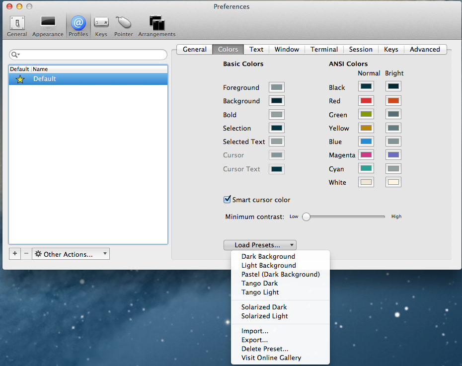
See? Much nicer.
Appendix 3: The Text Editor
Since your code is stored entirely as text files on your computer, you’ll want a nice text editor. Our instructions showed you how to use nano
, a text editor that you’ll find on almost every computer. However, there are at least two others that the team uses. Text editors are like the Microsoft Word of the programming world, except they come packed with all kinds of handy dandy features to make writing code a cinch.
Sublime Text 2
If you’re more comfortable with an editor that you can open up like Word, Sublime Text 2 has a sweet graphical user interface and some nice customizations available. You’ll likely want to learn some keyboard shortcuts to make yourself more efficient. You can also prettify it with the Flatland theme.
Note: In recent versions, installing Package Control (necessary for many customizations) assumes you have purchased Sublime Text, so consider getting a license first. Additionally, speed up your use by making Sublime Text your default editor from the command line. Here’s how. And another way.
Vim
Personally, I prefer vim — a terminal based editor that requires you to type rather than point-and-click to work on files. It comes pre-installed on your computer, but there’s a lot of little keyboard shortcuts you’ll need to get comfy with before you can just dive-in. You can add all kinds of features, but our teammate Chris recommends nerdtree and surround. Here are some videos to help make vim and those particular add-ons.
Note: In your terminal, type in vim
to begin using the editor. Here’s a resource to become more acquainted with vim: Vim Tips Wiki.
Conclusion
And with that you now have a sweet hackintosh. Happy hacking, and if you haven’t setup a Github account, you can try out your new tools and play with some of our code. Github provides a thorough walkthrough to get you setup and working on some open sourced projects.
User-generated graphics in the browser with SVG
The challenge
For NPR’s ongoing series “The Changing Lives of Women”, we wanted to ask women to share advice gleaned from their experience in the workforce. We’ve done a few user-generated content projects using Tumblr as a backend, most notably Cook Your Cupboard, so we knew we wanted to reuse that infrastructure. Tumblr provides a very natural format for displaying images as well as baked in tools for sharing and content management. For Cook your Cupboard we had users submit photos, but for this project we couldn’t think of a photo to ask our users to take that would say something meaningful about their workplace experience. So, with the help of our friends at Morning Edition, we arrived at the idea of a sign generator and our question:
“What’s your note to self – a piece of advice that’s helped you at work?”
With that in mind we sketched up a user interface that gave users some ability to customize their submission—font, color, etc—but also guaranteed us a certain amount of visual and thematic consistency.
Making images online
The traditional way of generating images in the browser is to use Flash, which is what sites like quickmeme do. We certainly weren’t going to do that. All of our apps must work across all major browsers and on mobile devices. My initial instinct said we could solve this problem with the HTML5 Canvas element. Some folks already use Canvas for resizing images on mobile devices before uploading them, so it seemed like a natural fit. However, in addition to saving the images to Tumblr, we also wanted to generate a very high-resolution version for printing. Generating this on the client would have made for large file sizes at upload time—a deal-breaker for mobile devices. Scaling it up on the server would have lead to poor quality for printing.
After some deliberation I fell upon the idea of using Raphaël.js to generate SVG in the browser. SVG stands for Scalable Vector Graphics, an image format typically used for icons, logos and other graphics that need to be rendered at a variety of sizes. SVG, like HTML, is based on XML and in modern browsers you can embed SVG content directly into your HTML. This also means that you can use standard DOM manipulation tools to modify SVG elements directly in the browser. (And also style them dynamically, as you can see in our recent Arrested Development visualization.)
The first prototype of this strategy came together remarkably quickly. The user selects text, colors and ornamentation. These are rendered as SVG elements directly into the page DOM. Upon hitting submit, we grab the text of the SVG using jQuery’s html
method and then assign to a hidden input in the form:
The SVG graphic is sent to the server as text via the hidden form field. We’ve already been running servers for our Tumblr projects to construct the post content and add tags before submitting to Tumblr, so we didn’t have to create any new infrastructure for this. (Tumblr also provides a form for having users submit directly, which we are not using for a variety of reasons.) You can see our boilerplate for building projects with Tumblr on the init-tumblr branch of our app-template.
Once the SVG text is on the server we save it to a file and use cairosvg to cut a PNG, which we then POST to Tumblr. Tumblr returns a URL to the new “blog post”, which we then send to the user as a 301 redirect. To the user it appears as though they posted their image directly to Tumblr.
Problems
Text
Text was probably the hardest thing to get right. Because each browser renders text in a different way we found that our resulting images were inconsistent and often ugly. Worse yet, because our server-side, Cairo-based renderer was also different, we couldn’t guarantee the text layout a user saw on their screen would match that of the final image once we’d converted it to a PNG.
Here is the same text (Quicksand 400), rendered in Chrome on the left and IE9 on the right:
Researching a solution for this led me to discover Cufon fonts, a JSON format for representing fonts as SVG paths (technically VML paths, but that doesn’t matter). There is a Cufon Javascript library for using these fonts directly, however, there are also built-in hooks for using them Raphaël. (For those who care: they get loaded up via a “magic” callback name.) These resulting fonts are ideal for us, because the paths are already set and thus look the same in every browser and when rendered on the server. It’s a beautiful thing:
Scaling
We found that the various SVG implementations we had to work with (Webkit, IE, Cairo) had different interpretations of width
, height
and viewBox
parameters of the SVG. We ended up using a fixed size for viewBox
(2048x2048) and rendering everything in that coordinate reference system. The width
and height
we scaled with our responsive viewport. On the server width
and height
were stripped before the SVG was sent to cairosvg, causing it to render the resulting PNGs at viewBox
size. See the next section for the code that cleans up the SVG on the server.
Browser support
A similar issue happened with IE9, which for no apparent reason was duplicating the XML namespace attribute of the SVG, xmlns
. This caused cairosvg to bomb, so we had to strip it.
Unfortunately, no amount of clever rewriting was ever going to make this work in IE8, which does not support SVG. Note that Raphaël does support IE8, by rendering VML instead of SVG, however, we have no way to get the XML text of the VML from the browser. (And even if we could we would then have to figure out how to convert the VML to a PNG in a way that precisely matched the output from our SVG process.)
Here is the code we use to normalize the SVGs before passing them to cairosvg:
Glyphs
One final thing we did for this project that is worth mentioning is building out a lightweight system for defining the ornaments you that can be selected as decoration for your quote. Although there is nothing technically challenging about this (it’s a grid of squares), it was awfully fun code to write:
And it gave us a chance to use good-old-fashioned bitmaps for the configuration:
You can see the full ornament definitions in this gist.
Conclusion
By using SVG to generate images we were able to produce user-generated images suitable for printing at large size in a cross-platform and mobile-friendly way. It also provided us an opportunity to be playful and explore some interesting new image composition techniques. This “sign generator” approach seems to have resonated with users and resulted in over 1,100 submissions!
NPR, Its Member Stations, and Trust
This level of distrust isn’t new. It existed in the early days of NPR, through decades of impressive audience and revenue growth, and into this age of digital disruption. That distrust existed, to different degrees, no matter who was sitting in the President’s office or who was second-in-command at NPR. That distrust has spanned a couple of generations of station managers.
Multiple trust-building efforts and exercises haven’t been able to exorcise the distrust. It is institutionalized.
Institutionalized distrust goes all the way back to the early 1980s and NPR’s financial crisis. It’s worth reading up on that crisis if you don’t know the story.* In short, the entire public radio business model was overhauled to save NPR from going under due to financial mismanagement and many stations backed a loan to as part of the NPR bailout.
Back then member stations had to vote on NPR’s budget every year, with board members and some station managers questioning line item expenses of just a few hundred dollars. NPR’s annual membership meetings were rancorous affairs that always ended with NPR getting budget increases and all parties leaving with bitter feelings.
There were also difficult battles over macro and micro programming issues, from a 4pm Eastern Time start for All Things Considered to giving stations more local cutaway opportunities in the newsmagazine program clocks. Every year stations were paying NPR more money but not getting the attention, respect, or services they felt were needed to grow. Seeds of distrust were sown.
Fast forward to today.
- Most stations are paying NPR somewhere around 15% of their gross revenues for the rights to broadcast NPR programs. That’s the highest percentage in the history of the industry.
- NPR now requires stations to pay for digital services whether they want those services or not.
- NPR is now competing directly with its member stations for listeners.
- NPR is now competing with stations for major donors.
- NPR is experimenting with raising money directly from listeners for the first time.
There have been times when the bonds of trust have been stronger than others. Sometimes those bonds were strengthened by people at NPR and at stations. Those bonds lasted only as long as the people lasted in their jobs, sometimes less than that. On a few occasions, those bonds were strengthened by new policies at NPR. Those bonds had more staying power.
One policy in particular was NPR’s decision to “lockdown” pricing for its news programs at a fixed percentage of total station revenues. That change in policy -- how money changed hands in public radio – went a long way towards improving the NPR/station relationship. It put an end to the battles over NPR’s budget and created a stable and predictable economic model that allowed NPR and stations to invest their money and energy into program and revenue growth.
The lesson – the bonds of trust between NPR and its member stations are just as much about policy as people, maybe even more so. A certain measure of trust can be institutionalized. Or perhaps more accurately, a certain measure of distrust can be prevented through good policy.
That’s going to be important in the next few years. Public radio continues to get severe warnings from experts inside and outside of public radio about the dangers of digital disruption. That disruption is already a source of increased distrust between NPR and stations. The disruption will only become more severe with time. Greater distrust will follow unless NPR and its board choose policies to minimize it.
One way to build trust is flip the public radio economic model on its head. NPR will never build sufficient trust with stations as long as it is charging stations more money than ever while actively taking listeners and donations away from those stations. Conversely, NPR could lay a strong foundation for trust by putting in place policies that put money in stations’ pockets and helps them grow audience.
* Amazon link to "Listener Supported" by Jack Mitchell
Early Lessons from Planet Money’s Kickstarter Campaign
A Not-So-Modest NPR Fundraising Proposal
NPR's Planet Money launched a Kickstarter campaign last night, a clear experiment on NPR's part to get direct access to listeners' wallets. The goal is a very modest $50,000 in 14 days. That goal should be exceeded in less than 24 hours.
NPR's not the only public radio network going after listener money now. American Public Media programs have been raising money directly from listeners for several years. Last month, PRI's The World launched a campaign on Indiegogo. This American Life has run several direct-to-listener campaigns as well.
NPR raising money directly from listeners could be very good for public radio. That's the essence of a commentary I wrote for this week's Current, public media's industry newspaper.
NPR could raise money in a way that everyone wins big. NPR wouldn't have to charge stations for its programming, would have tens of millions dollars more to spend on news coverage, and NPR would be able to award significant grants to stations for local news and digital initiatives.
That's right, instead of taking money from stations NPR would be giving stations its programs and money.
That would revolutionize the public radio economy at a time when that economy is threatened by digital disruption. All it takes is a commitment for all boats to rise together.
Click here to read the Current article - A Digital Revolution for Public Radio Fundraising.
See the links below for additional RadioSutton postings on NPR raising money directly from listeners.
Everybody But NPR
The NPR Pledge Drive Fuss
Public Radio 2018: The Inevitability of NPR Raising Money Directly from Listeners
First, some background. NPR policy prohibits direct listener fundraising. This is to protect the business model of its member stations. For most of these stations, listener contributions are the single largest source of income. The prevailing belief in the industry is that, given the option, listeners would prefer giving their money directly to NPR and not their local stations. The assumption is that the entire public radio business model would be wrecked should that happen.
It will happen. Within five years NPR will raise money directly from listeners. It just takes a little basic audience segmentation to understand why.
Today there are three types of NPR News listeners:
- Station Only Listeners
- Station and NPR.org Listeners
- NPR.org Only listeners
The NPR.org Only audience will eventually be large enough, if it isn’t already, to be a significant source of funding for public radio. If NPR remains banned from asking them to give, then there will be one or two or five million listeners who are never asked to support public radio.
No pledge drives. No emails. No letters. No telemarketing. No annoyance. Such a deal.
And NPR claims that its online audience is much younger than current station audiences. That means a new generation of listeners who will grow to treasure public radio programs with the belief that those programs are free, paid for by someone else.
Further complicating matters, the Station and NPR.org Listeners will eventually start giving less to their local stations. It’s only a matter of time. Every single study on listeners and giving shows that people donate to public radio because they value the entire service they receive from the station. They give because the programming on their station is personally important and they would miss it if it were to go away.
Research also shows that listeners who use their stations less -- are less likely to give. That will be true for people who use their station less because they are getting the programming they value from a different source. Their station could go away. The programming would not. That will reduce the likelihood of giving to the station.
The entire public radio business model would collapse under this scenario. There will be millions of new listeners who will never be asked to give. There will be hundreds of thousands of current donors who will feel less compelled to give because they now have multiple sources for the content they value.
That will be bad for NPR given how much it relies on stations for income. It will be even worse for stations that need excess revenue generated from NPR programs to help pay for local and digital initiatives.
And listener support is likely to become even more important if station audiences shrink in the digital age. The fracturing of the radio audience will likely cause a reduction in business underwriting support for NPR and stations alike. On-air announcements will reach fewer listeners, lowering the number of sales and reducing the value of each announcement aired. Plus, Federal funding will be sharply reduced or gone in five years. The need for listener contributions will be greater than ever.
There’s only one solution and that is for NPR to raise money directly from listeners. It’s the only way to capture giving from listeners who will have no exposure to station fundraising and from listeners who value their entire public radio listening experience across station and NPR outlets, but not enough to give directly to a station. It is the only way to more than replace federal funding and shrinking business support.
In time, NPR will make this case to stations. They will argue it is in the stations’ best interests for NPR to raise money directly from listeners.
Getting there won’t prove easy even when it is obviously necessary. And NPR might not be willing to make the changes it must make to truly benefit stations.
The fundraising piece is simple enough. NPR could be up and running with a highly effective fundraising operation in no time. There’s sufficient evidence from markets with two NPR stations that shows many listeners will give to two public radio services if they value both. So stations will still be able to raise significant, albeit less, money from listeners. But collectively, NPR and stations should be able to raise more money from listeners, for less cost, than stations currently raise.
The problem is that public radio’s spending model, how money changes hands in the business, will also have to change dramatically to protect stations’ ability to serve their communities with national and local programming.
NPR will have to give up charging stations for its programs, or significantly cut back on what it charges, to take into account reduced station revenues. That change will make or break the new public radio economy.
If the new business model is implemented properly, with the stations’ best interests in mind, then stations will have a cash windfall to invest in local and digital initiatives. NPR will end up with more money than it gets from stations today. If implemented without the stations’ best interests in mind, then the new public radio economy will severely damage stations while providing NPR with more cash.
It is inevitable that NPR will be raising money directly from listeners in 2018. Whether it will be done for the betterment of all of public radio is the open question.
Public Radio 2018: Sibling Rivalry
The largest cause of any station audience erosion will come from within the public radio industry, not from outside competitors.
The reason is simple. Public radio news and entertainment programs have developed to the point that no single source can match the sheer volume of quality content delivered on a daily basis, seven days a week.
Public Radio spends hundreds of millions of dollars annually to create its content. NPR alone invests $72 million annually in news. Its total annual programming expense is around $88 million. The cost of matching the volume and quality of public radio’s content is very high, especially in the digital space, where most media organizations still struggle to break even.
There are only three serious competitors for today’s public radio station audiences – the stations themselves, the networks that distribute the high quality national programs to stations, and listener indifference.
The best way for stations to keep, and indeed grow*, the audiences they have is to continue to provide a compelling mix of high quality network news and entertainment programs during peak radio usage hours, supplemented by local content and programs produced to network standards. Stations should extend their entire terrestrial radio brand – national and local -- into the digital space. Stations brand should be the same across platforms and they should supplement that brand with additional content and the effective use of social media.
But this is not the strategy public radio’s networks are pursuing. Their digital strategies prioritize network access over local access. So today, public radio’s best radio content is now available in near-real time on the web. For example, all of the stories in Morning Edition now post as a playlist by 7:30am Eastern Time. A listener can now go to NPR.org and hear all of the network stories consecutively and without interruption.
Compare this to the policy around satellite radio. The NPR Board was very concerned that running NPR News in real time on satellite radio would kill local station audiences. And kill is not too strong of a word here. So the board prohibits, to this day, the real time airing of Morning Edition and All Things Considered on satellite radio.
The NPR Board recognized that the biggest competition stations could ever face was NPR itself. As mobile devices and digital dashboards become more common, the circumstance that is most likely to pull listeners away from a local FM station or its digital stream is an alternative way to get the same content. And this is now the strategy set by the NPR Board.
Times have changed. Significant competition will not come from a commercial news entity or a non-profit start-up. It will be other public radio outlets. We know this because we see it already in markets where two stations carrying Morning Edition and All Things Considered.
But there might be an even bigger competitor for local station audiences -- listener indifference. This is already happening two ways at some stations.
First, station program offerings are suffering from too much local content for the sake of local content. Listeners don’t tune in for local. They tune in for interesting. They tune in for quality. And when they don’t find it, they are pushed away.
Second, some stations aren’t executing the programming basics as well as they used to because the energy and resources required are being diverted to digital. Weak programs remain on the schedule. Interstitial content fails to add value to the listening experience. It’s an issue of quality control. And when listeners don’t find quality, they are pushed away.
Pushing listeners away is typically how public radio stations have lost audience over the decades. Listeners are lost when they become indifferent to the station.
That will be true in the digital age. Increasingly stations have the means to be on all digital platforms. They have the means to market and promote where and how to find the station in the digital space. But if the current station offerings are diluted in the digital space, then the listeners will become indifferent. If the station brand they know from the radio – national and local – is different in the digital space, then the listeners will drift away.
They won’t have to go far to find what they want because the most significant competitor will be in the family.
* Yes, there is still room to grow the broadcast audiences for public radio. Most stations capture between 35% and 40% of their own listeners’ listening. That is, the typical public radio listener spends less than half of his radio listening time with the station. The balance of their listening goes to the competition. Better programming and promotion wins more listening from the competition. And remember that the average weekly audience is just that – average and weekly. Some weeks the audience is bigger than average. And then there are those people who listen every 8 days, or 14 days, or 30 days. Get them to listen more frequently and the weekly audience goes up. Some studies show the monthly audience to public radio stations is 50% higher than the weekly audience. There is room to grow the audience. But it requires recommitting to radio growth nationally and locally.
Public Radio 2018: Radio Still Rules
- In Spring 2012 more than 37 million people tuned in to public radio.^
- The average number of weekly tune-ins per listener is around 7.5. +
- That means public radio listeners chose to listen to public radio stations more than 13.5 billion times in 2012.
- All of those tune-ins translated into more than 8 billion hours of listening.
- Morning Edition was the biggest draw, attracting 12.3 million listeners per week.
- More than a dozen public radio programs have weekly audience of 1 million or more.
- This American Life claims to have one of the largest weekly podcast audiences with around 700,000 downloads per week.
- While there’s no single source of web and mobile statistics, the most optimistic estimate today is that streaming listening equals 3% to 5% of radio listening.*
^Source: NPR Audience Insight & Research
Be our summer intern!
Why aren’t we flying? Because getting there is half the fun. You know that. (Visuals en route to NICAR 2013.)
Hey!
Are you a student?
Do you design? Develop? Love the web?
…or…
Do you make pictures? Want to learn to be a great photo editor?
If so, we’d very much like to hear from you. You’ll spend the summer working on the visuals team here at NPR’s headquarters in Washington, DC. We’re a small group of photographers, videographers, photo editors, developers, designers and reporters in the NPR newsroom who work on visual stuff for npr.org. Our work varies widely, check it out here.
Photo editing
Our photo editing intern will work with our digital news team to edit photos for npr.org. It’ll be awesome. There will also be opportunities to research and pitch original work.
Please…
- Love to write, edit and research
- Be awesome at making pictures
Are you awesome? Apply now!
News applications
Our news apps intern will be working as a designer or developer on projects and daily graphics for npr.org. It’ll be awesome.
Please…
- Show your work. If you don’t have an online portfolio, github account, or other evidence of your work, we won’t call you.
- Code or design. We’re not the radio people. We don’t do social media. We make stuff.
Are you awesome? Apply now!
SoundCloud on Sound
How to build a news app that never goes down and costs you practically nothing
Our app on a shiny iPad: Inauguration 2013.
Prelude
I’ve been on the NPR apps team for a little over a month now. I’ll be real – it’s been pretty dope.
We launched a slideshow showcasing the family photos of Justice Sotomayor, an inauguration app using Tumblr, and we just wrapped up our State of the Union live coverage.
And we did it all in the open.
But the thing that really blew my mind is this: We’re only running two servers. These two servers let us build news applications that never go down and cost very little (here’s looking at you, S3). Exhibit A: NPR’s elections site only required a single server for running cron jobs — and was rock solid throughout election night. Even in 8-bit mode.
Developing in the newsroom is fast-paced and comes with a different set of priorities than when you’re coding for a technology product team. There are three salient Boyerisms I’ve picked up in my month as an NP-Rapper that sum up these differences:
Servers are for chumps. Newsrooms aren’t exactly making it rain. Cost-effectiveness is key. Servers are expensive and maintaining servers means less time to make the internets. Boo and boo. (We’re currently running only one production server, an EC2 small instance for running scheduled jobs. It does not serve web content.)
If it doesn’t work on mobile, it doesn’t work. Most of our work averages 10 to 20 percent mobile traffic. But for our elections app, 50 percent of users visited our Big Board on their phone. (And it wasn’t even responsive!) Moral of the stats: A good mobile experience is absolutely necessary.
Build for use. Refactor for reuse. This one has been the biggest transition for me. When we’re developing on deadline, there are certain sacrifices we have to make to roll our app out time – news doesn’t wait. Yet as a programmer, it causes me tension and anxiety to ignore code smells in the shitty JavaScript I write because I know that’s technical debt we’ll have to pay back later.
On our team, these Boyerisms aren’t just preached — they’re practiced and implemented in code.
Cue our team’s app template.
drumroll …
Raison d'être
It’s an opinionated template for building client-side apps, lovingly maintained by Chris, which provides a skeleton for bootstrapping projects that can be served entirely from flat files.
Briefly, it ships with:
- Flask (for rendering the project locally)
- Jinja (HTML templates)
- LESS (because who writes vanilla CSS anymore, right?)
- JST (Underscore.js templates for JavaScript)
For a more detailed rundown of the structure, check out the README.
There’s a lot of work that went into this app template and a fair amount of discipline after each project we do to continue to maintain it. With every project we learn something new, so we backport these things accordingly to ensure our app template is in tip-top shape and ready to go for the next project.
Design choices: A brief primer
Here’s a rundown of how we chose the right tools for the job and why.
Flask — seamless development workflow
We run a Flask app to simplify local development and is the crucial part of our template.
app.py
is rigged to provide a development workflow that minimizes the pains between local development and deployment. It lets us:
- Render Jinja HTML templates on demand
- Compile LESS into CSS
- Compile individual JST templates into a single file called
templates.js
- Compile
app_config.py
intoapp_config.js
so our application configuration is also available in JavaScript
That last point is worth elaborating on. We store our application configuration in app_config.py
. We use environment variables to set our deployment targets. This allows app_config.py
to detect if we’re running in staging or production and changes config values appropriately. For both local dev and deployed projects, we automatically compile app_config.js
to have our same application configuration available on the client side. Consistent configuration without repetition — it’s DRY!
Asset pipeline – simplifies local development
Our homegrown app template asset pipeline is quite nifty. As noted above, we write styles in LESS and keep our JS in separate files when developing locally. When we deploy, we push all our CSS into one file and all of our JS into a single file. We then gzip all of these assets for production (we only gzip, not minify, to avoid obfuscation).
Chris wrote some dope “pseudo-template tags” for Jinja that allow us to automatically serve original files locally or compress them when we deploy.
<!-- CSS -->
{{ CSS.push('css/bootstrap.css') }}
{{ CSS.push('css/bootstrap-responsive.css') }}
{{ CSS.push('less/app.less') }}
{{ CSS.render('css/app.min.css') }}
<!-- JS -->
{{ JS.push('js/app_config.js') }}
{{ JS.push('js/console.js') }}
{{ JS.push('js/lib/jquery-1.8.3.js') }}
{{ JS.push('js/lib/modernizr.js') }}
{{ JS.push('js/responsive-ad.js') }}
{{ JS.render('js/app-header.min.js') }}
You can see these in action in base.html.
The push
and render
are defined in render_utils.py.
So what does this actually mean? Our asset pipeline works like this:
- If running locally, we compile our LESS and JSTs to serve individual files.
- If deploying, we compile, concatenate our CSS and JS into single files, minify these two batches (remove whitespace), then gzip all static assets.
We push all our CSS and JS into single files to make our apps mobile-friendly. This translates to fewer browser requests and a faster page load time. Of course, this helps with desktop performance as well, but you really feel the snappiness on your phone.
Bootstrap – front-end foundation
We use Bootstrap as our base layer of CSS. Why? Because of reasons.
- Grid system
- Natively responsive — having a responsive base is cool
- Bootstrap modules are relatively painless to implement (i.e. modals)
- Not terribly ugly (we re-style almost everything anyways)
- Cross-browser testing is much easier
Let’s elaborate on that last point. Having Bootstrap on the page is a giant CSS reset (plus plus). Our browser testing process becomes much simpler, way less painful, and there’s almost no crying.
As a n00b on the apps team, using the Bootstrap as a foundation gives me reasonable peace of mind that the hacky JavaScript event bindings and functions I write will work across browsers.
Fab is fabulous — DRY (don’t repeat yourself!)
fab
ties our template together. We’ve got environment-configuration functions, template functions, deployment functions and supermerge functions (stay tuned!) all covered.
We use Fabric to manage our setup and configuration, both locally and when we deploy. fabfile.py
pulls its config from app_config.py
. The cool thing I learned about Fabric in my first week here was its ability to chain commands together.
Here’s the command that deploys our master branch to production:
$ fab production master deploy
This will automatically render files with the correct configuration for prod, gzips our assets, and then pushes files out to S3.
Sold?
Get our code here. It’s got a shiny MIT license so take ‘er for a spin! If you are so inclined, try deploying a small little test app. All you’ll need is S3 and a small EC2 instance (only if you want crons). Our template is always a work in progress and we’d love to hear your feedback.
Nerd aside: ICYW, our servers are running vanilla Ubuntu. We are planning to document our server configuration, but we haven’t had the time to do so yet.
Happy hacking!
NOTE: We published an updated explanation of our app template. Read about all the cool new stuff it does here.
The Blue Room at The Consumer Electronics Show
Hi, my name is Richard and I'm a technologist working in the BBC Blue Room.
It's my job to highlight immediate consumer technology trends and game changing media consumption devices and to bring them to the attention of our editorial, technical and management teams.
In the Blue Room we often find the strongest way to convey the importance and impact of new electronic equipment and content services is to put them in the hands of our colleagues and allow them to discover the potential for themselves.
The Blue Room is our den of devices where colleagues can touch, test and trial new consumer cameras, emerging displays, fresh forms of digital content and connected experiences across mobile, tablet, PC and televisions.
One of the biggest events in the technology calendar is the International Consumer Electronics Show. It features 20,000 product launches, more than 150,000 attendees and over 3,250 exhibitors.
With the exception of Amazon, Apple, Google and Microsoft nearly every technology company from start-up to the multi-billion dollar global brand have a presence in Las Vegas in January.
My fellow Blue Roomer, Lindsey Suter and I were there too.
Attending the CES show served three core knowledge gaining purposes for the Blue Room. It allows us to select interesting and exciting products to showcase, make contact with developers and engineers who make them and to pick-up on overarching themes and trends that show provides.
Smart utensils, bizarre iAccessories,' booth babes' and Ultra High Definition TV made headlines.
We'd like share some of our findings about the next generation of televisions and the potential for new content with you so we've produced our Little Blue Book from CES (Link to PDF).
If you have any comments or would like to suggest any exciting consumer technology products that you think the BBC should be across please use the comments section below or tweet us @BBCBlueRoom.
Richard Robbins is a senior technologist at the BBC.
What’s on BBC Red Button 19-25 January

We're busy on the Red Button this week preparing to host a maelstrom of great music for your viewing pleasure. It's an eclectic offering - from stadium rockers Bon Jovi to Asian Network collaboration with the BBC Philharmonic to the very best of Northern Ireland's music scene. Add to this insider exclusives from eccentric new comedy Blandings and firm favourite Miranda and we hope you'll agree it's a great week to stay on red!
Here's a look at what's in store - and if you want to stay updated throughout the week, why not follow us on Twitter or visit our Red Button page.
Bon Jovi
Bon Jovi fans listen up - we've got a real treat in store this week as we bring you the band in concert from the intimate BBC Radio Theatre. Watch on your Red Button as they play some of their stadium-filling hits as well as an early taster of their new material.
Thu 24 Jan, 8pm-9.30pm
Fri 25 Jan, 9am-10am
Fri 25 Jan, 7pm-6am
Sons and Daughters Concert
Girls Aloud's Nadine Coyle, Snow Patrol's Gary Lightbody and The Divine Comedy's Neil Hannon perform in the opening concert for the Derry-Londonderry City of Culture 2013. Press your red button for the concert featuring 'sons and daughters' from stage and screen reflecting on the city's cultural achievements through music, word and song.
Sun 20 Jan, 7.55pm-11pm
Blandings
Want to take a closer look at the castle and characters in BBC One's new Sunday-night comedy? Join us as Beach gives a guided tour of Blandings Castle and its ancestral history - watch out for encounters with some of the present residents including the Empress of Blandings, Lord Emsworth's prize sow.
Sun 20 Jan, 6.55pm-7.55pm
Sun 20 Jan, 11pm-12am
Mon 21 Jan, 11.30pm-12.30am
Miranda
Get closer to Miranda with this sneak peek into Monday's episode plus it's your chance to hear the cast share some exclusive backstage gossip.
Mon 21 Jan, 8.25pm-9pm
Queens of Melody
The BBC Philharmonic and Asian Network collaborate for the first time to celebrate the life and songs of iconic Pakistani singer Noor Jehan and other legendary divas. Join us as international artists like Shazia Manzoor and Quratulain Balouch perform alongside the orchestra, conducted by David Heath.
Mon 21 Jan, 6am-10am; 12pm-8.25pm; 9pm-11.30pm
Tue 22 Jan, 12.30am-7am; 9am-10am; 12pm-6am
Wed 23 Jan, 6am-7am; 9am-10am; 12pm-9.55pm
Thu 24 Jan, 4am-7am; 9am-10am; 9.30pm-6am
Fri 25 Jan, 6am-7am
In It To Win It Play-Along Quiz
Dale Winton's In It To Win It, the game show where people use their general knowledge to win a big-money jackpot, is back. Think you can do better than the studio contestants? Every Saturday press the Red Button during the show to pit your wits against our studio contestants.
Only available on Sky/Freeview:
Sat 19 Jan, 8pm-8.50pm
BBC Sport
Catch up on all the latest Sport here on the Red Button.
Highlights this week include:- Live: World Indoor Bowls Championships
- Skiing: Men's Slalom from Wengen, Switzerland
- Ski Sunday Extra
For the latest information refer to the BBC Sport website.
**Note all Red Button times are subject to change at short notice
Have your say on BBC Online and BBC Red Button
A final reminder about your chance to tell us your views on BBC Online and Red Button services before the review finishes on 23 January.
The BBC Trust carries out an in-depth review of each of the BBC's services at least once every five years. This time the Trust is looking at BBC Online and BBC Red Button Services.
The Trust wants your views and suggestions on these services and how they can be improved. There is also space in the consultation to raise any other points not covered by our questions. The consultation closes this Wednesday.
To find out more about the consultation and how to take part, visit the BBC Trust site: BBC Online and BBC Red Button Service Review
If you would like a paper version sent to you, email onlineandredbutton@bbc.co.uk or call 0800 0680 116.
To request the questions in audio or braille please call 0800 0680 116 or textphone 0800 0153 350.
Large print is also available to download via the BBC Trust site: BBC Online and BBC Red Button Service Review
CBeebies Red Button
CBeebies Red Button welcomes younger viewers and grown-ups with a sense of adventure to the big, bright and fun world of CBeebies interactive!
Your children's favourite characters are at the heart of the interactive TV experience. Satellite and digital terrestrial viewers will have slightly different offerings from one another. This has enabled the Red Button team to offer the best games tailored to each system.
CBeebies Red Button is available on the CBeebies channel.
Visit the CBeebies website to find out more.
Available on Freeview and Sky only
External Supply Review
I'm Richard Smith and I look after feedback and public accountability for BBC Online (including managing the small team who produce this blog and plan and deliver our BBC Online Industry Briefings.)
Part of my role involves working with BBC commissioners and external suppliers to facilitate the working relationship between BBC Online and the UK's digital industry, whether these are big players or start-ups.
BBC Online is subject to a quota which ensures that we spend at least 25% of our eligible budget with external suppliers, with the aim of creating the highest quality service and the best possible value for money.
In 2011 the BBC Trust asked us to report back with answers to six key questions relating to what our quota aims to achieve and how we work with the digital industry.
Today we're publishing our response. These findings and our recommendations are based on research carried out on our behalf by independent analysts MTM London, and today we are also publishing their final report (with some redactions where required for commercial confidentiality).
I'm pleased to say that the Trust have accepted our findings and recommendations. As a result we will be retaining the existing supply arrangements for at least two more years.
They've also asked to us to look at ways we can make further improvements in how we commission and work with external suppliers and to regularly review and report performance against our stated objectives.
Later this year we'll be publishing our 2012/13 Out-turn report for BBC Online which will have further details about how we have fulfilled the quota this year. (Out-turn reports for previous years are available on our Commissioning web site)
If you are a digital business who work with BBC Online and have any questions about the reports I'm happy to try and answer any queries - so please do leave a comment.
Richard Smith is head of public accountability, BBC Online and Red Button.
Executive Response to the Trust Review of Online Supply 2012/13
US Elections: Mobile design on BBC News
Recently I had the pleasure of working on US Elections on the BBC News site, a subject I'm especially passionate about as an American living in London.
My team produces a huge range of infographics that accompany our daily online news stories and we also do the UX design for larger stories such as this.
Four years ago I followed the elections closely on the BBC and getting the chance to design for them this time around has been incredible.
A lot of people worked very hard on this project but the team's greatest achievement (though there are many I'm proud of) has to be our mobile design success.
The design brief for the 'news story that brings the web to its knees'
The design challenge was to create an engaging and informative experience for the US Election results that would work across all mobile, tablet and desktop platforms and be consistent with TV.
The main focus of this was showing national and state-by-state presidential and congressional votes in an easy to understand yet visually exciting way.
US Elections has been described as "the news story that brings the web to its knees". It's a big worldwide story that only happens once every four years which means technology has moved on sufficiently enough that the last version can't just be dusted off and reused.
For this election there was no question that we had to create a great experience on our mobile site.
From the beginning of the creative process mobile was on the agenda and by presenting mobile designs at every team catch up we were able to make sure it never became an afterthought.
Designing mobile first is hugely beneficial, not just because it means there will be a mobile solution but also because it means the content has to have a clear hierarchy and progressively enhance.
This approach not only fits into the development (as the screen enlarges more content is added thus the smallest devices get the lightest pages) but it also fits into people's mental models.
People expect a streamlined view on the mobile which is often relying on a data connection, with a more in-depth solution on their desktops which have greater screen real estate and usually a better connection.
The page that required the most design effort was the results page. There was a long list of requirements from detailed state results to congressional overviews.
I started by creating a post-it note board of everything the page must, should and could do and then began wireframing the modules.
We initially experimented with versions of the results page that didn't have a map but we found it was a reference people were so accustomed to that we couldn't drop it.
The map is tricky because the size of a state often is not representative of how many votes it has. Montana is massive yet only has three votes so a map can be dominated by a party colour when actually the opponent won.
I decided to introduce a bar to the top of the page to give a more accurate snapshot of the election score.
As we moved forward we realized we wanted US Elections to have a singular home.
Previously the index, results and live updates page have all been separate pages. By tabbing all the content under the 'scoreboard' banner we were able to ensure users wouldn't miss all that was on offer, or they could choose to quickly check the latest tally if they just wanted an overview.
This score snapshot above in-depth tabs was especially effective on mobile.
I also wanted to give the site a bit of character so along with designer Nina Monet we gave each and every state an icon. These were things that the state was famous for and although only a small detail on the page it was fun to read people's tweets about them. [N.B links to external site with strong language]
Taking the designs worldwide
As this story is of interest worldwide we worked closely with World Service. Designers Nour Saab and Charlotte Thornton adapted our designs for over 20 languages.
World Service face difficult challenges. For example words in Russian are often much longer and don't fit the spacing allocated for the English words and Arabic reads right to left so the whole page has to be flipped.
Charlotte spent many days sitting with the developer - the ideal way to work I believe - making sure the design and development were aligned.
Final thoughts
The benefit of this project was that regardless of the user's device or language there was a consistent US Elections home with a 'scoreboard' overview above the tabbed index, results and live page.
Although not fully responsive it's close. The mobile site has a clear relationship with the desktop. We had 16 million unique visitors to the site of which 30% were on mobile proving our mobile first approach was worthwhile.
This project had the support of the Visual Journalism team and I'd like to send a big thank you to everyone who helped make it a reality. It would be great to hear what you thought of the site.
Helene Sears is the editorial designer for UX&D.
Knowledge & Learning’s Connected Studio brief
Hi I'm Andy Pipes, executive product manager for Knowledge & Learning at the BBC.
Knowledge and Learning (K&L) is a new product in the BBC Online portfolio.
When complete, it will exist as a standalone property while also connecting related content across the other nine BBC products. It will pull together over 100 existing BBC websites from Bitesize to Food to Science to History and bring them into a single, consistent user experience.
The vision is to channel inspiration from across the BBC and the world around us to spark our audience's natural curiosity and establish a positive relationship with learning.
The new product is making a promise that is firmly rooted in the BBC's mission to Inform, Educate and Entertain. To meet this promise requires moving from the current portfolio of individual web sites to a single product with a central production system and innovative new content formats.
The content currently produced by the editorial team in K&L ranges from formal learning formats (revision guides for students, guides for adult learners, and BBC programme clips to be used by teachers in classrooms) to topical features around arts, food, science, history and health.
We are now in the process of redefining the way that our audiences consume that educational and factual content. We believe that technology combined with storytelling broadens horizons for our audience. We hope the new product will satisfy our audience's appetite for topical content in an experience that is optimised for learning.
Below are some of the challenges that the team faces in building its longer-term vision, and some scenarios and themes that those attending our Connected Studio could help us explore.
If you've got an idea you'd like to pitch at the Creative Studio for K&L taking place on the 21st of February, apply via the Connected Studio website.
Key opportunities: audience and product
The Knowledge & Learning audience is large, diverse and ever-changing. We cater for school-aged children revising for their exams, empty nesters seeking more information about the birds in their hedgerows and almost everyone in between.
But one constant is that our audiences are all in some way open to learning. Finding ever more inventive ways to pique our audience's natural curiosity is the K&L product's principal challenge.
At this stage in development we're searching for innovative content formats, tools and user experiences. The challenges we have set out here provide a chance to contribute to fundamental elements of the future K&L product.
1. A K&L interactive video player
We have content around a large range of topics, places, people, events and fields of study. We now have the technology (as seen in the Olympics) to combine video and data to deliver statistical overlays, chapterised content and social elements to the video experience.
How should we design a player for people to consume our video content in the way that best sparks their curiosity and allows them to follow where it leads them?
We need to cater for a range of needs, from searching for a specific answer to allowing people to follow interesting links and relationships between topics.
How could this player offer a unique learning experience that is as immersive as it is useful? This is different to a second-screen experience - what we want to explore are ways to deliver a more immersive first-screen experience.
2. Doing, not just viewing
People learn better by doing and we would like the K&L product to include an opportunity for playful "practice" - activities designed to reinforce learning without feeling onerous.
How do we bring a level of interaction to our audiences that would mean their experience is more enjoyable, their learning is better absorbed and their curiosity is better sparked in order to continue learning more?
An interactive guide format with modular and 'stackable' content forms the building blocks of the new K&L Product. Each piece we create will be a single unit, the smallest unit of knowledge appropriate for a single step in a learning journey. Each unit will be consumed or completed in three to four minutes, is viewable on any device and is heavily wrapped in metadata so that it can easily be connected to any other unit of knowledge content.
We don't have the time or resource to 'reinvent the wheel' for each guide so it's important these interactive elements are designed to scale across the broad range of K&L topics and audiences. How can we create reusable patterns of interactivity to reduce the time it takes us to create activities?
3. Connecting the TV experience with K&L
A large proportion of our audience watch or listen to factual content without benefiting from the wealth of related content online. We know our audience are open to learning but don't want to be distracted from the content they are already enjoying.
How might people signal to us that they are interested in learning more during a broadcast of TV or radio content? How do we help them follow their curiosity without interrupting the original content?
4. Connecting the real world with Knowledge & Learning
More and more, people expect to see what they do in the real world reflected in their online world and vice versa.
How can our audiences easily track digitally what they do in the real world (e.g. trips to a museum, real world Stargazing Live activities, baking a cake, helping friends revise, etc), and then use that information to enrich their learning experience? What will they see when they go to BBC spaces online which represent the real world? And, how might these digital spaces change the way they experience real world events?
I will be at the Knowledge & Learning Connected Studio with the K&L team. We are very excited to see what ideas come from the community of designers, technologists and storytellers and look forward to seeing some of you in February.
Andy Pipes is executive product manager for BBC Knowledge & Learning.
N.B. The images used in this post are early concept designs only and not finished products.