BRENDAN BANASZAK is a producer at NPR.
NPR offers details on November 17th clock changes
BRENDAN BANASZAK is a producer at NPR.
The move completes a reorganization designed to boost Knight Foundation’s ability to help accelerate digital innovation at news organizations and journalism schools, while accelerating the pace of experimentation that drives that innovation.Preston will begin in her new position on October 20.
![]() |
Mayer new NPR COO |
![]() |
Wilson out at NPR |
With these two major changes come reshuffling of reporting lines that are detailed in the memo:
When appointed, the new SVP of News will report to the CEO (Jarl Mohn). Chris Turpin will remain in that role until the hiring is complete. Other changes:"...areas that will report up to Loren are: Corporate Strategy, Digital Media, Digital Services, Diversity, Engineering/IT, Human Resources, Member Partnership, and Policy and Representation. "
"Anya Grundmann, Director and Executive Producer of NPR Music, will report to the SVP of News, and Sarah Lumbard, VP of Content Strategy and Operations, Zach Brand, VP of Digital Media, and Bob Kempf, VP of Digital Services, will report to Loren. Eric Nuzum, VP of Programming, will report to Chief Marketing Officer Emma Carrasco, whose portfolio will expand to include audience development and the alignment of promotion and marketing across all platforms. All news-focused programming will eventually shift to the SVP of News, while non-news programs will continue to be led by Eric."
Are you scratching your head over the new NPR clocks, trying to figure out how to fit your local programming into the new segments? Well, we all are. That’s why PRNDI is bringing you a webinar that looks at what other stations are doing, Tuesday Sept. 30 at 3:00 p.m. EST.We’ll hear from programmers and news directors at large, medium and small stations on how they will use the new clocks to meet their local programming needs.
Join WBUR’s Sam Fleming, WJCT’s Karen Feagins, and WRKF’s Amy Jeffries as they go over what they’re adding, subtracting or re-jiggering to fit local into Morning Edition and All Things Considered.
Sign up for the webinar here: https://www3.gotomeeting.com/register/157528062
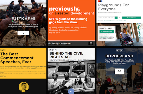
Just a few of the apps we have made with the app template. Photo by Emily Bogle.
On the NPR Visuals Team, we make a point to open source and publish as much of the code we write as we can. That includes open sourcing code like the app template, which we use every day to build the individual projects we make as a team.
However, we tend to optimize for ourselves rather than for the public, which means it can be a little more difficult for someone outside of our team to setup the app template. For this reason, I will walk through how to set up the app template for yourself if you are not a developer on our team. If you are unfamiliar with the app template, read more about it here.
In this post, you will learn how to:
Our app template relies on a UNIX-based development environment and working knowledge of the command line. We have a Python and Node-based stack. Thus, if you are new to all of this, you should probably read our development environment blog post first and make sure your environment matches ours. Namely, you should have Python 2.7 and the latest version of Node installed.
Also, all of our projects are deployed from the template to Amazon S3. You should have three buckets configured: one for production, one for staging and one for synchronizing large media assets (like images) across computers. For example, we use apps.npr.org, stage-apps.npr.org and assets.apps.npr.org for our three buckets, respectively.
All of our projects start and end in version control, so the first thing to do for your project is to fork our app template so you have a place for all of your defaults when you use the app template for more projects. This is going to be the place where all of your app template projects begin. When you want to start a new project, you clone your fork of the app template.
Once that is done, clone your fork to your local machine so we can start changing some defaults.
git clone git@github.com:$YOUR_GITHUB_USERNAME/app-template.git
Hopefully, you’ve already checked to make sure your development stack matches ours. Next, we’re going to create a virtual environment for the app template and install the Python and Node requirements. Use the following commands:
mkvirtualenv app-template
pip install -r requirements.txt
npm install
You will also need a few environment variables established so that the entire stack works.
In order to use Google Spreadsheets with copytext from within the app template, you will need to store a Google username and password in your ’.bash_profile’ (or comparable file for other shells like zsh).
export APPS_GOOGLE_EMAIL="youremail@gmail.com"
export APPS_GOOGLE_PASS="ih0pey0urpassw0rdisn0tpassword"
When you create spreadsheets for your projects, ensure the Google account stored in your environment can access the spreadsheet.
For deployment to Amazon S3, you will need your AWS Access Key ID and Secret stored as environment variables as well:
export AWS_ACCESS_KEY_ID="$AWSKEY"
export AWS_SECRET_ACCESS_KEY="$AWSSECRET"
After you have set these variables, open a new terminal session so that these variables are a part of your environment.
With your development environment and environment variables set, we can start hacking on the template.
All of the configuration you will need to change lives in ‘app_config.py’. Open that file in your text editor of choice. We will edit a few of the NPR-specific defaults in this file.
Change the following variables:
GITHUB_USERNAME
: Change this to your (or your news org’s) Github username.PRODUCTION_S3_BUCKETS
, STAGING_S3_BUCKETS
and ASSETS_S3_BUCKET
: You should change these dictionaries to the three buckets you have setup for this purpose. We also have a backup production bucket in case apps.npr.org goes down for any reason. Be sure to note the region of each S3 bucket.COPY_GOOGLE_DOC_URL
: Technically, the default Google Spreadsheet for our projects is viewable by anyone with the link, but you should make your own and use that as the default spreadsheet for your projects. That way, you can change the default sheet style for your projects. For each individual project, you will want to make a copy of your template post and update the URL in the individual project’s 'app_config.py’.GOOGLE_ANALYTICS: ACCOUNT_ID
: We love you, but we don’t want to see the pageviews for your stuff in our analytics. Please change this to you or your news org’s ID.DISQUS_API_KEY
: If you want to use Disqus comments, retrieve your public Disqus API key and paste it as the value for this variable.DISQUS_SHORTNAME
: We configure different Disqus shortnames for different deployment targets. You can set yours in the configure_targets()
function in app_config.py
You will also notice the variables PRODUCTION_SERVERS
and STAGING_SERVERS
. Our app template is capable of deploying cron jobs and Flask applications to live servers. We do this for apps like our Playgrounds app.
If you are going to use these server-side features, you will want to create a couple EC2 boxes for this purpose. As our defaults show, you can either create a full URL for this box or just use an elastic IP.
With all of this changed, you should be able to bootstrap a new project, work on it, and deploy it with the entire pipeline working. Let’s try it!
First, make sure you have pushed all of the changes you just made back to Github. Then, make a test repository for a new app template project on Github. Take note of what you call this repository.
Clone your fork of the app template once again. This is how you will begin all individual app template projects. This time, we’re going to specify that the clone is created in a folder with the name of the repository you just created. For example, if you made a repository called 'my-new-awesome-project’, your clone command would look like this:
git clone git@github.com:$YOUR_GITHUB_USERNAME/app-template.git my-new-awesome-project
Next, run the following commands:
cd my-new-awesome-project
mkvirtualenv my-new-awesome-project
pip install -r requirements.txt
npm install
fab bootstrap
If you go back to the my-new-awesome-project
you created, you should see an initial commit that puts the app template in this repository. If this worked, you have made all the changes necessary for bootstrapping new app template projects.
In the project’s root directory in the terminal, run ./app.py
. Then, open your web browser and visit http://localhost:8000
You should see a web page (albeit one with NPR branding all over it… we’ll get there). If you see an error, something went wrong.
Finally, let’s test deployment. Run fab staging master deploy
. Visit YOUR-S3-STAGING-BUCKET.com/my-new-awesome-project
to see if deployment worked properly. You should see the same page you saw when you ran the local Flask server.
If everything we just tested worked, then you are ready to start using the app template for all of your static site needs. Happy hacking!
Below, I will get into some finer details about how to turn off certain features and get rid of more NPR-specific defaults
Chances are, if you are using our app template, you don’t want to use all of our template. We’re fully aware that some of ways we do things are esoteric and may not work for everyone. Other things are our standard defaults, but won’t work for your projects. Here are some things you will probably want to change.
We automatically include the NPR-licensed Gotham web font. You can’t use this. Sorry. If you go to templates/_fonts.html
, you can point to your own hosted webfont CSS files, or alternatively, remove the template include from templates/_base.html
to turn off the webfont feature entirely.
We have a rig to serve NPR ads on some of our apps. We’re pretty sure you won’t want NPR ads on your stuff. To remove the ads, remove two files from the repo: www/js/ads.js
and less/adhesion.less
. Then, in templates/_base.html
, remove the call to js/ads.js
and in less/app.less
, remove the import statement that imports the adhesion.less
file.
Finally, in app_config.py
, you should remove the NPR_DFP
dict, as it will now be unnecessary.
We have a base template setup so that we can see that all of the template is working easily. You will probably want something similar, but you will want to strip out the NPR header/footer and all the branding. You can do that by editing the various templates inside the templates
folder, especially _base.html
and index.html
and editing app.less
.
All of our apps come with a common share panel and comments form. We use Disqus for comments and integrate with Facebook and Twitter. This may or may not work for you. Should you want to remove all of these features, remove the following files:
data/featured.json
fabfile/data.py
less/comments.less
less/comments_full.less
less/share-modal.less
templates/_disqus.html
templates/_featured_facebook_post.html
templates/_featured_tweet.html
templates/_share_modal.html
www/js/comments.js
Be sure to check for where these files are included in the HTML and less templates as well.
To turn off the dependency on Google Spreadsheets, simply set the variable COPY_GOOGLE_DOC_URL
in app_config.py
to None
.
Note that many of the default templates rely on a COPY object that is retrieved from a local .xlsx file stored in the data
directory. That file path is set by the COPY_PATH
variable in app_config.py
.
If you want to factor out all spreadsheet functionality, this will take a lot more work. You will need to completely remove the dependency on copytext throughout the app template.
Our app template is customized for our needs. It has a great many NPR-specific defaults. If you want to use the app template for projects outside of NPR, it takes a good amount of customization to truly decouple the template from NPR defaults.
But we think the payoff would be worth it for any news organization. Having a baseline template with sensible defaults makes all of your future projects faster, and you can spend more time focusing on the development of your individual project. We spend so much time working on our template up front because we like to spend as much time as we can working on the specifics of an individual project, rather than building the 90% of every website that is the same. The app template allows us to work at a quick pace, working on weekly sprints and turning around projects in a week or two.
If you work for a news organization looking to turn around web projects quickly, you need a place to start every time. Instead of making broad, templated design decisions that compromise the functionality and purpose of a project, use our template to handle the boring stuff and make more amazing things.
Correction (September 2, 2014 8:55pm EDT): We originally stated that the script should combine data from multiple American Community Survey population estimates. This methodology is not valid. This post and the accompanying source code have been updated accordingly. Thanks to census expert Ryan Pitts for catching the mistake. This is why we open source our code!
The NPR Visuals team was recently tasked with analysing data from the Pentagon’s program to disperse surplus military gear to law enforcement agencies around the country through the Law Enforcement Support Office (LESO), also known as the “1033” program. The project offers a useful case study in creating data processing pipelines for data analysis and reporting.
The source code for the processing scripts discussed in this post is available on Github. The processed data is available in a folder on Google Drive.
There is one rule for data processing: Automate everything.
Data processing is fraught with peril. Your initial transformations and data analysis will always have errors and never be as sophisticated as your final analysis. Do you want to hand-categorize a dataset, only to get updated data from your source? Do you want to laboriously add calculations to a spreadsheet, only to find out you misunderstood some crucial aspect of the data? Do you want to arrive at a conclusion and forget how you got there?
No you don’t! Don’t do things by hand, don’t do one-off transformations, don’t make it hard to get back to where you started.
Create processing scripts managed under version control that can be refined and repeated. Whatever extra effort it takes to set up and develop processing scripts, you will be rewarded the second or third or fiftieth time you need to run them.
It might be tempting to change the source data in some way, perhaps to add categories or calculations. If you need to add additional data or make calculations, your scripts should do that for you.
The top-level build script from our recent project shows this clearly, even if you don’t write code:
#!/bin/bash
echo 'IMPORT DATA'
echo '-----------'
./import.sh
echo 'CREATE SUMMARY FILES'
echo '--------------------'
./summarize.sh
echo 'EXPORT PROCESSED DATA'
echo '---------------------'
./export.sh
We separate the process into three scripts: one for importing the data, one for creating summarized versions of the data (useful for charting and analysis) and one that exports full versions of the cleaned data.
The data, provided by the Defense Logistics Agency’s Law Enforcement Support Office, describes every distribution of military equipment to local law enforcement agencies through the “1033” program since 2006. The data does not specify the agency receiving the equipment, only the county the agency operates in. Every row represents a single instance of a single type of equipment going to a law enforcement agency. The fields in the source data are:
The process starts with a single Excel file and builds a relational database around it. The Excel file is cleaned and converted into a CSV file and imported into a PostgreSQL database. Then additional data is loaded that help categorize and contextualize the primary dataset.
Here’s the whole workflow:
We also import a list of all agencies using csvkit:
in2csv
command to extract each sheetcsvstack
command to combine the sheets and add a grouping columncsvcut
command to remove a pointless “row number” columnOnce the data is loaded, we can start playing around with it by running queries. As the queries become well-defined, we add them to a script that exports CSV files summarizing the data. These files are easy to drop into Google spreadsheets or send directly to reporters using Excel.
We won’t go into the gory details of every summary query. Here’s a simple query that demonstrates the basic idea:
echo "Generate category distribution"
psql leso -c "COPY (
select c.full_name, c.code as federal_supply_class,
sum((d.quantity * d.acquisition_cost)) as total_cost
from data as d
join codes as c on d.federal_supply_class = c.code
group by c.full_name, c.code
order by c.full_name
) to '`pwd`/build/category_distribution.csv' WITH CSV HEADER;"
This builds a table that calculates the total acquisition cost for each federal supply class:
full_name | federal_supply_code | total_cost |
---|---|---|
Trucks and Truck Tractors, Wheeled | 2320 | $405,592,549.59 |
Aircraft, Rotary Wing | 1520 | $281,736,199.00 |
Combat, Assault, and Tactical Vehicles, Wheeled | 2355 | $244,017,665.00 |
Night Vision Equipment, Emitted and Reflected Radiation | 5855 | $124,204,563.34 |
Aircraft, Fixed Wing | 1510 | $58,689,263.00 |
Guns, through 30 mm | 1005 | $34,445,427.45 |
… |
Notice how we use SQL joins to pull in additional data (specifically, the full name field) and aggregate functions to handle calculations. By using a little SQL, we can avoid manipulating the underlying data.
The usefulness of our approach was evident early on in our analysis. At first, we calculated the total cost as sum(acquisition_cost)
, not accounting for the quantity of items. Because we have a processing script managed with version control, it was easy to catch the problem, fix it and regenerate the tables.
Not everybody uses PostgreSQL (or wants to). So our final step is to export cleaned and processed data for public consumption. This big old query merges useful categorical information, county FIPS codes, and pre-calculates the total cost for each equipment order:
psql leso -c "COPY (
select d.state,
d.county,
f.fips,
d.nsn,
d.item_name,
d.quantity,
d.ui,
d.acquisition_cost,
d.quantity * d.acquisition_cost as total_cost,
d.ship_date,
d.federal_supply_category,
sc.name as federal_supply_category_name,
d.federal_supply_class,
c.full_name as federal_supply_class_name
from data as d
join fips as f on d.state = f.state and d.county = f.county
join codes as c on d.federal_supply_class = c.code
join codes as sc on d.federal_supply_category = sc.code
) to '`pwd`/export/states/all_states.csv' WITH CSV HEADER;"
Because we’ve cleanly imported the data, we can re-run this export whenever we need. If we want to revisit the story with a year’s worth of additional data next summer, it won’t be a problem.
Make your scripts chatty: Always print to the console at each step of import and processing scripts (e.g. echo "Merging with census data"
). This makes it easy to track down problems as they crop up and get a sense of which parts of the script are running slowly.
Use mappings to combine datasets: As demonstrated above, we make extensive use of files that map fields in one table to fields in another. We use SQL joins to combine the datasets. These features can be hard to understand at first. But once you get the hang of it, they are easy to implement and keep your data clean and simple.
Work on a subset of the data: When dealing with huge datasets that could take many hours to process, use a representative sample of the data to test your data processing workflow. For example, use 6 months of data from a multi-year dataset, or pick random samples from the data in a way that ensures the sample data adequately represents the whole.
Visual journalism experts. David Sweeney/NPR.
It’s joy to work in public media.
Folks here do amazing journalism, and are awesome to work with.
Why? The non-commercial relationship between us and our audience. We’re not selling them anything. We do sell sponsorship, but have you heard an ad on NPR? They’re the nicest, dullest ads you’ve ever heard, and they aren’t our primary source of income. No, public media exists because, for more than 40 years, our audience has sent us money, just because they want us to keep up the good work.
And this relationship, built with love and trust, permeates the newsroom and the whole organization. It’s fucking cool.
The visuals team is trying something weird. We’re a small team (a dozen, not including interns), and we handle all aspects of visual storytelling at NPR. We make and edit: charts and maps, data visualizations, photography and video, and lots of experimental, web-native stories.
We’re mission-driven, and believe that being open-source and transparent in our methods is essential to our role as public media.
And we’re having a pretty fun time doing it.
A fellow on our team will not get a special project, just for you. We don’t work that way. You’ll be our teammate: making stuff with us, learning what we’ve learned, teaching us what you know and what you’re learning elsewhere during your fellowship year.
Your perspective is even more valuable than your skills. We’re still just figuring out the best ways for a mashed-up visual journalism team to work together and make great internet. You will help us make this thing happen.
So come along for the ride! I guarantee it’ll be a tremendous year. Apply now! (It closes August 16th!)
The NPR News Apps team, before its merger with the Multimedia team to form Visuals, made an early commitment to building client-side news applications, or static sites. The team made this choice for many reasons — performance, reliability and cost among them — but such a decision meant we needed our own template to start from so that we could easily build production-ready static sites. Over the past two years, the team has iterated on our app template, our “opinionated project template for client-side apps.” We also commit ourselves to keeping that template completely open source and free to use.
We last checked in on the app template over a year ago. Since then, our team has grown and merged with the Multimedia team to become Visuals. We have built user-submitted databases, visual stories and curated collections of great things, all with the app template. As we continue to build newer and weirder things, we learn more about what our app template needs. When we develop something for a particular project that can be used later — say, the share panel from Behind the Civil Rights Act — we refactor it back into the app template. Since we haven’t checked in for a while, I thought I would provide a rundown of everything the app template does in July 2014.
The fundamental backbone of the app template is the same as it has always been: a Flask app that renders the project locally and provides routes for baking the project into flat files. All of our tooling for local development revolves around this Flask app. That includes:
Out of these tools, we essentially built a basic static site generator. With just these features, the app template wouldn’t be all that special or worth using. But the app template comes with plenty more features that make it worth our investment.
A few months ago, we released copytext, a library for accessing a spreadsheet as a native Python object suitable for templating. Some version of copytext has been a part of the app template for much longer, but we felt it was valuable enough to factor out into its own library.
We often describe our Google Docs to Jinja template workflow entirely as “copytext”, but that’s not entirely true. Copytext, the library, works with a locally downloaded .xlsx
version of a Google spreadsheet (or any .xlsx
file). We have separate code in the app template itself that handles the automated download of the Google Spreadsheet.
Once we have the Google Spreadsheet locally, we use copytext to turn it into a Python object, which is passed through the Flask app to the Jinja templates (and a separate JS file if we want to render templates on the client).
The benefits of using Google Spreadsheets to handle your copy are well-documented. A globally accessible spreadsheet lets us remove all content from the raw HTML, including tags for social media and SEO. Spreadsheets democratize our workflow, letting reporters, product owners and copy editors read through the raw content without having to dig into HTML. Admittedly, a spreadsheet is not an optimal place to read and edit long blocks of text, but this is the best solution we have right now.
Another piece of the backbone of the static site generator is the render pipeline. This makes all of our applications performance-ready once they get to the S3 server. Before we deploy, the render pipeline works as follows:
When running through the Jinja templates, some more optimization magic happens. We defined template tags that allow us to “push” individual CSS and JavaScript files into one minified and compressed file. You can see the code that creates those tags here. In production, this reduces the number of HTTP requests the browser has to make and makes the files the browser has to download as small as possible.
We like to say that the app template creates the 90% of every website that is exactly the same so we can spend our time perfecting the last 10%, the presentation layer. But we also include some defaults that make creating the presentation layer easier. Every app template project comes with Bootstrap and Font Awesome. We include our custom-built share panel so we never have to do that again. Our NPR fonts are automatically included into the project. This makes going from paper sketching to wireframing in code simple and quick.
Once we merged with the Multimedia team, we started working more with large binary files such as images, videos and audio. Committing these large files to our git repository was not optimal, slowing down clone, push and pull times as well as pushing against repository sizes limits. We knew we needed a different solution for syncing large assets and keeping them in a place where our app could see and use them.
First, we tried symlinking to a shared Dropbox folder, but this required everyone to maintain the same paths for both repositories and Dropbox folders. We quickly approached our size limit on Dropbox after a few projects. So we decided to move all of our assets to a separate S3 bucket that is used solely for syncing assets across computers. We use a Fabric command to scan a gitignored assets folder to do three things:
This adds a layer of complexity for the user, having to remember to update assets continually so that everyone stays in sync during development. But it does resolve space issues and keeps assets out of the git repo.
On the Visuals Team, we use GitHub Issues as our main project management tool. Doing so requires a bit of configuration on each project. We don’t like GitHub’s default labels, and we have a lot of issues (or tickets, as we call them) that we need to open for every project we do, such as browser testing.
To automate that process we have — you guessed it — a Fabric command to make the whole thing happen! Using the GitHub API, we run some code that sets up our default labels, milestones and issues. Those defaults are defined in .csv
files that we can update as we learn more and get better.
Every few weeks, Chris Groskopf gets an itch. He gets an itch that he must solve a problem. And he usually solves that problem by writing a Python library.
Most recently, Chris wrote clan (or Command Line Analytics) for generating analytics reports about any of our projects. The app template itself has baseline event tracking baked into our default JavaScript files (Who opened our share panel? Who reached the end of the app?). Clan is easily configured through a YAML file to track those events as well as Google Analytics’ standard events for any of our apps. While clan is an external library and not technically part of the template, we configure our app template with Google Analytics defaults that make using clan easy.
It is important for us to be able to not only easily make and deploy apps, but also easily see how well they are performing. Clan allows us to not only easily generate individual reports, but also generate reports that compare different apps to each other so we get a relative sense of performance.
Our static site generator can also deploy to real servers. Seriously. In our Playgrounds For Everyone app, we need a cron server running to listen for when people submit new playgrounds to the database. As much as we wish we could, we can’t do that statically, but that doesn’t mean the entire application has to be dynamic! Instead, the app template provides tooling for deploying cron jobs to a cron server.
In the instance of Playgrounds, the cron server listens for new playground submissions and sends an email daily to the team so we can see what has been added to the database. It also re-renders and re-deploys the static website. Read more about that here.
This is the benefit of having a static site generator that is actually just a Flask application. Running a dynamic version of it on an EC2 server is not much more complicated.
Over 1500 words later, we’ve gone through (nearly) everything the app template can do. At the most fundamental level, the app template is a Flask-based static site generator that renders dynamic templates into flat HTML. But it also handles deployment, spreadsheet-based content management, CSS and JavaScript optimization, large asset synchronization, project management, analytics reporting and, if we need it, server configuration.
While creating static websites is a design constraint, the app template’s flexibility allows us to do many different things within that constraint. It provides a structural framework through which we can be creative about how we present our content and tell our stories.
Why aren’t we flying? Because getting there is half the fun. You know that. (Visuals en route to NICAR 2013.)
Hey!
Are you a student?
Do you design? Develop? Love the web?
…or…
Do you make pictures? Want to learn to be a great photo editor?
If so, we’d very much like to hear from you. You’ll spend the fall working on the visuals team here at NPR’s headquarters in Washington, DC. We’re a small group of photographers, videographers, photo editors, developers, designers and reporters in the NPR newsroom who work on visual stuff for npr.org. Our work varies widely, check it out here.
Our photo editing intern will work with our digital news team to edit photos for npr.org. It’ll be awesome. There will also be opportunities to research and pitch original work.
Please…
Are you awesome? Apply now!
Our news apps intern will be working as a designer or developer on projects and daily graphics for npr.org. It’ll be awesome.
Please…
Are you awesome? Apply now!
Check out our careers site for much more info.
Thx!
Geballte Energie: James Brown, Februar 1973, Musikhalle Hamburg by Heinrich Klaffs
We wrote this for the newsroom. It’s changed some since we first distributed it internally, and, like our other processes, will change much more as we learn by doing.
Process must never be a burden, and never be static. If we’re doing it right, the way we work should feel lighter and easier every week. (I’ve edited/annotated it a tiny bit to make sense as a blog post, but didn’t remove any sekrits.)
The visuals team was assembled at the end of last year. We’re the product of merging two groups: the news applications team, who served as NPR’s graphics and data desks, and the multimedia team, who made and edited pictures and video.
Our teams were already both making visual news things, often in collaboration. When the leader of the multimedia team left NPR last fall, we all did a lot of soul searching. And we realized that we had a lot to learn from each other.
The multimedia crew wanted to make pictures and video that were truly web-native, which required web makers. And our news apps lacked empathy — something we’re so great at on the radio. It’s hard to make people care with a chart. Pictures were the obvious missing piece. We needed each other.
In addition, it seemed that we would have a lot to gain by establishing a common set of priorities. So we decided to get the teams together. The working titles for the new team — “We make people care” and “Good Internet” — reflected our new shared vision. But in the end, we settled on a simple name, “Visuals”.
(See also: “What is your mission?”, a post published on my personal blog, because swears.)
Everything we do is driven by the priorities of the newsroom, in collaboration with reporters and editors. We don’t want to go it alone. We’d be dim if we launched a project about the Supreme Court and didn’t work with Nina Totenberg.
Here’s the metaphor I’ve been trying out on reporters and editors:
We want to be your rhythm section. But that’s not to say we’re not stars. We want to be the best rhythm section. We want to be James Brown’s rhythm section. But we’re not James. We’re gonna kick ass and make you look good, but we still need you to write the songs. And we play together.
We love making stuff, but we can’t possibly do every project that crosses our desks. So we do our best to prioritize our work, and our top priority is serving NPR’s audience.
We start every project with a user-centered design exercise. We talk about our users, their needs, and then discuss the features we might build. And often the output of that exercise is not a fancy project.
(This process is a great mind-hack. We all get excited about a cool new thing, but most of the time the cool new thing is not the right thing to build for our audience. User-centered design is an exercise in self-control.)
Sometimes we realize the best thing to publish is a list post, or a simple chart alongside a story, or a call-to-action on Facebook — that is to say, something we don’t make. But sometimes we do need to build something, and put it on the schedule.
Visual journalism experts. David Sweeney/NPR.
There are twelve of us (soon to be thirteen!) on the visuals team, and we’re still learning the most effective ways to work together. The following breakdown is an ongoing experiment.
We currently have one full-time teammate, Emily Bogle, working on pictures for daily news, and we are in the process of hiring another. They attend news meetings and are available to help the desks and shows with short-term visuals.
If you need a photo, go to Emily.
Similarly, our graphics editor, Alyson Hurt, is our primary point of contact when you need graphics for daily and short-term stories. She is also charged with maintaining design standards for news graphics on npr.org, ensuring quality and consistency.
If you need a graphic created, go to Aly.
If you are making your own graphic, go to Aly.
If you are planning to publish somebody else’s graphic, go to Aly.
Brian Boyer and Kainaz Amaria serve as NPR’s visuals editor and pictures editor, respectively. Sometimes they make things, but their primary job is to act as point on project requests, decide what we will and won’t do, serve as primary stakeholders on projects, and define priorities and strategy for the team.
If you’ve got a project, go to Brian or Kainaz, ASAP.
We’ve got one full-time photographer/videographer, David Gilkey, who work with desks and shows to make visuals for our online storytelling.
The rest of the crew rotates between two project teams (usually three or four people) each run by a project manager. Folks rotate between teams, and sometimes rotate onto daily news work, depending on the needs of the project and the newsroom.
This work is generally planned. These are the format-breakers — data-driven applications or visual stories. The projects range from 1-week to 6-weeks in duration (usually around 2-3 weeks).
We’re taking this opportunity to rethink some of our processes and how we work with the newsroom, including…
Until recently, our only scheduled weekly catchup was with Morning Edition. And, no surprise, we’ve ended up doing a lot of work with them. A couple of months ago, we started meeting with each desk and show, once a month. It’s not a big meeting, just a couple of folks from each team. And it’s only for 15 minutes — just enough time to catch up on upcoming stories.
Photo galleries are nice, but when we’ve sent a photographer to far-off lands, it just doesn’t make sense to place their work at the top of a written story, buried under a click, click, click user interface. When we’ve got the art, we want to use it, boldly.
We like making graphics, but there’s always more to do then we are staffed to handle. And too often a graphic requires such a short turn-around that we’re just not able to get to them. We’d love to know about your graphics needs as soon as possible, but when that’s not possible, we’ve got tools to make some graphics self-serve.
(I wanted to link to these tools, but they’re internal, and we haven’t blogged about them yet. Shameful! Here’s some source code: Chartbuilder, Quotable, Papertrail)
For breaking news events and time-sensitive stories, we’ll do what we’ve been doing — we’ll time our launches to coincide with our news stories.
But the rest of the time, we’re going to try something new. It seems to us that running a buildout and a visual story on the same day is a mistake. It’s usually an editing headache to launch two different pieces at the same time. And then once you’ve launched, the pieces end up competing for attention on the homepage and social media. It’s counter-productive.
So instead, we’re going to launch after the air date and buildout, as a second- or third-day story.
This “slow news” strategy may work at other organizations, but it seems to make extra sense at NPR since so much of our work is explanatory, and evergreen. Also, visuals usually works on stories that are of extra importance to our audience, so a second-day launch will give us an opportunity to raise an important issue a second time.
At NPR, we regularly ask our audience to submit photos on a certain theme related to a series or particular story. We wanted a way to streamline these callouts on Instagram using the hashtag we’ve assigned, so we turned to IFTTT.
IFTTT is a website whose name means “If This, Then That.” You can use the service to set up “recipes” where an event on one site can trigger a different event on another site. For example, if someone tags an Instagram photo with a particular hashtag, IFTTT can log it in a Google Spreadsheet. (Sadly, this will not work with photos posted to Twitter.)
Here, we’ll explain our workflow, from IFTTT recipe to moderation to putting the results on a page.
(Side note: Thanks to Melody Kramer, who introduced the idea of an IFTTT moderation queue for our “Planet Money Makes A T-Shirt” project. Our workflow has evolved quite a bit since that first experiment.)
Set this up at the very beginning of the process, before you’ve publicized the callout. IFTTT will only pull in images as they are submitted. It will not pull images that were posted before we set up the recipe.
(A note about accounts: Rather than use someone’s own individual account, we created team Gmail and IFTTT accounts for use with these photo callouts. That way anyone on the team can modify the IFTTT recipes. Also, we created a folder in our team Google Drive folder just for photo callouts and shared that with the team IFTTT Gmail account.)
First step: Go to Google Drive. We’ve already set up a spreadsheet template for callouts with all of the column headers filled in, corresponding with the code we’ll use to put photos on a page later on. Make a copy of that spreadsheet and rename it something appropriate to your project (say, photo-cats).
Next, log into IFTTT.
Before you set up your recipe, double-check your IFTTT account preferences. By default, IFTTT runs all links through a URL shortener. To make it use the original Instagram and image URLs in your spreadsheet, go into your IFTTT account preferences and uncheck URL shortening.
Now, create a new recipe (“create” at the top of the page).
Select Instagram as the “trigger channel,” and as the trigger, a new photo by anyone tagged. (Note: If we wanted to pull in Instagram videos, we would need to make a separate recipe for just video.)
Then enter your hashtag (in this case, #cats).
(Note: We’re not using this to scrape Instagram and republish photos without permission. We’d normally use a much more specific hashtag, like #nprshevotes or #nprpublicsquare — the assumption being that users who tag their photos with such a specific hashtag want NPR to see the photos and potentially use them. But for the sake of this example, #cats is fun.)
Next, select Google Drive as the “action channel,” and add row to spreadsheet as the action.
Put the name of the spreadsheet in the Spreadsheet name box so IFTTT can point to it, in this case photo-cats. (If the spreadsheet does not already exist, IFTTT will create one for you, but it’s better to copy the spreadsheet template because the header labels are already set up.)
In the formatted row, IFTTT gives you a few options to include data from Instagram like username, embed code, caption, etc. Copy and paste this to get the same fields that are in the spreadsheet template:
{{CreatedAt}} ||| {{Username}} ||| {{Caption}} ||| {{Url}} ||| =IMAGE("{{SourceUrl}}";1) ||| {{SourceUrl}} ||| {{EmbedCode}}
Then point the spreadsheet to the Google Drive folder where your spreadsheet lives — in this case, photo-callouts. Once your recipe has been activated, hit the check button (with the circle arrow) to run the recipe for the first time. IFTTT will run on its own every 15 minutes or so, appending information for up to 10 images at a time to the bottom of the spreadsheet.
Not every photo will meet our standards, so moderation will be important. Our spreadsheet template has an extra column called “approved.” Periodically, a photo editor will look at the new photos added to the spreadsheet and mark approved images with a “y.”
Here’s an example of a mix of approved and not approved images (clearly, we wanted only the best cat photos):
To reorder images, you can either manually reorder rows (copy/pasting or dragging rows around), or add a separate column, number the rows you want and sort by that column. In either case, it’s best to wait until the very end to do this.
When you’ve reached your deadline, or you’ve collected as many photos as you need, remember to go back into IFTTT and turn off the recipe — otherwise, it’ll keep running and adding photos to the spreadsheet.
So we have a spreadsheet, and we know which photos we want. Now to put them on a page.
The NPR Visuals system for creating and publishing small-scale daily projects has built-in support for copytext, a Python library that Christopher Groskopf wrote to pull content from Google Spreadsheets. The dailygraphics system, a stripped-down version of our team app-template, runs a Flask webserver locally and renders spreadsheet content to the page using Jinja tags. When it’s time to publish the page, it bakes everything out to flat files and deploys those files to S3. (Read more about dailygraphics.)
(In our private graphics repo, we have a template for photo callouts. So an NPR photo producer would duplicate the photo-callout-template
folder and rename it something appropriate to the project — in this case, photo-cats
.)
If you’re starting from scratch with dailygraphics (read the docs first), you’d instead use fab add_graphic:photo-cats
to create a new photo mini-project.
Every mini-project starts with a few files: an HTML file, a Python config file and supporting JS libraries. For this project, you’ll work with child_template.html
and graphic_config.py
.
First, connect to the Google Spreadsheet. In graphic_config.py
, replace the COPY_GOOGLE_DOC_KEY
with the key for your Google Spreadsheet, which you can find (highlighted here) in the spreadsheet’s URL:
Run fab update_copy:photo-cats
to pull the latest spreadsheet content down to your computer.
And here are the template tags we’ll use in child_template.html
to render the Google Spreadsheet content onto the pages:
<div id="callout">
<!-- Loop through every row in the spreadsheet -->
{% for row in COPY.instagram %}
<!-- Check if the photo has been approved.
If not, skip to the next line.
(Notice that “approved” matches the column
header from the spreadsheet.) -->
{% if row.approved == 'y' %}
<section
id="post-{{ loop.index }}"
class="post post-{{ row.username }}">
<!-- Display the photo and link to the original image on Instagram.
Again, “row.instagram_url” and “row.image_url” reference
the columns in the original spreadsheet. -->
<div class="photo">
<a href="{{row.instagram_url}}" target="_blank"><img src="{{ row.image_url }}" alt="Photo" /></a>
</div>
<!-- Display the photographer’s username, the photo caption
and a link to the original image on Instagram -->
<div class="caption">
<h3><a href="{{row.instagram_url}}" target="_blank">@{{ row.username }}</a></h3>
<p>{{ row.caption }}</p>
</div>
</section>
{% endif %}
{% endfor %}
</div>
(If you started from the photo-callout-template
, you’re already good to go.)
Preview the page locally at http://localhost:8000/graphics/photo-cats/
, then commit your work to GitHub. When you’re ready, publish it out: fab production deploy:photo-cats
Everything for this photo callout so far has happened entirely outside our content management system. But now we want to put this on an article page or blog post.
Seamus, NPR’s CMS, is very flexible, but we’ve found that it’s still good practice to keep our code-heavy work walled off to some degree from the overall page templates so that styles, JavaScript and other code don’t conflict with each other. Our solution: embed our content using iframes and Pym.js, a JavaScript library that keeps the iframe’s width and height in sync with its content.
Our system for small projects has Pym.js already built-in. At the bottom of the photo callout page, there is a snippet of embed code.
Copy that code, open the story page in your CMS, and add the code to your story as a new HTML asset. And behold:
In addition to big, long-term projects, the NPR Visuals team also produces short-turnaround charts and tables for daily stories. Our dailygraphics rig, newly open-sourced, offers a workflow and some automated machinery for creating, deploying and embedding these mini-projects, including:
Credit goes to Jeremy Bowers, Tyler Fisher and Christopher Groskopf for developing this system.
This system relies on two GitHub repositories:
(Setting things up this way means we can share the machinery while keeping NPR-copyrighted or embargoed content to ourselves.)
Tell dailygraphics where the graphics live (relative to itself) in dailygraphics/app_config.py
:
# Path to the folder containing the graphics
GRAPHICS_PATH = os.path.abspath('../graphics')
When working on these projects, I’ll keep three tabs open in Terminal:
fab app
)If you use iTerm2 as your terminal client, here’s an AppleScript shortcut to launch all your terminal windows at once.
In Tab 1, run a fabric command — fab add_graphic:my-new-graphic
— to copy a starter set of files to a folder inside the graphics repo called my-new-graphic
.
The key files to edit are child_template.html
and, if relevant, js/graphic.js
. Store any additional JavaScript libraries (for example, D3 or Modernizr), in js/lib
.
If you’ve specified a Google Spreadsheet ID in graphic_config.py
(our templates have this by default), this process will also clone a Google Spreadsheet for you to use as a mini-CMS for this project. (More on this later.)
I can preview the new project locally by pulling up http://localhost:8000/graphics/my-new-graphic/
in a browser.
When I’m ready to save my work to GitHub, I’ll switch over to Tab 3 to commit it to the graphics repo.
First, make sure the latest code has been committed and pushed to the graphics GitHub repo (Tab 3).
Then return to dailygraphics (Tab 1) to deploy, running the fabric command fab production deploy:my-new-graphic
. This process will gzip the files, flatten any dynamic tags on child_template.html
(more on that later) into a new file called child.html
and publish everything out to Amazon S3.
To avoid CSS and JavaScript conflicts, we’ve found that it’s a good practice to keep our code-driven graphics walled off to some degree from CMS-generated pages. Our solution: embed these graphics using iframes, and use Pym.js to keep the iframes’ width and height in sync with their content.)
http://localhost:8000/graphics/my-new-graphic/
— also generates “parent” embed code I can paste into our CMS. For example:js/graphic.js
file generated for every new graphic includes standard “child” code needed for the graphic to communicate with its “parent” iframe. (For more advanced code and examples, read the docs.)Sometimes it’s useful to store information related to a particular graphic, such as data or supporting text, in a Google Spreadsheet. dailygraphics uses copytext, a Python library that serves as an intermediary between Google Spreadsheets and an HTML page.
Every graphic generated by dailygraphics includes the file graphic_config.py
. If you don’t want to use the default sheet, you can replace the value of COPY_GOOGLE_DOC_KEY
with the ID for another sheet.
There are two ways I can pull down the latest copy of the spreadsheet:
Append ?refresh=1
to the graphic URL (for example, http://localhost:8000/graphics/my-test-graphic/?refresh=1
) to reload the graphic every time I refresh the browser window. (This only works in local development.)
In Tab 1 of my terminal, run fab update_copy:my-new-graphic
to pull down the latest copy of the spreadsheet.
I can use Jinja tags to reference the spreadsheet content on the actual page. For example:
<header>
<h1>{{ COPY.content.header_title }}</h1>
<h2>{{ COPY.content.lorem_ipsum }}</h2>
</header>
<dl>
{% for row in COPY.example_list %}
<dt>{{ row.term }}</dt><dd>{{ row.definition }}</dd>
{% endfor %}
</dl>
You can also use it to, say, output the content of a data spreadsheet into a table or JSON object.
(For more on how to use copytext, read the docs.)
When I publish out the graphic, the deploy script will flatten the Google Spreadsheet content on child_template.html
into a new file, child.html
.
(Note: A published graphic will not automatically reflect edits to its Google Spreadsheet. The graphic must be republished for any changes to appear in the published version.)
One of our NPR Visuals mantras is Don’t store binaries in the repo! And when that repo is a quickly multiplying series of mini-projects, that becomes even more relevant.
We store larger files (such as photos or audio) separate from the graphics, with a process to upload them directly to Amazon S3 and sync them between users.
When I create a new project with fab add_graphic:my-new-graphic
, the new project folder includes an assets
folder. After saving media files to this folder, I can, in Tab 1 of my Terminal (dailygraphics), run fab assets.sync:my-new-graphic
to sync my local assets
folder with what’s already on S3. None of these files will go to GitHub.
This is explained in greater detail in the README.
Our dailygraphics rig offers a fairly lightweight system for developing and deploying small chunks of code-based content, with some useful extras like support for Google Spreadsheets and responsive iframes. We’re sharing it in the hope that it might be useful for those who need something to collect and deploy small projects, but don’t need something as robust as our full app-template.
If you end up using it or taking inspiration from it, let us know!
(This was updated in August 2014, January 2015 and April 2015 to reflect changes to dailygraphics
.)
Infographics are a challenge to present in a responsive website (or, really, any context where the container could be any width).
Left: A chart designed for the website at desktop size, saved as a flat image.
Right: The same image scaled down for mobile. Note that as the image has resized, the text inside it (axis labels and key) has scaled down as well, making it much harder to read.
If you render your graphics in code — perhaps using something like D3 or Raphael — you can make design judgements based on the overall context and maintain some measure of consistency in type size and legibility regardless of the graphic’s width.
A dynamically-rendered chart that sizes depending on its container.
You can find all the files here. I won’t get into how to draw the graph itself, but I’ll explain how to make it responsive. The general idea:
#graphic
) for the line graph (including a static fallback image for browsers that don’t support SVG)var $graphic = $('#graphic');
var graphic_data_url = 'data.csv';
var graphic_data;
var graphic_aspect_width = 16;
var graphic_aspect_height = 9;
var mobile_threshold = 500;
$graphic
— caches the reference to #graphic
, where the graph will livegraphic_data_url
— URL for your datafile. I store it up top to make it a little easier to copy/paste code from project to project.graphic_data
— An object to store the data loaded from the datafile. Ideally, I’ll only load the data onto the page once.graphic_aspect_width
and graphic_aspect_height
— I will refer to these to constrain the aspect ratio of my graphicmobile_threshold
— The breakpoint at which your graphic needs to be optimized for a smaller screenSeparate out the code that renders the graphic into its own function, drawGraphic
.
function drawGraphic() {
var margin = { top: 10, right: 15, bottom: 25, left: 35 };
var width = $graphic.width() - margin.left - margin.right;
First, rather than use a fixed width, check the width of the graphic’s container on the page and use that instead.
var height = Math.ceil((width * graphic_aspect_height) / graphic_aspect_width) - margin.top - margin.bottom;
Based on that width, use the aspect ratio values to calculate what the graphic’s height should be.
var num_ticks = 13;
if (width < mobile_threshold) {
num_ticks = 5;
}
On a large chart, you might want lots of granularity with your y-axis tick marks. But on a smaller screen, that might be excessive.
// clear out existing graphics
$graphic.empty();
You don’t need the fallback image (or whatever else is in your container div). Destroy it.
var x = d3.time.scale()
.range([0, width]);
var y = d3.scale.linear()
.range([height, 0]);
var xAxis = d3.svg.axis()
.scale(x)
.orient("bottom")
.tickFormat(function(d,i) {
if (width <= mobile_threshold) {
var fmt = d3.time.format('%y');
return 'u2019' + fmt(d);
} else {
var fmt = d3.time.format('%Y');
return fmt(d);
}
});
Another small bit of responsiveness: use tickFormat to conditionally display dates along the x-axis (e.g., “2008” when the graph is rendered large and “‘08” when it is rendered small).
Then set up and draw the rest of the chart.
if (Modernizr.svg) {
d3.csv(graphic_data_url, function(error, data) {
graphic_data = data;
graphic_data.forEach(function(d) {
d.date = d3.time.format('%Y-%m').parse(d.date);
d.jobs = d.jobs / 1000;
});
drawGraphic();
});
}
How this works:
Because it’s sensitive to the initial width of its container, the graphic is already somewhat responsive.
To make the graphic self-adjust any time the overall page resizes, add an onresize event to the window. So the code at the bottom would look like:
if (Modernizr.svg) {
d3.csv(graphic_data_url, function(error, data) {
graphic_data = data;
graphic_data.forEach(function(d) {
d.date = d3.time.format('%Y-%m').parse(d.date);
d.jobs = d.jobs / 1000;
});
drawGraphic();
window.onresize = drawGraphic;
});
}
(Note: onresize can be inefficient, constantly firing events as the browser is being resized. If this is a concern, consider wrapping the event in something like debounce or throttle in Underscore.js).
An added bit of fun: Remember this bit of code in drawGraphic()
that removes the fallback image for non-SVG users?
// clear out existing graphics
$graphic.empty();
It’ll clear out anything that’s inside $graphic
— including previous versions of the graph.
So here’s how the graphic now works:
$graphic
, destroys the fallback image and renders the graph to the page.drawGraphic
is called again. It checks the new width of #graphic
, destroys the existing graph and renders a new graph.(Note: If your graphic has interactivity or otherwise changes state, this may not be the best approach, as the graphic will be redrawn at its initial state, not the state it’s in when the page is resized. The start-from-scratch approach described here is intended more for simple graphics.)
At NPR, when we do simple charts like these, they’re usually meant to accompany stories in our CMS. To avoid conflicts, we like to keep the code compartmentalized from the CMS — saved in separate files and then added to the CMS via iframes.
iFrames in a responsive site can be tricky, though. It’s easy enough to set the iframe’s width to 100% of its container, but what if the height of the content varies depending on its width (e.g., text wraps, or an image resizes)?
We recently released Pym.js, a JavaScript library that handles communication between an iframe and its parent page. It will size an iframe based on the width of its parent container and the height of its content.
We’ll need to make a few modifications to the JavaScript for the graphic:
First, declare a null pymChild
variable at the top, with all the other variables:
var pymChild = null;
(Declaring all the global variables together at the top is considered good code hygiene in our team best practices.)
Then, at the bottom of the page, initialize pymChild
and specify a callback function — drawGraphic
. Remove the other calls to drawGraphic
because Pym will take care of calling it both onload and onresize.
if (Modernizr.svg) {
d3.csv(graphic_data_url, function(error, data) {
graphic_data = data;
graphic_data.forEach(function(d) {
d.date = d3.time.format('%Y-%m').parse(d.date);
d.jobs = d.jobs / 1000;
});
// Set up pymChild, with a callback function that will render the graphic
pymChild = new pym.Child({ renderCallback: drawGraphic });
});
} else { // If not, rely on static fallback image. No callback needed.
pymChild = new pym.Child({ });
}
And then a couple tweaks to drawGraphic
:
function drawGraphic(container_width) {
var margin = { top: 10, right: 15, bottom: 25, left: 35 };
var width = container_width - margin.left - margin.right;
...
Pym.js will pass the width of the iframe to drawGraphic
. Use that value to calculate width of the graph. (There’s a bug we’ve run into with iframes and iOS where iOS might not correctly calculate the width of content inside an iframe sized to 100%. Passing in the width of the iframe seems to resolve that issue.)
...
// This is calling an updated height.
if (pymChild) {
pymChild.sendHeightToParent();
}
}
After drawGraphic
renders the graph, it tells Pym.js to recalculate the page’s height and adjust the height of the iframe.
Include Pym.js among the libraries you’re loading:
<script src="js/lib/jquery.js" type="text/javascript"></script>
<script src="js/lib/d3.v3.min.js" type="text/javascript"></script>
<script src="js/lib/modernizr.svg.min.js" type="text/javascript"></script>
<script src="js/lib/pym.js" type="text/javascript"></script>
<script src="js/graphic.js" type="text/javascript"></script>
This is what we’ll paste into our CMS, so the story page can communicate with the graphic:
<div id="line-graph"></div>
<script type="text/javascript" src="path/to/pym.js"></script>
<script>
var line_graph_parent = new pym.Parent('line-graph', 'path/to/child.html', {});
</script>
#line-graph
in this case is the containing div on the parent page.path/to/
references with the actual published paths to those files.(Edited Sept. 4, 2014: Thanks to Gerald Rich for spotting a bug in the onresize example code.)
Left: A data table on a desktop-sized screen.
Right: The same table on a small screen, too wide for the viewport.
Data tables with multiple columns are great on desktop screens, but don’t work as well at mobile sizes, where the table might be too wide to fit onscreen.
We’ve been experimenting with a technique we read about from Aaron Gustafson, where the display shifts from a data table to something more row-based at smaller screen widths. Each cell has a data-title
attribute with the label for that particular column. On small screens, we:
<tr>
and <td>
to display: block;
to make the table cells display in rows instead of columns:before { content: attr(data-title) ": 0A0";
to display a label in front of each table cellIt works well for simple data tables. More complex presentations, like those involving filtering or sorting, would require more consideration.
Left: A data table on a desktop-sized screen.
Right: The same table on a small screen, reformatted for the viewport.
We’ll start with some sample data from the Bureau of Labor Statistics that I’ve dropped into Google Spreadsheets:
Use standard HTML table markup. Wrap your header row in a thead
tag — it will be simpler to hide later. And in each td
, add a data-title
attribute that corresponds to its column label (e.g., <td data-title="Category">
).
<table>
<thead>
<tr>
<th>Category</th>
<th>January</th>
<th>February</th>
<th>March</th>
</tr>
</thead>
<tr>
<td data-title="Category">Total (16 years and over)</td>
<td data-title="January">6.6</td>
<td data-title="February">6.7</td>
<td data-title="March">6.7</td>
</tr>
<tr>
<td data-title="Category">Less than a high school diploma</td>
<td data-title="January">9.6</td>
<td data-title="February">9.8</td>
<td data-title="March">9.6</td>
</tr>
<tr>
<td data-title="Category">High school graduates, no college</td>
<td data-title="January">6.5</td>
<td data-title="February">6.4</td>
<td data-title="March">6.3</td>
</tr>
<tr>
<td data-title="Category">Some college or associate degree</td>
<td data-title="January">6.0</td>
<td data-title="February">6.2</td>
<td data-title="March">6.1</td>
</tr>
<tr>
<td data-title="Category">Bachelor’s degree and higher</td>
<td data-title="January">3.2</td>
<td data-title="February">3.4</td>
<td data-title="March">3.4</td>
</tr>
</table>
<style type="text/css">
body {
font: 12px/1.4 Arial, Helvetica, sans-serif;
color: #333;
margin: 0;
padding: 0;
}
table {
border-collapse: collapse;
padding: 0;
margin: 0 0 11px 0;
width: 100%;
}
table th {
text-align: left;
border-bottom: 2px solid #eee;
vertical-align: bottom;
padding: 0 10px 10px 10px;
text-align: right;
}
table td {
border-bottom: 1px solid #eee;
vertical-align: top;
padding: 10px;
text-align: right;
}
table th:nth-child(1),
table td:nth-child(1) {
text-align: left;
padding-left: 0;
font-weight: bold;
}
Above, basic CSS styling for the data table, as desktop users would see it.
Below, what the table will look like when it appears in a viewport that is 480px wide or narrower:
/* responsive table */
@media screen and (max-width: 480px) {
table,
tbody {
display: block;
width: 100%;
}
Make the table display: block;
instead of display: table;
and make sure it spans the full width of the content well.
thead { display: none; }
Hide the header row.
table tr,
table th,
table td {
display: block;
padding: 0;
text-align: left;
white-space: normal;
}
Make all the <tr>
, <th>
and <td>
tags display as rows rather than columns. (<th>
is probably not necessary to include, since we’re hiding the <thead>
, but I’m doing so for completeness.)
table tr {
border-bottom: 1px solid #eee;
padding-bottom: 11px;
margin-bottom: 11px;
}
Add a dividing line between each row of data.
table th[data-title]:before,
table td[data-title]:before {
content: attr(data-title) ": 0A0";
font-weight: bold;
}
If a table cell has a data-table
attribute, prepend it to the contents of the table cell. (e.g., <td data-title="January">6.5</td>
would display as January: 6.5
)
table td {
border: none;
margin-bottom: 6px;
color: #444;
}
Table cell style refinements.
table td:empty { display: none; }
Hide empty table cells.
table td:first-child {
font-size: 14px;
font-weight: bold;
margin-bottom: 6px;
color: #333;
}
table td:first-child:before { content: ''; }
Make the first table cell appear larger than the others — more like a header — and override the display of the data-title
attribute.
}
</style>
And there you go!
At NPR, when we do simple tables like these, they’re usually meant to accompany stories in our CMS. To avoid conflicts, we like to keep the code for mini-projects like this graph compartmentalized from the CMS — saved in separate files and then added to the CMS via an iframe.
Iframes in a responsive site can be tricky, though. It’s easy enough to set the iframe’s width to 100% of its container, but what if the height of the content varies depending on its width (e.g., text wraps, or an image resizes)?
We recently released Pym.js, a JavaScript library that handles communication between an iframe and its parent page. It will size an iframe based on the width of its parent container and the height of its content.
At the bottom of your page, add this bit of JavaScript:
<script src="path/to/pym.js" type="text/javascript"></script>
<script>
var pymChild = new pym.Child();
</script>
path/to/
with the actual published path to the file.This is what we’ll paste into our CMS, so the story page can communicate with the graphic:
<div id="jobs-table"></div>
<script type="text/javascript" src="http://blog.apps.npr.org/pym.js/src/pym.js"></script>
<script>
var jobs_table_parent = new pym.Parent('jobs-table', 'http://blog.apps.npr.org/pym.js/examples/table/child.html', {});
</script>
#jobs-table
in this case is the containing div on the parent page.path/to/
references with the actual published paths to those files.It’s rather repetitive to write those same data-title
attributes over and over. And even all those <tr>
and <td>
tags.
The standard templates we use for our big projects and for our smaller daily graphics projects rely on Copytext.py, a Python library that lets us use Google Spreadsheets as a kind of lightweight CMS.
In this case, we have a Google Spreadsheet with two sheets in it: one called data
for the actual table data, and another called labels
for things like verbose column headers.
Once we point the project to my Google Spreadsheet ID, we can supply some basic markup and have Flask + Jinja output the rest of the table for us:
Since the NPR News Apps team merged with the Multimedia team, now known as the Visuals team, we’ve been working on different types of projects. Planet Money Makes a T-Shirt was the first real “Visuals” project, and since then, we’ve been telling more stories that are driven by photos and video such as Wolves at the Door and Grave Science. Borderland is the most recent visual story we have built, and its size and breadth required us to develop a smart process for handling a huge variety of content.
Borderland is a giant slide deck. 129 slides, to be exact. Within those slides, we tell 12 independent stories about the U.S.-Mexico border. Some of these stories are told in photos, some are told in text, some are told in maps and some are told in video. Managing all of this varying content coming from writers, photographers, editors and cartographers was a challenge, and one that made editing an HTML file directly impossible. Instead, we used a spreadsheet to manage all of our content.
On Monday, the team released copytext.py, a Python library for accessing spreadsheets as native Python objects so that they can be used for templating. Copytext, paired with our Flask-driven app template, allows us to use Google Spreadsheets as a lightweight CMS. You can read the fine details about how we set that up in the Flask app here, but for now, know that we have a global COPY
object accessible to our templates that is filled with the data from a Google Spreadsheet.
In the Google Spreadsheet project, we can create multiple sheets. For Borderland, our most important sheet was the content
sheet, shown above. Within that sheet lived all of the text, images, background colors and more. The most important column in that sheet, however, is the first one, called template
. The template column is filled with the name of a corresponding Jinja2 template we create in our project repo. For example, a row where the template
column has a value of “slide” will be rendered with the “slide.html” template.
We do this with some simple looping in our index.html file:
In this loop, we search for a template matching the value of each row’s template
column. If we find one, we render the row’s content through that template. If it is not found (for example, in the first row of the spreadsheet, where we set column headers), then we skip the row thanks to ignore missing
. We can access all of that row’s content and render the content in any way we like.
Let’s look at a specific example. Here’s row 28 of our spreadsheet.
It is given the slide template, and has both text and an image associated with it. Jinja recognizes this template slug and passes the row to the slide.html
template.
There’s a lot going on here, but note that the text column is placed within the full-block-content
div, and the image is set in the data-bgimage
attribute in the container div, which we use for lazy-loading our assets at the correct time.
The result is slide 25:
Looping through each row of our spreadsheet like this is extremely powerful. It allow us to create arbitrary reusable templates for each of our projects. In Borderland, the vast majority of our rows were slide
templates. However, the “What’s It Like” section of the project required a different treatment in the template markup to retain both readability of the quotations and visibiilty of the images. So we created a new template, called slide-big-quote to deal with those issues.
Other times, we didn’t need to alter the markup; we just needed to style particular aspects of a slide differently. That’s why we have an extra_class
column that allows us to tie classes to particular rows and style them properly in our LESS file. For example, we gave many slides within the “Words” section the class word-pair
to handle the treatment of the text in this section. Rather than write a whole new template, we wrote a little bit of LESS to handle the treatment.
More importantly, the spreadsheet separated concerns among our team well. Content producers never had to do more than write some rudimentary HTML for each slide in the cell of the spreadsheet, allowing them to focus on editorial voice and flow. Meanwhile, the developers and designers could focus on the templating and functionality as the content evolved in the spreadsheet. We were able to iterate quickly and play with many different treatments of our content before settling on the final product.
Using a spreadsheet as a lightweight CMS is certainly an imperfect solution to a difficult problem. Writing multiple lines of HTML in a spreadsheet cell is an unfriendly interface, and relying on Google to synchronize our content seems tenuous at best (though we do create a local .xlsx file with a Fabric command instead of relying on Google for development). But for us, this solution makes the most sense. By making our content modular and templatable, we can iterate over design solutions quickly and effectively and allow our content producers to be directly involved in the process of storytelling on the web.
Does this solution sound like something that appeals to you? Check out our app template to see the full rig, or check out copytext.py if you want to template with spreadsheets in Python.
Most of our work lives outside of NPR’s content management system. This has many upsides, but it complicates the editing process. We can hardly expect every veteran journalist to put aside their beat in order to learn how to do their writing inside HTML, CSS, Javascript, and Python—to say nothing of version control.
That’s why we made copytext, a library that allows us to give editorial control back to our reporters and editors, without sacrificing our capacity to iterate quickly.
Copytext takes a Excel xlsx
file as an input and creates from it a single Python object which we can use in our templates.
Here is some example data:
And here is how you would load it with copytext:
copy = copytext.Copy('examples/test_copy.xlsx')
This object can then be treated sort of like a JSON object. Sheets are referenced by name, then rows by index and then columns by index.
# Get a sheet by name
sheet = copy['content']
# Get a row by index
row = sheet[1]
# Get a cell by column index
cell = row[1]
print cell
>> "Across-The-Top Header"
But there is also one magical perk: worksheets with key
and value
columns can be accessed like object properties.
# Get a row by "key" value
row = sheet['header_title']
# Evaluate a row to automatically use the "value" column
print row
>> "Across-The-Top Header"
You can also iterate over the rows for rendering lists!
sheet = copy['example_list']
for row in sheet:
print row['term'], row['definition']
These code examples might seem strange, but they make a lot more sense in the context of our page templates. For example, in a template we might once have had <a href="/download">Download the data!</a>
and now we would have something like <a href="/download"></a>
. COPY is the global object created by copytext, “content” is the name of a worksheet inside the spreadsheet and “download” is the key that uniquely identifies a row of content.
Here is an example of how we do this with a Flask view:
from flask import Markup, render_template
import copytext
@app.route('/')
def index():
context = {
'COPY': copytext.Copy('examples/test_copy.xlsx', cell_wrapper_cls=Markup)
}
return render_template('index.html', context)
The cell_wrapper_cls=Markup
ensures that any HTML you put into your spreadsheet will be rendered correctly in your Jinja template.
And in your template:
<header>
<h1>{{ COPY.content.header_title }}</h1>
<h2>{{ COPY.content.lorem_ipsum }}</h2>
</header>
<dl>
{% for row in COPY.example_list %}
<dt>{{ row.term }}</dt><dd>{{ row.definition }}</dd>
{% endfor %}
</dl>
If you combine copytext with Google Spreadsheets, you have a very powerful combination: a portable, concurrent editing interface that anyone can use. In fact, we like this so much that we bake this into every project made with our app-template. Anytime a project is rendered we fetch the latest spreadsheet from Google and place it at data/copy.xlsx
. That spreadsheet is loaded by copytext and placed into the context for each of our Flask views. All the text on our site is brought up-to-date. We even take this a step further and automatically render out a copytext.js
that includes the entire object as JSON, for client-side templating.
The documentation for copytext has more code examples of how to use it, both for Flask users and for anyone else who needs a solution for having writers work in parallel with developers.
Let us know how you use it!
Love photography?
Obsessed with the web?
Do you find magic in the mundane?
The visuals team is looking for a News Picture Editor to work with us at NPR headquarters in Washington, DC. It’s a new and important role, fit for an experienced editor. You’ll rethink our photographic approach to daily news. You’ll work on stories that matter, at a place people love. You’ll invent new ways to see stories and teach them to our newsroom.
You’ll work fast and hard. You’ll have a damned good time.
NPR tells amazing stories, and it’s our team’s job to tell those stories visually. We’re not a huge team, but we are an essential, growing part of the newsroom.
We’re pushing the limits of online storytelling, and photography is at the heart of this effort. Our new picture editor will be a leader and advocate for visual awesomeness, every day. Job perks include…
Like what you’ve heard?
Email your info to bboyer@npr.org! Thanks!
This position has been filled. Thanks!
Why aren’t we flying? Because getting there is half the fun. You know that. (Visuals en route to NICAR 2013.)
Hey!
Are you a student?
Do you design? Develop? Love the web?
…or…
Do you make pictures? Want to learn to be a great photo editor?
If so, we’d very much like to hear from you. You’ll spend the summer working on the visuals team here at NPR’s headquarters in Washington, DC. We’re a small group of photographers, videographers, photo editors, developers, designers and reporters in the NPR newsroom who work on visual stuff for npr.org. Our work varies widely, check it out here.
Our photo editing intern will work with our digital news team to edit photos for npr.org. It’ll be awesome. There will also be opportunities to research and pitch original work.
Please…
Are you awesome? Apply now!
Our news apps intern will be working as a designer or developer on projects and daily graphics for npr.org. It’ll be awesome.
Please…
Are you awesome? Apply now!
Check out our careers site for much more info.
Thx!
Tight budgets, technological advances, and the impulse to experiment are leading some producers to record “not by the book.” Does it work?
This post is cross-posted with our friends at Source.
Animated gifs have immediate visual impact — from space cats to artistic cinemagraphs. For NPR’s “Planet Money Makes A T-Shirt” project, we wanted to experiment with using looping images to convey a quick concept or establish a mood.
However, GIF as a format requires so many compromises in image quality and the resulting files can be enormous. A few months ago, Zeega’s Jesse Shapins wrote about a different technique that his company is using: filmstrips. The frames of the animation are stacked vertically and saved out as a JPG. The JPG is set as the background image of a div, and a CSS animation is used to shift the y-position of the image.
Benefits of this approach:
Potentially better image quality and lower filesize than an equivalent GIF
Since the animation is done in code, rather than baked into the image itself, you can do fun things like toy with the animation speed or trigger the animation to pause/play onclick or based on scroll position, as we did in this prototype.
Drawback:
We decided to use this technique to show a snippet of a 1937 Department of Agriculture documentary in which teams of men roll large bales of cotton onto a steamboat. It’s a striking contrast to the highly efficient modern shipping methods that are the focus of this chapter, and having it play immediately, over and over, underscores the drudgery of it.
(This is just a screenshot. You can see the animated version in the “Boxes” chapter of the t-shirt site.)
The hardest part of the process is generating the filmstrip itself. What follows is how I did it, but I’d love to find a way to simplify the process.
First, I downloaded the highest-quality version of the video that I could find from archive.org. Then I opened it in Adobe Media Encoder (I’m using CS5, an older version).
I flipped to the “output” tab to double-check my source video’s aspect ratio. It wasn’t precisely 4:3, so the encoder had added black bars to the sides. I tweaked the output height (right side, “video” tab) until the black bars disappeared. I also checked “Export As Sequence” and set the frame rate to 10. Then, on the left side of the screen, I used the bar underneath the video preview to select the section of video I wanted to export.
The encoder saved several dozen stills, which I judged was probably too many. I went through the stills individually and eliminated unnecessary ones, starting with frames that were blurry or had cross-fades, then getting pickier. When I was done, I had 25 usable frames. (You may be able to get similar results in less time by experimenting with different export frame rates from Media Encoder.)
Then I used a Photoshop script called Strip Maker to make a filmstrip from my frames.
And here’s the result, zoomed way out and flipped sideways so it’ll fit onscreen here:
I exported two versions: one at 800px wide for desktop and another at 480px for mobile. (Since the filmstrip went into the page as a background image, I could use media queries to use one or the other depending on the width of the viewport.) Because the image quality in the source video was so poor, I could save the final JPG at a fairly low image quality setting without too much visible effect. The file sizes: 737KB for desktop, 393KB for mobile.
Here’s how it appeared in the HTML markup:
And the LESS/CSS:
Key things to note:
.filmstrip
is set to stretch to the height/width of its containing div, .filmstrip-wrapper. The dimensions of .filmstrip-wrapper
are explicitly set to define how much of the filmstrip is exposed. I initially set its height/width to the original dimensions of the video (though I will soon override this via JS). The key thing here is having the right aspect ratio, so a single full frame is visible.
The background-size of .filmstrip
is 100% (width) and 100 times the number of frames (height) — in this case, that’s 25 frames, so 2500%. This ensures that the image stretches at the proper proportion.
The background-image for .filmstrip
is set via media query: the smaller mobile version by default, and then the larger version for wider screens.
I’m using a separate class called .animated
so I have the flexibility to trigger the animation on or off just by applying or removing that class.
.animated
is looking for a CSS animation called filmstrip
, which I will define next in my JavaScript file.
On page load, as part of the initial JavaScript setup, I call a series of functions. One of those sets up CSS animations. I’m doing this in JS partly out of laziness — I don’t want to write four different versions of each animation (one for each browser prefix). But I’m also doing it because there’s a separate keyframe for each filmstrip still, and it’s so much simpler to render that dynamically. Here’s the code (filmstrip-relevant lines included):
I set a variable at the very beginning of the function with the number of frames in my filmstrip. The code loops through to generate CSS for all the keyframes I need (with the relevant browser prefixes), then appends the styles just before the </head>
tag. The result looks like this (excerpted):
Key things to note:
The first percentage number is the keyframe’s place in the animation.
The timing difference between keyframes depends on the number of video stills in my filmstrip.
background-position
: The left value is always 0 (so the image is anchored to the left of the div). The second value is the y-position of the background image. It moves up in one-frame increments (100%) every keyframe.
animation-timing-function
: Setting the animation to move in steps means that the image will jump straight to its destination, with no transition tweening in between. (If there was a transition animation between frames, the image would appear to be moving vertically, which is the completely wrong effect.)
Lastly, I have a function that resizes .filmstrip-wrapper
and makes the filmstrip animation work in a responsive layout. This function is called when the page first initializes, and again any time the screen resizes. Here it is below, along with some variables that are defined at the very top of the JS file:
This function:
Checks the width of the outer wrapper (.filmstrip-outer-wrapper
), which is set to fill the width of whatever div it’s in;
Sets the inner wrapper (.filmstrip-wrapper
) to that width; and
Proportionally sets the height of that inner wrapper according to its original aspect ratio.
Footnote: For the chapter title cards, we used looping HTML5 videos instead of filmstrips. My colleague Wes Lindamood found, through some experimentation, that he could get smaller files and better image quality with video. Given iOS’s restrictions on auto-playing media — users have to tap to initiate any audio or video — we were okay with the title cards being a desktop-only feature.
Love to code?
Want to use your skills to make the world a better place?
The visuals team (formerly known as news applications) is a crew of developers, designers, photojournalists and videographers in the newsroom at NPR headquarters in sunny Washington, DC — and we’re hiring.
We work closely with editors and reporters to create data-driven news applications (Playgrounds For Everyone), fun and informative websites (NPR’s Book Concierge), web-native documentaries (Planet Money Makes A T-shirt), and charts and maps and videos and pictures and lots of things in-between.
It’s great fun.
The newsroom is a crucible. We work on tight schedules with hard deadlines. That may sound stressful, but check this out: With every project we learn from our mistakes and refine our methods. It’s a fast-moving, volatile environment that drives you to be better at what you do, every day. It’s awesome. Job perks include…
Like what you’ve heard? Check out what we’ve built and our code on GitHub.
Interested? Email your info to bboyer@npr.org! Thanks!
This position has been filled. Thanks!