All posts by media-man

Tow Report Details the Power and Promise of Crowdsourcing

Posted To: Ideas & Innovation > Blogically Thinking

Posted To: Ideas & Innovation > Articles

First published Nov. 23, 2015 on Mediashift.org.

Jan Schaffer co-authored this report with Mimi Onuoha, a Fulbright-National Geographic fellow and data specialist, and Jeanne Pinder, founder of ClearHealthCosts.com, which crowdsources medical costs.


When CNN recently announced it was ending its longstanding iReport crowdsourcing efforts to, instead, source stories directly from social media streams, it was a notable marker signaling how news organizations are making different choices about audience growth and engagement.

It also affirmed the findings in our Guide to Crowdsourcing, released Nov. 20 by Columbia’s Tow Center for Digital Journalism.

As far as engagement around creating content, our team saw two paths clearly emerging: One involves news organizations investing major resources into inviting and organizing input from their audiences. The other involves culling non-solicited contributions from social media to help either create a story or identify story ideas.

The label “crowdsourcing” has been applied to both. Indeed, the term has become conflated with many things over the last decade. Some regard all story comments as crowdsourcing. Others apply it to any user-generated content, distributed reporting, collaborative journalism, networked journalism, participatory journalism and social journalism as well. To be sure, all of these share attributes.

Our task, we decided, was to zero in on journalism efforts that involve specific call-outs. Then, through interviews, a survey and case studies, we developed a new typology to spotlight how journalists are using crowdsourcing. The team included me, Mimi Onuoha, a Fulbright-National Geographic fellow and data specialist, and Jeanne Pinder, founder of ClearHealthCosts.com, which crowdsources medical costs.

OUR DEFINITION
Here’s our definition: Journalism crowdsourcing is the act of specifically inviting a group of people to participate in a reporting task- — such as newsgathering, data collection, or analysis — through a targeted, open call for input, personal experiences, documents, or other contributions.

Using that definition, we found that most crowdsourcing generally takes two forms:

  • An unstructured call-out, which is an open invitation to vote, email, call, or otherwise contact a journalist with information.
  • A structured call-out, which engages in targeted outreach to ask people to respond to a specific request. Responses can enter a newsroom via multiple channels, including email, SMS, a website, or Google form. Often, they are captured in a searchable database.

We assert that crowdsourcing requires a specific call-out rather than simply harvesting information available on the social web. We believe that the people engaging in crowdsourcing need to feel they have agency in contributing to a news story to be considered a “source.”

While crowdsourcing efforts don’t fit neatly into classifications, for this guide, we’ve organized our typologies by six different calls to action:

  1. Voting — prioritizing which stories reporters should tackle.
  2. Witnessing — sharing what you saw during a breaking news event or natural catastrophe.
  3. Sharing personal experiences — divulging what you know about your life experience. “Tell us something you know that we don’t know.”
  4. Tapping specialized expertise — contributing data or unique knowledge. “We know you know stuff. Tell us the specifics of what you know.”
  5. Completing a task — volunteering time or skills to help create a news story.
  6. Engaging audiences — joining in call-outs that range from informative to playful.


We found that crowdsourcing has produced some amazing journalism. Look at ProPublica’s efforts on Patient Safety, political ad spending, or Red Cross disaster assistance. Or check out The Guardian’s efforts to chronicle people killed by police in the U.S., or track expenditures from Members of Parliament. See what WNYC has done to map winter storm cleanup. Or look what stories listeners wanted CNN Digital’s John Sutter to do in its 2 Degrees project on climate change.

Crowdsourcing made all these stories possible.

It has also made journalism more iterative – turning it from a product into a process. It enables newsrooms to build audience entry points at every stage of the process — from story assigning, to pre-data collection, to data mining, to sharing specialized expertise, to collecting personal experiences and continuing post-story conversations on Facebook and elsewhere. Moreover, experienced practitioners are learning how to incrementally share input in ways that tease out more contributions.

We see how today’s crowdsourcing would not be possible without advances in web technologies that have made it easier for journalists to identify and cultivate communities; organize data; and follow real-time, breaking-news developments.


Journalistic Tensions

Still, crowdsourcing produces some tensions within the industry, Some journalists worry about giving the audience too much input into what their newsrooms cover. Others fear the accuracy of the contributions citizens make — a concern that long-time crowdsourcers dismiss. Many investigative reporters, in particular, recoil at telegraphing their intentions through an open call for contributions.

Others balk at committing the resources. Crowdsourcing can be a high-touch activity. Journalists must strategize about the type of call-out to make, the communities to target for outreach, the method for collecting responses, and the avenues for connecting and giving back to contributors to encourage more input. That is all before the contributions are even turned into journalism.

We found that, for all its potential, crowdsourcing is widespread and systemic at just a few big news organizations — ProPublica, WNYC, and The Guardian, for example. At other mainstream news organizations, only a handful of reporters and editors — and not the institutions themselves — are the standard bearers.


Crowdsourcing and Support for News

There are intriguing clues that there is a business case for crowdsourcing. Indeed, some crowdsourcing ventures, such as Hearken and Food52, are turning into bona fide businesses.

For digital-first startups, in particular, crowdsourcing provides a way to cultivate new audiences from scratch and produce unique journalism. Moreover, once communities of sources are built, they can be retained forever — if news organizations take care to maintain them with updates and ongoing conversation

Amanda Zamora, ProPublica’s senior engagement editor, credits their crowdsourcing initiatives with building pipelines directly to the people who are affected.

“We are creating lists of consumers interested in our stories,” she said in an interview.

She recently spearheaded the creation of the Crowd-Powered News Network, a venue for journalists to share ideas.

Jim Schachter, vice president for news at WNYC, said the engagement levels seen in crowdsourcing help the station get grants and bolster its outreach to donors.

Within the news industry, however, we think wider systemic adoption awaits more than enthusiasm from experienced practitioners and accolades from sources who welcome contact. Ways of measuring the impact of engaging in crowdsourcing initiatives and analyzing its value to a newsroom must be further developed.

We ask, for instance, whether crowdsourced stories have more real-world impact, such as prompting legislative change, than other types of journalism do?

To that end, we advocate for more research and evidence exploring whether crowdsourcing can foster increased support for journalism. That support might take the form of audience engagement, such as attention, loyalty, time spent on a site, repeat visits, or contributing personal stories. Or it might involve financial support from members or donors, from advertisers who want to be associated with the practice, or from funders who want to support it.

“The soufflé collapses” and other writing that surprises

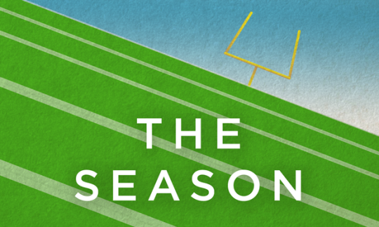
The man in this photo is Ilya Marritz. He is NOT a football player. He’s the host of WNYC’s podcast “The Season,” which ends its season this week. Ilya has been narrating, in serialized form, the story of the underdog Columbia football team.*

image

Also, Ilya is a great writer. What he does so well is describe things in surprising and specific ways. Here are just a few examples:

  • When Columbia almost wins its first game in 2 years and then blows it, “the soufflé collapses.”
  • When Ilya describes a post-game locker room, it smells of “Lycra marinated in sweat.”
  • When the team misses a field goal during a game in Ithaca, NY, “the ball flies off in the direction of Syracuse.”

In these examples, the descriptions aren’t predictable and, because of that, they’re especially evocative. “Lycra” (specific) and “marinated” (surprising) is much better than “uniforms” and “soaked.” 

Ilya’s writing is also restrained. If every sentence were peppered with this kind of description, it would be too heavy on the ears. So he’s sparing; every once in a while, Ilya drops in a gem. 

You can do that, too. In any story – long or short – you can offer what some people call “a grace note,” or “spark,” or a moment of “flair.” Just a word or phrase. In this post from the NPR Editorial Training website, it’s described as dropping “gold coins along the path… every 60 seconds or so.”

                                                                                 – Alison

*(Disclaimer: Ilya is a friend of mine.)

Photo credits: Matt Collette (above, Ilya in the uniform); WNYC (below, podcast logo)

image

Do Visual Stories Make People Care?

Since we published Borderland in April of 2014, the NPR Visuals Team has been iterating on a style of storytelling we call “sequential visual stories.” They integrate photography, text, and sometimes audio, video or illustration into a slideshow-like format. My colleague Wes Lindamood already wrote more eloquently than I can about the design approach we took to evolving these stories, and you should absolutely read that.

In this blog post, I will use event tracking data from Google Analytics to evaluate the performance of certain features of our sequential visual storytelling, focusing on our ability to get users to start and finish our stories.

With a few aberrations, we have consistently tracked user engagement on these stories and, with over 2 million unique pageviews on our sequential visual storytelling, we can come to some conclusions about how users interact with this type of storytelling.

Why Do This?

At NPR Visuals, our mission is to make people care. In order to determine whether or not we are making people care, we need a better tool than the pageview.

You may have heard the Visuals Team recently received a Knight Prototype Grant to build a product we’re calling Carebot. We’re hoping the Carebot can help us determine whether people cared about our story automatically and quickly. Consider this exploration a very manual, very early, very facile version of what Carebot might do.

Clear Calls To Action Work

A consistent feature among our set of stories is a titlecard that presents a clear call to action, often asking users to “Go” or “Begin”, which advances the user to the next slide. Using Google Analytics, we were able to track clicks on these buttons. Of the 16 stories we tracked begin rates on, nine of them have begin rates of greater than 70%.

An example titlecard

For the stories where begin performance fell flat, we can point to a clear reason: “Put on your headphones” prompts or similar notices that audio will be a part of the experience. Of all users who saw a titlecard without an audio notice, 74.4% of them clicked to the next slide. If an audio notice was on the slide, only 59.8% of users faced with that titlecard moved forward. The lowest performing titlecard was on prompted users to “Listen” instead of “Begin.”

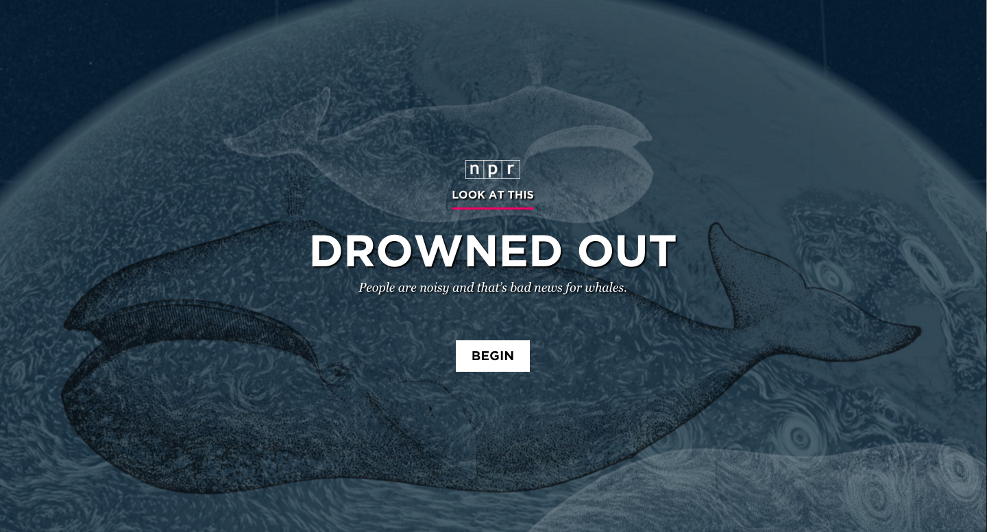
It is also worth nothing that we have tried audio notices at other places in our stories, and we see similar levels of dropoff. In Drowned Out and Arab Art Redefined, we placed the audio notice on a second slide. With Drowned Out, only 61.28% of users got past both slides, while with Arab Art Redefined, only 44.3% did. Though these are two examples with lower traffic than most stories, it seems clear that this is not a more effective way of getting users into the story.

Does this mean we should remove audio notices from titlecards? Or stop doing sequential visual stories that integrate audio altogether? Not necessarily. As we will see later, stories with audio in them perform better in other aspects that filter out the begin rate.

People Read — Or Watch! — Sequential Visual Stories

One of the most important metrics for determining the success of our stories is completion rate. Completion is defined as when a user reaches the last slide of content in a sequential visual story.

We can calculate the mean completion rate for our sequential visual stories by taking the overall completion rate of each story, adding them together, and dividing by the total number of stories. This places equal weight on each story rather than letting certain stories with outsized traffic numbers skew the results.

Across our sequential visual stories, this method shows a 35.4% completion rate on average.

Compare that to Chartbeat data about the average web page, where 55% of users spend less than 15 seconds on a page. Chartbeat never talked about completion rate, but if the average web page were to compete with our sequential visual stories, 85-90% of users who spend more than 15 seconds with a page would have to finish the page. That seems unlikely.

However, completion rates varied wildly across stories. In our first sequential visual story, Borderland, we only acheived a completion rate of 20%. It was also 130 slides long, nearly twice as many slides as any other sequential visual story we’ve done. Meanwhile, The Unthinkable, a heavy story about the “war on civilians” in Yemen, managed a completion rate of 57.6%, our highest ever. It clocked in at 35 slides.

Despite these two data points, there seems to be no correlation between number of slides and completion rate. For example, Plastic Rebirth, a relatively quick story about plastic surgery in Brazil, only had 33 slides and had completion rate of 33.2% (which is a number we were still pretty happy with).

A Better Completion Rate

However, as demonstrated by the wide variance in begin rate across stories, completion rate is highly influenced by the ability for the titlecard to entice people to continue into the story. So I created a new metric, what I call “engaged user completion rate,” to find which of our stories were doing the best at pulling an engaged user all the way through. Engaged user completion rate uses the number of users who began the story as the denominator instead of the number of unique pageviews.

Our average engaged user completion rate across stories was 50.9%. But the data gets more interesting when we start dividing by story subtypes — particulary the divide between stories that integrate audio and those that do not. In that divide, the average engaged user completion rate for stories with audio is 54.5%, compared to 48.5% without.

(Note that for all of these calculations, I considered “beginning” the story getting after the audio notice on the second slide in the case of Drowned Out and Arab Art Redefined.)

So what’s the answer? I think the jury is still out on whether integrating audio into our sequential visual stories makes them perform better or worse because our sample size is still quite small, but early indicators point towards them being better for users that choose to engage. However, A Photo I Love: Reid Wiseman is our highest performing story overall with regards to engaged user completion rate, so we have evidence that at its best, combining audio and visuals can make a compelling, engaging story.

So, Did We Make People Care?

Maybe? It’s clear that we are achieving high completion rates even on our lowest performing stories. Consider that Borderland, our lowest performing story with a completion rate of 20.1% and engaged user completion rate of 31.6%, was over 2,500 words long.

Of course, in order to determine how successful we were, we often track other metrics such as shares per pageview, as well as qualitative measures like sampling Facebook comments and Twitter replies.

Ultimately, making people care is about the quality of the story itself, not about the format in which we tell it. But I think that, with stories where text plays a large role, we are capable of making people read stories longer than they normally would because of how sequential visual storytelling allows us to pace the story.

Of course, this is not an argument for telling all stories in the sequential visual story format. Sequential visual stories work when the visuals are strong enough for the treatment. Not all of our stories have worked. But when they do, we can tell important stories in a way that pulls people through to the end.

To truly evaluate the success of our sequential visual stories, it would help to see data from other organizations who have tried this type of storytelling. If you have insights to share, please share them with me in the comments, on Twitter or through email at tfisher@npr.org. Or, even better, write a blog post!

We’re hiring a developer!

The NPR Visuals team

Love to code?

Want to use your skills to make the world a better place?

We’re a crew of visual journalists (developers, designers, photojournalists…lots of things) in the newsroom at NPR headquarters in sunny Washington, DC. We make charts and maps, we make and edit pictures and video, we help reporters with data, and we create all sorts of web-native visual stories and weird data-driven websites.

(And yeah, sometimes it’s strange to be a visuals team at a radio organization. But there’s this special thing about audio. It’s intimate, it’s personal. Well, visual storytelling is really similar. It’s power is innate. Humans invented writing — visual and audio storytelling are built in, deep in our primordial lizard brains. So, anyway, yeah, we fit right in.)

Pictures and graphics are little empathy machines. And that’s our mission. To create empathy. To make people care.

It’s important work, and great fun.

And we’d love it if you’d join us.

We believe strongly that…

You must have…

  • Experience making things for the web (We’ve got ways we like to do things, but we love to meet folks with new ideas and talents!)
  • Attention to detail and love for making things
  • A genuine and friendly disposition

(What “developer” exactly means for this position is pretty flexible. You might do lots of front-end stuff like graphics, or data crunching, or other stuff. We’d love to hear from people with many different skills and interests!)

Bonus points for…

  • Deep knowledge of Javascript and programming performant web software
  • Proven experience and a passion for running open-source projects
  • A background in data journalism and/or news graphics

Allow me to persuade you

The newsroom is a crucible. We work on tight schedules with hard deadlines. That may sound stressful, but check this out: With every project we learn from our mistakes and refine our methods. It’s a fast-moving, volatile environment that drives you to be better at what you do, every day. It’s awesome. Job perks include…

  • Live music at the Tiny Desk
  • All the tote bags you can eat
  • A sense of purpose

Know somebody who’d love this job?

Maybe it’s you?

Email bboyer@npr.org! Thanks!

Introducing training.npr.org

image

Today we’re very excited to unveil a new site – training.npr.org.

We created it for the many journalists working in public media. Sometimes it can feel impossible to find the time and space to hone your storytelling techniques, learn something new or experiment with new tools. We hope the site will help jumpstart all of that for you. It features guides and best practices in four categories: audio, digital, social media and visual.

Check it out and let us know what you think. We’re just getting started!

                                                                  —Serri

Do you even Snapchat, bro?

image

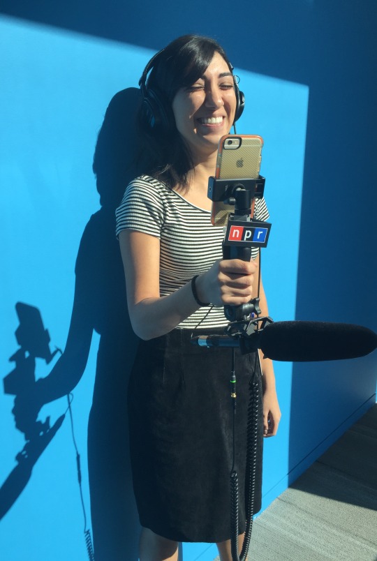
NPR’s social media intern Vesta Partovi has taken our Snapchat/Periscope game to a new level with this custom iPhone rig (dubbed “Wombat”). She put it together with the help of two NPR engineers and photographer John Poole

She writes: 

The idea for a Snapchat rig came about after a conversation John and I had last week. We were talking about Snapchat and it’s emergence as a platform for short-form filmmaking. When new technology for storytelling kicks off, creators get excited. We already have the skills, we just need the right tools to optimize them! As NPR folk, we knew that having bad audio was out of the question. As filmmakers, we knew that using steady camera-microphone rigs was a way of life. Being John, he had already invented something similar with Ben for use on a Periscope experiment. Right then and there, Wombat was born.

The rig itself is a shotgun microphone with pistol grip, this $6 cellphone tripod mount, a XLR-to-iPhone adapter (like this), a few screws and a clamp. Now she’ll be able to capture much smoother video and better sound at the same time. You can see the results in action on Snapchat — follow “nprnews”

The lesson: A lo-fi platform like Snapchat doesn’t have to mean low-tech. A few small adjustments can really make your work shine.

                                                                    —Serri

The Pympocalypse

Everything was going so well. We finally had a solution for embedding responsive charts inside our CMS. We called it pym.js. We had built a framework around it, the dailygraphics rig, and when that worked for us we shared it with the world. It even worked for member stations.

Then there came unexpected implication was something was very wrong. It first manifested in a ticket numbered 97. We took it as nothing important at first. But soon that number was appearing everywhere. Every day. In every inbox. It’s the user, we said. But the evidence of a real problem was looming larger and larger. Something was very wrong with pym.

At first we thought it was a just member station issue; a singular problem brought on by their implementation of PJAX. They wanted the audio to work on every page — and across pages! What were they thinking? They had broken our elegant solution by creating pages that never refresh!

What I didn’t know then is that we had not yet begun to suffer. Just when it had started to hurt, I received an unexpected email from an engineer on the NPR.org CMS team. They were going to PJAX our site too! Bow down to persistence! he said. No browser upon these lands shall ever be refreshed! (Or something to that effect.)

It was a dark day in August. The closer we looked, the more problems we found. jQuery wasn’t on the page anymore. Our script tags didn’t work right. Nothing worked when you changed pages. Event handlers stayed bound to their pages like ghosts. We looked to our source code — so simple! How could it all have gone so wrong?

<div id="responsive-embed-homeless-vets-budget">
</div>
<script src="http://apps.npr.org/dailygraphics/graphics/homeless-vets-budget/js/lib/pym.js" type="text/javascript"></script>
<script type="text/javascript">
$(function() {
    var pymParent = new pym.Parent(
        'responsive-embed-homeless-vets-budget',
        'http://apps.npr.org/dailygraphics/graphics/homeless-vets-budget/child.html',
        {}
    );
});
</script>

The dark times began. We plucked at our keyboards morning to night. Dark shapes coalesced and spoke, offering shadowy pacts from godforsaken corners of the abyss. You can get that event handler back, said one. You only have to override window.addEventListener. No harm in it. And so I did. I wrote a wrapper around the default event binding so I could capture anonymous callbacks bound in our own library.

Our assets were independent of the require.js context that was being used to load the core site assets, so we had had to write our own require.js context onto the page and asynchronously load our Javascript libraries into that context. And, for those that depended on jQuery, we had to load that first.

The problems compounded. We had several versions of pym in use on the site. Each had its own specific edge-cases we had to support. All of our solutions also had to work with both the old version of the CMS and the new version, so that we could rollover gracefully.

BEHOLD! This is the horrible contraption we have created!

<div id="responsive-embed-homeless-vets-budget"></div>
<script type="text/javascript">
    // Require.js is on the page (new Seamus)
    if (typeof requirejs !== 'undefined') {
        // Create a local require.js namespace
        var require_homeless_vets_budget = requirejs.config({
            context: 'homeless-vets-budget',
            paths: {
                'pym': 'http://apps.npr.org/dailygraphics/graphics/homeless-vets-budget/js/lib/pym'
            },
            shim: {
                'pym': { exports: 'pym' }
            }
        });

        // Load pym into locale namespace
        require_homeless_vets_budget(['require', 'pym'], function (require, Pym) {
            var messageHandler = null;
            var resizeHandler = null;

            // Cache window event binding method
            window.realAddEventListener = window.addEventListener;

            // Monkey patch window event binding method
            window.addEventListener = function(type, listener, capture) {
                // Fire default behavior
                this.realAddEventListener(type, listener, capture);

                // Catch events that pym binds anonymously
                // In pym 0.4.2 these were given explicit names, but
                // this solution works for all versions.
                if (type == 'resize') {
                    resizeHandler = listener;
                } else if (type == 'message') {
                    messageHandler = listener;
                }
            };

            // Create pym parent
            var pymParent = new Pym.Parent(
                'responsive-embed-homeless-vets-budget',
                'http://apps.npr.org/dailygraphics/graphics/homeless-vets-budget/child.html',
                {}
            );

            // Reattach original window event binding method
            window.addEventListener = window.realAddEventListener;

            // Unbind events when the page changes
            document.addEventListener('npr:pageUnload', function(e) {
                // Unbind *this* event once its run once
                e.target.removeEventListener(e.type, arguments.callee);

                window.removeEventListener('message', messageHandler);
                window.removeEventListener('resize', resizeHandler);

                // Explicitly unload pym library
                require_homeless_vets_budget.undef('pym');
                require_homeless_vets_budget = null;
            });
        });
    // Require.js is not on the page, but jQuery is (old Seamus)
    } else if (typeof $ !== 'undefined' && typeof $.getScript === 'function') {
        // Load pym
        $.getScript('http://apps.npr.org/dailygraphics/graphics/homeless-vets-budget/js/lib/pym.js').done(function () {
            // Wait for page load
            $(function () {
                // Create pym parent
                var pymParent = new pym.Parent(
                    'responsive-embed-homeless-vets-budget',
                    'http://apps.npr.org/dailygraphics/graphics/homeless-vets-budget/child.html',
                    {}
                );
            });
        });
    // Neither require.js nor jQuery are on the page
    } else {
        console.error('Could not load homeless-vets-budget! Neither require.js nor jQuery are on the page.');
    }
</script>

I don’t even know what to say about this except that it works. It successfully handles every edge case in every browser for modern versions of pym. There is an entirely different script for older versions of pym. There are also very old graphics that never used pym. Those have to be individually retrofitted.

And then there is the member stations CMS, where the problem was first identified.

We still haven’t fixed that. (But we’re working on it.)

Happy Halloween.

TL;DR: If you PJAX a big website everything you assumed about how the internet works is going to break. In particular, it broke all our responsive embeds. We spent eight weeks figuring out how to fix it and our embed codes went from being 13 lines to being 79.

Many thanks to our friends at the member stations and on the CMS team at NPR for their aid and understanding during our dark times.

Audio people! Don’t forget to tell stories about soundSometimes,…


Audio people! Don’t forget to tell stories about sound

Sometimes, it’s helpful to offer reminders of the obvious: Radio/audio is a really good medium for stories about sound.

This segment from All Things Considered last week, especially its intro*, is a perfect example. It’s a mini-audio history of the typing sound you hear in action movies and TV shows… you know, when the letters robotically appear across the screen, as if the hand of God was typing:

Washington, DC. 08:00. Somewhere near the Lincoln Memorial.

Take a listen (audio above). In the same way that a Daily Show montage of newscasters saying the same dumb thing reveals a political pattern, this intro – because of the proximity of so many related sounds – reveals a pop-cultural pattern. (And it’s delightfully written.) 

Here are some other ideas for stories about sound:

One final pro-tip: Get the people you interview to make sounds that illustrate your story. (e.g. The sounds of the Port of Seattle, humorously evoked by Chana Joffe-Walt)

                                                                                   –Alison

*Huge credit to ATC producer Connor Donevan, who wrote the intro to the ATC segment and produced it.

Parsing complex social study data

NPR’s #15girls project looks at the lives of 15 year old girls around the world. The reporting team was interested in using data from the World Values Survey (WVS) to help inform the reporting and produce a “by-the-numbers” piece.

Analyzing the World Values Survey data represents a fairly typical problem in data journalism: crunching numbers from social science surveys. Social science surveys have some typical features:

  • The data is in proprietary/non-standard formats like those used by Stata or SPSS. The WVS, happily, distributes comma separated value (CSV) files as well as SPSS and Stata files.
  • The data has hundreds of columns per respondent that correspond to responses to each question. The WVS has 431 columns and over 86,000 rows.
  • The possible responses are coded in a separate file, known as the codebook, which match a numerical or text code with the response value.
  • Possible responses to any question range from free-form (“what is your name?”, “what is your age?”) to structured (“agree”, “disagree”, “neither”).

In other words, they’re kind of a pain to work with. In analyzing this data, I learned some tricks that might ease the pain.

As always, the code used in the analysis is available on Github.

Parsing and analysis requirements

To crunch such numbers, we need a process that accounts for the issues inherent in importing and parsing data with these qualities. Our end goal is to get all this stuff into a Postgres database where we can analyze it. Here’s what we need to do that:

  • Implicit column creation: Typing in a schema for hundreds of columns is no fun and error-prone. We need some way to automatically create the columns.
  • Fast import: Importing tens of thousands of rows with hundreds of columns each can get pretty slow. We need efficient import.
  • Generic analysis: We need a way to match responses for any given question with the possible responses from the codebook, whether it is a free-form response, Likert scale, a coded value, or something else.

Importing the World Values Survey response data

We use a three-step process to get implicit column creation and fast import.

Dataset, a Python database wrapper, auto-magically creates database fields as data is added to a table. That handles the schema creation. But because of all the magic under the hood, Dataset is very inefficient at inserting large datasets. The WVS data – with over 86,000 rows with 431 columns each – took many hours to import.

The Postgres COPY [table] FROM [file] command is very efficient at importing data from a CSV, but notoriously finkicky about data formatting. Instead of hours, COPY runs in seconds, but your data needs to be perfectly formatted for the table you’re importing into.

The good news is that the WVS provides CSV data files. If they didn’t provide CSV, we’d use a tool like R to convert from Stata or SPSS to CSV. The bad news is that the WVS data files use inconsistent quoting and contain a few other oddities that causes the Postgres COPY routine to choke.

To get the advantages of both tools, we took a hybrid approach. It’s a bit ugly, but it does the job nicely. Our import process looks like this:

  • Open the dirty source CSV with Python
  • Read the file line-by-line:
    • On the first data row:
      • Create a single database row in the responses table with Dataset which creates all the columns in one go.
      • Delete the row from the responses table in the database.
    • Write each cleaned line to a new CSV file, quoting all values.
  • Use the Postgres COPY command to import the data.

Importing the World Values Survey codebook

The codebook format is fairly typical. There are columns for the question ID, details about the question, and a carriage-return separated list of possible responses. Here’s a simplified view of a typical row:

ID Label Categories
V48 Having a job is the best way for a woman to be an independent person. 1##Agree
2##Neither
3##Disagree
-5##BH,SG:Missing; DE,SE:Inapplicable; RU:Inappropriate response{Inappropriate}
-4##Not asked
-3##Not applicable
-2##No answer
-1##Don´t know
V241 Year of birth 1900#1909#1900-1909
1910#1919#1910-1919
1920#1929#1920-1929
1930#1939#1930-1939
1940#1949#1940-1949
1950#1959#1950-1959
1960#1969#1960-1969
1970#1979#1970-1979
1980#1989#1980-1989
1990#1999#1990-1999
2000#2010#2000-2010
-5##Missing; Unknown; SG: Refused{Missing}
-4##Not asked in survey
-3##Not applicable
-2##No answer
-1##Don´t know

Note that the potential responses have a complex encoding scheme of their own. Carriage returns separate the responses. Within a line, # characters split the response into a response code, optional middle value (as seen above for the year of birth question), and verbose value. We’re still not sure what the middle value is for, but we learned the hard way we have to account for it.

Our codebook parser writes to two tables. One table holds metadata about the question, the other contains the possible response values. The conceptual operation looks like this:

  • For each row in the codebook:
    • Write question id, label, and description to questions table.
    • Split the possible responses on carriage returns.
    • For each row in possible responses:
      • Split response on # character to decompose into response code, middle value (which we throw out) and the real value (the verbose name of the response).
      • Write the code, real value, and associated question id to response table.

Analyzing the data

Now we have three tables – survey responses, codebook questions, and potential responses to each question. It’s not fully normalized, but it’s normalized enough to run some analysis.

What we need to do is write some code that can dynamically generate a query that gets all the responses to a given question. Once we have that, we can summarize and analyze the numbers as needed with Python code.

The helper query dynamically generates a query against the correct column and joins the correct survey responses using subqueries:

result = db.query("""
  select
    countries.value as country, c.value as response
  from
    survey_responses r
  join
    (select * from categories where question_id='{0}') c 
    on r.{0}=c.code
  join
    (select * from categories where question_id='v2a') countries
    on r.v2a=countries.code
  order by
    country
  ;
  """.format(question_id))

The results look like:

Country Response
Brazil Agree
Brazil Agree
Brazil Neither
Brazil Disagree

We could have expanded on the SQL above to summarize this data further, but using a little basic Python (or a slick analysis tool like Agate) has some advantages.

Specifically, because of our database structure, caculating percentages for arbitrary response values in pure SQL would have led to a rather ugly query (we tried). Post-processing was going to be necessary in all events. And the relatively simple format let us use the query results for more advanced analysis, specifically to add “agree/strongly agree” and favorable Likert scale responses into a composite values for reporting purposes.

Here’s a snippet from our processing code that adds up the counts for each response (initialize_counts is a helper function to create a dict with zeroed out values for all possible responses; you could also use Python’s DefaultDict):

counts = OrderedDict()
for row in result:
    if not row['country'] in counts.keys():
        counts[row['country']] = initialize_counts(question_id)

    counts[row["country"]][row["response"]] += 1

If you were to present the counts dict as a table, the processed data looks like this:

Country Agree Neither Disagree
United States 1,043 683 482

A query that returns partially processed data turned out to be the best option for the full range of analysis we wanted to do.

Half-way solutions for the win

None of these techniques would be considered a best practice from a data management standpoint. Each step represents a partial solution to a tough problem. Taken together, they provide a nice middle ground between needing to write a lot of code and schemas and complex queries to do things the Right Way and not being able to do anything at all. The process might be a little ugly but it’s fast and repeatable. That counts for a lot in a newsroom.

How to be an intern at NPR Visuals (Apply now for Winter/Spring 2016!)

We’re currently looking for interns for spring 2016!

We want to see your best work.

Here’s how.

Cover letters

All candidates must submit a cover letter. Your cover letter should be a statement of purpose. We’re interested in what you’re passionate about and why you’re passionate about it. (Most cover letters tell us that you are hardworking, passionate and talented, etc. And that you love NPR. We don’t need you to tell us that.)

  • Tell us what you care about and work on.
  • Tell us why you are passionate about your work.
  • Tell us why this opportunity will help you reach your potential.
  • Tell us how you will contribute to our team.

Other expectations

  • Photo internship candidates must have a portfolio.
  • Programming/design candidates with either projects on Github or a personal site are strongly preferred.

Selection process

After you submit a resume and cover letter, our selection committee will read through all the applications. We’ll reduce the list to approximately 8-10 candidates by eliminating applications that don’t have a cover letter and resume or who clearly aren’t a good fit for the team.

If you’re one of these candidates, two or three folks from the Visuals team will conduct a 30 minute Skype interview with you. You’ll get an email before your interview with outline of the questions you’ll be asked in the interview and also given the opportunity to ask any questions beforehand. The questions may vary a bit from interview to interview based on your professional experience, but we will be as consistent as possible.

Then we’ll call references and conduct some follow-up via email, possibly asking one or two more substantial, interview-style questions. Email communication is crucial in our workplace, and gives us an opportunity to see how you communicate in writing. We expect that answers are prompt, succinct, and clear.

We’ll follow up with all of our finalists with some constructive criticism about their application and interview.

Who we are

We’re a small group of photographers, videographers, photo editors, developers and designers in the NPR newsroom who make visual journalism. (Yeah, NPR is a radio thing, and yeah, it’s weird sometimes.) Check out our latest stuff!

Why we’re doing this

Everyone on the Visuals team wants to open our field to the best people out there, but the process doesn’t always work that way. So we’re trying to make the job application process more accessible.

Applicants with strong cover letters and good interview skills naturally tend to do well in this process. Often, those skills are a result of coaching and support — something that not all students are privileged to have. To help candidates without those resources, we’re being more transparent about our process and expectations.

We’re certain that we’re missing out on candidates with great talent and potential who don’t have that kind of support in their lives. We think knowing our cover letter expectations and interview questions ahead of time will help level the playing field, keep our personal bias out of the interview process, and allow better comparisons between candidates.

Apply!

Photo editing

Our photo editing intern will work with our digital news team to edit photos for npr.org. It’ll be awesome. There will also be opportunities to research and pitch original work.

Please…

  • Love to write, edit and research
  • Be awesome at making pictures

Are you awesome? Apply now!

Design and code

This intern will work as a designer and/or developer on graphics and projects for npr.org. It’ll be awesome.

Please…

  • Our work is for the web, so be a web maker!
  • We’d especially love to hear from folks who love illustration, news graphics and information design.

Are you awesome? Apply now!

What will I be paid? What are the dates?

The deadline for applications is November 1, 2015.

Check out our careers site for much more info.

Thx!

Why so many people clicked play on this story’s audio from a congressional hearing

image

When people visit NPR.org stories that include audio, few typically click “play” – only about 13 percent. 

But this piece by NPR’s Eyder Peralta? It got hundreds of thousands of views and about 62 percent of them resulted in a “play.”  

Why? Because the audio was thoughtfully cut and packaged for a digital audience. Take a look for yourself:

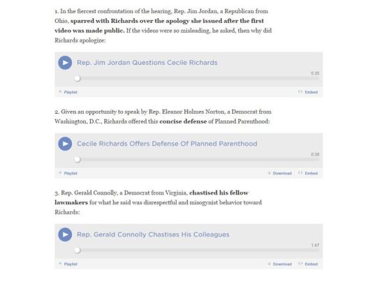
image

Let’s break this down:

The headline: It’s clear and easy to understand. And the content delivers exactly what the headline promises – a story told through sound snippets.

Some text, but not too much: Eyder begins the piece with a few paragraphs for context without burying the audio, which, again, is the experience people are promised.

The packaging: Eyder doesn’t overthink it. He lists each clip with a brief description so you know what you are getting before you click play. That makes it easy to scan from clip to clip (and our analytics show that’s exactly what people are doing).

This is not the first NPR story to take this form. It’s often used by the Two-Way blog for congressional hearings and complicated issues, such as this one.

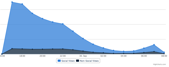
The chart at the top of this post is from our internal analytics dashboard. It shows the surge of people who visited the Planned Parenthood story, which became the most popular item on NPR.org.

                                                                           –Eric

How to make scenes that breathe and move and WORK

Thanks to an invitation from Storybench.org to write about NPR stories that “breathe life into a neighborhood scene,” I’ve been thinking about what distinguishes audio scenes that are, well … meh … from those that really sing.

I came up with six examples of scenes you can learn something from (though there are many, many more). Check it out HERE.

Here are some “CliffsNotes” of ways to create immersive scenes:

1. Awesome writing (like at the beginning of this piece by Robert Siegel from Cuba).

image

2. Stereo sound recorded and mixed by a pro (fast forward to about 9:45 in Part 1 here)

3. A clearly plotted pathway through the scene (I love how KCUR’s Frank Morris walked through the 7 mile-long line of tornado destruction in Joplin, MO)

4. A surprise that challenges listeners’ expectations (In this story from Turkey, Ari Shapiro highlights unexpected things about the place and people)

5. Movement! (Steve Inskeep takes you along a Louisiana street)

6. Audio of people interacting (Kelly McEvers brings LA’s Skid Row to life by letting us hear the regulars talk)

                                                                – Alison

Photo credit: NPR/John Poole

Public radio people told a story exclusively on Snapchat…


Public radio people told a story exclusively on Snapchat … and lived to tell the tale!

A couple of weeks ago, Alison MacAdam and I spent a day showing a new employee how a story comes together at NPR, from start to finish. It’s an extensive process that not many people — even those who work at NPR — get to see in its entirety, so we wanted to find a way to share the experience with our audience (who love getting glimpses at faces-for-radio). 

Enter Snapchat.

The app felt like a natural fit for the story we wanted to tell because it has a peek-behind-the-scenes feel. (You can watch the final product above.)

I wrote about how we did it in the NPR Social Media Desk Tumblr, but let me add something here about using Snapchat for storytelling. 

Our experiment worked for a couple of reasons: 

1. It presents everything in chronological order. Classic story structure.

2. It’s easy to add more context with captions and drawings. 

3. It’s not that intrusive to the people you’re photographing or recording (videos have a maximum length of 10 seconds). 

4. It’s okay if it doesn’t look totally polished – that’s part of the charm.

8,800 people ended up watching the story in the 24 hours it was available. Dozens of them sent positive feedback right back to us via Snapchat. It was a reminder that you shouldn’t be afraid to make a story explicitly for a social platform. If it only lives in one place and doesn’t directly connect back to your site, that’s okay! 

                                                                                   —Serri

PS — Before you start, consider which platforms make the most sense for what you’re trying to accomplish. I don’t think this would have worked as well on Twitter or Facebook, for example, because you don’t naturally check back in with the same story throughout the day. 

When should you reveal the big magical number?

When you have a story that’s centered around a huge and surprising number, when do you reveal it?

This piece by NPR’s Nell Greenfieldboyce illustrates how the answer could be different for audio and digital.  It’s about researchers who discovered how many trees there are on the planet (the answer is 3 trillion).

In the radio version, Nell took listeners on the researchers’ quest to find the answer and didn’t drop the big figure until the story called for it – at the 1:30 mark of a three and a half-minute piece. 

CROWTHER: We all gathered in a room. It was a very exciting time. We’d been working towards it for two years.

GREENFIELDBOYCE: And…

CROWTHER: The total number of trees is close to about 3.04 trillion.

GREENFIELDBOYCE: Three trillion - that’s, like, eight times more than the previous estimate. If you were to plant a tree every second…

CROWTHER: It would take you somewhere in the order of 96,000 years to plant that 3 trillion trees. So it’s a huge astronomical number that I don’t think I could comprehend before this study.

If Nell revealed the number at the beginning, it would have spoiled the story.

But Internet readers of a text piece don’t want to wait. They want the answer immediately. And Nell’s write-up delivered it 27 words into the story.

image

                                                       –Eric

Building a neighborhood scene

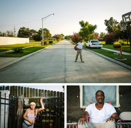
On Friday, August 28, two stories on Morning Edition achieved the same thing: They painted effective scenes of single, emblematic streets. 

The first street is in LA - in this diminutive piece by NPR’s Nathan Rott about Californians limiting their water use. With a small amount of ambient sound, audio of people talking about their lawns, and a few directional details (”on the corner,” “a couple houses down,” “across the street”), Nate began his piece with a 360-degree view of the street.

It could have been… fine… to hear just one resident, but with three Nate sketched a more comprehensive visual image of the street. He also served his story better since he was elucidating statewide statistics, not just individual experiences. 

image

The second example is longer and more immersive. The entire frame of Steve Inskeep’s post-Katrina feature from Arabi, Louisiana, is a street scene: Schnell Drive, which was inundated after the hurricane (see photos above). Listen to the ways Steve (with producer Rachel Ward) sketched a human streetscape – not with predictable, static sounds (lawn mowers, cars passing) – but by capturing their interactions with residents - knocking on doors, introducing themselves, entering homes, engaging people spontaneously on the street.

There are a million ways to build a scene with sound. These are just two - unintentionally related! – ways to do it. The lesson here: If you want to bring a street or neighborhood to life, don’t describe its parts in isolation. Demonstrate how they are connected.

                                                                – Alison   

Credit: Photos of Schnell Drive and its residents by Edmund D. Fountain (Check out some of his other photos from the Gulf states here.)

How doodling can improve your audio story

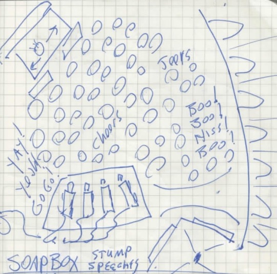
Here’s a handy trick from NPR’s Don Gonyea, who has endured more campaign airplanes, Iowa State Fairs, and overstuffed spin rooms than almost anyone. Don is nearly always on a tight deadline, and it turns out he sketches pictures like the doodle below - to help him tell vivid stories quickly.

image

Don explained the doodle above – of an event at the Iowa State Fair - as a way of remembering the layout. It’s an act of reinforcement: The protesters stood where you see “Boo!” and “Hiss!” The supporters? Look for “Yay!” and “Go Go!” The stage was quite small (top left corner). There were hay bales (those rectangles by the stage). And so on… 

He even uses graph paper – in part because it helps keep things to scale.

Why not just take a photo?

Don says, “You can draw from any perspective.” For example, the aerial view. No photo will get you that, unless you catch a ride on Trump helicopter.

And why not rattle off these visual details into your microphone?

It would get lost on the tape. Don doesn’t have the luxury of rolling back through all of his audio to find those moments. He’s sprinting too fast for this afternoon’s All Things Considered or tomorrow’s Morning Edition.

Ultimately, Don uses his doodles to recall those one or two telling visual details he can write into his story. And those details make the difference between mediocre exposition and a story that takes the listener somewhere.

                                                                          – Alison

When you can’t get a story out of your head, write an explainer

image

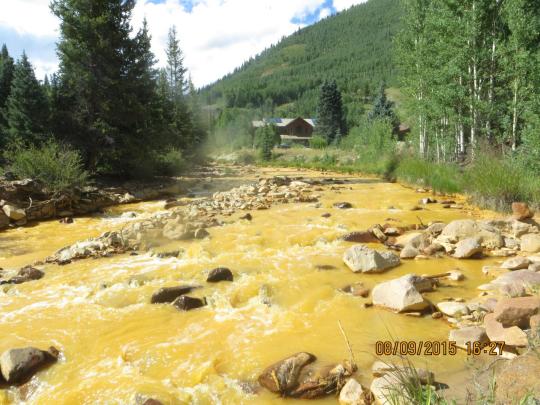
You’ve probably seen the photos: shockingly orange water cascading through Colorado’s Animas River, the contamination the result of an accident by the Environmental Protection Agency at a nearby mine. 

KUNC reporter Stephanie Paige Ogburn has been covering the story on air, but I was particularly struck by one of her web posts about it (which she published before most national media started paying attention). It’s a great case study in the efficient explainer. 

The headline sets the right tone from the start: Why Was The Environmental Protection Agency Messing With A Mine Above Silverton? In the post, she deftly describes the history of mining in Colorado, how and why the EPA was involved in this particular site and the basic mechanics of how mining creates the bad orange water:

That water, when it runs through the rocks in a mine, hits a mineral called pyrite, or iron sulfide. It reacts with air and pyrite to form sulfuric acid and dissolved iron. That acid then continues through the mine, dissolving other heavy metals, like copper and lead. Eventually, you end up with water that’s got high levels of a lot of undesirable materials in it.

Ogburn says she wrote the post from home (bed, actually), the night after the accident.

“My husband was like, what are you doing, but I couldn’t stop thinking about that story and kept digging around when I got home,” she says. 

Her post was just what I wanted in the early days of the story. It works because it feels clearly distilled; it provides a remarkable amount of context on a complicated topic, without getting caught up in too many of the details. 

Photo credit: EPA

                                                                             —Serri

How to tell a powerful story… in real timeAugust 14 is…


How to tell a powerful story… in real time

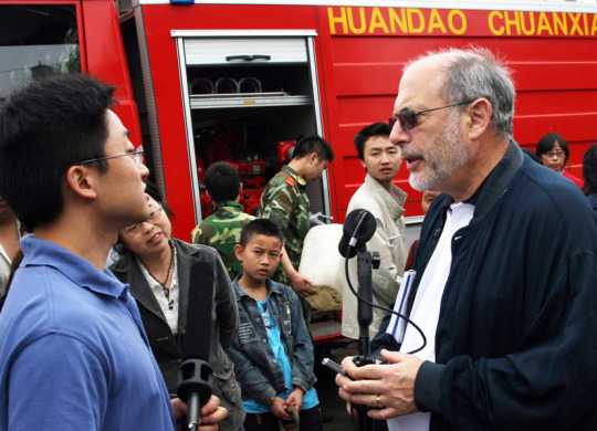
August 14 is Melissa Block’s last day as host of All Things Considered. After 12 years “in the chair,” she leaves behind thousands of memorable moments. But none are more powerful than her stories from Sichuan Province, China, in the days after the 2008 earthquake hit. 

In honor of Melissa, I thought I’d share the audio excerpt above – because of the presence she brings to this story. In the midst of the tragedy and chaos you can hear above, Melissa just talked into the microphone, describing everything she saw. 

Here’s what’s happening: Melissa is watching a couple desperately search the rubble for their toddler son and parents, with the help of a huge, rumbling excavator. She is witnessing one family’s tragedy, nobody speaks English, and it’s not the time or place to stand around doing traditional interviews with an interpreter. So Melissa narrated the whole thing in real time. It’s raw. Heartbreaking. 

If you want to hear a master class in how to tell a disaster story – and to be reminded that journalists are human, and that’s OK! – there is no better lesson than this story.

image

And here’s one more reason Melissa is a class act. She took every chance she got to thank the people who helped her tell this story – interpreter Philip He (above) and producer extraordinaire, Andrea Hsu.

                                                                               – Alison

Photos by Andrea Hsu/NPR

It’s time for you to discover your mission.

I didn’t always have a mission. For the first seven years of my career, I worked in the software industry. The work was interesting, and I had a craft, for sure, but not a mission. All that changed when I quit my job to become a journalist.

Our mission at NPR Visuals is to make people care. Everything we do: The things we make, our design process, and how we measure success, all flow from that mission. It’s awesome.

We’re here to create empathy. To introduce you to somebody you’ve never met, and think for a few minutes about life in their shoes. We’re here to open your eyes and make you give a shit.

Are you ready for a change?

The Knight-Mozilla fellowship is an awesome opportunity — for you and for us. It’s a chance for you to change your life, to try out working in a newsroom. You’ll learn a ton, and we’ll learn from you.

We’re open to folks from all walks of life, but if you’re a filmmaker, graphic designer, or involved in the digital humanities, we’d especially love to hear from you. No sweat if you can’t code or haven’t reported a story before — we’ll teach you.

(As for the specific work you’ll be doing… it’s hard to say! That’s one of the joys of working in a newsroom. We work on short schedules, and news deadlines. But I can say that you’ll work with us to report and tell important, impactful, visual stories, online.)

Want to join our mission? APPLY NOW!

Listen to the work of your colleagues

From Sara Sarasohn, longtime NPR editor and producer, now editorial leader of NPR One:

“When I stopped being a producer, I did a back-of-the-envelope calculation and figured that I had mixed more than a thousand reporter pieces. That is what taught me to be an editor. I actively engaged with such a volume of the work of my colleagues - good and bad - that I developed a lot of ideas about what worked and what didn’t. 

When I became an editor, I realized that I was mostly just engaging with my own work. I had lost the valuable teaching I got from engaging in - not just listening casually to - others’ work. So I developed a practice of sitting down once a day with my hands folded in my lap and just listening, very carefully, to a piece I had nothing to do with. It gave me new insight into techniques and pitfalls I would never have if I just did my work as an editor. It only took five minutes a day. You don’t have to do that exactly, but you should develop some mechanism for learning from the work of others.”

Illustration by Alison MacAdam

Tell a small story in order to tell a large one*

Compliments to Rachel Martin, Jordana Hochman and Connor Donevan at Weekend Edition for this great story last Sunday. They produced an 11-minute piece about two sisters who were stranded in the New Orleans Superdome with thousands of other people after Hurricane Katrina.

Weekend Edition could have tried to tell the story of the Superdome by talking to LOTS of people. Some might consider that a more “accurate” reflection of what happened in 2005. 

But by focusing tightly on just two sisters, Rachel and team immersed listeners in Talitha and Regina Halley’s memories. And that “small” story told the BIG story of the Superdome more effectively, I think. There is an emotional truth to it – the horror, the trauma, the transformation of lives – that is hard to depict without this kind of deep dive.

Here’s Regina Halley, now 33 years old:

I still don’t feel like I’m OK. Like, for us, tomorrow never came. We were supposed to go back to our house. My sister was able to push through. I don’t even know how she was able to cope with it as a child. Or maybe her coping was to move forward and not let it stop her. But in me and my mom’s case, it’s totally different. Still to this day, if it’s raining, my mom, she still packs a suitcase.

                                                                           – Alison

*Lots of people have conveyed this “tell a small story to tell a big one” tip, but I’ll add a shout-out to NPR’s Ari Shapiro, who said it to me. 

One secret to good visual storytelling

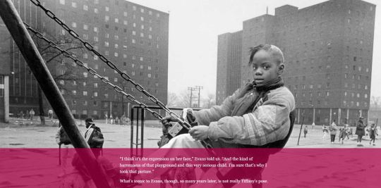
The NPR Visuals team has gotten raves for this story, produced by David Eads and Claire O’Neill in 2014. “Demolished,” about Chicago’s public housing projects, won the top award given out by the Society of News Designers.

So why is “Demolished” great? Here is just one (of many) reasons, using three (of many) images from the story:

image

“Demolished” begins by drawing your attention to one girl and one photo. Above, you see 10 year-old Tiffany Sanders. This 1993 photo became an iconic image, used in rap videos, posters, news reports, and more.

At this point, you may expect the story to zoom in further on Tiffany. But click “Next,” and there’s a twist, the first moment of surprise:

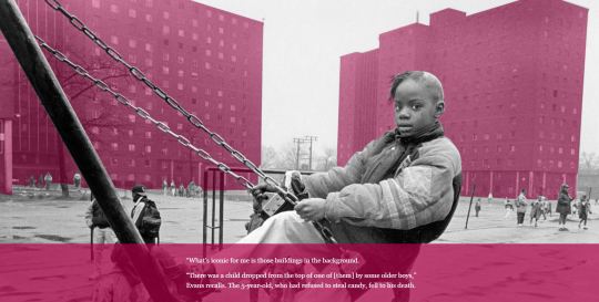
image

When the buildings suddenly turn bright pink, the story’s focus shifts. You were looking at Tiffany. Now, you’re forced to look at her environment, the backdrop to her life.

Then, click the “Next” arrow, and there’s one more twist:

image

This image tells you that Tiffany’s home was demolished soon after the photo was taken. And it completes the thematic movement from the human… to her environment… to policy.  

Claire O’Neill explains what works here as “one thought per gesture;” meaning, each time you click “Next” you’re presented with just one idea, not many. In this case:

SLIDE 1: Meet Tiffany.

SLIDE 2: This is her home.

SLIDE 3: Her home is gone.

Using this simple approach (and by “simple,” I don’t mean it was easy to make!), “Demolished” achieved what visual aspire to: A high “completion rate.” That means, despite the depressing topic and the complicated urban policies it explored, “Demolished” held onto its viewers until the end.

                                                                – Alison

Credit: The photos used in “Demolished” were taken by Patricia Evans.

Sense of place: Learning from “insiders” with outside perspective

image

Why would anyone want to trade the comforts of British Columbia for a partially-destroyed, periodically war-torn, 7 mile-long enclave squeezed between Israel and the sea? 

NPR’s Emily Harris (with editing by Larry Kaplow) recently told the story of a family that moved from Vancouver, Canada, back to their native Gaza. 

Emily often reports from Gaza – so she has lots of chances to describe the place through the eyes of its residents. And it’s common, when we seek to evoke a place “authentically,” to defer to residents with the deepest local experience. We prize longevity (so-and-so has lived in Gaza her whole life). 

But this piece stood out because the Al-Aloul family brings outside perspective. And that perspective made their descriptions of Gaza more striking. I got a more surprising picture of Gaza through their eyes. 

Like this, from the Al-Aloul’s 20 year-old daughter, Nour:

My parents, they give you all the freedom here. Like, I go out, I do whatever I want because you walk in the streets, you know that no one will do something bad for you.

I love the idea that Gaza feels safer than Canada. 

The lesson here could apply to reporting anywhere. Mining deep local knowledge is always important, but the eyes of a local with outside perspective - a comparative view - is just as important.

                                                                    – Alison

Photo credit: Emily Harris/NPR

No studio on the road? No problem

image

Every radio producer and reporter knows you have to get creative when tracking while traveling. Our engineer, Kevin Wait, says you should try to recreate the studio environment as much as possible — find the quietest area and use something soft above or around you to minimize the echo.

All Things Considered producer Monika Evstatieva (above) went for the old coat-over-the-head trick while working with Ari Shapiro on a recent reporting trip in Eastern Europe. And NPR correspondent Jeff Brady constructed the mobile studio below with couch cushions while he was in Charleston, S.C., covering the church shooting. There was a loud wedding in the same hotel so he retreated to the bathroom when it came time to track. “It was a pretty good studio!,” he says. 

image

                                                                                    —Serri

Image credits: Ari Shapiro (above) and Jeff Brady (below)

How to apply for an internship at NPR Visuals

We want to see your best work.

Here’s how.

(In case you missed it, applications are currently open for our fall internships.)

Cover letters

All candidates must submit a cover letter. Your cover letter should be a statement of purpose. We’re interested in what you’re passionate about and why you’re passionate about it. (Most cover letters tell us that you are hardworking, passionate and talented, etc. And that you love NPR. We don’t need you to tell us that.)

  • Tell us what you care about and work on.
  • Tell us why you are passionate about your work.
  • Tell us why this opportunity will help you reach your potential.
  • Tell us how you will contribute to our team.

Other expectations

  • Photo internships candidates must have a portfolio.
  • Programming/design candidates with either projects on Github or a personal site are strongly preferred.

Selection process

After you submit a resume and cover letter, our selection committee will read through all the applications. We’ll reduce the list to approximately 8-10 candidates by eliminating applications that don’t have a cover letter and resume or who clearly aren’t a good fit for the team.

If you’re one of these candidates, two or three folks from the Visuals team will conduct a 30 minute Skype interview with you. You’ll get an email before your interview with outline of the questions you’ll be asked in the interview and also given the opportunity to ask any questions beforehand. The questions may vary a bit from interview to interview based on your professional experience, but we will be as consistent as possible.

Then we’ll call references and conduct some follow-up via email, possibly asking one or two more substantial, interview-style questions. Email communication is crucial in our workplace, and gives us an opportunity to see how you communicate in writing. We expect that answers are prompt, succinct, and clear.

We’ll follow up with all of our finalists with some constructive criticism about their application and interview.

Why we’re doing this

Everyone on the Visuals team wants to open our field to the best people out there, but the process doesn’t always work that way. So we’re trying to make the job application process more accessible.

Applicants with strong cover letters and good interview skills naturally tend to do well in this process. Often, those skills are a result of coaching and support — something that not all students are privileged to have. To help candidates without those resources, we’re being more transparent about our process and expectations.

We’re certain that we’re missing out on candidates with great talent and potential who don’t have that kind of support in their lives. We think knowing our cover letter expectations and interview questions ahead of time will help level the playing field, keep our personal bias out of the interview process, and allow better comparisons between candidates.

Apply for this fall!

If you’re looking for a gig, please apply. If you know somebody who may be, please pass this along.

What’s new in our first release version of the dailygraphics rig?

Our dailygraphics rig has been around for more than a year and in that time we’ve used it to make hundreds of responsive rectangles of good internet, but we’ve never made it easy for others to use. The rig is heavily customized for our needs and includes our organization-specific styles and templates. Despite this, a handful of hardy news organizations have made efforts to adopt it. In order to better facilitate this, today we are releasing our first fixed “version” of the rig: 0.1.0.

This isn’t a traditional release. The rapid pace of development and the pace of our news cycle makes it impossible for us to manage normal open source releases. Instead, we will tag selected commits with version numbers, and maintain a detailed CHANGELOG of everything that happens between those commits. This way users who want to use and stay up to date with the rig will have a clear path to do so.

As part of this release we’ve folded in a number of changes that make dailygraphics better than ever.

Block histogram

This block histogram is a format we’ve used several times to display discrete “binned” data. It works especially well for states or countries. Aly has turned it into a new graphic template so we can spin them up quickly. Run fab add_block_histogram to make one now!

Negative numbers and smart label positioning

The bar_chart, column_chart, grouped_bar_chart, stacked_bar_chart and stacked_column_chart graphic templates have all been updated to gracefully support negative numbers.

These five templates are also now much smarter about positioning labels so they always fit within the confines of the chart or hiding them if there is no way to make them fit in the available space.

(Curious how we did this? Here is the relevant code for bar charts. And here it is for column charts.)

Custom Jinja filters

Lastly, we’ve added support for defining custom Jinja filter functions in graphic_config.py. This allows for, among other things, much more complex formatting of numbers in Jinja templates. For example, to print comma-formatted numbers you can add this filter function:

def comma_format(value):
    return locale.format('%d', float(value), grouping=True)

JINJA_FILTER_FUNCTIONS = [
    comma_format
]

And then use it in your template, like this:

{{ row.value|comma_format }}

Documention for this feature has been added to the README.

Please see the CHANGELOG for a more complete list of changes we’ve made. We hope this new release process allows more news organizations to experience the joy of using a code-driven process for making daily charts and graphics.

Work with us this fall!

Hey!

Are you a student?

Do you design? Develop? Love the web?

…or…

Do you make pictures? Want to learn to be a great photo editor?

If so, we’d very much like to hear from you. You’ll spend the fall working on the visuals team here at NPR’s headquarters in Washington, DC. We’re a small group of photographers, videographers, photo editors, developers and designers in the NPR newsroom who work on visual stuff for npr.org. Our work varies widely, check it out here.

Before you apply, please read our guide about what we expect in an internship application.

Photo editing

Our photo editing intern will work with our digital news team to edit photos for npr.org. It’ll be awesome. There will also be opportunities to research and pitch original work.

Please…

  • Love to write, edit and research
  • Be awesome at making pictures

Are you awesome? Apply now!

Design and code

This intern will work as a designer and/or developer on graphics and projects for npr.org. It’ll be awesome.

Please…

  • Our work is for the web, so be a web maker!
  • We’d especially love to hear from folks who love illustration, news graphics and information design.

Are you awesome? Apply now!

What will I be paid? What are the dates?

The deadline for applications is July 31, 2015.

Check out our careers site for much more info.

Thx!

PMDMC Did Little to Clarify the Future of Pledge Drives

There were two sessions on the future of public radio pledge drives at last week's Public Radio Development and Marketing Conference In Washington, DC.  The conference was organized by Greater Public, the industry's trade group for fundraising and marketing professionals.

Here's a summary of the main points from those two sessions.

1. It is getting harder to raise money during pledge drives.

2. Greater Public presented a formula for lowering pledge drive goals to counter the impact of sustaining (monthly) givers and $1,000+ donors on drive results.  The example shown at the conference suggested goals should be lowered by as much as 25%.  The exact percentage will vary by station. The more successful a station is with Sustaining Givers, the lower the goal will be.

3.  Greater Public's Fundraising benchmarks show that up to 90% of stations still had room to increase annual listener income through pledge drives.

Unfortunately, those three points taken together lead to just one conclusion -- many stations will need to do more on-air fundraising with lower goals in a tougher fundraising environment in order to meet their listener income potential. That's a recipe for more pledge drive days and, perhaps, more pledge drives per year.

A separate, but related, thread in these sessions was the new wave of shortening or eliminating pledge drives. Station representatives from Phoenix and upstate New York presented their current approaches to reducing on-air drives.

As noted in a previous post, we always learn something new and valuable when stations embrace more programming and less on-air fundraising. What hasn't changed in nearly two decades of drive shortening efforts is this -- the less on-air fundraising a station does, the less room it has to increase its on-air goals.

We know from past experience that the less on-air fundraising approach doesn't rule out growing annual listener income. Most of that growth, however, has to come outside of pledge drives.  That conflicts with Greater Public's assertion that most stations still have growth potential from on-air drives, even in a tougher fundraising environment.

In the end, the conference sessions did affirm the difficulties stations face and that could help foster productive dialogue between fundraisers and their station managers.  But moving forward to the Fall fundraising season, PMDMC didn't deliver any new industry-wide intelligence on how to address the pledge drive challenges ahead.  It feels like a missed opportunity.  

Rethinking Public Radio Station Brands

This week Public Radio Fundraising and Marketing professionals are meeting in Washington DC at the Public Media Marketing and Development Conference. 

Public Radio branding is one of the big topics as NPR News stations try to figure out how to remain relevant as listeners gain more direct access to their favorite NPR content.

A few years ago, the mantra was that Local is the Future for stations. That hasn't worked out so far and probably won't since NPR News listeners consider themselves citizens of the world. They are the epitome of "think globally, act locally."  The range of potential content available in a station's market is simply too narrow to win enough listening to remain sustainable. 

Thanks to a resurgence of podcasting, many stations are asking if their future is in podcasts.  Perhaps, but not solely.  Stations will need NPR as part of their broadcast and digital brand in order to remain viable, let alone grow, in the future.

They can do that as public media brand aggregators.

Think of it this way. NPR is Apple. Stations are Target, offering the leading brand (Apple) but also other top digital and electronics brands. Consumers can get most of Apple's products from either brand.  They can shop online.  They can go into an old-fashioned brick-and-mortar. 

Some consumers shop for Apple only through Apple.  Some shop only through brand aggregators such as Target.  Some do both.  The same behaviors will unfold in public radio.  The good news is that there's plenty of room in listeners' minds and hearts to embrace both.

Stations have always been brand aggregators by carrying programs such as Marketplace from APM, This American Life, and the Moth.  In the past, it almost worked against station interests to highlight those brands. 

Maybe that's changing. Consumers in the digital space are now learning that not everything good in public radio is from NPR.  They're learning there is more than one quality brand.

Being a quality brand aggregator can be a brand too!  Stations have an opportunity to become a primary source of the best brands in public radio -- over the radio and in the digital space. Stations have the opportunity to be the place to find listeners their favorite brands and discover new ones.  

One of those new brands should be the station's original programming, which does not necessarily have to be local and it doesn't have to be just news.  It has to be enriching and engaging.  It has to be comparable in quality to the best existing brands in public radio. It can be on the radio, digital, or both. Sense of Place is important but it is not necessary 100% of the time.

Great original content, easily found and consumed along side the best national content in public radio, will create a station brand that still highlights NPR but is much more than NPR.

I think this is a highly viable approach for stations. It works for Apple, perhaps the strongest consumer brand out there. It works for Target. It could work for NPR, stations, and other producers and distributors in public radio.

We’re hiring a designer!

The NPR Visuals team

Love to design and code?

Want to use your skills to make the world a better place?

We’re a crew of visual journalists (developers, designers, photojournalists…lots of things) in the newsroom at NPR headquarters in sunny Washington, DC. We make charts and maps, we make and edit pictures and video, we help reporters with data, and we create all sorts of web-native visual stories.

(And yeah, sometimes it’s kind of weird to be a visuals team at a radio organization. But there’s this special thing about audio. It’s intimate, it’s personal. Well, visual storytelling is really similar. It’s power is innate. Humans invented writing — visual and audio storytelling are built in, deep in our primordial lizard brains. So, anyway, yeah, we fit right in.)

Pictures and graphics are little empathy machines. And that’s our mission. To create empathy. To make people care.

It’s important work, and great fun.

And we’d love it if you’d join us.

We believe strongly that…

You must have…

  • Strong design skills, and experience implementing your designs on the web
  • A steely and unshakable sense of ethics
  • Attention to detail and love for making things
  • A genuine and friendly disposition

Bonus points for…

  • Serious front-end coding skills
  • Experience running user-centered design processes

Allow me to persuade you

The newsroom is a crucible. We work on tight schedules with hard deadlines. That may sound stressful, but check this out: With every project we learn from our mistakes and refine our methods. It’s a fast-moving, volatile environment that drives you to be better at what you do, every day. It’s awesome. Job perks include…

  • Live music at the Tiny Desk
  • All the tote bags you can eat
  • A sense of purpose

Know somebody who’d love this job?

Maybe it’s you?

Email bboyer@npr.org! Thanks!

When Engagement Really Worked

Posted To: Ideas & Innovation > Blogically Thinking

This article first appeared June 22, 2015 in Nieman Labs.

Nowadays, we often seek to measure media engagement by social media activity, web metrics or attention minutes.

But there was a time in the not-so-distant past – before the Internet and social media disrupted traditional media – when genuine engagement really worked.  A period when news organizations actually involved people in their communities so successfully it triggered impact.

With last week’s celebration of the tremendous journalism contributions of Ed Fouhy, the award-winning broadcast executive and founder of the Pew Center for Civic Journalism, it seemed like a good time to revisit what we already learned – but may have forgotten.

During the heyday of civic journalism, which spanned a decade starting in the early ‘90’s, the Pew Center funded 120 newsroom projects and rewarded scores more with the James K. Batten Awards. More than 600 CJ initiatives were counted and studied by U-Wisconsin researchers, who found a pattern of outcomes. Some 78 percent of the projects studied offered solutions, and more than half included solutions offered by citizens themselves.

I was on the frontlines of this activity. Fouhy hired me in 1994 to be his Pew Center deputy. A couple years later, I took his place at the helm.

I find it striking how many of these efforts foreshadowed what we now call interactive and participatory journalism.

Civic journalism began as a way to get political candidates to address the public’s agenda in running for office. News organizations soon adapted its techniques, starting with polls and town hall meetings, to difficult problems in their communities. Later on-ramps involved civic mapping, email, voice mail, cutting-edge video technologies, and eventually, of course, the Internet.

Key hallmarks of these civic journalism initiatives included:

  • Building specific ways to involve readers and viewers.
  • Deliberately positioning ordinary people as capable of some action.
  • Inviting the community to identify solutions.

Consider how some of these efforts played out:

Taking Back Our Neighborhoods: This seminal initiative, a finalist for a Pulitzer Public Service Award, set the bar high for CJ projects.  It evolved from the 1993 shooting of two Charlotte, N.C. police officers.

Determined to address the root cause of crime, The Charlotte Observer partnered with WSOC-TV to synchronize in-depth coverage and give people things they could do reclaim their communities.

Elements included data analysis, which identified patterns of crime and the most violent neighborhoods to spotlight. A poll asked residents how crime affected them, why crime was happening and what were possible solutions. Town hall meetings and neighborhood advisory panels in 10 targeted communities contributed very specific lists of neighborhood “needs” that were published with each community’s narrative.

Outcomes were impressive:  Some 700 volunteers stepped up to fulfill the needs on those lists – from opening new recreation centers to making uniforms for a fledgling drill team. Eighteen law firms filed pro bono nuisance suits to close crack houses. New community centers were built and neighborhoods were cleaned up. Eight years later, crime was still down and the quality of life had improved in eight of the 10 neighborhoods.

West Virginia After Coal: The Herald-Dispatch in Huntington, W.Va., and West Virginia Public Broadcasting joined forces in 2000-01 to examine one of the state’s biggest issues: Its future without coal.  

The partners developed a groundbreaking database that exposed how virtually none of the $18 million in coal severance taxes distributed to the state’s 55 counties and 234 municipalities were being used for economic development. Instead, the funds paid for such things as dog wardens or postage. The media partners used statewide polls and an interactive town hall involving audience input from 10 different sites via cutting-edge video conferencing technology. By the project’s end, the state was promising more job training and more revenue targeted to economic development.

Waterfront Renaissance: In 2001 The Herald of Everett, Wa. engaged the community in plans to remake its waterfront. It held a town hall meeting on development plans and created online clickable maps with moveable icons to give residents a virtual vote on what should be built along the Snohomish River and Port Gardner Bay. Some 1,200 people participated. The Herald tabulated the results of these maps and submitted their findings to city officials. A prevailing theme was that people wanted any development to give them access to their riverfront. Their wishes were ultimately included in city plans. The project today remains a prime example of how to involve citizens in surrogate “public hearings.”

Neighbor to Neighbor: In 2002, after the shooting of an unarmed teenager in Cincinnati sparked allegations of police misconduct and major rioting, The Cincinnati Enquirer embarked on an ambitious project. It held solutions-oriented conversations on how to improve race relations in every municipality and neighborhood in the regions – some 145 in all.  

Each group was asked to answer:

  • What three things can people do to ease racial tensions?
  • What three things would we like to see our community leaders do?
  • How can we make it happen?

Some 1,838 people participated; 300 people volunteered to host or facilitate the conversations. The project inspired much grassroots volunteerism and efforts among black and whites to interact. The project "started people talking together, going to dinner, meeting in their homes and going to school and churches together,” said then-managing editor Rosemary Goudreau at the time.

There were scores of similar robust projects:

  • The Savannah Morning News involved a large citizen task force in discussions and visits to 15 U.S. schools to figure out how to improve local education.
  • A 1997 series on alcoholism, “Maine’s Deadliest Drug,” by The Portland Press Herald and Maine Sunday Telegram led to citizen forming 29 study circles that concluded with an action plan to stem alcohol abuse.
  • We the People/Wisconsin, involving the Wisconsin State Journalism and the state’s public broadcaster, engaged in some of longest-running efforts to bring citizens face-to-face with candidates running for statewide office.

To be sure, journalism investigations often lead to widespread change. But, to me, so many of today’s journalism success stores seem pallid by comparison to what I saw during the period of civic journalism experimentation.

Simply put: civic journalism worked.  Readers and viewers got it.

We learned that if you deliberately build in simple ways for people to participate – in community problems or elections – many will engage.  Particularly if they feel they have something to contribute to the problem.

Nowadays, this is so much easier than it used to be. All that is needed is the creativity to make it happen.

Jan Schaffer is executive director of J-Lab, a successor to the Pew Center and an incubator for entrepreneurial news startups.


Navigating Law for Media Startups

Posted To: Ideas & Innovation > Blogically Thinking

This was first published March 10, 2015 on Mediashift.

When I launched J-Lab in 2002, the best piece of advice I received was to have a lawyer draft a Memorandum of Understanding outlining the relationship between my center and its soon-to-be home, the University of Maryland.

The agreement detailed how I would support my startup, who owned the intellectual property, how much the university would charge for administering my incoming grants – and how I might spin the center into its own 50s(c)3 or affiliate with another fiscal agent in the future.

Thanks to that MOU, when U-MD changed its rules for grant-supported centers, I was able to seamlessly transition to American University. The MOU basically served as a pre-nup agreement.

I never really expected to need the MOU – until I did. So, too, are new media startups finding themselves in situations where they need to know about, and plan for, an array of legal issues.  Many of these issues particularly affect digital-first news sites.  

With this, and many more experiences under my belt, I approached Jeff Kosseff, a Washington, D.C., media lawyer and fellow A.U. adjunct, about co-authoring “Law for Media Startups.” We wanted to make it a user-friendly e-guide to what news entrepreneurs need to know and also help them identify when they needed professional help.

Next, I recruited CUNY’s Tow-Knight Center for Journalism Entrepreneurship to help support the project.  The result: our 12-chapter guide that we hope will be as helpful to educators teaching media law courses and it will be to startup founders themselves.  A downloadable PDF is coming soon.

Most journalists are used to working with legal counsel for such things as pre-publication review of important stories.  But legal issues for digital-first news startups extend far beyond such traditional First Amendment issues as defamation, privacy and open government.

“New media has not changed the law of libel at all,” said Richard Tofel, ProPublica’s president and its resident lawyer. “But it has changed the breadth of laws entrepreneurs need to know about.”

How should you respond when someone is demanding the IP address or the identity of a commenter on your sites. How should you flag sites that steal your content? How can your make sure, in a rush to add an image to an article, that you are not posting a copyrighted photo?  How to deal with a freelancer’s request to use for another assignment research gathered for a story you commissioned? When it is OK for someone to be a freelancer and when do they have a right to be an employee?

“The No. 1 question by far that we hear from our members is about freelancer contracts and rights,” said Kevin Davis, executive director of the Investigative News Network.

The IRS sets out very specific guidelines addressing who should be an employee and who can be an independent contractor.  As important, it requires all unpaid interns to meet six specific conditions.

All digital-first news startups are collecting some type of data on their users, and while most journalists advocate for openness and transparency, as an Internet-based business, you have a number of legal obligations to keep certain formation private. You also need to tell your users how you will use their data.

Certainly, one of the biggest misconceptions some online publishers have is that you websites will only have immunity if you take a hands-off approach, and don’t edit or moderate any comments. Indeed, according to the e-guide, “service providers have wide latitude to edit, delete, or even select user content without being held responsible for it.”

Again and again, I have reviewed applications for J-Lab funding that promised that the startup would get grants to support its work.  However, the applicant was neither a nonprofit nor affiliated with one and, therefore. was not eligible for the grants they wanted to support their business.  News entrepreneurs need to understand what being a nonprofit entails or pick another business structure.

As our guide notes, “journalism is not something the IRS recognizes as having a tax-exempt purpose.” So, if you embark on applying for 501(c)3 status, you need to flesh out how you will be different from a regular commercial publisher.

In the media startup space, legal needs can be surprising. Lorie Hearn, founder of inewsource.org, has partnered with a number of media outlets to amplify her investigative stories in the San Diego area.

But she says she has begun to feel the need to craft written distribution agreements to cover inewsource partnerships with other news outlets, especially pertaining to how they credit her material on their websites. Some “want their own correspondents to come in and interview our people and make like this is a joint investigation,” she said.

For that, she will likely seek out a lawyer who has worked closed with her site over the years.

To read about more issues, see the full guide here.


Should Public Radio Offer Incentives to Attract New Digital Listeners?

The strategic use of incentives helps make public radio pledge drives more successful. They help boost the number of donations during key dayparts. They motivate some listeners to give at certain pledge levels and in ways that are beneficial to the station.

Incentives were successfully used in the late 1980s and early 1990s to encourage listeners to give via credit card instead of asking for an invoice. One of the most popular credit card incentives was an annual subscription to Newsweek magazine. Each subscription cost the station a dollar.

Incentives were successfully used in the late 1990s and early 2000s to encourage giving via the station web site. Stations held special “cyber days” to get listeners to give online. One of the most famous cyber days was in 1999 at WAMU when the station gave away a new Volvo.

Public radio has no problem offering incentives to generate contributions and encourage ideal giving behaviors.  Why not try the same for digital listening?

We know from decades of research that listening causes giving. And having more listening makes it easier to generate more underwriting revenue. Getting more listening, generating more public service, is the best fundraising a station can do. It might make sense to accelerate digital listening by offering some incentives for listeners to try it.

It’s an interesting prospect. There could be incentives for downloading an app or registering to listen online. There could be incentives for first use or the first ten hours of listening or a certain number of podcast downloads.

What types of incentives? That’s the fun part. We get to test.

Maybe it is offering bonus content or a coupon code for the NPR Shop. Maybe it is a dining discount with an underwriter or a digital coupon for a local bookseller. Perhaps it is a “vintage” t-shirt or mug from the back of the premium closet. Maybe a Bluetooth speaker is offered at a special discount price to digital listeners who use the station 10 times over two weeks.

Digital listening is supposed to be an essential component of public radio’s future. That means public radio’s finances will depend on it. It just might be worth the testing whether incentives can accelerate digital audience growth.

Promoting Digital Listening Like Your Survival Depends On It

How would you promote your public radio station’s on-line stream if the station’s very existence depended on it?

It’s not a hypothetical question.  Every public radio station faces that situation today as more of its listeners and donors spread their listening across broadcast and digital platforms.

It wasn’t a hypothetical question five years ago for Classical KDFC in San Francisco.  KDFC was a commercial radio station and its owner decided to drop the format.  Classical music lost its home at 102.1 FM.

The University of Southern California and KUSC stepped in and acquired two lesser signals on which to broadcast KDFC as a public radio station.  Two frequencies.  Far less coverage.  More than 100,000 distraught listeners who could no longer hear the station over the air.

KDFC already had a good digital presence.  It had streams and mobile apps.  It was social media savvy.  It had a good database and a newsletter.

KDFC researched the many ways listeners could easily hear its programming through digital platforms.  It developed recommendations for Internet radio options and how to use Bluetooth to send sound to external speakers.  It developed the simplest possible narrative for communicating those options.  It heavily promoted that narrative across all available touch points.  This went on for months.

Listeners who could no longer hear KDFC reached out to the station as well and KDFC was prepared to help them with information and support. That support went as far as KDFC’s program hosts returning phone calls from listeners and walking them through the steps necessary to hear the station online.  It was a daily occurrence.

Embedded in KDFC’s story is a template for how all public radio stations should be promoting their digital listening options.
  • Start with the goal of helping as many listeners as possible learn to create a quality listening experience on a computer, to listen via an app, to use external speakers at home and in the car, and to find and listen to a podcast or on demand content.
  • Have up-to-date and easy to use digital listening options.
  • Develop a simple narrative describing the benefits of using the station’s digital offerings, including step-by-step instructions on how to get the most out of each option.
  • Promote the heck out of it using every possible touch point, including on-air.
  • Provide prompt individualized customer service when needed.
  • Rinse and Repeat.
That last point is really important.  Rinse and repeat.

KDFC ended up with five different radio signals throughout the Bay Area.  Most of its previous coverage area was restored three years ago.  In some areas the station has even better coverage. KDFC promoted those new signals even more heavily than it originally promoted online listening, including billboard and bus card advertising, and has rebuilt much of its audience.

Still, 5 years after losing its original signal and 3 years after restoring most of its coverage, a pledge drive doesn’t go by without hearing from past listeners who are just discovering that KDFC is back on the air in their community. They didn’t get the message.

Rinse and repeat.  There’s always someone who didn’t hear the message.  There’s always some who has just discovered your station for the first time.

Growing digital listening is too important to not be engaged in continuous promotion.  To borrow and modify an old slogan from PBS, if you aren’t going to effectively promote your own digital offerings, who will?

If Digital is the Future, Public Radio Needs to Promote it Better Now

I just spent part of the last two days listening to 50 station breaks across 14 different large and medium market public radio stations. Every station is considered to be a top station in public radio and most are considered to be digitally savvy. Some quick numbers:
  • 43 of the breaks (86%) had absolutely no promotion for the station's digital listening offerings.
  • 8 of the 14 stations had no digital listening promotion. I listened to at least 3 breaks in one hour for each station.
  • Of the 5 stations that had some sort of digital listening promotion, 3 mentioned more than one type of digital listening in the same break.  For example, the website was promoted as a way to stream the station and as a way to hear the station's new podcast.
  • 1 station qualified as promoting digital listening only because it included the website in its legal ID, "...and online at WXZY.org."  That's more of a throw away mention than a promotion, but I still counted it.
There's not a whole lot to say here other than this is a woefully inadequate level of self-promotion given the importance of digital listening to public radio's future.  It is a notable lack of promotion given public radio's decades-long marketing lament, "If only more people knew about us."

When it comes to digital, even the people who know about us through the radio probably don't really know about our digital offerings.

It is going to be tough enough to win new listeners with the infinite number of media options now available in the digital space. Stations need to make it a priority to move as many current listeners as possible to its digital platforms. That starts with the station selling current listeners on those digital offerings. Right now, that doesn't appear to be happening in any meaningful way.

In the next post, a possible template for the promotion of digital listening.

Simplifying Map Production

Map of recent Nepal earthquakes

When news happens in locations that our audience may not know very well, a map seems like a natural thing to include as part of our coverage.

But good maps take time.*

In ArcMap, I’ll assemble the skeleton of my map with shapefiles from Natural Earth and other sources and find an appropriate projection. Then I’ll export it to .AI format and bring it into Adobe Illustrator for styling. (In the example below, I also separately exported a raster layer for shaded relief.) And then I’ll port the final thing, layer by layer, to Adobe Photoshop, applying layer effects and sharpening straight lines as necessary.

Mapping process

(* Note: I enjoy making maps, but I am unqualified to call myself a cartographer. I owe much, though, to the influence of cartographer colleagues and GIS professors.)

I concede that this workflow has some definite drawbacks:

  • It’s cumbersome and undocumented (my own fault), and it’s difficult to train others how to do it.

  • It relies on an expensive piece of software that we have on a single PC. (I know there are free options out there like QGIS, but I find QGIS’s editing interface difficult to use and SVG export frustrating. ArcMap has its own challenges, but I’m used to its quirks and the .AI export preserves layers better.)

  • This reliance on ArcMap means we can’t easily make maps from scratch if we’re not in the office.

  • The final maps are flat images, which means that text doesn’t always scale readably between desktop and mobile.

  • Nothing’s in version control.

So for the most recent round of Serendipity Day at NPR (an internal hackday), I resolved to explore ways to improve the process for at least very simple locator maps – and maybe bypass the expensive software altogether.

Filtering And Converting Geodata

My colleague Danny DeBelius had explored a little bit of scripted mapmaking with his animated map of ISIS-claimed territory. And Mike Bostock has a great tutorial for making maps using ogr2ogr, TopoJSON and D3.

(ogr2ogr is a utility bundled with GDAL that converts between geo formats. In this case, we’re using it to convert GIS shapefiles and CSVs with latitude/longitude to GeoJSON format. TopoJSON is a utility that compresses GeoJSON.)

Danny figured out how to use ogr2ogr to clip a shapefile to a defined bounding box. This way, we only have shapes relevant to the map we’re making, keeping filesize down.

ogr2ogr -f GeoJSON -clipsrc 77.25 24.28 91.45 31.5 data/nepal-geo.json ../_basemaps/cultural/ne_10m_admin_0_countries_v3.1/ne_10m_admin_0_countries.shp

We applied that to a variety of shapefile layers — populated places, rivers, roads, etc. – and then ran a separate command to compile and compress them into TopoJSON format.

ogr2ogr -f GeoJSON -clipsrc 77.25 24.28 91.45 31.5 data/nepal-geo.json ../_basemaps/cultural/ne_10m_admin_0_countries_v3.1/ne_10m_admin_0_countries.shp

ogr2ogr -f GeoJSON -clipsrc 77.25 24.28 91.45 31.5 data/nepal-cities.json -where "adm0name = 'Nepal' AND scalerank < 8" ../_basemaps/cultural/ne_10m_populated_places_simple_v3.0/ne_10m_populated_places_simple.shp

ogr2ogr -f GeoJSON -clipsrc 77.25 24.28 91.45 31.5 data/nepal-neighbors.json -where "adm0name != 'Nepal' AND scalerank <= 2" ../_basemaps/cultural/ne_10m_populated_places_simple_v3.0/ne_10m_populated_places_simple.shp

ogr2ogr -f GeoJSON -where "featurecla = 'River' AND scalerank < 8" -clipsrc 77.25 24.28 91.45 31.5 data/nepal-rivers.json ../_basemaps/physical/ne_10m_rivers_lake_centerlines_v3.1/ne_10m_rivers_lake_centerlines.shp

ogr2ogr -f GeoJSON -clipsrc 77.25 24.28 91.45 31.5 data/nepal-lakes.json ../_basemaps/physical/ne_10m_lakes_v3.0/ne_10m_lakes.shp

ogr2ogr -f GeoJSON -clipsrc 77.25 24.28 91.45 31.5 data/nepal-roads.json ../_basemaps/cultural/ne_10m_roads_v3.0/ne_10m_roads.shp

topojson -o data/nepal-topo.json --id-property NAME -p featurecla,city=name,country=NAME -- data/nepal-geo.json data/nepal-cities.json data/nepal-neighbors.json data/nepal-rivers.json data/nepal-lakes.json data/nepal-roads.json data/nepal-quakes.csv

(Why two separate calls for city data? The Natural Earth shapefile for populated places has a column called scalerank, which ranks cities by importance or size. Since our example was a map of Nepal, I wanted to show a range of cities inside Nepal, but only major cities outside.)

Mapturner

Christopher Groskopf and Tyler Fisher extended that series of ogr2ogr and TopoJSON commands to a new command-line utility: mapturner.

Mapturner takes in a YAML configuration file, processes the data and saves out a compressed TopoJSON file. Users can specify settings for each data layer, including data columns to preserve and attributes to query. The config file for our Nepal example looked like this:

bbox: '77.25 24.28 91.45 31.5'
layers:
    countries:
        type: 'shp'
        path: 'http://www.naturalearthdata.com/http//www.naturalearthdata.com/download/10m/cultural/ne_10m_admin_0_countries.zip'
        id-property: 'NAME'
        properties:
            - 'country=NAME'
    cities:
        type: 'shp'
        path: 'http://www.naturalearthdata.com/http//www.naturalearthdata.com/download/10m/cultural/ne_10m_populated_places_simple.zip'
        id-property: 'name'
        properties:
            - 'featurecla'
            - 'city=name'
            - 'scalerank'
        where: adm0name = 'Nepal' AND scalerank < 8
    neighbors:
        type: 'shp'
        path: 'http://www.naturalearthdata.com/http//www.naturalearthdata.com/download/10m/cultural/ne_10m_populated_places_simple.zip'
        id-property: 'name'
        properties:
            - 'featurecla'
            - 'city=name'
            - 'scalerank'
        where: adm0name != 'Nepal' AND scalerank <= 2
    lakes:
        type: 'shp'
        path: 'http://www.naturalearthdata.com/http//www.naturalearthdata.com/download/10m/physical/ne_10m_lakes.zip'
    rivers:
        type: 'shp'
        path: 'http://www.naturalearthdata.com/http//www.naturalearthdata.com/download/10m/physical/ne_10m_rivers_lake_centerlines.zip'
        where: featurecla = 'River' AND scalerank < 8
    quakes:
        type: 'csv'
        path: 'data/nepal.csv'
        properties:
            - 'date'
            - '+intensity'

Mapturner currently supports SHP, JSON and CSV files.

Drawing The Map

I’ve been pretty impressed with the relative ease of using D3 to render maps and test projections. Need to adjust the scope of the map? It might just be a matter of adjusting the map scale and centroid (and, if necessary, expanding the overall bounding-box and re-running the mapturner script) — much faster than redrawing a flat map.

Label positioning is a tricky thing. So far, the best way I’ve found to deal with it is to set up an object at the top of the JS with all the nit-picky adjustments, and then checking for that when the labels are rendered.

var CITY_LABEL_ADJUSTMENTS = [];
CITY_LABEL_ADJUSTMENTS['Biratnagar'] = { 'dy': -3 };
CITY_LABEL_ADJUSTMENTS['Birganj'] = { 'dy': -3 };
CITY_LABEL_ADJUSTMENTS['Kathmandu'] = { 'text-anchor': 'end', 'dx': -4, 'dy': -4 };
CITY_LABEL_ADJUSTMENTS['Nepalganj'] = { 'text-anchor': 'end', 'dx': -4, 'dy': 12 };
CITY_LABEL_ADJUSTMENTS['Pokhara'] = { 'text-anchor': 'end', 'dx': -6 };
CITY_LABEL_ADJUSTMENTS['Kanpur'] = { 'dy': 12 };

Responsiveness makes label positioning even more of a challenge. In the Nepal example, I gave each label a class corresponding to its scalerank, and then used LESS in a media query to hide cities above a certain scalerank on smaller screens.

@media screen and (max-width: 480px) {
    .city-labels text,
    .cities path {
        &.scalerank-4,
        &.scalerank-5,
        &.scalerank-6,
        &.scalerank-7,
        &.scalerank-8 {
            display: none;
        }
    }
}

Our finished example map (or as finished as anything is at the end of a hackday):


There’s still more polishing to do — for example, the Bangladesh country label, even abbreviated, is still getting cut off. And the quake dots need more labelling and context. But it’s a reasonable start.

Drawing these maps in code has also meant revisiting our map styles — colors, typography, label and line conventions, etc. Our static map styles rely heavily on Helvetica Neue Condensed, which we don’t have as a webfont. We do have access to Gotham, which is lovely but too wide to be a universal go-to. So we may end up with a mix of Gotham and Helvetica — or something else entirely. We’ll see how it evolves.

Locator Maps And Dailygraphics

We’ve rolled sample map code into our dailygraphics rig for small embedded projects. Run fab add_map:$SLUG to get going with a new map. To process geo data, you’ll need to install mapturner (and its dependencies, GDAL and TopoJSON). Instructions are in the README.

Caveats And Next Steps

  • This process will NOT produce finished maps — and is not intended to do so. Our goal is to simplify one part of the process and get someone, say, 80 percent of the way to a basic map. It still requires craft on the part of the map-maker — research, judgement, design and polish.

  • These maps are only as good as their source data and the regional knowledge of the person making them. For example, the Natural Earth country shapefiles still include Crimea as part of Ukraine. Depending on where your newsroom stands on that, this may mean extra work to specially call out Crimea as a disputed territory.

  • When everything’s in code, it becomes a lot harder to work with vague boundaries and data that is not in geo format. I can’t just highlight and clip an area in Illustrator. We’ll have to figure out how to handle this as we go. (Any suggestions? Please leave a comment!)

  • We’ve figured out how to make smart scale bars. Next up: inset maps and pointer boxes. I’d also like to figure out how to incorporate raster topo layers.