All posts by media-man

How we work

James Brown, working.

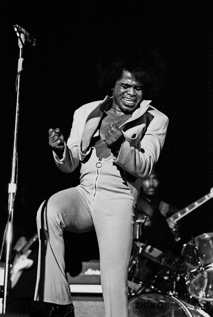
Geballte Energie: James Brown, Februar 1973, Musikhalle Hamburg by Heinrich Klaffs

We wrote this for the newsroom. It’s changed some since we first distributed it internally, and, like our other processes, will change much more as we learn by doing.

Process must never be a burden, and never be static. If we’re doing it right, the way we work should feel lighter and easier every week. (I’ve edited/annotated it a tiny bit to make sense as a blog post, but didn’t remove any sekrits.)

How we got here

The visuals team was assembled at the end of last year. We’re the product of merging two groups: the news applications team, who served as NPR’s graphics and data desks, and the multimedia team, who made and edited pictures and video.

Our teams were already both making visual news things, often in collaboration. When the leader of the multimedia team left NPR last fall, we all did a lot of soul searching. And we realized that we had a lot to learn from each other.

The multimedia crew wanted to make pictures and video that were truly web-native, which required web makers. And our news apps lacked empathy — something we’re so great at on the radio. It’s hard to make people care with a chart. Pictures were the obvious missing piece. We needed each other.

In addition, it seemed that we would have a lot to gain by establishing a common set of priorities. So we decided to get the teams together. The working titles for the new team — “We make people care” and “Good Internet” — reflected our new shared vision. But in the end, we settled on a simple name, “Visuals”.

(See also: “What is your mission?”, a post published on my personal blog, because swears.)

Our role in the newsroom

Everything we do is driven by the priorities of the newsroom, in collaboration with reporters and editors. We don’t want to go it alone. We’d be dim if we launched a project about the Supreme Court and didn’t work with Nina Totenberg.

Here’s the metaphor I’ve been trying out on reporters and editors:

We want to be your rhythm section. But that’s not to say we’re not stars. We want to be the best rhythm section. We want to be James Brown’s rhythm section. But we’re not James. We’re gonna kick ass and make you look good, but we still need you to write the songs. And we play together.

Our priorities

We love making stuff, but we can’t possibly do every project that crosses our desks. So we do our best to prioritize our work, and our top priority is serving NPR’s audience.

We start every project with a user-centered design exercise. We talk about our users, their needs, and then discuss the features we might build. And often the output of that exercise is not a fancy project.

(This process is a great mind-hack. We all get excited about a cool new thing, but most of the time the cool new thing is not the right thing to build for our audience. User-centered design is an exercise in self-control.)

Sometimes we realize the best thing to publish is a list post, or a simple chart alongside a story, or a call-to-action on Facebook — that is to say, something we don’t make. But sometimes we do need to build something, and put it on the schedule.

We make…

And we…

Team structure

Visual journalism experts.

Visual journalism experts. David Sweeney/NPR.

There are twelve of us (soon to be thirteen!) on the visuals team, and we’re still learning the most effective ways to work together. The following breakdown is an ongoing experiment.

Two people dedicated to daily news photography

We currently have one full-time teammate, Emily Bogle, working on pictures for daily news, and we are in the process of hiring another. They attend news meetings and are available to help the desks and shows with short-term visuals.

If you need a photo, go to Emily.

One person dedicated to daily news graphics

Similarly, our graphics editor, Alyson Hurt, is our primary point of contact when you need graphics for daily and short-term stories. She is also charged with maintaining design standards for news graphics on npr.org, ensuring quality and consistency.

If you need a graphic created, go to Aly.

If you are making your own graphic, go to Aly.

If you are planning to publish somebody else’s graphic, go to Aly.

Two lead editors

Brian Boyer and Kainaz Amaria serve as NPR’s visuals editor and pictures editor, respectively. Sometimes they make things, but their primary job is to act as point on project requests, decide what we will and won’t do, serve as primary stakeholders on projects, and define priorities and strategy for the team.

If you’ve got a project, go to Brian or Kainaz, ASAP.

One photojournalist

We’ve got one full-time photographer/videographer, David Gilkey, who work with desks and shows to make visuals for our online storytelling.

Five makers and two managers on project teams

The rest of the crew rotates between two project teams (usually three or four people) each run by a project manager. Folks rotate between teams, and sometimes rotate onto daily news work, depending on the needs of the project and the newsroom.

This work is generally planned. These are the format-breakers — data-driven applications or visual stories. The projects range from 1-week to 6-weeks in duration (usually around 2-3 weeks).

And since we’re reorganizing, some other things we’re gonna try

We’re taking this opportunity to rethink some of our processes and how we work with the newsroom, including…

Very short, monthly meetings with each desk and show

Until recently, our only scheduled weekly catchup was with Morning Edition. And, no surprise, we’ve ended up doing a lot of work with them. A couple of months ago, we started meeting with each desk and show, once a month. It’s not a big meeting, just a couple of folks from each team. And it’s only for 15 minutes — just enough time to catch up on upcoming stories.

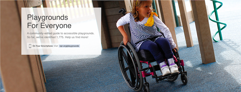
Fewer photo galleries, more photo stories

Photo galleries are nice, but when we’ve sent a photographer to far-off lands, it just doesn’t make sense to place their work at the top of a written story, buried under a click, click, click user interface. When we’ve got the art, we want to use it, boldly.

More self-service tools

We like making graphics, but there’s always more to do then we are staffed to handle. And too often a graphic requires such a short turn-around that we’re just not able to get to them. We’d love to know about your graphics needs as soon as possible, but when that’s not possible, we’ve got tools to make some graphics self-serve.

(I wanted to link to these tools, but they’re internal, and we haven’t blogged about them yet. Shameful! Here’s some source code: Chartbuilder, Quotable, Papertrail)

Slow news

For breaking news events and time-sensitive stories, we’ll do what we’ve been doing — we’ll time our launches to coincide with our news stories.

But the rest of the time, we’re going to try something new. It seems to us that running a buildout and a visual story on the same day is a mistake. It’s usually an editing headache to launch two different pieces at the same time. And then once you’ve launched, the pieces end up competing for attention on the homepage and social media. It’s counter-productive.

So instead, we’re going to launch after the air date and buildout, as a second- or third-day story.

This “slow news” strategy may work at other organizations, but it seems to make extra sense at NPR since so much of our work is explanatory, and evergreen. Also, visuals usually works on stories that are of extra importance to our audience, so a second-day launch will give us an opportunity to raise an important issue a second time.


WOULD YOU LIKE TO KNOW MORE?

Managing Instagram Photo Call-Outs

At NPR, we regularly ask our audience to submit photos on a certain theme related to a series or particular story. We wanted a way to streamline these callouts on Instagram using the hashtag we’ve assigned, so we turned to IFTTT.

IFTTT is a website whose name means “If This, Then That.” You can use the service to set up “recipes” where an event on one site can trigger a different event on another site. For example, if someone tags an Instagram photo with a particular hashtag, IFTTT can log it in a Google Spreadsheet. (Sadly, this will not work with photos posted to Twitter.)

Here, we’ll explain our workflow, from IFTTT recipe to moderation to putting the results on a page.

(Side note: Thanks to Melody Kramer, who introduced the idea of an IFTTT moderation queue for our “Planet Money Makes A T-Shirt” project. Our workflow has evolved quite a bit since that first experiment.)

Build A Spreadsheet Of Photos With IFTTT

Set this up at the very beginning of the process, before you’ve publicized the callout. IFTTT will only pull in images as they are submitted. It will not pull images that were posted before we set up the recipe.

(A note about accounts: Rather than use someone’s own individual account, we created team Gmail and IFTTT accounts for use with these photo callouts. That way anyone on the team can modify the IFTTT recipes. Also, we created a folder in our team Google Drive folder just for photo callouts and shared that with the team IFTTT Gmail account.)

First step: Go to Google Drive. We’ve already set up a spreadsheet template for callouts with all of the column headers filled in, corresponding with the code we’ll use to put photos on a page later on. Make a copy of that spreadsheet and rename it something appropriate to your project (say, photo-cats).

Next, log into IFTTT.

Before you set up your recipe, double-check your IFTTT account preferences. By default, IFTTT runs all links through a URL shortener. To make it use the original Instagram and image URLs in your spreadsheet, go into your IFTTT account preferences and uncheck URL shortening.

Now, create a new recipe (“create” at the top of the page).

Select Instagram as the “trigger channel,” and as the trigger, a new photo by anyone tagged. (Note: If we wanted to pull in Instagram videos, we would need to make a separate recipe for just video.)

Then enter your hashtag (in this case, #cats).

(Note: We’re not using this to scrape Instagram and republish photos without permission. We’d normally use a much more specific hashtag, like #nprshevotes or #nprpublicsquare — the assumption being that users who tag their photos with such a specific hashtag want NPR to see the photos and potentially use them. But for the sake of this example, #cats is fun.)

Next, select Google Drive as the “action channel,” and add row to spreadsheet as the action.

Put the name of the spreadsheet in the Spreadsheet name box so IFTTT can point to it, in this case photo-cats. (If the spreadsheet does not already exist, IFTTT will create one for you, but it’s better to copy the spreadsheet template because the header labels are already set up.)

In the formatted row, IFTTT gives you a few options to include data from Instagram like username, embed code, caption, etc. Copy and paste this to get the same fields that are in the spreadsheet template:

{{CreatedAt}} ||| {{Username}} ||| {{Caption}} ||| {{Url}} ||| =IMAGE("{{SourceUrl}}";1) ||| {{SourceUrl}}  ||| {{EmbedCode}}

Then point the spreadsheet to the Google Drive folder where your spreadsheet lives — in this case, photo-callouts. Once your recipe has been activated, hit the check button (with the circle arrow) to run the recipe for the first time. IFTTT will run on its own every 15 minutes or so, appending information for up to 10 images at a time to the bottom of the spreadsheet.

Moderating Photos Using Google Spreadsheets

Not every photo will meet our standards, so moderation will be important. Our spreadsheet template has an extra column called “approved.” Periodically, a photo editor will look at the new photos added to the spreadsheet and mark approved images with a “y.”

Here’s an example of a mix of approved and not approved images (clearly, we wanted only the best cat photos):

To reorder images, you can either manually reorder rows (copy/pasting or dragging rows around), or add a separate column, number the rows you want and sort by that column. In either case, it’s best to wait until the very end to do this.

When you’ve reached your deadline, or you’ve collected as many photos as you need, remember to go back into IFTTT and turn off the recipe — otherwise, it’ll keep running and adding photos to the spreadsheet.

Adding Photos To A Page And Publish Using dailygraphics

So we have a spreadsheet, and we know which photos we want. Now to put them on a page.

The NPR Visuals system for creating and publishing small-scale daily projects has built-in support for copytext, a Python library that Christopher Groskopf wrote to pull content from Google Spreadsheets. The dailygraphics system, a stripped-down version of our team app-template, runs a Flask webserver locally and renders spreadsheet content to the page using Jinja tags. When it’s time to publish the page, it bakes everything out to flat files and deploys those files to S3. (Read more about dailygraphics.)

(In our private graphics repo, we have a template for photo callouts. So an NPR photo producer would duplicate the photo-callout-template folder and rename it something appropriate to the project — in this case, photo-cats.)

If you’re starting from scratch with dailygraphics (read the docs first), you’d instead use fab add_graphic:photo-cats to create a new photo mini-project.

Every mini-project starts with a few files: an HTML file, a Python config file and supporting JS libraries. For this project, you’ll work with child_template.html and graphic_config.py.

First, connect to the Google Spreadsheet. In graphic_config.py, replace the COPY_GOOGLE_DOC_KEY with the key for your Google Spreadsheet, which you can find (highlighted here) in the spreadsheet’s URL:

Run fab update_copy:photo-cats to pull the latest spreadsheet content down to your computer.

And here are the template tags we’ll use in child_template.html to render the Google Spreadsheet content onto the pages:

<div id="callout">

    <!-- Loop through every row in the spreadsheet -->

    {% for row in COPY.instagram %}

    <!-- Check if the photo has been approved.
         If not, skip to the next line.
         (Notice that “approved” matches the column 
         header from the spreadsheet.) -->

        {% if row.approved == 'y' %}

        <section 
            id="post-{{ loop.index }}" 
            class="post post-{{ row.username }}">

    <!-- Display the photo and link to the original image on Instagram. 
         Again, “row.instagram_url” and “row.image_url” reference 
         the columns in the original spreadsheet. -->

            <div class="photo">
                <a href="{{row.instagram_url}}"  target="_blank"><img src="{{ row.image_url }}" alt="Photo" /></a>
            </div>

    <!-- Display the photographer’s username, the photo caption 
         and a link to the original image on Instagram -->

            <div class="caption">
                <h3><a href="{{row.instagram_url}}" target="_blank">@{{ row.username }}</a></h3>
                <p>{{ row.caption }}</p>
            </div>

        </section>

       {% endif %}
    {% endfor %}
</div>

(If you started from the photo-callout-template, you’re already good to go.)

Preview the page locally at http://localhost:8000/graphics/photo-cats/, then commit your work to GitHub. When you’re ready, publish it out: fab production deploy:photo-cats

Put This On A Page In The CMS

Everything for this photo callout so far has happened entirely outside our content management system. But now we want to put this on an article page or blog post.

Seamus, NPR’s CMS, is very flexible, but we’ve found that it’s still good practice to keep our code-heavy work walled off to some degree from the overall page templates so that styles, JavaScript and other code don’t conflict with each other. Our solution: embed our content using iframes and Pym.js, a JavaScript library that keeps the iframe’s width and height in sync with its content.

Our system for small projects has Pym.js already built-in. At the bottom of the photo callout page, there is a snippet of embed code.

Copy that code, open the story page in your CMS, and add the code to your story as a new HTML asset. And behold:


Related Posts

Creating And Deploying Small-Scale Projects

In addition to big, long-term projects, the NPR Visuals team also produces short-turnaround charts and tables for daily stories. Our dailygraphics rig, newly open-sourced, offers a workflow and some automated machinery for creating, deploying and embedding these mini-projects, including:

  • Version control (with GitHub)
  • Starter code for frequently-reused project types (like bar charts and data tables)
  • One command to deploy to Amazon S3
  • A mini-CMS for each project (with Google Spreadsheets)
  • Management of binary assets (like photos or audio files) outside of GitHub

Credit goes to Jeremy Bowers, Tyler Fisher and Christopher Groskopf for developing this system.

Two Repos

This system relies on two GitHub repositories:

  • dailygraphics, the “machine” that creates and deploys mini-projects
  • A private repo to store all the actual projects (which we’re calling graphics)

(Setting things up this way means we can share the machinery while keeping NPR-copyrighted or embargoed content to ourselves.)

Tell dailygraphics where the graphics live (relative to itself) in dailygraphics/app_config.py:

# Path to the folder containing the graphics
GRAPHICS_PATH = os.path.abspath('../graphics')

When working on these projects, I’ll keep three tabs open in Terminal:

  • Tab 1: dailygraphics, running in a virtualenv, to create graphics, update copy, sync assets and deploy files
  • Tab 2: dailygraphics local webserver, running in a virtual environment, to preview my graphics as I’m building them (start it up using fab app)
  • Tab 3: graphics, to commit the code in my graphics to GitHub

If you use iTerm2 as your terminal client, here’s an AppleScript shortcut to launch all your terminal windows at once.

Create A Graphic

In Tab 1, run a fabric command — fab add_graphic:my-new-graphic — to copy a starter set of files to a folder inside the graphics repo called my-new-graphic.

File tree

The key files to edit are child_template.html and, if relevant, js/graphic.js. Store any additional JavaScript libraries (for example, D3 or Modernizr), in js/lib.

If you’ve specified a Google Spreadsheet ID in graphic_config.py (our templates have this by default), this process will also clone a Google Spreadsheet for you to use as a mini-CMS for this project. (More on this later.)

I can preview the new project locally by pulling up http://localhost:8000/graphics/my-new-graphic/ in a browser.

When I’m ready to save my work to GitHub, I’ll switch over to Tab 3 to commit it to the graphics repo.

Publish A Graphic

First, make sure the latest code has been committed and pushed to the graphics GitHub repo (Tab 3).

Then return to dailygraphics (Tab 1) to deploy, running the fabric command fab production deploy:my-new-graphic. This process will gzip the files, flatten any dynamic tags on child_template.html (more on that later) into a new file called child.html and publish everything out to Amazon S3.

Embed A Graphic

To avoid CSS and JavaScript conflicts, we’ve found that it’s a good practice to keep our code-driven graphics walled off to some degree from CMS-generated pages. Our solution: embed these graphics using iframes, and use Pym.js to keep the iframes’ width and height in sync with their content.)

  • The page where I preview my graphic locally — http://localhost:8000/graphics/my-new-graphic/ — also generates “parent” embed code I can paste into our CMS. For example:
  • The js/graphic.js file generated for every new graphic includes standard “child” code needed for the graphic to communicate with its “parent” iframe. (For more advanced code and examples, read the docs.)

Connecting To A Google Spreadsheet

Sometimes it’s useful to store information related to a particular graphic, such as data or supporting text, in a Google Spreadsheet. dailygraphics uses copytext, a Python library that serves as an intermediary between Google Spreadsheets and an HTML page.

Every graphic generated by dailygraphics includes the file graphic_config.py. If you don’t want to use the default sheet, you can replace the value of COPY_GOOGLE_DOC_KEY with the ID for another sheet.

There are two ways I can pull down the latest copy of the spreadsheet:

  • Append ?refresh=1 to the graphic URL (for example, http://localhost:8000/graphics/my-test-graphic/?refresh=1) to reload the graphic every time I refresh the browser window. (This only works in local development.)

  • In Tab 1 of my terminal, run fab update_copy:my-new-graphic to pull down the latest copy of the spreadsheet.

I can use Jinja tags to reference the spreadsheet content on the actual page. For example:

<header>
    <h1>{{ COPY.content.header_title }}</h1>
    <h2>{{ COPY.content.lorem_ipsum }}</h2>
</header>

<dl>
    {% for row in COPY.example_list %}
    <dt>{{ row.term }}</dt><dd>{{ row.definition }}</dd>
    {% endfor %}
</dl>

You can also use it to, say, output the content of a data spreadsheet into a table or JSON object.

(For more on how to use copytext, read the docs.)

When I publish out the graphic, the deploy script will flatten the Google Spreadsheet content on child_template.html into a new file, child.html.

(Note: A published graphic will not automatically reflect edits to its Google Spreadsheet. The graphic must be republished for any changes to appear in the published version.)

Storing Larger Assets

One of our NPR Visuals mantras is Don’t store binaries in the repo! And when that repo is a quickly multiplying series of mini-projects, that becomes even more relevant.

We store larger files (such as photos or audio) separate from the graphics, with a process to upload them directly to Amazon S3 and sync them between users.

When I create a new project with fab add_graphic:my-new-graphic, the new project folder includes an assets folder. After saving media files to this folder, I can, in Tab 1 of my Terminal (dailygraphics), run fab assets.sync:my-new-graphic to sync my local assets folder with what’s already on S3. None of these files will go to GitHub.

This is explained in greater detail in the README.

In Sum

Our dailygraphics rig offers a fairly lightweight system for developing and deploying small chunks of code-based content, with some useful extras like support for Google Spreadsheets and responsive iframes. We’re sharing it in the hope that it might be useful for those who need something to collect and deploy small projects, but don’t need something as robust as our full app-template.

If you end up using it or taking inspiration from it, let us know!

(This was updated in August 2014, January 2015 and April 2015 to reflect changes to dailygraphics.)


Related Posts

Responsive Charts With D3 And Pym.js

Infographics are a challenge to present in a responsive website (or, really, any context where the container could be any width).


Left: A chart designed for the website at desktop size, saved as a flat image.
Right: The same image scaled down for mobile. Note that as the image has resized, the text inside it (axis labels and key) has scaled down as well, making it much harder to read.

If you render your graphics in code — perhaps using something like D3 or Raphael — you can make design judgements based on the overall context and maintain some measure of consistency in type size and legibility regardless of the graphic’s width.


A dynamically-rendered chart that sizes depending on its container.

Case Study: Make A Simple Line Graph Work Responsively

You can find all the files here. I won’t get into how to draw the graph itself, but I’ll explain how to make it responsive. The general idea:

  • Calculate the graph’s dimensions based on the width of its container (rather than fixed numbers)
  • If the page is resized, destroy the graph, check for new dimensions and redraw the graph.

Structure Of The HTML File:

  • CSS styles
  • A container div (#graphic) for the line graph (including a static fallback image for browsers that don’t support SVG)
  • Footnotes and credits
  • JavaScript libraries and the JavaScript file for this graphic

The JavaScript File

Set Global Variables:

var $graphic = $('#graphic');
var graphic_data_url = 'data.csv';
var graphic_data;
var graphic_aspect_width = 16;
var graphic_aspect_height = 9;
var mobile_threshold = 500;
  • $graphic — caches the reference to #graphic, where the graph will live
  • graphic_data_url — URL for your datafile. I store it up top to make it a little easier to copy/paste code from project to project.
  • graphic_data — An object to store the data loaded from the datafile. Ideally, I’ll only load the data onto the page once.
  • graphic_aspect_width and graphic_aspect_height — I will refer to these to constrain the aspect ratio of my graphic
  • mobile_threshold — The breakpoint at which your graphic needs to be optimized for a smaller screen

Function: Draw The Graphic

Separate out the code that renders the graphic into its own function, drawGraphic.

function drawGraphic() {
    var margin = { top: 10, right: 15, bottom: 25, left: 35 };
    var width = $graphic.width() - margin.left - margin.right;

First, rather than use a fixed width, check the width of the graphic’s container on the page and use that instead.

    var height = Math.ceil((width * graphic_aspect_height) / graphic_aspect_width) - margin.top - margin.bottom;

Based on that width, use the aspect ratio values to calculate what the graphic’s height should be.

    var num_ticks = 13;
    if (width < mobile_threshold) {
        num_ticks = 5;
    }

On a large chart, you might want lots of granularity with your y-axis tick marks. But on a smaller screen, that might be excessive.

    // clear out existing graphics
    $graphic.empty();

You don’t need the fallback image (or whatever else is in your container div). Destroy it.

    var x = d3.time.scale()
        .range([0, width]);

    var y = d3.scale.linear()
        .range([height, 0]);

    var xAxis = d3.svg.axis()
        .scale(x)
        .orient("bottom")
        .tickFormat(function(d,i) {
            if (width <= mobile_threshold) {
                var fmt = d3.time.format('%y');
                return 'u2019' + fmt(d);
            } else {
                var fmt = d3.time.format('%Y');
                return fmt(d);
            }
        });

Another small bit of responsiveness: use tickFormat to conditionally display dates along the x-axis (e.g., “2008” when the graph is rendered large and “‘08” when it is rendered small).

Then set up and draw the rest of the chart.

Load The Data And Actually Draw The Graphic

if (Modernizr.svg) {
    d3.csv(graphic_data_url, function(error, data) {
        graphic_data = data;

        graphic_data.forEach(function(d) {
            d.date = d3.time.format('%Y-%m').parse(d.date);
            d.jobs = d.jobs / 1000;
        });

        drawGraphic();
    });
}

How this works:

  • Since D3 draws graphics using SVG, we use a limited build of Modernizr to check if the user’s browser supports it.
  • If so, it loads in the datafile, formats particular data columns as dates or fractions of numbers, and calls a function to draw the graphic.
  • If not, it does nothing, and the user sees the fallback image instead.

Make It Responsive

Because it’s sensitive to the initial width of its container, the graphic is already somewhat responsive.

To make the graphic self-adjust any time the overall page resizes, add an onresize event to the window. So the code at the bottom would look like:

if (Modernizr.svg) {
    d3.csv(graphic_data_url, function(error, data) {
        graphic_data = data;

        graphic_data.forEach(function(d) {
            d.date = d3.time.format('%Y-%m').parse(d.date);
            d.jobs = d.jobs / 1000;
        });

        drawGraphic();
        window.onresize = drawGraphic;
    });
}

(Note: onresize can be inefficient, constantly firing events as the browser is being resized. If this is a concern, consider wrapping the event in something like debounce or throttle in Underscore.js).

An added bit of fun: Remember this bit of code in drawGraphic() that removes the fallback image for non-SVG users?

// clear out existing graphics
$graphic.empty();

It’ll clear out anything that’s inside $graphic — including previous versions of the graph.

So here’s how the graphic now works:

  • On initial load, if the browser supports SVG, D3 loads in the data, checks the width of the containing div $graphic, destroys the fallback image and renders the graph to the page.
  • Whenever the page is resized, drawGraphic is called again. It checks the new width of #graphic, destroys the existing graph and renders a new graph.

(Note: If your graphic has interactivity or otherwise changes state, this may not be the best approach, as the graphic will be redrawn at its initial state, not the state it’s in when the page is resized. The start-from-scratch approach described here is intended more for simple graphics.)

A Responsive Chart In A Responsive iFrame

At NPR, when we do simple charts like these, they’re usually meant to accompany stories in our CMS. To avoid conflicts, we like to keep the code compartmentalized from the CMS — saved in separate files and then added to the CMS via iframes.

iFrames in a responsive site can be tricky, though. It’s easy enough to set the iframe’s width to 100% of its container, but what if the height of the content varies depending on its width (e.g., text wraps, or an image resizes)?

We recently released Pym.js, a JavaScript library that handles communication between an iframe and its parent page. It will size an iframe based on the width of its parent container and the height of its content.

The JavaScript

We’ll need to make a few modifications to the JavaScript for the graphic:

First, declare a null pymChild variable at the top, with all the other variables:

var pymChild = null;

(Declaring all the global variables together at the top is considered good code hygiene in our team best practices.)

Then, at the bottom of the page, initialize pymChild and specify a callback function — drawGraphic. Remove the other calls to drawGraphic because Pym will take care of calling it both onload and onresize.

if (Modernizr.svg) {
    d3.csv(graphic_data_url, function(error, data) {
        graphic_data = data;

        graphic_data.forEach(function(d) {
            d.date = d3.time.format('%Y-%m').parse(d.date);
            d.jobs = d.jobs / 1000;
        });

        // Set up pymChild, with a callback function that will render the graphic
        pymChild = new pym.Child({ renderCallback: drawGraphic });
    });
} else { // If not, rely on static fallback image. No callback needed.
    pymChild = new pym.Child({ });
}

And then a couple tweaks to drawGraphic:

function drawGraphic(container_width) {
    var margin = { top: 10, right: 15, bottom: 25, left: 35 };
    var width = container_width - margin.left - margin.right;
    ...

Pym.js will pass the width of the iframe to drawGraphic. Use that value to calculate width of the graph. (There’s a bug we’ve run into with iframes and iOS where iOS might not correctly calculate the width of content inside an iframe sized to 100%. Passing in the width of the iframe seems to resolve that issue.)

    ...
    // This is calling an updated height.
    if (pymChild) {
        pymChild.sendHeightToParent();
    }
}

After drawGraphic renders the graph, it tells Pym.js to recalculate the page’s height and adjust the height of the iframe.

The HTML Page

Include Pym.js among the libraries you’re loading:

<script src="js/lib/jquery.js" type="text/javascript"></script>
<script src="js/lib/d3.v3.min.js" type="text/javascript"></script>
<script src="js/lib/modernizr.svg.min.js" type="text/javascript"></script>
<script src="js/lib/pym.js" type="text/javascript"></script>
<script src="js/graphic.js" type="text/javascript"></script>

The Parent Page (The CMS)

This is what we’ll paste into our CMS, so the story page can communicate with the graphic:

<div id="line-graph"></div>
<script type="text/javascript" src="path/to/pym.js"></script>
<script>
    var line_graph_parent = new pym.Parent('line-graph', 'path/to/child.html', {});
</script>
  • #line-graph in this case is the containing div on the parent page.
  • Sub out all the path/to/ references with the actual published paths to those files.

(Edited Sept. 4, 2014: Thanks to Gerald Rich for spotting a bug in the onresize example code.)


Related Posts

Making Data Tables Responsive


Left: A data table on a desktop-sized screen.
Right: The same table on a small screen, too wide for the viewport.

The Problem

Data tables with multiple columns are great on desktop screens, but don’t work as well at mobile sizes, where the table might be too wide to fit onscreen.

We’ve been experimenting with a technique we read about from Aaron Gustafson, where the display shifts from a data table to something more row-based at smaller screen widths. Each cell has a data-title attribute with the label for that particular column. On small screens, we:

  • Set each <tr> and <td> to display: block; to make the table cells display in rows instead of columns
  • Hide the header row
  • Use :before { content: attr(data-title) ":0A0"; to display a label in front of each table cell

It works well for simple data tables. More complex presentations, like those involving filtering or sorting, would require more consideration.


Left: A data table on a desktop-sized screen.
Right: The same table on a small screen, reformatted for the viewport.

The Data

We’ll start with some sample data from the Bureau of Labor Statistics that I’ve dropped into Google Spreadsheets:

The Markup

Use standard HTML table markup. Wrap your header row in a thead tag — it will be simpler to hide later. And in each td, add a data-title attribute that corresponds to its column label (e.g., <td data-title="Category">).

<table>
    <thead>
        <tr>
            <th>Category</th>
            <th>January</th>
            <th>February</th>
            <th>March</th>
        </tr>
    </thead>
    <tr>
        <td data-title="Category">Total (16 years and over)</td>
        <td data-title="January">6.6</td>
        <td data-title="February">6.7</td>
        <td data-title="March">6.7</td>
    </tr>
    <tr>
        <td data-title="Category">Less than a high school diploma</td>
        <td data-title="January">9.6</td>
        <td data-title="February">9.8</td>
        <td data-title="March">9.6</td>
    </tr>
    <tr>
        <td data-title="Category">High school graduates, no college</td>
        <td data-title="January">6.5</td>
        <td data-title="February">6.4</td>
        <td data-title="March">6.3</td>
    </tr>
    <tr>
        <td data-title="Category">Some college or associate degree</td>
        <td data-title="January">6.0</td>
        <td data-title="February">6.2</td>
        <td data-title="March">6.1</td>
    </tr>
    <tr>
        <td data-title="Category">Bachelor&rsquo;s degree and higher</td>
        <td data-title="January">3.2</td>
        <td data-title="February">3.4</td>
        <td data-title="March">3.4</td>
    </tr>
</table>

The CSS

<style type="text/css">
    body {
        font: 12px/1.4 Arial, Helvetica, sans-serif;
        color: #333;
        margin: 0;
        padding: 0;
    }

    table {
        border-collapse: collapse;
        padding: 0;
        margin: 0 0 11px 0;
        width: 100%;
    }

    table th {
        text-align: left;
        border-bottom: 2px solid #eee;
        vertical-align: bottom;
        padding: 0 10px 10px 10px;
        text-align: right;
    }

    table td {
        border-bottom: 1px solid #eee;
        vertical-align: top;
        padding: 10px;
        text-align: right;
    }

    table th:nth-child(1),
    table td:nth-child(1) {
        text-align: left;
        padding-left: 0;
        font-weight: bold;
    }

Above, basic CSS styling for the data table, as desktop users would see it.

Below, what the table will look like when it appears in a viewport that is 480px wide or narrower:

/* responsive table */
@media screen and (max-width: 480px) {
    table,
    tbody {
        display: block;
        width: 100%;
    }

Make the table display: block; instead of display: table; and make sure it spans the full width of the content well.

    thead { display: none; }

Hide the header row.

    table tr,
    table th,
    table td {
        display: block;
        padding: 0;
        text-align: left;
        white-space: normal;
    }

Make all the <tr>, <th> and <td> tags display as rows rather than columns. (<th> is probably not necessary to include, since we’re hiding the <thead>, but I’m doing so for completeness.)

    table tr {
        border-bottom: 1px solid #eee;
        padding-bottom: 11px;
        margin-bottom: 11px;
    }

Add a dividing line between each row of data.

    table th[data-title]:before,
    table td[data-title]:before {
        content: attr(data-title) ":0A0";
        font-weight: bold;
    }

If a table cell has a data-table attribute, prepend it to the contents of the table cell. (e.g., <td data-title="January">6.5</td> would display as January: 6.5)

    table td {
        border: none;
        margin-bottom: 6px;
        color: #444;
    }

Table cell style refinements.

    table td:empty { display: none; }

Hide empty table cells.

    table td:first-child {
        font-size: 14px;
        font-weight: bold;
        margin-bottom: 6px;
        color: #333;
    }
    table td:first-child:before { content: ''; }

Make the first table cell appear larger than the others — more like a header — and override the display of the data-title attribute.

    }
</style>

And there you go!

Extra: Embed This Table Using Pym.js

At NPR, when we do simple tables like these, they’re usually meant to accompany stories in our CMS. To avoid conflicts, we like to keep the code for mini-projects like this graph compartmentalized from the CMS — saved in separate files and then added to the CMS via an iframe.

Iframes in a responsive site can be tricky, though. It’s easy enough to set the iframe’s width to 100% of its container, but what if the height of the content varies depending on its width (e.g., text wraps, or an image resizes)?

We recently released Pym.js, a JavaScript library that handles communication between an iframe and its parent page. It will size an iframe based on the width of its parent container and the height of its content.

The Table (To Be iFramed In)

At the bottom of your page, add this bit of JavaScript:

<script src="path/to/pym.js" type="text/javascript"></script>
<script>
    var pymChild = new pym.Child();
</script>    
  • Sub out path/to/ with the actual published path to the file.

The Parent Page (The CMS)

This is what we’ll paste into our CMS, so the story page can communicate with the graphic:

<div id="jobs-table"></div>
<script type="text/javascript" src="http://blog.apps.npr.org/pym.js/src/pym.js"></script>
<script>
    var jobs_table_parent = new pym.Parent('jobs-table', 'http://blog.apps.npr.org/pym.js/examples/table/child.html', {});
</script>
  • #jobs-table in this case is the containing div on the parent page.
  • Sub out all the path/to/ references with the actual published paths to those files.

Advanced: Responsive Data Tables Made Easier With Copytext.py

It’s rather repetitive to write those same data-title attributes over and over. And even all those <tr> and <td> tags.

The standard templates we use for our big projects and for our smaller daily graphics projects rely on Copytext.py, a Python library that lets us use Google Spreadsheets as a kind of lightweight CMS.

In this case, we have a Google Spreadsheet with two sheets in it: one called data for the actual table data, and another called labels for things like verbose column headers.

Once we point the project to my Google Spreadsheet ID, we can supply some basic markup and have Flask + Jinja output the rest of the table for us:


Related Posts

How We Built Borderland Out Of A Spreadsheet

Since the NPR News Apps team merged with the Multimedia team, now known as the Visuals team, we’ve been working on different types of projects. Planet Money Makes a T-Shirt was the first real “Visuals” project, and since then, we’ve been telling more stories that are driven by photos and video such as Wolves at the Door and Grave Science. Borderland is the most recent visual story we have built, and its size and breadth required us to develop a smart process for handling a huge variety of content.

Borderland is a giant slide deck. 129 slides, to be exact. Within those slides, we tell 12 independent stories about the U.S.-Mexico border. Some of these stories are told in photos, some are told in text, some are told in maps and some are told in video. Managing all of this varying content coming from writers, photographers, editors and cartographers was a challenge, and one that made editing an HTML file directly impossible. Instead, we used a spreadsheet to manage all of our content.

A screenshot of our content spreadsheet

On Monday, the team released copytext.py, a Python library for accessing spreadsheets as native Python objects so that they can be used for templating. Copytext, paired with our Flask-driven app template, allows us to use Google Spreadsheets as a lightweight CMS. You can read the fine details about how we set that up in the Flask app here, but for now, know that we have a global COPY object accessible to our templates that is filled with the data from a Google Spreadsheet.

In the Google Spreadsheet project, we can create multiple sheets. For Borderland, our most important sheet was the content sheet, shown above. Within that sheet lived all of the text, images, background colors and more. The most important column in that sheet, however, is the first one, called template. The template column is filled with the name of a corresponding Jinja2 template we create in our project repo. For example, a row where the template column has a value of “slide” will be rendered with the “slide.html” template.

We do this with some simple looping in our index.html file:

In this loop, we search for a template matching the value of each row’s template column. If we find one, we render the row’s content through that template. If it is not found (for example, in the first row of the spreadsheet, where we set column headers), then we skip the row thanks to ignore missing. We can access all of that row’s content and render the content in any way we like.

Let’s look at a specific example. Here’s row 28 of our spreadsheet.

Row 28

It is given the slide template, and has both text and an image associated with it. Jinja recognizes this template slug and passes the row to the slide.html template.

There’s a lot going on here, but note that the text column is placed within the full-block-content div, and the image is set in the data-bgimage attribute in the container div, which we use for lazy-loading our assets at the correct time.

The result is slide 25:

Slide 25

Looping through each row of our spreadsheet like this is extremely powerful. It allow us to create arbitrary reusable templates for each of our projects. In Borderland, the vast majority of our rows were slide templates. However, the “What’s It Like” section of the project required a different treatment in the template markup to retain both readability of the quotations and visibiilty of the images. So we created a new template, called slide-big-quote to deal with those issues.

Other times, we didn’t need to alter the markup; we just needed to style particular aspects of a slide differently. That’s why we have an extra_class column that allows us to tie classes to particular rows and style them properly in our LESS file. For example, we gave many slides within the “Words” section the class word-pair to handle the treatment of the text in this section. Rather than write a whole new template, we wrote a little bit of LESS to handle the treatment.

Words

More importantly, the spreadsheet separated concerns among our team well. Content producers never had to do more than write some rudimentary HTML for each slide in the cell of the spreadsheet, allowing them to focus on editorial voice and flow. Meanwhile, the developers and designers could focus on the templating and functionality as the content evolved in the spreadsheet. We were able to iterate quickly and play with many different treatments of our content before settling on the final product.

Using a spreadsheet as a lightweight CMS is certainly an imperfect solution to a difficult problem. Writing multiple lines of HTML in a spreadsheet cell is an unfriendly interface, and relying on Google to synchronize our content seems tenuous at best (though we do create a local .xlsx file with a Fabric command instead of relying on Google for development). But for us, this solution makes the most sense. By making our content modular and templatable, we can iterate over design solutions quickly and effectively and allow our content producers to be directly involved in the process of storytelling on the web.

Does this solution sound like something that appeals to you? Check out our app template to see the full rig, or check out copytext.py if you want to template with spreadsheets in Python.

Introducing copytext.py: your words are data too

"We used copytext for Planet Money Makes a T-Shirt.

Most of our work lives outside of NPR’s content management system. This has many upsides, but it complicates the editing process. We can hardly expect every veteran journalist to put aside their beat in order to learn how to do their writing inside HTML, CSS, Javascript, and Python—to say nothing of version control.

That’s why we made copytext, a library that allows us to give editorial control back to our reporters and editors, without sacrificing our capacity to iterate quickly.

How it works

Copytext takes a Excel xlsx file as an input and creates from it a single Python object which we can use in our templates.

Here is some example data:

And here is how you would load it with copytext:

copy = copytext.Copy('examples/test_copy.xlsx')

This object can then be treated sort of like a JSON object. Sheets are referenced by name, then rows by index and then columns by index.

# Get a sheet by name
sheet = copy['content']

# Get a row by index
row = sheet[1]

# Get a cell by column index
cell = row[1]

print cell
>> "Across-The-Top Header"

But there is also one magical perk: worksheets with key and value columns can be accessed like object properties.

# Get a row by "key" value
row = sheet['header_title']

# Evaluate a row to automatically use the "value" column
print row
>>  "Across-The-Top Header"

You can also iterate over the rows for rendering lists!

sheet = copy['example_list']

for row in sheet:
    print row['term'], row['definition']

Into your templates

These code examples might seem strange, but they make a lot more sense in the context of our page templates. For example, in a template we might once have had <a href="/download">Download the data!</a> and now we would have something like <a href="/download"></a>. COPY is the global object created by copytext, “content” is the name of a worksheet inside the spreadsheet and “download” is the key that uniquely identifies a row of content.

Here is an example of how we do this with a Flask view:

from flask import Markup, render_template

import copytext

@app.route('/')
def index():
    context = {
        'COPY': copytext.Copy('examples/test_copy.xlsx', cell_wrapper_cls=Markup)
    }

    return render_template('index.html', context)

The cell_wrapper_cls=Markup ensures that any HTML you put into your spreadsheet will be rendered correctly in your Jinja template.

And in your template:

<header>
    <h1>{{ COPY.content.header_title }}</h1>
    <h2>{{ COPY.content.lorem_ipsum }}</h2>
</header>

<dl>
    {% for row in COPY.example_list %}
    <dt>{{ row.term }}</dt><dd>{{ row.definition }}</dd>
    {% endfor %}
</dl>

The spreadsheet is your CMS

If you combine copytext with Google Spreadsheets, you have a very powerful combination: a portable, concurrent editing interface that anyone can use. In fact, we like this so much that we bake this into every project made with our app-template. Anytime a project is rendered we fetch the latest spreadsheet from Google and place it at data/copy.xlsx. That spreadsheet is loaded by copytext and placed into the context for each of our Flask views. All the text on our site is brought up-to-date. We even take this a step further and automatically render out a copytext.js that includes the entire object as JSON, for client-side templating.

The documentation for copytext has more code examples of how to use it, both for Flask users and for anyone else who needs a solution for having writers work in parallel with developers.

Let us know how you use it!

We’re hiring a picture editor

Love photography?

Obsessed with the web?

Do you find magic in the mundane?

The visuals team is looking for a News Picture Editor to work with us at NPR headquarters in Washington, DC. It’s a new and important role, fit for an experienced editor. You’ll rethink our photographic approach to daily news. You’ll work on stories that matter, at a place people love. You’ll invent new ways to see stories and teach them to our newsroom.

You’ll work fast and hard. You’ll have a damned good time.

We believe strongly in…

You must have…

  • A love for writing
  • An inexhaustible interest in daily news
  • A steely and unshakable sense of ethics
  • A genuine and friendly disposition

Allow me to persuade you

NPR tells amazing stories, and it’s our team’s job to tell those stories visually. We’re not a huge team, but we are an essential, growing part of the newsroom.

We’re pushing the limits of online storytelling, and photography is at the heart of this effort. Our new picture editor will be a leader and advocate for visual awesomeness, every day. Job perks include…

  • Live music at the Tiny Desk
  • All the tote bags you can eat
  • A sense of purpose

Like what you’ve heard?

Email your info to bboyer@npr.org! Thanks!

This position has been filled. Thanks!

Be our summer intern!

Why aren’t we flying? Because getting there is half the fun. You know that. (Visuals en route to NICAR 2013.)

Hey!

Are you a student?

Do you design? Develop? Love the web?

…or…

Do you make pictures? Want to learn to be a great photo editor?

If so, we’d very much like to hear from you. You’ll spend the summer working on the visuals team here at NPR’s headquarters in Washington, DC. We’re a small group of photographers, videographers, photo editors, developers, designers and reporters in the NPR newsroom who work on visual stuff for npr.org. Our work varies widely, check it out here.

Photo editing

Our photo editing intern will work with our digital news team to edit photos for npr.org. It’ll be awesome. There will also be opportunities to research and pitch original work.

Please…

  • Love to write, edit and research
  • Be awesome at making pictures

Are you awesome? Apply now!

News applications

Our news apps intern will be working as a designer or developer on projects and daily graphics for npr.org. It’ll be awesome.

Please…

  • Show your work. If you don’t have an online portfolio, github account, or other evidence of your work, we won’t call you.
  • Code or design. We’re not the radio people. We don’t do social media. We make stuff.

Are you awesome? Apply now!

What will I be paid? What are the dates?

Check out our careers site for much more info.

Thx!

Tensions Over Pensions

Hold the presses, if there are any of them left operating. Late this afternoon, just after this column was written, member-station WNET in New York and PBS issued a statement resolving the controversy that is discussed below. The joint statement...

Over the Air or Off the Air?

The powers that be at PBS were dancing in the aisles earlier this week (I didn't really see this but it was undoubtedly in the minimum-physical-contact, please; we're British style) when it was reported that the season four debut of...

Animation With Filmstrips

This post is cross-posted with our friends at Source.

Animated gifs have immediate visual impact — from space cats to artistic cinemagraphs. For NPR’s “Planet Money Makes A T-Shirt” project, we wanted to experiment with using looping images to convey a quick concept or establish a mood.

However, GIF as a format requires so many compromises in image quality and the resulting files can be enormous. A few months ago, Zeega’s Jesse Shapins wrote about a different technique that his company is using: filmstrips. The frames of the animation are stacked vertically and saved out as a JPG. The JPG is set as the background image of a div, and a CSS animation is used to shift the y-position of the image.

Benefits of this approach:

  • Potentially better image quality and lower filesize than an equivalent GIF

  • Since the animation is done in code, rather than baked into the image itself, you can do fun things like toy with the animation speed or trigger the animation to pause/play onclick or based on scroll position, as we did in this prototype.

Drawback:

  • Implementation is very code-based, which makes it much more complicated to share the animation on Tumblr or embed it in a CMS. Depending on your project needs, this may not matter.

We decided to use this technique to show a snippet of a 1937 Department of Agriculture documentary in which teams of men roll large bales of cotton onto a steamboat. It’s a striking contrast to the highly efficient modern shipping methods that are the focus of this chapter, and having it play immediately, over and over, underscores the drudgery of it.

screenshot from the video 
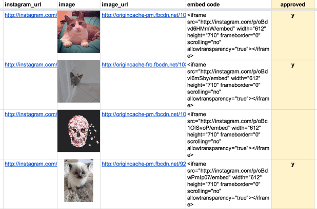
(This is just a screenshot. You can see the animated version in the “Boxes” chapter of the t-shirt site.)

Making A Filmstrip

The hardest part of the process is generating the filmstrip itself. What follows is how I did it, but I’d love to find a way to simplify the process.

First, I downloaded the highest-quality version of the video that I could find from archive.org. Then I opened it in Adobe Media Encoder (I’m using CS5, an older version).

screenshot of the Adobe Media Encoder CS5 interface

I flipped to the “output” tab to double-check my source video’s aspect ratio. It wasn’t precisely 4:3, so the encoder had added black bars to the sides. I tweaked the output height (right side, “video” tab) until the black bars disappeared. I also checked “Export As Sequence” and set the frame rate to 10. Then, on the left side of the screen, I used the bar underneath the video preview to select the section of video I wanted to export.

The encoder saved several dozen stills, which I judged was probably too many. I went through the stills individually and eliminated unnecessary ones, starting with frames that were blurry or had cross-fades, then getting pickier. When I was done, I had 25 usable frames. (You may be able to get similar results in less time by experimenting with different export frame rates from Media Encoder.)

Then I used a Photoshop script called Strip Maker to make a filmstrip from my frames.

the StripMaker interface

And here’s the result, zoomed way out and flipped sideways so it’ll fit onscreen here:

the finished filmstrip

I exported two versions: one at 800px wide for desktop and another at 480px for mobile. (Since the filmstrip went into the page as a background image, I could use media queries to use one or the other depending on the width of the viewport.) Because the image quality in the source video was so poor, I could save the final JPG at a fairly low image quality setting without too much visible effect. The file sizes: 737KB for desktop, 393KB for mobile.

And Now The Code

Here’s how it appeared in the HTML markup:

And the LESS/CSS:

Key things to note:

  • .filmstrip is set to stretch to the height/width of its containing div, .filmstrip-wrapper. The dimensions of .filmstrip-wrapper are explicitly set to define how much of the filmstrip is exposed. I initially set its height/width to the original dimensions of the video (though I will soon override this via JS). The key thing here is having the right aspect ratio, so a single full frame is visible.

  • The background-size of .filmstrip is 100% (width) and 100 times the number of frames (height) — in this case, that’s 25 frames, so 2500%. This ensures that the image stretches at the proper proportion.

  • The background-image for .filmstrip is set via media query: the smaller mobile version by default, and then the larger version for wider screens.

  • I’m using a separate class called .animated so I have the flexibility to trigger the animation on or off just by applying or removing that class.

  • .animated is looking for a CSS animation called filmstrip, which I will define next in my JavaScript file.

On page load, as part of the initial JavaScript setup, I call a series of functions. One of those sets up CSS animations. I’m doing this in JS partly out of laziness — I don’t want to write four different versions of each animation (one for each browser prefix). But I’m also doing it because there’s a separate keyframe for each filmstrip still, and it’s so much simpler to render that dynamically. Here’s the code (filmstrip-relevant lines included):

I set a variable at the very beginning of the function with the number of frames in my filmstrip. The code loops through to generate CSS for all the keyframes I need (with the relevant browser prefixes), then appends the styles just before the </head> tag. The result looks like this (excerpted):

Key things to note:

  • The first percentage number is the keyframe’s place in the animation.

  • The timing difference between keyframes depends on the number of video stills in my filmstrip.

  • background-position: The left value is always 0 (so the image is anchored to the left of the div). The second value is the y-position of the background image. It moves up in one-frame increments (100%) every keyframe.

  • animation-timing-function: Setting the animation to move in steps means that the image will jump straight to its destination, with no transition tweening in between. (If there was a transition animation between frames, the image would appear to be moving vertically, which is the completely wrong effect.)

Lastly, I have a function that resizes .filmstrip-wrapper and makes the filmstrip animation work in a responsive layout. This function is called when the page first initializes, and again any time the screen resizes. Here it is below, along with some variables that are defined at the very top of the JS file:

This function:

  • Checks the width of the outer wrapper (.filmstrip-outer-wrapper), which is set to fill the width of whatever div it’s in;

  • Sets the inner wrapper (.filmstrip-wrapper) to that width; and

  • Proportionally sets the height of that inner wrapper according to its original aspect ratio.

Footnote: For the chapter title cards, we used looping HTML5 videos instead of filmstrips. My colleague Wes Lindamood found, through some experimentation, that he could get smaller files and better image quality with video. Given iOS’s restrictions on auto-playing media — users have to tap to initiate any audio or video — we were okay with the title cards being a desktop-only feature.

We’re hiring a web developer

Love to code?

Want to use your skills to make the world a better place?

The visuals team (formerly known as news applications) is a crew of developers, designers, photojournalists and videographers in the newsroom at NPR headquarters in sunny Washington, DC — and we’re hiring.

We work closely with editors and reporters to create data-driven news applications (Playgrounds For Everyone), fun and informative websites (NPR’s Book Concierge), web-native documentaries (Planet Money Makes A T-shirt), and charts and maps and videos and pictures and lots of things in-between.

It’s great fun.

We believe strongly in…

You must have…

  • Experience making things for the web (We’ve got a way we like to do things, but we love to meet folks with new talents!)
  • Attention to detail and love for making things
  • A genuine and friendly disposition

Bonus points for…

  • An uncontrollable urge to write code to test your code
  • Love for making audio and video experiences that are of the web, not just on the web
  • Deep knowledge of Javascript and functional programming for the web

Allow me to persuade you

The newsroom is a crucible. We work on tight schedules with hard deadlines. That may sound stressful, but check this out: With every project we learn from our mistakes and refine our methods. It’s a fast-moving, volatile environment that drives you to be better at what you do, every day. It’s awesome. Job perks include…

  • Live music at the Tiny Desk
  • All the tote bags you can eat
  • A sense of purpose

Like what you’ve heard? Check out what we’ve built and our code on GitHub.

Interested? Email your info to bboyer@npr.org! Thanks!

This position has been filled. Thanks!

Different Strokes From Different Folks

It is still sort of holiday-quiet in the ombudsman's mailbox, but one critical letter from a viewer in Miami raises an editorial issue that I seldom get asked about — a comparison between NPR (radio) and PBS (television) coverage of...

Does Public Radio Have a Leadership Inferiority Complex?


One of the more perplexing situations in public radio is the failure of NPR to find and develop strong executive leadership from within the public radio system. It appears that that is unlikely to change as the NPR Board selects its next CEO. 
NPR has hired a headhunting firm that specializes in recruiting for technology companies. Headhunting firms are typically hired for their knowledge of a field.  It’s not unreasonable to assume that the NPR Board believes its next CEO will not come from the station ranks.
On top of that, several sources close to the NPR board tell us that the current and past CEO search committees have taken the position that no one in public radio is qualified to manage the external relationships NPR must forge to succeed in the digital age.  I hope that’s not that case.  It is a weak starting position for a search given the difficulty recent CEO’s have had managing the internal relationships NPR must repair to succeed in the digital age.
The NPR-Member Station relationship is the foundation of NPR’s business model.  It is widely understood these days that the NPR-Member Station relationship, and consequently, the NPR business model are in great need of repair.  Yet the vision, skills, and experience to affect those repairs don’t appear to be part of the hiring criteria for NPR’s new CEO.
It is unlikely that a headhunting firm will find those skills in the tech world.  Wikimedia CEO Sue Gardner lamented in her recent speech at the Public Radio Programming Conference that Silicon Valley isn’t funding start-ups with public service in mind.  It’s all about profit.  So viewing NPR’s leadership needs through a technology lens could make it doubly difficult to find someone who can be the keeper of the industry’s public service flame and cultivate healing relationships with Member Stations.
Meanwhile, across the country, there are many stations that have built strong local radio services while developing original content and improving public service, marketing, and engagement through new digital technologies. And not all of them are in large markets.
Leaders at these stations are forging the kinds of external relationships an NPR CEO would be expected to develop. They’ve proven quite capable of getting in front of foundations, major donors, and potential business partners and articulating the current value of public radio as well as a compelling vision for the future. They’ve proven quite capable of raising money in a difficult fundraising environment. They’ve proven quite capable of managing complex budgets, handling challenging business relationships and decisions, and managing large, diverse staffs.  They know how to develop original content. Many have experience as national program producers and distributors. And they are quite knowledgeable about the difficult audience and revenue issues facing NPR and it Member Stations.
There are many station leaders who have helped build public radio into the success it is today. Much of that success has come in the digital age.  But for some reason, past NPR search committees have deemed that success insufficient for leading NPR.
This sets up an interesting dichotomy. NPR’s Board searches for leaders who want to build on public radio’s great success, but does not think the leaders who are very much responsible for creating that success are good enough for the job.
It’s as if public radio has an inferiority complex; that the incredible success of public radio stations is somehow inferior to the success of other leading businesses and non-profits. Why?  Perhaps they believe it is because of NPR programming; that the qualities of great station leaders are diminished because they have the benefit of NPR content. Or perhaps they believe that station accomplishments are less meaningful because they are in radio and not some other field, like television or newspapers or digital.  That couldn’t be further from the truth.
NPR and public radio stations, together, have built a significant public service, one that has enjoyed exceptional growth as newspapers and Public TV have been in decline. The public radio system is widely admired for its contributions to improving society, its editorial and business integrity, and its current revenue model. This didn’t happen by accident and it isn’t just because of NPR programming.
Until satellite radio, there was no such thing as a national audience to an NPR program. The national audience for NPR News was exclusively an aggregation of audiences to local stations. Most of the growth that NPR claims for its programs over the past few decades is really the growth of local station audiences.  And today that aggregation remains, by far, the most significant source of listeners to NPR.
That audience success, the success so admired by the outside leaders who aspire to win the NPR CEO job, is a product of leadership at local stations. Believe it or not, it is easy to mess up an NPR News station.  It happens all the time.  Audience success at top performing stations is a result of acumen and intent beyond scheduling NPR programs at the best times of day.
The same holds true for membership fundraising, major giving, underwriting sales, and creating value in the digital space.  The best stations in each of these areas are successful because of strong leadership, innovation, and a commitment to being, and staying, the best. Those leaders are at the foundation of any success that NPR can claim for itself.  There’s no NPR success story today without strong station leadership over several decades.
It is fallacy to assume that success leading a growing public radio station can’t translate into success leading NPR. And given the failure of NPR’s last few CEOs to address the core problems harming the NPR-Member station relationship, it is fair to question whether hiring outside of public radio again will get a different result, especially if the new CEO lacks a strong public service background.
Any new hire to the position is going to have to grow into some parts of the job.  NPR’s recent CEO failures raise the legitimate possibility that a highly qualified station manager has a better chance of growing into the external CEO role than an external candidate has of growing into a successful public radio system leader.
There are several highly qualified individuals in public radio for the NPR CEO position. When it comes to recruiting potential candidates, their success should count more because it is in public radio, not less.  

The Book Concierge: Bringing Together Two Teams, Nine Reporters, And Over 200 Books

This post is cross-posted with our friends at Source.

We started the Book Concierge with the NPR Books team about four weeks back in early November. I worked alongside Danny Debelius, Jeremy Bowers and Chris Groskopf. The project centered on Books’ annual best books review, which is traditionally published in multiple lists in categories like “10 Books To Help You Recover From A Tense 2012.” But this presentation was limiting; Books wanted to take a break from lists.

The Collaborative Process

We needed a process for working with Books. Previously, we collaborated with an external team, St. Louis Public Radio, on our Lobbying Missouri project. That project required a solid communication process. It worked out well and gave us a solid foundation to collaborate internally.

We created a separate, isolated HipChat room for the project. Web producer Beth Novey volunteered to be the rep for the Books team, and so we invited her to this chat room, which made for easy, direct communication, and we added her as a user on GitHub. We could assign her work tickets when needed. We used GitHub, HipChat, email, and weekly iteration reviews to communicate as a team.

Once we determined who our users were and what they needed, we started sketching out how the page would visually be organized. At this point, we were thinking the interface would focus on the book covers. The images would be tiled, a simple filter system would be in place, and clicking on a book cover would bring up a pop-up modal with deeper coverage. And because sharing is caring, everything has permalinks.

Implementing The Grid Layout

Isotope (a jQuery plugin) animated all of our sorting and fit the variably sized covers into a tight masonry grid. But loading 200 book covers killed mobile. So we used jQuery Unveil to lazy load the covers as the user scrolled. A cover-sized loading gif was used to hold the space for each book on the page.

Unfortunately, there were some significant difficulties with combining Isotope and Unveil. Isotope kept trying to rearrange the covers into a grid before the images had actually loaded. It didn’t yet know the exact size of the images so we ended up with books covers that were cut off and stacked up in an extremely strange ways. We ended up writing code so that as Unveil revealed the images, we would manually invoke the “reLayout” function of Isotope. As you can see, we also had to throttle this event to prevent constantly relaying out the grid as images loaded in:

There was an even thornier problem in that whenever Isotope would rearrange the grid, all the images would briefly be visible in the viewport (not to the naked eye, but mathematically visible) and thus Unveil would try to load them all. This required hacking Unveil in order to delay those events. Finding the careful balance that allowed these two libraries to work together was a tricky endeavor. You can see our full implementation here.

How The Tags UI Evolved

The tags list initially lived above the book covers on both desktop and mobile versions. A very rough cut (along with placeholder header art) can be seen below:

image alt text

Our initial UI was oriented around a single level of tagging–books themselves could have multiple tags, but users couldn’t select multiple tags at once. Our feeling was that the data set of books wasn’t large enough to warrant a UI with multiple tags; it would result in tiny lists of just one or two books. But Books felt that the app’s purpose was to help readers find their “sweet spots” or each person’s perfect book. They also tagged each book in great detail, which ensured that there were extremely few two-tag combinations with only a few books in them.

Our interface focused heavily on the book covers. But Books felt that the custom tags were more of a draw–you can browse book images anywhere, but you can only get these specific, curated lists from NPR. Brains over beauty, if you will.

In the end, we agreed that multiple levels of tagging and drawing more attention to the tags were necessary to the user experience. In our final design, the tags list lives to the left of the book covers. A “What would you like to read?” prompt points readers toward the tags.

On mobile, we thought we would just use drop-down menus to display the tags list. However, the iOS 7’s new picker is super difficult to navigate and results in a bit of helpless thumb mashing. The low contrast makes the text hard to read and notice; the hit areas are smaller and difficult to navigate; etc. So we eschewed drop-down menus in favor of a tags list that slides in when a button is hit.

All of these UI changes were made to better present the tags and to allow for the multiple-tag functionality. It took about three weeks to develop/finish the project, and everything launched by the fourth week. Two teams, nine reporters, over 200 books, and one Book Concierge.

image alt text

Check us out

Wanna see our code? You can find it here on our GitHub page. Don’t hesitate to get in touch with any questions or feedback.

War of the Words

Sometimes, when journalists talk among themselves about stories they have read, the phrase "burying the lead" comes into the discussion. What is meant by that is a story that has important information way down inside the text, rather than at...

Transition for NPR Highlights Major Industry Issues – Part 2: The NPR-Member Station Relationship

A recent article at Current.org highlighted some of the financial and membership issues facing NPR as it looks for its next leader.  Our last post considered the financial side.  This post considers the membership issues.

Current reported on NPR's recent customer satisfaction survey among member stations.  NPR scored well when it came to representing stations on regulatory, legislative and legal matters.  NPR received very low satisfaction scores on engagement with member stations.

It's no secret that stations have felt for many years that NPR hasn't been looking out for their best interests. The surprise here is the depth of dissatisfaction.  NPR was hoping to score 7.5 out of 10 on the engagement portion of the survey -- that is, NPR aspired to a "C+" average -- and it scored a 5.9.  On attentiveness to small stations, NPR scored 5.1 out of 10.

The low customer satisfaction scores are an especially big deal because NPR's Board is controlled by member stations. Also worth noting is that the past three NPR Board Chairs have come from medium-sized stations, not large stations. 

There's a long history of tension between NPR and stations over financial, audience service, and governance issues.  That tension has grown in recent years as NPR's digital efforts allow more listeners to get content directly from NPR.  This "bypass" is a scary proposition for NPR member stations and most stations view their control of NPR's board as the last line of protection against NPR grabbing their listeners and donors. 

The thing is -- it's not working at that well.  Stations can wield their governance power to prevent NPR from doing some things but they can't seem to use it to get NPR to act in their best interests. The recent satisfaction survey is evidence of that.  Member stations control the Board. Through their votes they control which station managers sit on the Board,. Yet with all of this control at the top, NPR still gets an "F" on customer satisfaction among member stations.  Station control of the Board isn't translating into a better NPR-Member Station relationship. 

So where's the disconnect?  It's easy to blame the executives in charge at NPR but perhaps the issue still rests at the Board level.  Here are two factors to consider.

First, NPR's Mission and Vision statement doesn't embrace helping member stations succeed. Even though NPR is a membership organization, the Board has not charged the executive leadership with serving member stations.  The mission statement says NPR partners with member stations. It says NPR represents the member stations in matters of mutual interest.  But it is silent about NPR acting in ways to help stations succeed.

The second factor, and this is probably linked to the Mission/Vision statement, is the role of the CEO/President.  Recently, the NPR Board has taken to hiring leaders of NPR but not leaders of the NPR membership, and certainly not leaders of the public radio system. That has to change if the NPR Board wants to repair relationships between NPR and its member stations.

More in our next posting.

Transition for NPR Highlights Major Industry Issues – Part 1: Financial

Current.org has a good read on some of the financial and membership issues facing NPR as it looks for its next leader. 

On the financial side, Current reports that NPR had its best fundraising year ever in 2013, yet ended the year with a $3 million budget deficit.  It was a remarkable comeback given that the project budget deficit was $6.1 million. 

The lesson here is that public radio doesn't have a fundraising problem, it has a spending problem.  This is not only true for NPR, it is also true for many public radio stations.  Many stations are raising more money than ever, but struggling to make ends meet.  Additional investments in digital and local news aren't coming close to paying for themselves.

According to Mark Fuerst, who is leading the Public Media Futures Forums, this financial pressure is greatest on medium and smaller stations.  Revenues are growing for the largest 50 stations, but the smaller stations are struggling. That has to change soon or these stations will find themselves facing the same situation as NPR -- having to shed staff to make ends meet. 

How does it change?  Here are two necessary steps.

1.  Restructure how money changes hands in public radio.  After salaries, national program acquisitions are typically the largest line item in a station's budget.  The basis for those programming fees is an economic model rooted in 1990s media market dynamics not today's digital media marketplace. Restructuring the public radio's internal economic model could free up much needed resources for the smaller stations while ensuring that NPR and other national program producers have the resources needed to create high value programming, programming that generates loyal listeners and surplus revenues nationally and locally.

2.  Start applying financial success metrics to digital and local content efforts. Station managers need  to know how much public service these activities really provide.  They need to know if there are real returns in terms of public service provided and net revenues against direct expenses.  They need to know how close these activities come to breaking even.  And if they aren't at least breaking even, they need to know how much subsidization each activity requires. Having a handle on those metrics will help managers make smarter financial decisions whether there is a financial crunch or not.

In the next posting, thoughts on the troubled NPR-Member Station relationship.

Keep Hitting Listeners Right Between the Ears

Below is the original text from John Sutton’s acceptance speech after receiving the Don Otto Award from Audience Research Analysis and the Public Radio Program Directors association.  You can hear the speech here.  Just like live radio, what was written and what was said varied some.

It’s an honor to receive an award in the name of Don Otto, whose all-too brief career helped launch PRPD and professionalize the job of public radio program director. 

The first time I met Don was in 1987 at one the PD Bee workshops he helped to organize.  Those workshops were a critical beginning to the success and relevance public radio has today.

One of the key themes of those workshops was helping PDs understand what business they were in.  Many thought they were in the “be all things to all people” business.  Others thought they were in the museum business, that their stations existed as a place to preserve the failed programming of commercial radio.  Polka anyone?

What program directors learned during the PD Bees was that they were in the public service business… more specifically… public service delivered via the ears.  They learned that public service was NOT what they created… but what was consumed… what was heard. 

Here we are, a quarter century later, and as an industry public radio is again questioning what business it is in.  And by “business”I mean the activities that generate the money that pays the bills.  The value proposition. 

Is it the radio business?  The journalism business?  The content business. The public media business?  Honestly, do listeners even know that that even means?

How about none of the above?

The significant service public radio provides,  the market niche public radio owns, the one that keeps public radio in business is not radio.  Radio is a technology.  And it’s not journalism.  There are hundreds of places to find good journalism.

No, the service that you deliver, the service listeners voluntarily support with money is helping people find meaningfulness and joy in life while they are doing other, mundane things.

It's not just the content.  It's how and where the content gets to them, how it fits into their lives.  That's what listeners support with their money.

Again, the business you’re in today is helping people find meaningfulness and joy in life while they are doing other, mundane things.  And you are the best in the world at doing that.

I just started a new reserch company that measures the emotional connection public radio listeners have with NPR, and with their stations.  Let me tell you two things we’ve learned and reaffirmed.

First, your listeners believe that the act of listening to public radio is part of doing something good for society.  Think about that. For your audience listening is doing good for society.

Second, your listeners believe that listening to public radio makes them better people.  You make them feel smarter.  You contribute to their sense of happiness.  You help them connect to people and ideas that enrich their lives.

You help people lead more meaningful personal and civic lives while they are doing the mundane -- shaving, dressing, making coffee, sitting in traffic.

You don’t occupy their time.  You make the time they spend doing other things more valuable.

Sometimes you do that with journalism.  Sometimes you do it with music.  Sometimes you do it with entertainment.

That was the essential lesson Don Otto, and many others, were trying to help program directors learn in the 1980s.  That lesson still applies today.

You’re not a hospice for dying radio formats or, for that matter, local journalism.  And digital technology?   It’s just that –technology -- another means to the end.

The end game is the same today as it was in the 1980s. 

Keep hitting listeners right between the ears.

Keep getting better at turning the most mundane, routine activities into meaningful moments.  And when you think you are good as you can be, find ways to be even better.

That was what Don Otto brought to public radio.  It is an honor to receive this award in his name.  Thank you. 

Complex But Not Dynamic: Using A Static Site To Crowdsource Playgrounds

This post is cross-posted with our friends at Source.

You can build and deploy complex sites without running servers. Here's how.

We usually build relatively simple sites with our app template. Our accessible playgrounds project needed to be more complex. We needed to deal with moderated, user-generated data. But we didn’t have to run a server in order to make this site work; we just modified our app template.

Asynchronous Updates

App template-based sites are HTML files rendered from templates and deployed to Amazon’s Simple Storage Service (S3). This technique works tremendously for sites that never change, but our playgrounds site needs to be dynamic.

When someone adds, edits or deletes a playground, we POST to a tiny server running a Flask application. This application appends the update to a file on our server, one line for each change. These updates accumulate throughout the day.

At 5 a.m., a cron job runs that copies and then deletes this file, and then processes updates from the copied file. (This copy-delete-read the copy flow helps us solve race conditions where new updates from the web might attempt to write to a locked-for-reading file. After the initial copy-and-delete step, any new writes will be written to a new updates file that will get processed the next day.)

Each update is processed twice. First, we write the old and new states of the playground to a revision log with a timestamp, like so:

{
    'slug': 'ambucs-hub-city-playground-at-maxey-park-lubbock-tx',
    'revisions':[
        {
            'field': 'address',
            'from': '26th Street and Nashville Avenue'
            'to': '4007 26th Street'
        },
    ],
    'type': 'update'
}

Second, we update the playground in a SQLite database. When this is complete, a script on the server regenerates the site from the data in the database. Since each page includes a list of other nearby playgrounds, we need to regenerate every playground page. This process takes 10 or 15 minutes, but it’s asynchronous from the rest of the application, so we don’t mind. We’re guaranteed to have the correct version of each playground page generated every 24 hours.

At each step of the process, we take snapshots of the state of our data. Before running our update process, we time-stamp and copy the JSON file of updates from the previous day. We also time-stamp and copy the SQLite database file and push it up to S3 for safekeeping.

Email As Admin

Billions and billions of emails.

Maintaining a crowdsourced web site requires a little work. We fix spelling and location errors, remove duplicates, and delete playgrounds that were added but aren’t accessible.

Typically, you’d run an admin site for your maintenance tasks, but we decided that our editors use the public-facing site just like our readers. That said, our editors still need a way to check the updates our users are making.

Since we only process updates once every 24 hours, we decided to just send an email. For additions, we link the playground URL in the email so that editors could click through. For updates, we list the changes. And for delete requests, we include a link that, when clicked, confirms a deletion and instructs the site to process the delete during the next day’s cron.

Search

Our geographic-enabled search page.

Flat files are awesome, but without a web server, how do you search?

To solve this, we use Amazon’s CloudSearch. Eventually, we’ll probably implement a way to find playgrounds with certain features or to search by name. But right now, we’re using it just for geographic search, e.g., finding playgrounds near a point.

To implement geographic search in CloudSearch you need to use rank expressions, bits of JavaScript that apply an order to the results. CloudSearch allows you to specify a rank expression as a parameter to the search URL. That’s right: Our search URLs include a string that contains instructions for CloudSearch to order the results. Amazon has documentation on how to use this to implement simple “great circle” math. We took it a step further and implemented spherical law of cosines because it is a more accurate algorithm for determining distance between points on a sphere.

You can see the source code where we build our search querystrings in the playgrounds repository, but you should take note of a few further caveats.

CloudSearch only supports unsigned integers, so we have to add the 180 degrees (because latitudes and longitudes can be negative numbers) and also multiply the coordinates by 10,000 (because an unsigned integer can’t have a decimal point) to get five decimal points of precision. Finally, we have to reverse this process within our rank expression before converting the coordinates to radians to calculate distance.

Also, a single CloudSearch instance is not very stable when running high-CPU queries like geographic searches. During load testing we saw a large number of HTTP 507 errors, indicating that the search service was overloaded. Unfortunately, 5xx errors and JSONP don’t mix. To solve this, we catch 507 errors in Nginx and instead return a HTTP 202 with a custom JSON error document. The 202 response allowed us to read the JSON in the response and then retry the search if it failed. We retry up to three times, though in practice we observed that almost every failed request would return a proper result after only a single fail/retry.

Finally, while Amazon would auto-scale our CloudSearch instances to match demand, we couldn’t find any published material explaining how often Amazon would spin up new servers or how many would initialize at once. So, we reached out to Amazon. They were able to set our CloudSearch domain to always have at least two servers at all times. With the extra firepower and our retry solution, on launch day we had no problems at all.

Retrofitting CloudSearch For JSONP

You might notice we’re doing all of our CloudSearch interaction on the client. But the CloudSearch API doesn’t support JSONP natively. So we need to proxy the responses with Nginx.

Option 1: CORS

We could have modified the headers coming back from our CloudSearch to support Cross-Origin Resource Sharing, aka CORS. CORS works when your response contains a header like Access-Control-Allow-Origin: *, which would instruct a Web browser to trust responses from any origin.

However, while CORS has support in many modern browsers, it fails in older versions of Android and iOS Safari, as well as having inconsistent support in IE8 and IE9. JSONP just matched our needs more closely than CORS did.

Option 2: Rewrite the response.

Once we settled on JSONP, we knew we would need to rewrite the response to wrap it in a function. Initially, we specified a static callback name in jQuery and hard-coded it into our Nginx configuration.

This pattern worked great until we needed to get search results twice on the same page load. In that case, we returned a function with new data but with the same function name as the previous AJAX call. The result? We didn’t see any updated data. We needed a dynamic callback where the function that wraps your JSON was unique for each request. jQuery will do this automatically.

Now we needed our Nginx configuration to sniff the callback out of the URL and then wrap it around the response. And while this might be easy using some nonstandard Nginx libraries like OpenResty, we didn’t have the option to recompile our Nginx on the fly without possibly disturbing existing running projects.

One other hassle: Amazon’s CloudSearch would return a 403 if we included a callback param in the URL. Adding insult to injury, we’d need to strip this parameter from the URL before proxying it to Amazon’s servers.

Thankfully, Nginx’s location pattern-matcher allowed us to use regular expressions with multiple capture groups. Here’s the final Nginx configuration we used to both capture and strip the callback from the proxy URL.

Nginx Proxy And DNS

Another thing you might notice: We had to specify a DNS server in the Nginx configuration so that we could resolve the domain name for the Amazon CloudSearch servers. Nginx’s proxy_pass is meant to work with routable IP addresses, not fully-qualified domain names. Adding a resolver directive meant that Nginx could look up the DNS name for our CloudSearch server instead of forcing us to hard-code an IP address that might change in the future.

Embrace Constraints

Static sites with asynchronous architectures stay up under great load, cost very little to deploy, and have low maintenance burden.

We really like doing things this way. If you’re feeling inspired, complete instructions for getting this code up and running on your machine are available on our GitHub page. Don’t hesitate to send us a note with any questions.

Happy hacking!